Merry & Bright
Hi everyone! Allison here with a layout using the fun DIY Christmas collection. I've also got a new sketch to share with you that combines traditional scrapbooking with the SN@P! Pocket Pages.

You can download the full sketch with measurements and placements here.
The right side of the sketch uses the SN@P! Pocket Page, Design 9 and the left side follows a traditional style of layout design. Here is my layout based on the sketch:

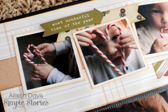
I got to take a trip down memory lane with these pictures of my now 9-year-old son Drew. Every year I take the pictures for our Christmas card and each year I try to do something different. I think Drew loved this year the most because he had a sweet and tasty prop to occupy him while I snapped his picture. We ended up with messier pictures than I had planned but his smile was so cute I didn't care!

I am in love with the DIY Christmas collection! There are so many fun options and elements to create and add your own unique touches to your projects. I used the "Merry & Bright" paper as the background and simply added my pictures and pieces from the DIY Christmas collection around that.

I added a few banner strips from the A2 Card Layers package and finished it with some hand stitching and the "cheer" arrow.

I framed the "Merry & Bright" with some Christmas trees, hearts, and enamel dots. I also added a little candy cane to one of the trees.

I used more of the banner strips and a scallop strip with some hearts to the top of the photos.

I added one more banner strip to the top left corner of the page and finished it with some hearts and enamel dots and hand stitching.

For the right page I used a combination of card and photos with the SN@P! Pocket Page, Design 9.

In the top pocket I used a 4x12" strip accent with 2x2" photos.

I also added more banner strips, hearts, and a title to the 4x12" strip.

There are three 6x4" pockets on the SN@P! Pocket Page but I didn't use any 6x4" photos. All of the photos I wanted to use were vertical photos and I wanted to include a lot more. My simple solution was to break the 6x4" pockets/photos into two 3x4" photos.

I couldn't resist using the cute candy canes so I created a card to fit the candy cane theme of the layout. I added some stitching and few hearts to finish the card.

I created another card to use as my journaling space. I layered a few pieces and added some hearts and a candy cane to finish it.
I'm using the 12x12 SN@P! faux leather album in black for all of my Life Documented layouts. The quality of the faux leather is fantastic and I love the stitching accent on them. I also used the 12x12 SN@P! Pocket Pages, Design 9 from the Variety Pack. I enjoy using several different styles of Pocket Pages and since the Variety Pack has so many great options, I have a lot to choose from!
I hope you all enjoy the new Life Documented sketch and I wish everyone a fun and memorable holiday season!

