Summer Goodness
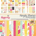
Hey there, friends! Missy here, and today I have two new layouts to share. I used the new Sunshine & Happiness collection for my first one. Summer pool pictures are my favorite ones to scrap, so I dove right into this gorgeous collection for these photos of my little girl. I decided to use a fun cut & fold cut file from The Cut Shoppe on this layout, and I backed the circles with various patterned papers and even a few of the Snap pack cards. I wanted to have lots of bright colors scattered all around the page, and this collection makes it easy to do. I used lots of coordinating watercolors to jazz up the background behind the circles, and I love how that makes the paper colors pop even more. How often do you use cut files on your layouts?
Here you can see the cut file, the watercolors and some of the gorgeous papers up close. I fussy cut this flower so it would go beyond the edges of the circle. I added a few of the phrase stickers and machine stitched through each line of circles. I created my title and ran this pretty Tangerine Stripe paper through my Cameo. I added an extra pop of blue behind it with some tangled thread.
I added a simple line of journaling here. I couldn’t resist using this adorable little bird. He looked perfect standing on this circle. I love that this collection is also perfect for Spring photos as well. It isn’t just limited to Summer; there are some very versatile pieces in this line.
I added in this cute balloon sticker and a few more smaller ones here. I love how the blue watercolor makes everything pop and stand out.
I fussy cut this sun from a 3x4 card and angled it so the rays would come outside the circle. I love how it turned out! The added yellows and pinks mixed in with the blue in the photo really look nice together here. I love mixing color all around the page.
_______________
I used the beautiful Bloom & Grow collection for my next layout. It’s perfect for outdoor photos, and I love how it showcases this cute photo of my daughter’s reflection in our 4-wheeler’s mirror. All the green in the photo coordinates so nicely with the papers and embellishments. I started with a neutral patterned paper from the Color Vibe Lights pack to have a light background. I used some white gesso, acrylic paint and spray inks to create the blue mixed media look, and I also used a few inks to add some messy splatters. Since my daughter is looking down to the left in the photo, I wanted it placed in the upper right area. I pulled lots of flowers & leaves from the Bits & Pieces pack and a few stickers. I used a floral & leaf cut file from The Cut Shoppe and created a few big yellow flowers and green leaves. I placed them all around and under the photo and also created a cluster on the left.
These die cuts I used for my title actually inspired this layout. I had the title before I even began, and I wanted to use that big floral ampersand in between the words. I love how it looks, and the mix of colors reminds me of nature and being outside. You can see all the die cuts and stickers layered under the photo as well as some tangled thread.
Layering is such a great technique, especially when there are flowers and leaves. They made it so easy to create layers here, and I wish I had more of them! The cute phrase stickers are the perfect little accents for just about anywhere on your layout.
This is something I love to do…instead of just cutting a square of the yellow paper here to use as a layer behind my photo, I cut a big flower out of it on my Cameo and used it as a layer that way. It just gives it more interest while still adding the color and the layer. Plus it goes with the theme of what the page is about.
Simple Stories always includes a ton of little stickers like this in all their collections. They are perfect for just about anything, but I love to layer them like this. Sometimes they have just the right sentiment on them and can make great additions to your journaling.


