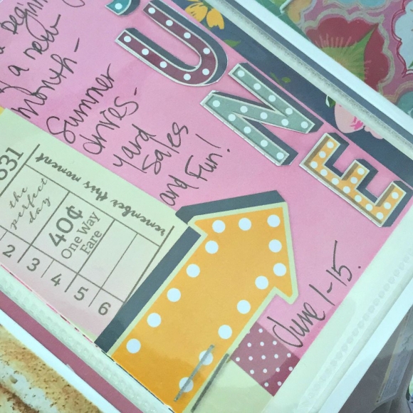
By now, you are well familiar with the new collections that Simple Stories has released as the gals before me have shown you some AH-MAZING projects. I have two more layouts to add that will, hopefully, be of inspiration to you.
 
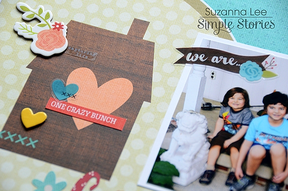
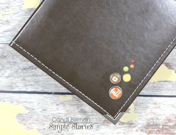
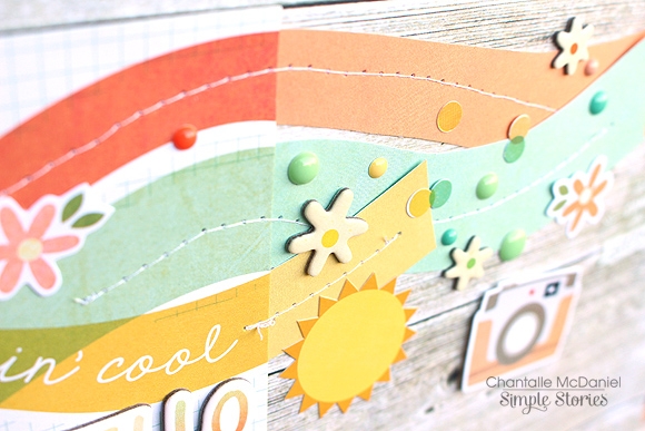
First up, We Are... Cousins created using the We Are... Family collection. I love this collection because it is family, who doesn't love family?!  I also love that the colors are very fitting for fall yet there are some bright pops of color in addition to the warmth.
 
 
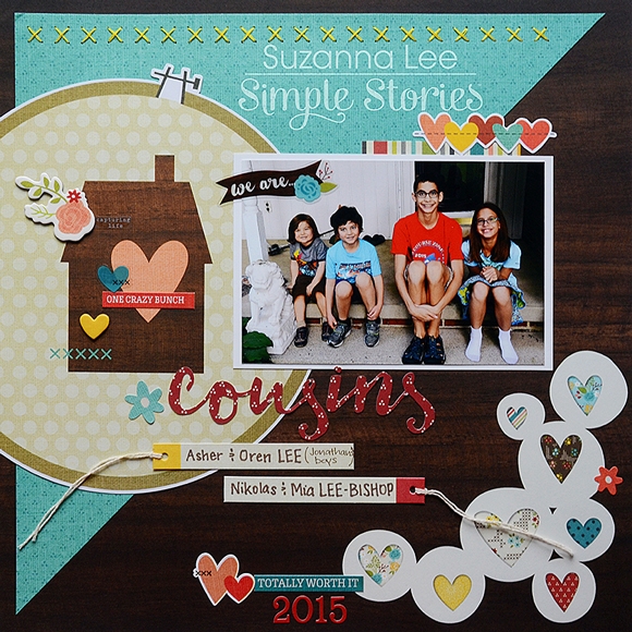
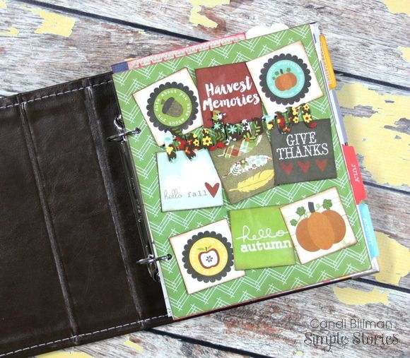
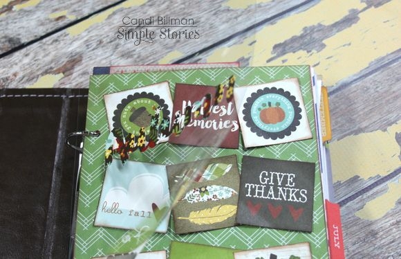
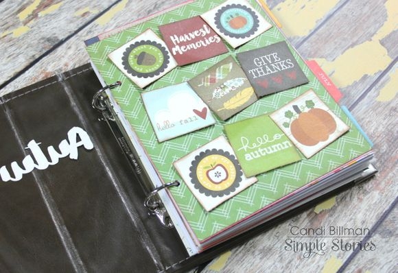
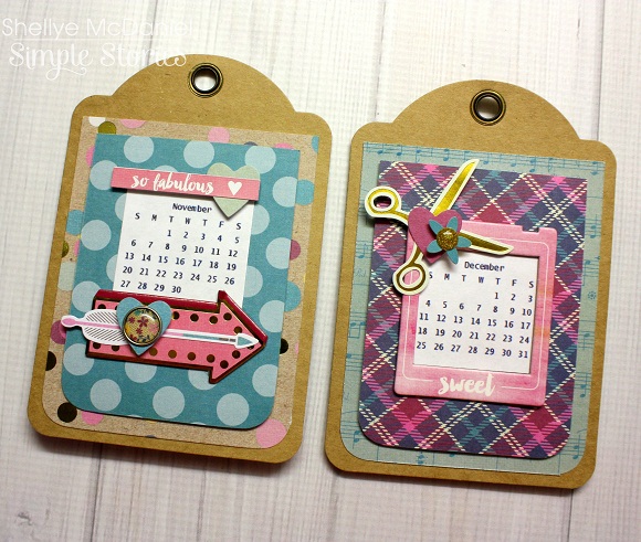
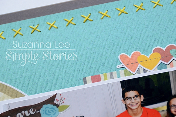
Found throughout the collection are bits and pieces of hand stitching for that homey feel. To tie my layout into this, I used the cross stitch hoop from the SN@P! Journal Pages and handstitched some "x"s across the top of the page.
 
 
If you are as crazy about design as I am, I'm sure you have amassed a plethora of fonts too. And finding the matching font to coordinate with the font used with this collection was fun! LOL! I used "Honeycream" with my Silhouette to create "cousins" in order to finish my title. It's not the exact font but it was close enough using the free fonts collected over time.
 
 
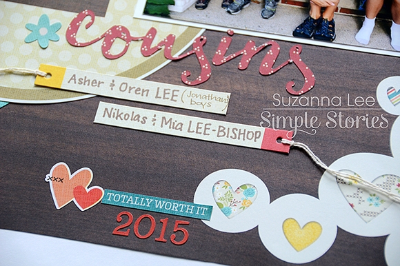
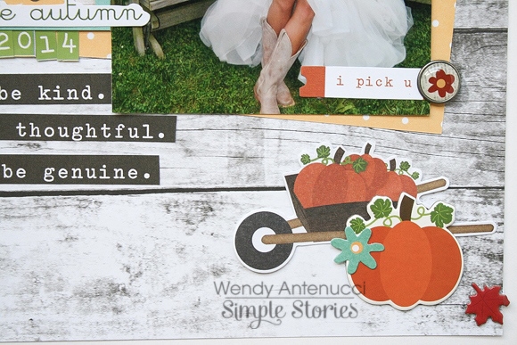
Other decorations scattered through out the layout were just fun embellishments to add to the homey, family feeling of the layout. We only see these cousins for a very brief visit once a year so to have pictures to reflect back upon is a treasure.
 
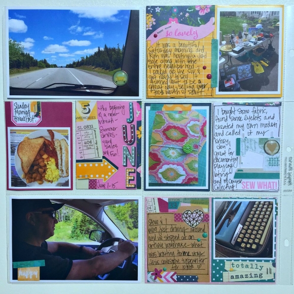
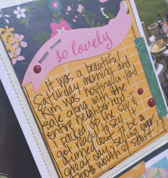
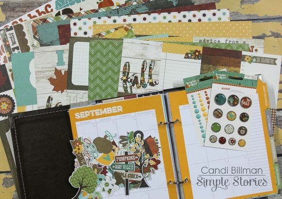
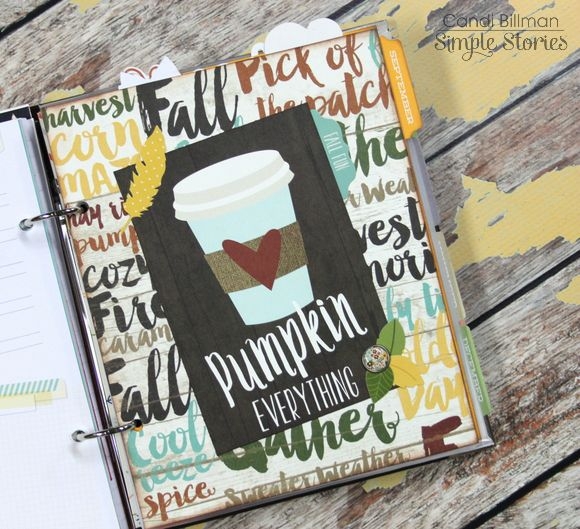
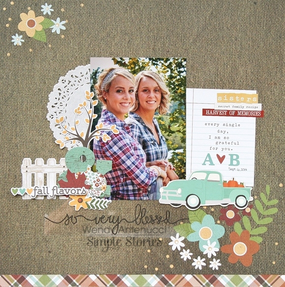
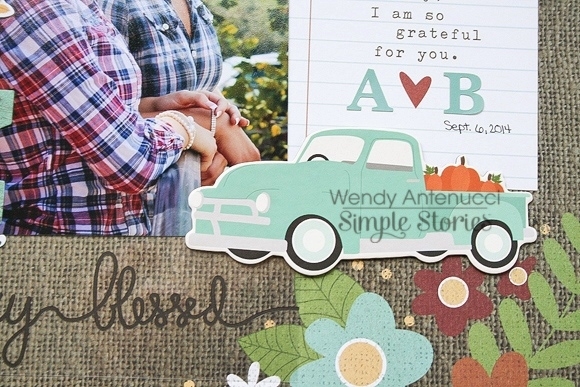
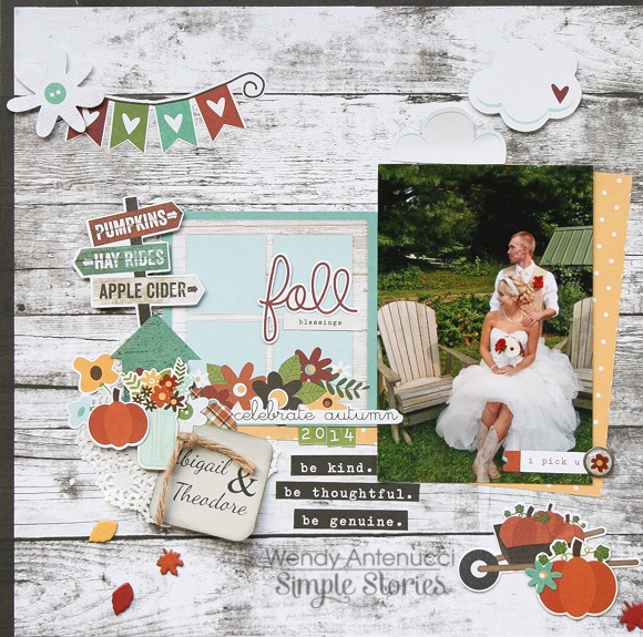
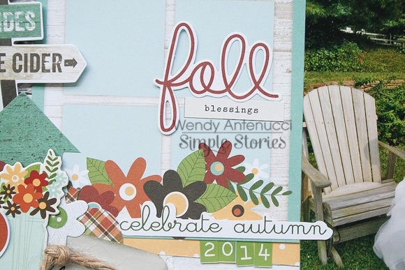
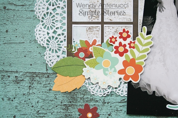
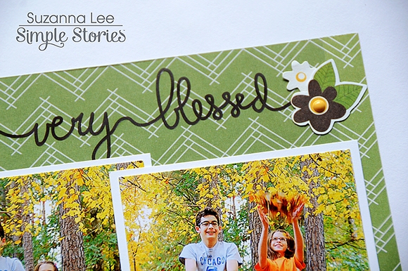
My second layout also documents a family relationship, that of siblings. As the pictures were taken during fall and it's rather obviously fall, I used the Pumpkin Spice collection for this layout. I wanted something a little bit more intimate and went with a smaller size for that effect.
 
 
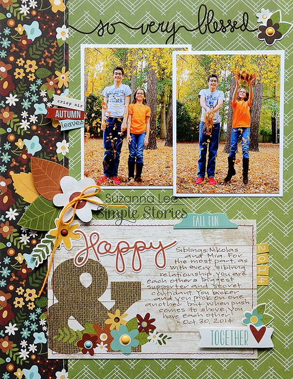
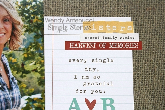
I used one of the transparencies that accompanies the Collection Kit as the header of this layout. It blends right in and appears as though there is writing directly on the layout. It was easy to adhere to the patterned paper using a thin liquid glue pen behing the brown lettering.
 
 
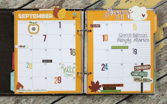
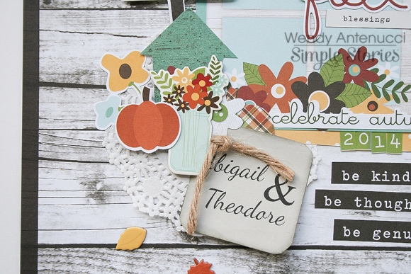
The title work and journaling are all on one of the 4x6 journal cards. The big ampersand tie the die cut "Happy" and popped sticker "together" together and still leave room to tell my story.
 
 
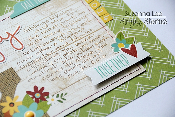
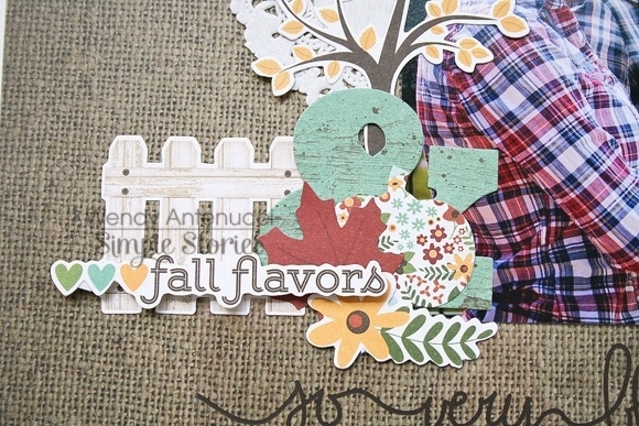
The fall flower bouquet at the edge of the page was constructed using love and bits & pieces in addition to leaves that I fussy cut from the smaller 2x2 squares from the Elements patterned paper. I love those small squares and though my layouts are rather linear, I can never incorporate the actual squares into my layouts. Rather, I prefer to fussy cut the elements and use them as bits & pieces.
 
 
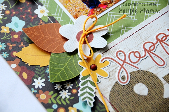
Again, there is some stitching on the page. This time I went with machine stitching.
 
I hope you have fallen for the Fall and Family themed layouts! I don't know about you but working with these layouts as me ready for the golden glow of fall and the cooler temperatures! I just love having four seasons and can't wait for the transition to Fall!
 
Hi everyone!  Teri here, and I'm excited to share some thank you cards I cooked up with Simple Stories' new Pumpkin Spice collection.
 
They say there's always something to be thankful for, and I find I am always in need of thank you cards to say 'thanks' with. The Pumpkin Spice collection is perfect for making those kinds of cards because it's jam-packed with gratitude-type phrases.
 
I played it clean and graphic with this first card.
 
 
I really liked the phrase on the SN@P! card. I wanted it to stand out so I placed the enamel dots and chipboard feathers in somewhat of a circle around it.  For good measure, I added an enamel dot to the little red heart.
 
 
When I think of Fall, I think of pumpkins and leaves. This thank you card has a real Fall twist with a pumpkin and pumpkin inspired sentiment.
 
 
To make that pumpkin stand out, I added a few enamel dots to it. And I added a couple at the top of the sentiment to just kinda even the whole card out.
 
 
Another gratitude phrase I just love is the one on this card.
 
 
Do you see the "u" shapes at the top and bottom of the card? Well, friends, they started out as one chipboard frame. Rather than using it as a frame, I cut it in half with my trusty old scissors and used the two pieces as decorative elements on my card.
 
 
I think they give the card a fun and funky look to it. I like that a lot.
 
This card is probably one of my favorite cards I've made  so far with the Pumpkin Spice collection. I framed the flower SN@P! card with a chipboard frame and then I used stickers to create the sentiment. 
 
 
To give the card some extra dimension, I adhered the chipboard bird onto the frame. And then I also added some enamel dots.
 
 
The last Thank You card I made it this So Blessed card.
 
 
I again brought out the chipboard frames. Boy, I dig them. This time, I adhered two to the card. For the third frame, I placed patterned paper behind it and then adhered it onto the card with foam dots. 
 
 
The sentiment was created by mixing together the "blessed" word on the frame with letter stickers. 
 
Alright! So that's what I have for you today!  Thanks for stopping by. I will be back again soon!


Supplies

Hello Friends! 

It's Kristine Davidson with you today and I am here to share a Life Documented spread featuring the So Fancy Collection!

I must admit this is one of my all time favorite collections. I love the colors, the gold accents and that fuchsia has my name all over it ;-)  A great collection for layouts and of course for pocket page scrapbooking!

When I started my spread I had pictures that I wanted to use and they honestly matched perfectly with this collection!  This spread is from the month of June 2015. The bleeding hearts were in full bloom, my husband and I enjoyed some travelling around, we had a yard sale and I found a typewrite for $10at our local antique store.

Here are a few close up pictures of the left hand side of my spread. - I added some stitching, and used washi paper tape on lots of my journal cards.

Here are a few close ups -

As you can see, if a journal card doesn't have any lines for me to write on I add them myself with a black marker.  I also like adding paper as a mat on most of my photos and cards.

Here's the right side of my spread -

Here are a few pictures of my filler cards. I cut a few cards and layer them on top of each other. Adding paper tape and a staple is easy and cute too!

I hope you enjoyed my post today and I hope you enjoy creating with Simple Stories!

Hi everyone, it's Audrey, and today I have a couple of card ideas to share with you using the new We Are Family collection. AudreyPettit-WeAreFamily-BestofFriendsCard Now I absolutely adore this collection, and think it can be used for so many events. Can't wait to use it for Thanksgiving this year with it's emphasis on family and blessings, but in the mean time, this versatile paper line is absolutely perfect for cards for all occasions. AudreyPettit-WeAreFamily-BestofFriendsCard2 I often find myself in need of general purpose cards, such as thank you's, birthdays, and friendship designs, so that is what I'm focusing on today. First up is a little 4.5" square card that combines lots of my favorite colors, patterns, and prints from the collection. AudreyPettit-WeAreFamily-BestofFriendsCard3 I am a huge fan of patterned papers, and as you can see, I like to mix and match quite a few on my cards for a fun layered look. One of my favorite tricks is to combine prints from the larger 12x12 papers with the smaller scale prints found on the 6x6 pad and journaling cards. Don't forget that both the SN@P Cards and Elements Journaling Cards are double-sided, giving you even more pattern options, like this yellow print and brown striped paper I used here. Those cards are often a great resource for card sentiments, too, like you see here. AudreyPettit-WeAreFamily-SoThankfulCard Next up is a standard A2-sized thank you card, once again made up of a fun mix of patterned papers and lots of adorable We Are Family embellishments. AudreyPettit-WeAreFamily-SoThankfulCard2 I love using the chipboard frames to call attention to my focal point, here a cutie pie die cut flower vase. Using pre-made embellishments is such an easy way to create a stunning focal point on any card design with very little effort. But to help my die cut stand out even more, I added a few extra details like these tiny black stitches from the Photo Stickers, and a simple twine bow around the center of the vase. It's those little touches that will really set your cards apart from the rest. AudreyPettit-WeAreFamily-SoThankfulCard3 The sentiment, too, was quick and easy thanks to the help of another pre-printed die cut. And since it's on the small side, I added a whole row of black stitches underneath to make it stand out. Great way to call attention to some of those smaller details. Hope I've given you some great ideas today! Enjoy!

Supplies

Click here to download your FREE copy!  Visit the Projects Downloads page here for more free downloads!

Hi everyone, Amy here to share a layout I created using the new We are...Family collection, which is AMAZING!  The colors are perfect for fall pictures, but they are also neutral enough for anything.  I used the line to create a layout about our recent trip to Punta Cana.

I used a loose grid design, so I could work in some more of my favorite chipboard frames. :) Here are some closeups. Simple Stories has some of the best ephemera out there, hands down!

My chipboard frame that I used for my title and to house some ephemera.

I could resist adding some goodies to the top of the photo.

Head over and check out the We are...Family collection, I promise you'll love it!

Candi here today to show you how I am prepping for Fall inside my Life Documented Planner!  Winter is my favorite month, but Fall is my second favorite and using the new Pumpkin Spice Collection has me all HAPPY!!!!!!  New Collection means a new Binder too!!!!!!!  


I was a little nervous about doing this, but I added some Bradz and Enamel Dots to my cover!  Super pleased with the way it looks!!!


Open up my planner and you will find a dashboard/flyleaf that I created!  I took an 8 1/2 x 11 piece of transparency and trimmed it down to size and added "Autumn" (from the Fundamentals Cardstock Stickers) to the front.  Behind the transparency I trimmed down a 12 x 12 Designer Cardstock from the Pumpkin Spice Collection Pack and topped it off with several 2 x 2's from the Element Sheets.


Here is the opening for September...the original divider did not match the Pumpkin Spice theme so I covered it up with my favorite sheet from the Collection, Harvest Memories.  On top of that...I had to add the 4 x 6 Element: Pumpkin Everything!!!


September is ready for planning!  I always need a month on two pages (MO2P) to look at quickly to see what important tasks/appointments are coming up!  I highlighted a few dates with some Number Stickers and the rest of the dates I just wrote in myself.  Love the pops of color from the Number Stickers!  


This is the back side of the divider where I will highlight some of my September memories!  I added some Cardstock Stickers and a few Bits & Pieces...


I pulled out my Pouch and have it loaded with some miscellaneous 4 x 4 Elements!  I have them trimmed down and ready to go...I love to punch a single hole in these and add them inside my planner or just to jot down some notes or memories that I don't want to forget!


Inside my Pouch I also have this 4 x 6 Photo Booklet to store my Fall Bucket List!!!  For the cover I cut out a 4 x 6 Element and added that to the cover.  The inside has four 4 x 6 photo sleeves so I can add two photos, back to back, inside each sleeve.


I have my Weekly Planner Inserts all set and ready to go for September!  I stamped out the date for each day and already added some fun Cardstock Stickers and a few Bits & Pieces along the way...


Here is a dashboard that I created to mark where my day is at.  I will move this from week to week.  It is a good place to house those sticky notes until you have time to jot it down inside your planner!  I put it against this blue divider so you could see it a little better.  


Makes me happy to have September all set up!  That means more time out doing my Fall Favorites: Apple Orchard Trips, Mini Road Trips and Pumpkin Spice Lattes!
 
Thanks for stopping by and have a lovely weekend!
 
Happy Planning...
Candi

Supplies

Fall is right around the corner! And even if you live somewhere that doesn't enjoy the crisp nights and traditional fall weather, you can enjoy the scents and sights of the season. We are usually sweltering at the pumpkin patch, but we don't care! It is one of our favorite family traditions and so we go every year even if our weather is still unbearable! So imagine my joy when I saw the new Pumpkin Spice collection!
 
 
Fall colors and pumpkins galore! I created a mixed title with stickers, a die cut and a chipboard sticker.
 
 
 I layered some of the Bits and Pieces over patterned paper and popped the die cuts up on dimensional adhesive for a fun look.
 
 
I cut that journaling spot out of a larger journaling card and added some chipbaord sticker leaves and Enamel Dots.
 
 
Finally, I created the look of ribbon by cutting a small strip of green gingham paper from the Simple Basics collection. I folded it into pleats and machine stitched up the middle with some coordinating thread.
 
 
For my second layout I focused on the chipboard frames.I used the largest and middle sized frames for my photos.
 
 
I used a 4x6 card as my title and added some Bits and Pieces. I love to pop them up with 3D adhesive.
 
 
I added some Enamel Dots and Bradz to the larger frames and journaled with a white gell pen around the outside.


Supplies

Did you know that the Pumpkin Spice collection works for weddings?  I didn't either, but I found out how amazing the collection was when I was looking for fall pictures to use with this collection.  Wendy here today sharing some inspiration with the new Pumpkin Spice collection.

 
Sometimes a picture just works with a paper and you know you have to build your layout from there.  This picture and paper instantly clicked for me and with the addition of the 3x4 Sn@p! card a layout was complete.  
 
 
I chose to add a doily to the page (and all the other wedding pages I created) to add in a little wedding feel and to unite my pages.  Some stickers, chipboard pieces, 
 
 
and the Bits & Pieces were all it took to finish the layout.  
 
 
I used the overlay to add some subtle interest to my page.
 
My next page, was just some fun with the Bits & Pieces, forming a scene that I then added in a picture that fit the theme.
 
 
I began with the window and added a few flowers and the word for my title.
 
 
I added in my doily to tie together my pages, and some ephemera from the wedding forming an embellishment cluster.
 
 
A few odds and ends, added in my finishing touches and some journaling to the happy couple.
 
 
My last page, Blessed, is totally different for me.  I loved the black and white photo of my precious sister in law and the combination on the blue wood grain paper seemed to be timeless and stunning.  
 
 
I added in my doily again for the wedding theme and a few bits and pieces to form a simple yet hopefully stunning layout.
 
 
To me, a collection shows how wonderful it is depending on its versatility.  Needless to say, I am pretty impressed with the Pumpkin Spice collection and can't wait to finish the happy couple's wedding album.  Thanks for joining me today, I hope you've been inspired to try out this amazing collection!


Click here to download your free copy of the Summer Vibes eBook!  Enjoy!


Hello!  Shellye with you today with a "So Fancy" tag-desk calendar for the upcoming new year!
 

I started with a set of six kraft tags that measure 3.75" X 5.5", the "So Fancy" SN@P Cards, various patterned papers and embellishments from the collection and a free printable calendar that I found here.
 

To begin, I cut the patterned paper down to 3.5" X 4.5" and corner rounded them at the bottom so that they matched the kraft tags.  Next, one of the 3X4 SN@P cards were added with foam adhesive tape.  The calendar was cut down to size, glued in place and then each month was embellished with various pretties!
 

The backs of the tags include a continuation of the calendar months, July through December:


The calendar is sturdy enough to stand up for display, or add it to an easel.  With holiday gift-making right around the corner, this would make a quick and fun gift for friends on your list!

Hello Simple Stories fans!
I couldn't wait to dig into the new We Are...Family collection!! I love mini albums, and it had been awhile since I'd whipped one together. This one came together in about an hour thanks to the handy pre-cut 4x6 booklet that comes in the Interactive Elements. Pages already stapled together with die cut edges were calling out to me...so I gave in. ;)

I love that all you have to do is add photos and embellishments in this little pocket album...that's the fun part, right?! My family and I had taken a last minute day trip to Niagara Falls (without checking the weather forecast) so I knew this would be perfect to house just a few photos + the story. The woodgrain alphabet in the collection didn't stand out against the woodgrain cover so I grabbed my gold Sharpie marker and switched them up a bit.

It dries almost instantly and looks great! :)

Inside the first page I added a 3x4 card from the Sn@p! set to the right side and heat embossed one of the smaller 'girl' wood veneer pieces with gold metallic powder...we are a family of three, after all. ;) On the left side I used half of one of the chipboard frames to kind of foretell the theme of the album...the weather we had was unfortunate, but we had a great time together regardless.

Each page comes with an image or phrase, so I just added a few details here and there. We spent the afternoon at the outlet mall (trying to convince ourselves that the torrential rain would wear itself out), and found some awesome deals to save for back to school time. Our daughter scored an insane steal on this purse and it was fun to document her first 'real' purchase from her summer job. A washi tape strip here and there paired with a few enamel dots + the flat backed brad were all that was needed to wrap this page up. 

The next page sums up the ridiculousness of the entire day, lol. It was STILL pouring with sideways rain after we had dinner, but we barreled through the bad weather and stopped by Niagara Falls despite the grey day. We stopped at a gift shop to grab a few ponchos, and sported the Canadian maple leaf all over town. We were on the U.S. side of the Falls, and so many folks told us we were troopers to brave the weather since we were 'visitors'...rather than correct them, we just went with the flow. :) 

I'm glad I stuffed the wrapper for one of our ponchos in my pocket during the downpour...I adhered it to the back of one of the 4x6 transparency pieces that comes with the collection kit, and made an extra page out of it. I used a washi tape strip and one of the foldover tabs on the back side to hold it in the album. 

The last page tells the story about the ponchos...I love the graph design that is throughout the album. It unifies everything and makes journaling SIMPLE. After layering a few stickers together, this album was complete!

There are several neat items in the Interactive Elements from each collection...make sure to check them out for simple projects like this one. :)

  •  

Supplies

Click here to download the free So Rad Sn@pbooking Guide!  Visit the Project Downloads page for other Sn@pbooking guides and free downloads!

Supplies

As summer starts to come to a close, I find myself looking through vacation photos and feeling nostalgic. Last year our entire family got together and rented a beach house on the Eastern seaboard. It was equal parts crazy and fun. I created this mini album so that I wouldn't forget the details and to see the entire trip in one small capsule. The Summer Vibes collection was perfect for documenting my memories!

​Take a look at the video to see how it all came together:

I used the 4x6 SN@P! binder album in a bright, sunny yellow. It's filled with page protectors in a variety of sizes, ledger pages and pretty yellow dividers.

​Transparencies from the Summer Vibes Collection Pack make perfect dividers for your mini.

These pages came together quickly with die cuts, frames and stickers from Summer Vibes.

And now a peek at my planner set up for September. I went for a softer look with the Happy SN@P Pack. This is me not accepting that fall is coming! I'll stick with a tropical palette any time.

Planning out my video schedule with the daily pages, alpha stickers and more bits and pieces from the Happy SN@P Pack.

One of my favorite places to make lists are on the monthly divider pages. These let me focus on what's important for the coming month.

This is one of the busiest months of the year for me. I'm looking forward to having one place to keep it all! 

Supplies

Hello everybody. It's Mindi here with you today sharing some pocket pages about all things girly ! I wanted to show you that the Enchanted line is very versatile and can be used for more than just Princess projects. 
 
 
Back in May of 2014 the boys went off for a weekend of camping. It left us girls all alone to party !! We invited some friends over to play, scrap, and eat with us all weekend. 
 
Here is a look at the left side of my 2 page spread. 
 
I kept the title card pretty simple. Only added a few small embellishments with the most important info. (date and what the pages are about)
 
 
One of my favorite things to do is to take a journaling card and personalize it, embellish it, ect. Isn't that why we scrapbook, right ?!!! 
 
I started out with a journaling card and added one end of a chipboard piece to the side. I knew I wanted something inside of the chipboard frame. I added a strip of washi tape and a few stickers. So fun. 
 
 
Sometimes when I am short on photos I will add in a filler card, a big journaling card, ect. This was one of those times, especially since I had a lot of journaling. 
 
I decided to use a 4x6 journaling card and cut it up to fit into two 3x4 pockets. Before I cut it in half I added a few strips of the washi tape and some other embellishments. I also printed out some journaling on the card then finished it off by cutting it in half. 


Let's move on to the second page. 
 
 
Can I just say that I love these chipboard frames. I decided to use this square one as a frame for some embellishing. I took the pink VIP filler card and put it underneath the frame. I added the word US around the circle for a fun look. I decided to add the names of all us to make sure we would remember in the coming years. 
 
 
Here are some close ups from the second page. 


I wanted to make sure that I documented what we did over the weekend. Remember even if it's not in detail, those small details matter. 
 
 
That is it for me today. I had lots of fun working with the Enchanted line, which was all things pink, princess like, girly, and sparkly. It was the perfect product for my girls weekend photos and stories. 


Hi!  It's Chantalle again :)  My final page is also about skateboarding, but this time my little girl’s version - which involves flying down our steep driveway, while seated! I took a series of burst shots as she was doing it and they help tell the story across the centre of my page.

Mimicking the triangle print, the base layer of this layout comprises of a number of triangles which I cut from various sheets from the So Fancy 6x6 pad, using my Silhouette Cameo.

I grouped them so I could place two 6x6 sheets next to each other which can save time.

I just love the gold foil accents in this collection and the chipboard frames are perfect for highlighting areas in a photo. Her face says it all - pure joy!

Thank you so much for stopping by today! If you would like to see more of what I get up to, feel free to pop in to my blog (copasetique.blogspot.com) or you can find me on FB and Instagram @chantallemcdaniel.

Happy creating!

Hi!  It's Chantalle back again with the 2nd of 3 layouts!

I’m sure I am not alone when I say that it feels as if So Rad has been designed just for me. With a nine year old Son, I find myself laughing out loud at the sentiments and images. Video games… skating… duuuuuude. Sweet ;)

I’ve made a feature of my photo by using a number of the smaller size So Rad chipboard frames. Almost like photo corners. I really like the angle they create in opposition to the straight title.

To create my layered SK8R title:

* I first planned the layout in Silhouette Studio (I will often draw out/type up elements I have in mind, so I can effectively plan where my cuts will be placed in relation to the paper I want to use.)
 
* I then deleted the holding areas and sent the title to cut on a sheet of So Rad 12x12 ‘X-Treme’. 
 
* To make the multi-layer title, I then selected the SK8R text and created an internal offset. (Select the offset menu from the tool bar in the upper right of the screen and click ‘offset’, adjusting the options to suit your project.) Now I had a smaller identical version of the word SK8R. I deleted the larger outline and using a contrasting shade of paper from the So rad 6x6 pad, I sent this file to cut again.


I backed the larger type area with a section from a sheet of So Rad 12x12 ‘Dark wood/Newsprint’ and raised the orange paper up on some foam tape.
 
 
I ran with a star theme for the embellishments and used whichever ones I could find, be it stickers, wood veneer, brads. I also punched tiny stars from a sheet of cork to coordinate with the awesome cork print in this collection.
 
 
Hi!  It's Chantalle with you today with the first of 3 layouts!!
 
This first page documents, in my eyes, a little moment of madness on my children’s behalf. We were in the first couple of weeks of Spring last year - you know, when the sun is out but not really warm enough to swim… Well these crazies didn’t need any excuses to get themselves wet! The sheer joy of the moment is captured on their little faces. We were so looking forward to welcoming Summer!
 
 
I was really inspired by the ‘keepin’ cool’ 4x6 card from the Summer Vibes SN@P! card set. I wanted to extend the lines of the fan image and did so by placing the card next to a Summer Vibes 12x12 sheet of ‘Oh hello’ which has the same colours printed. I drew the lines freehand and cut the sections out with scissors.
 
 
Once I was happy with the pieces and the placement, I went about machine stitching them on for a bit of interest. I also think it adds direction and movement to the page.
 
 
The page has been embellished with lots of little elements like stickers. The new colour photo stickers across the new lines are definitely a favourite!
 
 
I'll be back later today with my 2nd layout!!


Pages