Hey everyone, Amy here to share a couple of my recent layouts I've created using Simple Stories Collections.  I really love all the collections, but I have to say that the So Rad collection has always been a favorite. I grabbed it to create this layout of us posing with a monkey on vacation this summer.  I started by creating a loose grid, which I tend to use when I am working with multiple pictures.  Here's the layout.

I felt like I didn't need much journaling, the pictures really tell the story.  Here are some closeups.

For my next layout, I knew the colors of We Are...Family would be perfect to document my son's new friend. Let me introduce you to Flag the Frog.

As you will notice, this is a grid based layout as well, but I changed it up some by working with a vertical grid this time around.  Here is a closeup. I really wanted to feature the chipboard banner, so I created my grid around it.

This layout has turned into one of my recent favorites.  Thanks for visiting the blog today!

Hi everyone!
Teri here, and I'm excited to share some thank you cards I cooked up with Simple Stories'  Pumpkin Spice collection.  I just love this collection. It has such a great color scheme and has so many fun fall icons.   Plus it is jam packed with gratitude-type phrases that make it great for creating thank you cards.
 
I created a scene for this first card by pairing together the fence and tree.
 
 
I always enjoy mixing different embellishments together, Simples Stories makes it easy by having design elements across their collections that work together. I created my custom sentiment by with letter stickers and the "blessed" die-cut from the Pumpkin Spice Bits & Pieces.
 
 
When I think of Fall, I think of leaves.... lots and lots of them! I wanted this card to definitely have a "Fall vibe" so I incorporated three leaves into my design. 
 
 
I really wanted the maple leaf to pop so I adhered it to the card with foam adhesive. And then I added a round Bradz on top.
And I thought it would be fun to really hit it home that this is a thank you card so I repeated the "so thankful" phrase three times.  
 
 
Although this card has a lot of pieces to it, it was a fairly simple thank you card to put together. I simply stacked (and slightly offset) three SN@P! cards and then added the "so thankful" banner on top. 
 
 
To complete the sentiment, I simply used letter stickers. 
 
 
I played it clean and graphic with my "Thankful For" card. 
 
 
I decorated a card with patterned paper and then added the "Thankful For" SN@P! card.
To give the card a more personal touch, I added a few enamel dots and a Bradz. Just a few embellishments can really make a card go from plain to something special.
 
 
I played it clean and graphic with this "Grateful Heart" as well. 
 
 
While I didn't use a lot of embellishments on it, I added just enough to lead the eye from one side of the card to the other. 
 
 
So that's what I have for you today!  Thanks for stopping by. I will be back again real soon!


Rebecca Larson here with a couple designs using some of the latest digital releases! 
 
First up, I wanted to highlight the digital Family SN@P! Set. This small collection on its own can bring so much added dimension to a pocket page, but can be a challenge when creating a stand alone page. I love the colors, and wanted to find a way to compliment some of our fall break photos, so I coupled it together with the digital Legacy Collection. The mix of the two collection's patterns and solidscoordinate so well together and I love the feel it brings to my layout.  I knew I wanted to use as much from the SN@P! Set that I could, so I created clipping masks with a polaroid action that I found online (here). I just used the top layer the action created, and masked it to the different 3x5 cards.
 
 
I love the ability to resize, and change the color or pattern with digital! I didn’t want two coordinating pattern’s to be right next to each other, so I gave the cute polkadot arrow a little makeover:)
 
 
I then filled in the frames with my photos, added a few coordinating elements, and created a title with the red letters/numbers included in the set (the “Fall Break” brushes are from littledreamer.co). I love how it turned out!
 
 
I couldn’t let October pass with out creating a Halloween layout! I have had the digital Frankie and Friends collection on my hard drive since its release! I was so excited to finally use it! When it comes to Halloween photos, I am usually a post season scrapper lol! Like several seasons post hahaha!  It seems when this beloved holiday rolls around, I am already thinking reindeer, snow, and sugar cookies (don’t hate me). I was so excited to use this collection! The colors are not your average orange and black! And the embellishments are so dreamy!
 
 
This collection also includes a very whimsical alpha that I didn’t use on this layout, but excited to use it in the future. I had a hard time not attempting to use almost the entire kit in one layout! (I restrained lol!) I loved creating a fabulous layout that frames the photo of our Star Wars family perfectly!
 
 
Thank you so much for stopping by!
 

Click here to shop from the new Silhouette designs.

Click here to shop from the new digital collections.

Hello Friends!

It's Kristine Davidson here today and I'm  happy to share a spread about my sister and her family featuring the We Are... Family collection.

First I would like to say "YELLOW!" I love this bright yellow that's included in this collection. I really don't use yellow very often in my pages but this color just made me happy!

These are photos of my sister and her children. The picture were taken from this past summer while they were all playing in the backyard. 

In this spread I wanted to showcase a pocket page but include a layout on the left side. I created a simple layout as to not overwhelm the simpler, colorful side of my pocket page on the right.

I really like this format since it gave me the opportunity to create a layout but also with a pocket page it allowed me to add more photos and extra journaling.

here is a close up pictures of the layout details.

I really enjoy creating with pocket pages and I find that sometimes I have too many photos to just put away in a box somewhere or create a few more layouts about this one event.  I added more photos of the day and little extras with embellishments.

As you can see the theme is pretty constant on both pages, lots of yellow, a little bit of red and the pictures are all from the same day.

If you have a family event to document, I would highly recommend trying a pocket page with a layout and don't be afraid to add some color !

A few close up pictures of my pocket page;

Thanks for coming to visit today, and I hope you feel inspired to create and try something new in your scrapbooking!

Enjoy creating with the We Are ... Family collection.

For more of my work you can visit my blog kristinedavidson.com or on instragram @KristineDavidson .

Supplies

HIP HIP HOORAY!! We know you've been waiting & the time is almost here! Our Carpe Diem A5 Planners & Accessories will be in stores in just a few weeks!

Lots of fun stuff taking place over the next few weeks on social media as we await the exciting arrival!  

Make sure to follow us on social media to join in the fun!

Facebook

Instagram - @simplestories_

Twitter - SimpleStories

Pinterest - Simple Stories

You Tube - Simple Stories TV

Periscope - @SimpleStories

Hi everyone, it's Audrey, here today with a couple of sweet fall cards made with the adorable Pumpkin Spice collection. AudreyPettit PumpkinSpice HelloCard Fall is such a happy time of year, and that's just what this collection is, too.... happy! Love the bright colors mixed with rustic tones of woodgrain and gingham. So great for fall themed scrapbooking layouts, but also really perfect for cards. AudreyPettit PumpkinSpice HelloCard2 On my first card, I took advantage of one of the chipboard frames to act as both the sentiment and the grounding framework for my focal point. Such an easy way to create a card design in no time at all. I simply backed the frame with one of the SN@P journaling cards, and then added a variety of die cuts to build a fun fall scene. AudreyPettit PumpkinSpice HelloCard3 The die cut fence behind the frame really adds to the fall scene here and helps create the illusion of depth and space. The piece wasn't originally large enough to span the width of my card, but since it was place behind another element, I could easily snip it in half to extend the size. That's a great tip for making embellishments work for you. AudreyPettit PumpkinSpice ThankfulCard For my second card, I also took advantage of some pre-made embellishments to create my focal point... this time, an adorable harvest pumpkin on one of the 3x4 SN@P journaling cards. The sentiment, from one of the Journaling Cards Element sheets, was a super easy find, too. AudreyPettit PumpkinSpice ThankfulCard2 I love to add layers to a one-dimensional element to create a bit of movement and depth. Here a few die cut flowers, enamel dots, and a rustic twine bow really dress up my otherwise flat journaling card. Foam adhesive behind some of the layers adds some great dimension, too. AudreyPettit PumpkinSpice ThankfulCard3 Happy Fall, everyone! I hope you enjoy!   

Supplies

Hello, SS Fans!  Candi here today to do a little "follow up" from my September Blog Post!  If you don't remember my blog post from last month, click HERE to get a little refresher!!! 
 
Real quick...for the September Blog Post, I did something a little different inside my Life Documented Planner......instead of weekly inserts, I used different elements from the We Are...Family Collection Kit!  Here we are mid-October and I wanted to update you all on how it is coming along!  Going into October, I was a little unsure if I was going to plan + journal or just journal.  I ended up with just journaling about each day and adding a few photos and memorabilia along the way!  Loving how it has turned out so far :)   
 
Inside my first Interactive Element, I added a few photos of my loves...Troy and our two black labs!  I love how you can fold this Interactive Element back up and add a paper clip to keep it closed.


My spot to store some important notes throughout the month...


The first week of October all filled in with things that happened throughout my day!


I signed up for a half marathon and so I had to print out the receipt, punch a few holes in it and stick it inside my planner.  I even added a business card that I received in the mail...


On the back side of the receipt, I added a photo...yep, that is a smashed windshield!  Of course I journaled about that ;) On the right hand side I paper clipped in an instax photo!


Here is a peek inside another Interactive Element!  Once again...to keep this closed I just used a pretty paper clip!


Lots of memorabilia from our weekend getaway...business cards and my coffee sleeve :)


This "matchbook" Interactive Element is so much fun!!!  I added a photo to each "flap" along with a few embellishments...


Can't forget to add the bag that the best tasting chocolates came in :) Printed out a photo of our "home" for the weekend, trimmed it down and used a corner rounder.  Added that photo directly behind a social media advertisement from our breakfast out.


Anxious to see how the rest of my month turns out?!  I will be updating my Instagram account as I continue adding more journaling, memorabilia and of course more photos!
 
Have a great month...I will see you in November!

Supplies

Hi Everybody. It's Mindi here with you today. I am happy to be sharing some pocket pages with you today, using the Pumpkin Spice collection. Every year around here Fall seems to be delayed. I makes it really nice to be able to work with some Fall related products to tide me over until the real Fall shows up. 
 
A few weekends ago we drove up the canyon to a small town that was holding an Apple Festival. While we were wandering around I happened to spot a tree that was changing it's colors !! Boy was I excited to see some beautiful fall colors. 
 
 
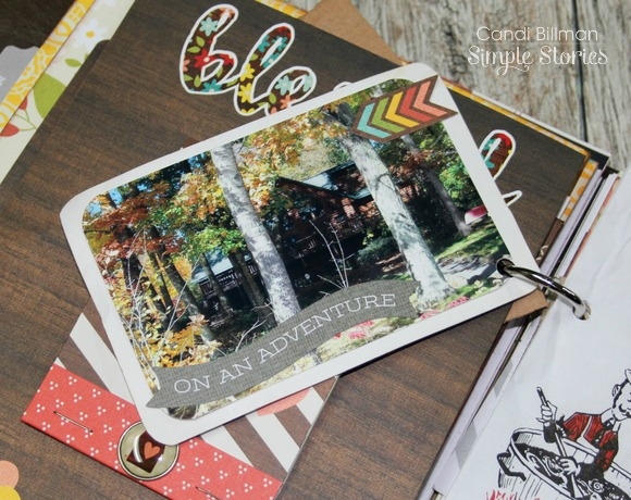
Speaking of fall leaves. I used the woodgrain tag underneath my embellishments here. It was the perfect backdrop for adding a little something extra on top of my photo. 
 
 
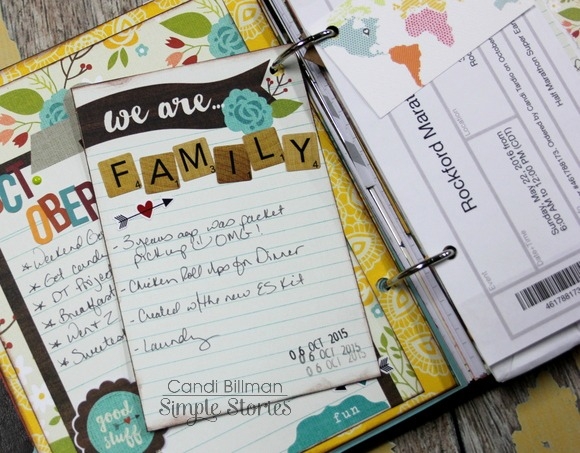
This is my title card. I really wanted to add in some of the great patterned paper from this collection somewhere. The title card was the perfect choice. I added the tree on top of the paper and added the week number and some embellishments on top. 
 
 
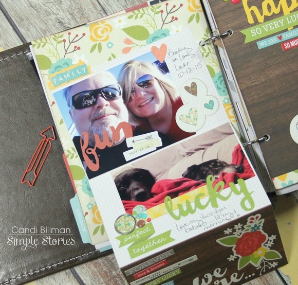
Here is a look at the left side of my spread. 
 
 
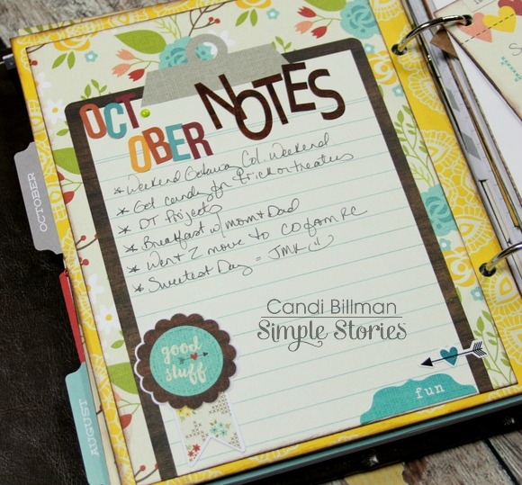
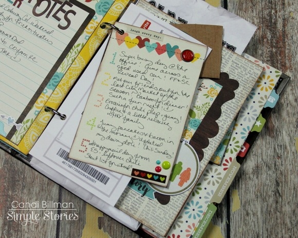
One thing I like to add into my pocket page spreads are "Highlights" journaling cards. Especially with weeks like this where I wanted to include a lot of photos from the weekend. Which, by the way, I am totally ok with. I printed out my journaling onto some white cardstock and cut it down to fit onto the yellow 3x4 card. I added a strip of paper to the top to add some color and then put some more embellishments on the top. 
 
 
One more closer look from the first page. Over the weekend the girls and I attended a girls only Witches party.  Don't be to afraid to customize your pages by cutting up some of the stickers, cards, bits and pieces. I cut up part of the chipboard flower sticker to use one of the smaller flowers on my journaling card. 
 
 
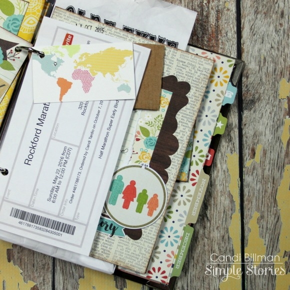
The second page of my spread included more of our adventure at the Apple Festival. 
 
 
There is nothing more beautiful than Fall colors. Am I right ?!! 
 
 
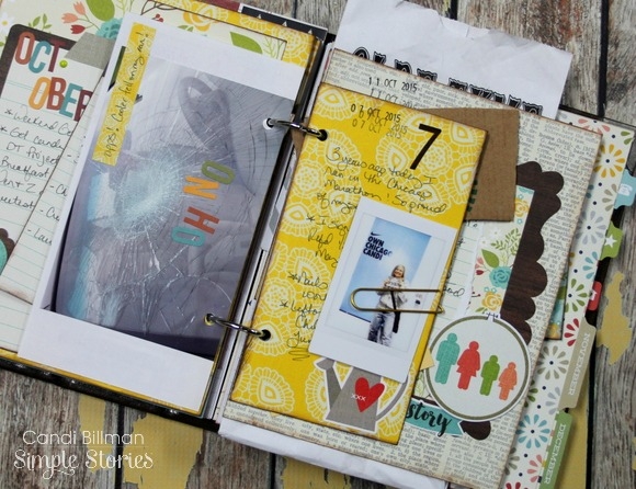
This is a fun filler card that I made for this week. On the bottom I made triangles out of patterned paper. Matching them up to make a fun pattern on the bottom. I added the chipboard frame on the top with the bird tucked right in. 
 
 
Back to the apples now. How could I not take home a souvenir from the Apple Festival. 
 
Isn't this apple journaling card the best. The word phrase stickers are perfect to add a little something extra to your photos of journaling cards. I stacked a few to the side of my journaling card. 
 
 
I knew I had to use this clear photo overlay somehow. I decided to put it on the bottom of my journaling card. They sure are versatile. I added the word Autumn to the top and then put my journaling about our day in the middle. 
 
 
That does it for me today. Go out there and enjoy all that Fall has to offer! 

Supplies

Happy Holidays!
 

And by Happy Holidays, I mean Happy Halloween, Happy Thanksgiving and Merry Christmas!  October through December is my favorite time of the year, and I love creating Fall and Christmas layouts.  And Simple Stories has you covered with some great collections for the upcoming holidays...Pumpkin Spice, We Are Family and Claus & Co.  Today, I'm sharing layouts using the Pumpkin Spice collection (with a bit of We Are Family mixed in) and the Claus & Co. collection.
 

Let's start out with the layout using the Pumpkin Spice collection (might as well stick with chronological order!!).  I had a lot of fun with this layout.  I thought it would be fun to cut a large pumpkin shape and then back it with an Ombre look, using patterned papers from the Pumpkin Spice collection


After I cut the pumpkin shape from White card stock, I traced the shape onto a second sheet of White card stock.  Then I cut strips of patterned paper and made sure they were placed outside of the pumpkin shape traced outline.  Before placing the die cut pumpkin paper over the second piece of card stock, I machine stitched through each of the paper strips


Then I adhered the die cut pumpkin paper over the background card stock piece.  I decided to mix in hand-stitching with the machine stitching, so I stitched around the outside edge of the pumpkin with a mix of embroidery floss.


Once I finished the hand-stitching, I started going through the Pumpkin Spice Chipboard, Bits pack and Sticker Sheet, to add coordinating embellishments to match the color of the patterned paper strips.  I also wanted to add some embellishing around the outside edge of the pumpkin, so I added a mix of embellishments, as well as Enamel Dots.
 

This look can be created with lots of different shapes and collections!  Hearts, stars, a large letter, etc. would work great to create this same effect on your layout!
 

On my second layout, I used the gorgeous Claus & Co. collection.  I took this photo of my hubby and the kids last year on Christmas Eve, as they were checking out the Santa tracker.  I loved that it was a candid shot, with no one making faces, crying or hitting brother or sister!  HA!  It was one of those photos I wanted to save for just the right collection, and Claus & Co. fit the bill!


I knew I wanted to use the frames from this collection in a prominent way on my layout.  So I started by mixing three patterned papers in the background, and then added a mix of the Chipboard Frames to the right hand side of the layout.
 

I placed the frames on the layout, and moved them around several times, to get just the right placement.  When I had them where I wanted them, I went ahead and adhered each one.  The frames made perfect spots to add embellishments from the Claus & Co. collection.  I added a mix of Chipboard, Stickers, Bradz and Wood Veneers to each of the frames to give the layout dimension and texture.


I finished the layout, by adding my title on the left hand side of the page, to balance out the design.  It also created a visual triangle on my layout, that helps to guide your eye around the page.  
 

So whether you are scrapping photos from Christmases past, looking forward to creating new layouts for this season, or prepping your December Daily, the Claus & Co. collection is perfect for documenting all of your holiday memories!!


Supplies

No doubt about it, we love fall here in the Midwest!!

That being said, when your daughter is 16 and constantly on the go, your 'traditions' change a bit. No more pumpkin patches or apple orchard visits, no more dressing for Halloween. What she does still love though is our annual 'photo shoot' at the local metroparks to celebrate the return of sweater weather and crisp sunny days. I snapped this pic last year during our walk and other than the long sleeved sweater, it didn't feel like your 'traditional fall' photo...so I snagged the opportunity to feature colors other than brown/orange/yellow. :)


Sometimes when you love a photo, you have to just let it stand out. I kept the colors around the photo pretty simple, and stayed away from what most may consider the common palette for autumn photos. It fit my photo (and our twist on fall around here), but it's also to liven things up a bit!! When things start to feel 'stale' (like using the same colors for photos this time of year might), I typically look for a change. 


As always, I adored the little phrase stickers + die cuts in this collection...Simple Stories has such a knack for including little details! So much so that I often find myself wanting to use more than I have room for, so this time I used them within my journaling to incorporate as many as I liked. The phrases did all of the work for me: I opted for a rainbow color scheme when choosing them (notice they go from red to blue, top to bottom), and they acted as my jump start for my own journaling. I placed the stickers + die cuts along the right edge of the page and added my journaling lines in between...all I needed to do was fill in the blanks!


Along the left edge of the photo, I layered more die cuts + stickers...using the ampersand and 'grateful' sticker for my title. Those leaves are probably the only thing that kind of screams 'autumn' on this page, and I love that it isn't quite so obvious. I'm all for thinking outside of the box to make something work for me in a different way, rather than feeling stuck in a rut. ;)


Don't be discouraged if your family isn't hanging out at all of the familiar fall places that they used to...just opt to roll with it and use your items in a way that fits!!


Supplies

Click here to download your free copy!  To access other free downloads, visit the Project Downloads page!

Hi, Chantalle back with you again for my 3rd project of the day.   This page uses a technique which I think is really fun - cutting in to paper and hiding bits inside.


The peek-a-boo effect adds a touch of playfulness, which really suits this happy photo of my children and I having fun together at the park.


Super quick and easy to do, you simply cut into an area of your choice, going just a tiny bit extra on either side of the bit that you want to tuck in, so you don’t have to force it into the cut slit, which might tear your paper.


For slightly thicker items, like chipboard, you will definitely need to cut that little bit extra on either side to accommodate it.


Have fun by layering up lots of similar shapes and finish off with tiny details, like glossy enamel dots.


Thank you so much for stopping by today! If you would like to see more of what I get up to, feel free to pop in to my blog or you can find me on FB and Instagram @chantallemcdaniel.

Hi all!  It's Chantalle with the 2nd of 3 projects I'm sharing on the blog today :)

This little pen pot happened almost by accident. I was admiring some Pumpkin Spice chipboard frames side by side, when I thought, if I added a third frame, I could make a sort of pyramid structure. Initially I thought it would just be a 3D photo frame but by keeping the inside hollow it’s become a pretty and useful addition to my desk.
 
 
I started out by trimming up a scrap of cardstock the same height as one of the frames and the length of three frames side by side, leaving a bit extra on the one side so that I could fold it in and glue it shut. I scored the card twice along the length, so I could fold it into a triangular shape.
 
 
This is a view from the top. I’ve used washi paper tape to cover half way down inside the pot, but it would’ve also been nice to use patterned paper instead of the plain cardstock I think.
 
 
I’ve used strong adhesive so the frames stay put on the chipboard base. As you can see, I’ve mounted some sweet family snaps from my recent camping trip inside the frames and embellished them quite simply with some ephemera and a few stickers.
 
 
From the top you can see the lovely spotty washi paper I used to line the inside with.
 

Hi there!  It's Chantalle with you here today.  Here's the first of 3 projects I'll be sharing with you; check back later this afternoon for me 2nd post and then again at the end of the day for my 3rd post!

I’ve taken inspiration from the adorable embroidery hoop prints in this collection. (I may or may not be hoarding a certain 12x12 sheet of ‘Perfect Together’!) Adding an actual mini hoop to my page was a great way to tie in the theme and frame a very special photo taken of us as a family, when my little man was only a few weeks old.

I’ve gathered as many of the hoop bits and pieces that I could find. The different sizes and textures add great dimension to the page and the floral die cuts fit in nicely with the circular shapes.

I just love the sweet stitched details and the texture of this Teal Calico/Linen 12x12. You will definitely want to invest in the 'We are Family’ Simple basics kit and grab yourself a sheet of every colour!

Utterly adorable, this teensy wood veneer hoop was the perfect finishing touch for this page!

Remember to check back later this afternoon for me 2nd post and then again at the end of the day for my 3rd post!

Together with We are Family

Hi all, Wendy here today with a few pages created with the We Are... Family collection.  I have just about exhausted my supply of this collection as it is just so wonderful for documenting life in general.  I love how bright the colors are, they just make me happy!
 
Today I created some fun pages working with the SN@P! Pages, a product normally used in the 6x8 SN@P! Binders. I simply trim the holes off of the Pages; I love incorporating these in my scrapbook layouts!  
 
 
My first layout, Best of Friends, used the frames to nestle little scenes and items to transform my page.
 
 
I contrasted the light playful pieces with the dark woodgrain paper which I used to mat my picture and draw your eyes to my focus.  I also used this area to place my title where it wouldn't get lost.
 
 
I even used a chipboard frame to make one of the areas pop out more, I chose a tone-on-tone look to keep the area from standing out too much.
 
 
A strip at the top and bottom of the layout held all of my pieces in and added a little more interest.
 
 
My next layout, Together Forever, again started with a SN@P! Page and my photo.  
 
 
I love looking for SN@P! cards that work for a title or sentiment to explain my thoughts on my layout, it takes the work out of it which allows me time just to create.
 
 
I dressed up the one side with a dark woodgrain to balance the SN@P! Page colors.  I created a visual triangle with the wood veneers and the black pops.
 
 
A chipboard banner added some fun to the page.  I carried the heart theme on a vertical to further bring cohesiveness to the layout.
 
 
A splattering of photo stickers and enamel dots were the finishing touches of playfulness.
 
Thanks for joining me today, you can see another layout I created with the We Are Family collection here on my blog. 
 
Hello all!!! Yesterday was Thanksgiving here in Canada so I'm feeling rather stuffed from all that yummy turkey & pumpkin pie!!  Plus it's always so wonderful to get together with family.
 
Family and fall are what my layouts have in common today and I'm excited to share them with you.
 
In this first layout, "Give Thanks with a Grateful Heart" I used the Pumpkin Spice collection. This collection offers so many possibilities for creating layouts and any type of project. I love it!!


I incorporated some of the Bits & Pieces (diecuts) into my handwritten journaling.  It's a good idea to pencil in your journaling first when doing something like this. That way you can space your lettering and sentences accordingly. Make sure to use a pen/marker that will not smudge when you erase too.
 
 
I then added a bunch of stickers, diecuts pieces and enamel dots across the lower section to give a whimsical feel.
 
 
I love the rich & warm colours in this collection and in this second layout I chose to use the colourful wood patterned paper  on the front of my layout.


I wrote some of the things I'm thankful for on the 3x4 journaling card and added the most adorable chipboard coffee cup on top. 
 
 
I added a few chipboard leaves here and there on my page as well as a few word strip stickers.


I kept the layout simple with 2 photos and journal/title blocks that balanced it out on either side of the photos.  
 
Thanks for stopping by.  We'd love to see what you create with this fabulous fall collection called Pumpkin Spice.
 

Howdy!  Layle here with you today.  Welcome to day 5 of the Simple Stories & Tombow Product Swap! 

Both design teams have swapped products and will be sharing on our blogs all week long.  Join us for some great inspiration as well as a chance to win a prize package from both Tombow & Simple Stories! 

Today design team member Nancy Damiano joins us with a super clever idea for creating your own cusom letters!
______________________________

Hi there Simple fans! Today I'm combining some of my favorite pieces from Simple Stories' Happy SN@P Pack and some cool products from Tombow. I created this tumbling title page with my die cut machine and added a pop of color and texture using the Tombow Colorful Adhesive Dots.


Here's a step by step look at how to create this glass enamel look:
 
 
​Create a cut file of tumbling words using your die cutting machine. Among the letters, choose a title and fit it in a prominent spot. Here I chose the word "cousin". Layer the die cut paper onto another sheet of white card stock. Then using a pencil, very lightly trace the title word onto the background.
 
 
Using the pencil guidelines, place the adhesive dots so that they form the letters in your title.
 
 
​Cover the glue dots with clear embossing powder and set with a heat gun. You'll get a beautiful clear glass look as the embossing powder melts. Then place the alphabet die cut sheet over lining up the dots and glue down.
 
 
I love how the color really pops off the page. It's a word find within a scrapbook layout!
 
 
Here's a peek at this month in my Simple Stories Planner. I started by creating a dashboard using a transparency from the Enchanted line. I like to add post-its to these which I use throughout the month. A simple Bradz gives it a pop of color.
 

I kept the color scheme for October traditional with black, orange, gray and a pop of aqua. I used simple graphic label and alphabet stickers to keep the theme clean.
 
 
My daily pages are dressed up for Halloween. This one is my fairytale page with pops of color from the Enchanted line. This is as close to a princess costume I'm going to get!
 
 
______________________________

Now for even more fun!!  Enter via the Rafflecopter widget below and we'll draw one lucky winner on Sunday to win a Claus & Co. collection pack!  

a Rafflecopter giveaway

After you enter, head on over to the Tombow blog to see what their team has created.  Make sure to enter there as well - they're giving away an adhesives package!   

Want to follow Tombow and keep up with all of their great projects & products?  Here you go!

Website: http://tombowusa.com

Facebook: https://www.facebook.com/tombowusa

Instagram: tombowusa

Blog: http://blog.tombowusa.com

Join us again here tomorrow for the final day of our swap with Tombow!

Pages