October 2014 Blog Posts

Hi Simple Stories fans, Rebecca here! I've always liked Halloween, but once I had little kids who loved to dress up, I started to really enjoy it! A few years ago, the whole family started dressing up and that made it even more fun. I thought it would be great to have a mini album and add our Halloween photos in each year.

I think I've mentioned before that I am not much of a mini album master? And then Simple Stories SN@P! entered my life and now I am a mini album fiend! So of course I turned to a black faux-leather SN@P! album and Simple Stories Frankie and Friends Collection to document our Halloween's past.

 The album came with several different varieties of page protectors like this full 6x8 pocket that holds the title page.

 After the introduction on the left, I started with last year's photos. Since the album is a two-ring binder I can just open and add new pages here each year!

I love chopping a 4x6 photo in half to fill two side by side 3x4 pockets like I did on the bottom left. On the right, the 12x12 Collection kit includes a sheet of 3x4 journaling cards for telling each year's story.

 I was sure to date each journaling card so I could remember what year the following photos were from.

 The Frankie and Friends collection also includes a sheet of paper with cards that cut down into the 2x2 square size.

The nice thing about all the cards and papers is they are double sided so when the backs show they are equally as cute!

It is so fun to flip through the pages and watch as time reverses and the kids get smaller lol!

For each year I included one open journaling card to jot down a few memories.

I even printed some 4x4 photos for the right side here. I cut a long strip of lined paper to journal on and decided to mix my handwriting in here since typing one or two words on every line sounded too tedious!

The Frankie and Friends collection kit also includes a sheet with 4x4 cards which I included here.

And last but not least- my oldest's first Halloween.

And all this was done in one weekend! Eight years worth of Halloween all documented and plenty more room to add future Halloweens!

Supplies

Hello everyone !! It's Mindi here with you today to share a few Life Documented pages using the Say Cheese SN@P! Set. 

During our last trip to Disneyland, back in 2012, we went for a whole week. As you can imagine there were a million photos. I divided some up into days but for this layout I gathered up all of the photos from Cars Land and put them together in one [ocket page spread. 

The Say Cheese SN@P! Set is so perfect for all of your Disney memories. I picked out a 4x6 card to make a title card with and quickly got down to business. The combination of fun, colorful cards with the fun pieces made this whole layout come together perfectly and easily. 

Here are a few close ups of some of the fun journaling cards and photos from our trip. 

I combined one of the 4x4 squares with a 2x4 strip of photos. I just love all the misc. journaling cards and squares. They are already beautifully embellished for you. This makes it super easy to finish a layout in record time. I finished off this card with a star and a few embellishments. 

This journaling card on the left might just be my favorite one from the collection. With the pie chart on the top and the journaling spots down on the bottom. It was fun trying to think back about our time in Cards Land and how it was spent. I used a strip of vellum over the top of the pie chart to document what it represented.

As you can see in the second page of my layout, I wanted to make sure and highlight the amazing neon lights that came on at night. 

This "insta magic" card was another one of my favorites. I put it next to one of my instagram photos and love how it turned out. 

I needed some more journaling space so I used the empty space in the middle of the card. Since I used vellum for my journaling I added a few stickers underneath to try and highlight some of the words in my journaling. I then added some enamel dots to hold down the vellum and to add dimension. 

It's really that easy to create an amazing pocket page or album using the Say Cheese SN@P! Set.  So go on and get those Disney photos scrapped !! We all know you have some :)

Hello Simple Stories fans, it's Cari with you today.  I decided to dig into my Legacy collection and I'm so glad that I did.  These papers are so rich & warm.  Perfect for a variety of photos from many years past to present day.  So I decided to use a photo from our family shoot last Thanksgiving and simply converted the colour photo to black & white (because the original colours in my photo really didn't go with the colour scheme).  This photo captures all the children in a tree - yes as soon as we found a spot for picture taking they were all up the tree in a blink of an eye!!! Kids will be kids!

I love the turquoise floral background paper and I added pops of that same colour with a few embellishments, such as the die-cut flowers, stickers and I also cut out this Silhouette polaroid pic frame on my Silhouette in the same colour.

I love the tree theme in this collection and decided to use this Silhouette cut file of the tree and layered that overtop of the tree on the journal card.

The 2" x 12" strips make creating a page so easy & quick. I love that! I simply used one vertically and another horizontally and this providing a starting point for my layout.

With all the matching embellishments and co-ordinating products it makes is so much fun to add finish off a layout!!

Thanks for joining me today!

Hi everyone! Lisa here with you today to share a couple of Christmas cards I made with the festive, new DIY Christmas collection. Are you thinking, wait a minute, did she just mention Christmas cards? In October? Why yes, I did. It's never too early to get started. This way you're done before the craziness of the holiday season arrives. So let's get the festivities going and take a look at the cards I made. :)

The patterns in the 6x6 Paper Pad are smaller so they're perfectly sized for card making, plus the DIY Christmas collection has a wide variety of embellishments to choose from. Having these options really makes cards come together quickly and easily.

This first card, Hello Santa, was fun to put together. Once I had the patterned paper combination figured out, I layered embellishments from the Tags & Twine and A2 Card Layers pack, adding in a sticker, chipboard pieces and enamel dots.

This next card, Happy Holidays/Merry Christmas, uses the same products as the card above, plus elements from the Journal Layers pack. If you want to create cards, each with a unique design, it's best to stick with one collection and to use similar products from that collection.

I hope these cards have inspired you and you're now ready to break out some DIY Christmas and get started making your own holiday cards. Don't forget to make a list and check it twice. Santa would like that. :)

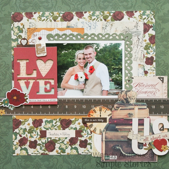
Hi there!  Wendy with you today sharing some layouts I created with the Legacy collection!

Love

We attended my little brother's wedding the beginning of September and I was able to grab this picture of the happy couple.  Their wedding was in a barn complete with cowboys boots and everything; perfect color scheme for the Legacy collection.  

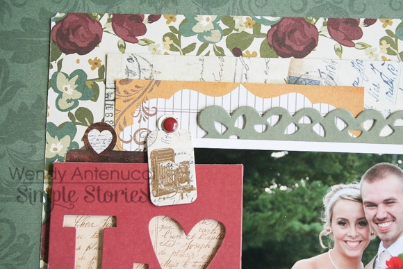
I wanted to keep the focus on this picture of the couple so I matted the picture with a Sn@p Card before I placed the photo on my flower background.  I chose the flowers because of the red flowers the couple used in their wedding.  I used a few other 3x4 cards and Sn@p Cards to layer behind my photo to add some layers and color variations. 

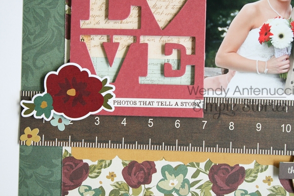
The green background, I felt really made the photos colors pop, giving the page a rich feeling.  I chose the red Sn@p Cut to give a title to my page and some visual interest to balance my embellishment cluster on the bottom of the page.

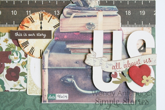
My bottom cluster helped to ground my photo and add in a few wedding type details.  These were mostly pieces I fussy cut from the various papers and cards from the collection, my favorite type of embellishing!

What Matters Most

My next layout was also snapped at the wedding and so I just continued to create with the Legacy collection.  My design also stayed very similar with the focus on my photo with warm colors to match the venue of the wedding.

On this layout I wanted to use the family border strip and the 3x4 card.  I loved the saying on another card and so I fussy cut the words to use as my title, highlighting them with some pen work.

I again used a Sn@p card behind my photo to mat my photo and a few bits & pieces to break up the blockiness of the design.  An embellishment cluster, a punched border with a pop of yellow added in a few last minute touches to finish up the layout.

Pages