September 2018 Blog Posts

Hello Friends!

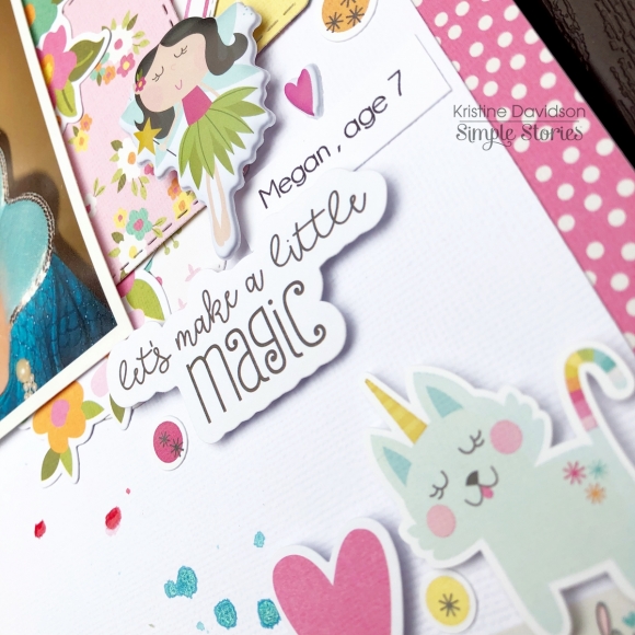
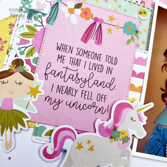
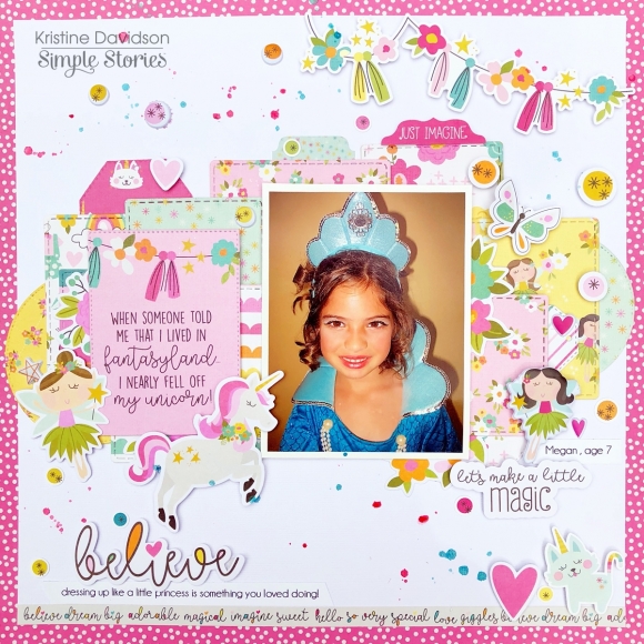
It's Kristine with you today. I am ready to show you the cutest page using the Dream Big collection.

Don't be intimidated by bright colors or designs. You can often create a page using many pieces of pattern papers. Layers are simple to do and make it easy to use so many pieces and not all of them have to be the same size.

Here I cut up a few pieces of papers and stacked them over each other. This gives me the opportunity to add many pieces and creates a uniform background.

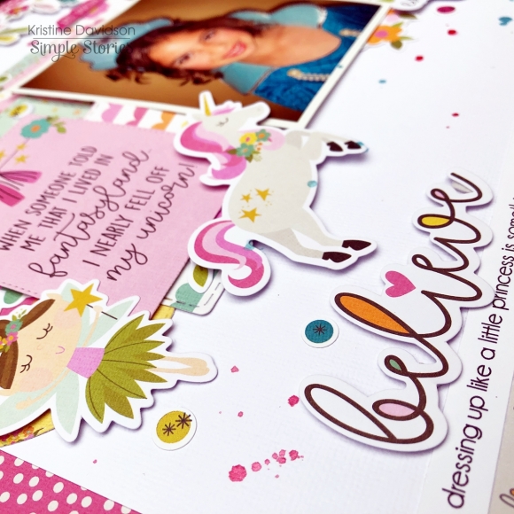
I used so many fun bits & Pieces, NEW Puffy Stickers and colors on this layout. I've had this picture for many years but never had the right collection. Dream Big is perfect for those fun dress up photos.


Hope you have yourself a MAGICAL day!

Supplies

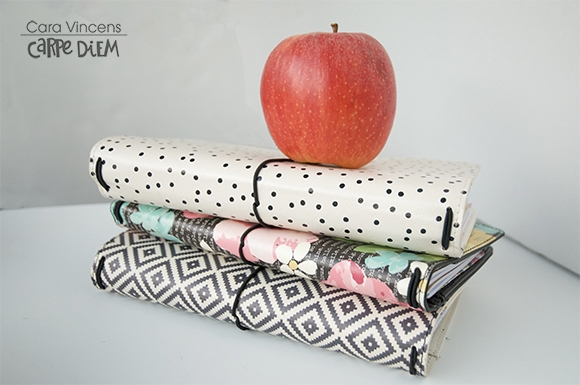
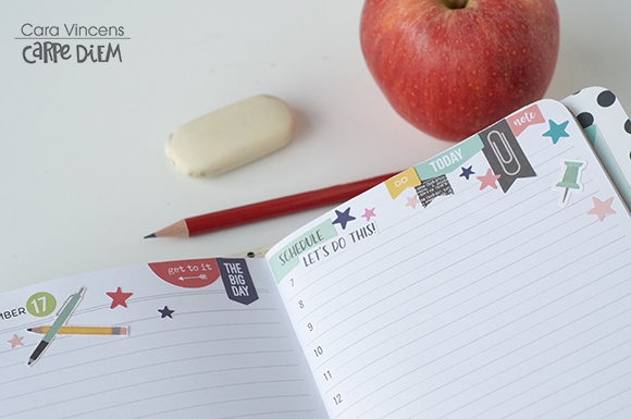
Happy September planner girls! It’s Cara here, I’m a planner lover and a school supply addict! September is such a fun time of year. That back to school season is fantastic with it’s fresh starts, sharp pencils and crisp new notebooks. It’s a time to set new goals or learn something new, even if you aren’t going back to school and you don’t have children going back either. 

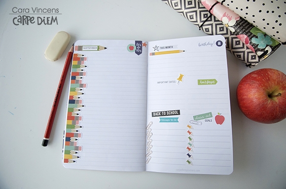
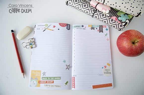
I’ve used the School Rocks collection to decorate my TN to help me plan my month, week and day and to plan in those goals as well. This collection is perfect for us school or office supply addicts! First off, I decorated my goal page, this page has lots of space for lists (I’m addicted to lists too!) and notes. 

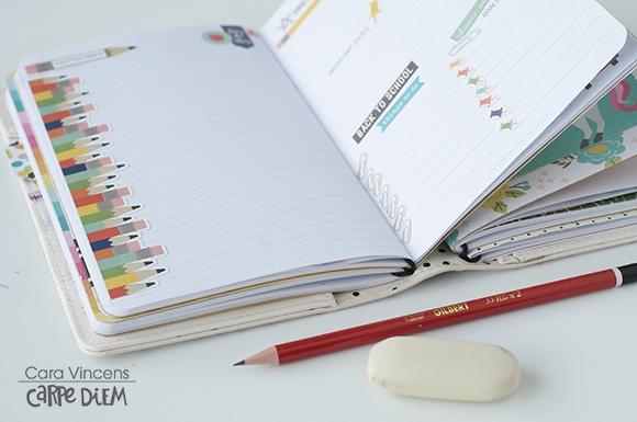
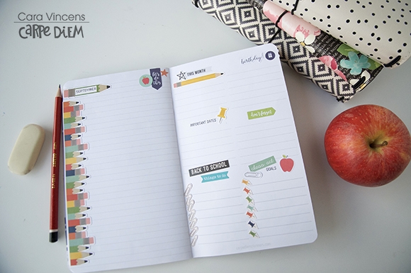
The lists are labelled for you but you can use the stickers from the Planner Basics Sticker Tablet to cover them with list titles that suit you best. I covered up ‘Notes’ with a pencil label sticker and added ‘September’ so that I can use the notes page as a general ideas and brainstorming place as I plan the month. The big pencil looks cute with the stack of pencils running down the side of the page.

I got ambitious and fussy cut 7 paperclips and then 7 pushpins to use as my checklists. I find fussy cutting relaxing but if you don’t like it, you can use some of the small stickers from the Planner Basics tablet instead. 

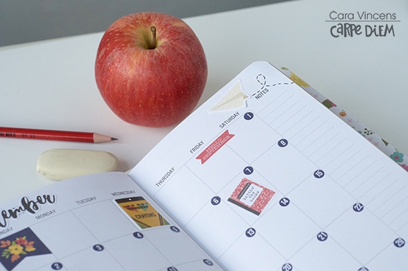
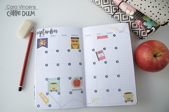
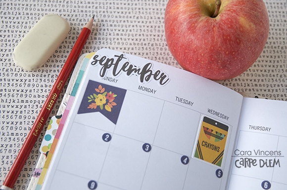
Onto to the monthly spread. I mixed stickers from the September page of the Seasons Sticker Tablet and the Cardstock Stickers from the School Rocks collection.

I don’t tend to write a lot in the monthly spread so I can afford to put the large, full stickers in my boxes. My six children go back to school on 3 different days (yes, that’s annoying, but it’s also allows me to focus more on each child on their special day) so I marked those with big stickers. I also marked the first day of autumn with a sticker. With the paper airplanes I mimicked the dashed trails from the paper airplane card from the cut apart paper. I used small round navy number stickers from the Number Sticker tablet for the days.

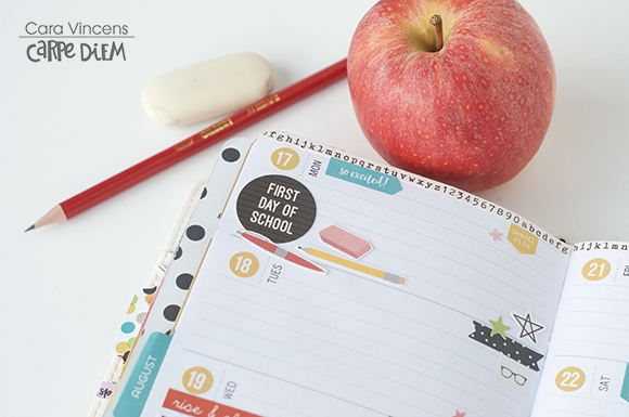
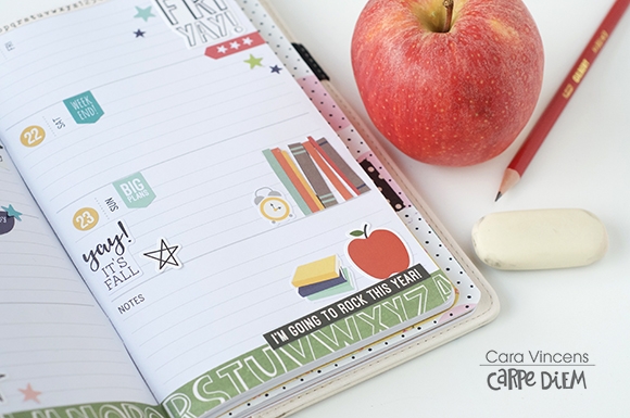
Moving on to the weekly spread, there were lots of ‘First Day of School’ stickers to choose from so I was able to use 2 in this spread.

I combined stickers from the collection, the tablets and fussy cut bits from the papers to complete this page. I cut strips of patterned papers to trim the top and bottom of the pages.

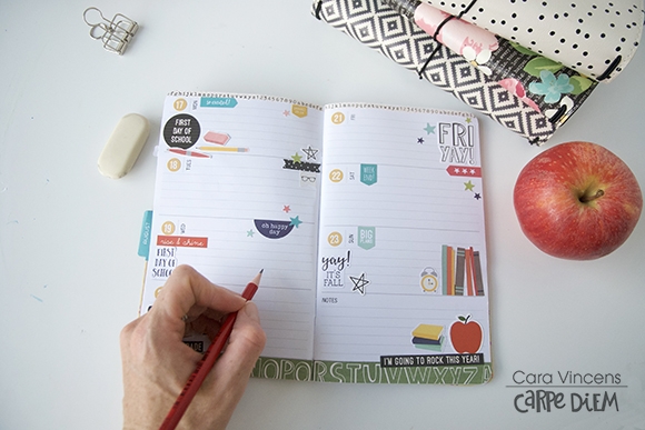
For the daily spread, I simply decorated around the edges of the pages, because I like lots of space to write, I try to keep my to-do list to a minimum each day, but I’ll use the space for notes and brainstorming too. 

The schedule side of the page however will be completely full! Lots to do in a day with 6 children going back to school!

If you’d like to see how I made these pages, you can find a process video on my YouTube channel here: The Hooting Pirate YouTube Channel - Are you addicted to school supplies? Do you love a fresh notebook? Then the School Rocks collection is perfect for you :D

Supplies

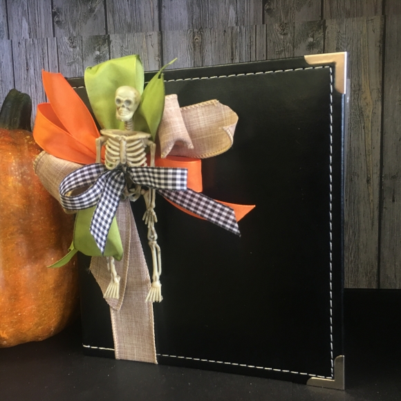
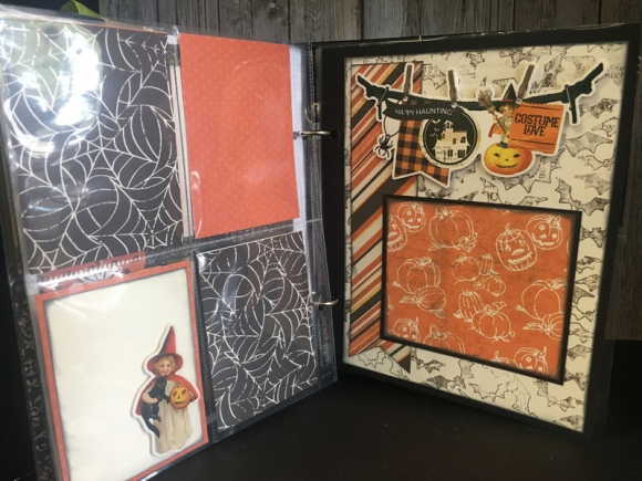
I Love this new Simple Vintage Halloween line. The patterns and colors are adorable!!! Halloween is my favorite holiday so when I saw this collection I just knew I had to create with it. I can’t wait to set this cute Halloween Snap book on my coffee table. 

I added some cute ribbons and a skeleton to decorate the cover on the Snap Album. 

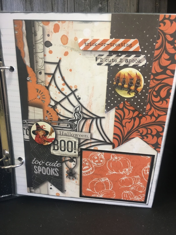
I love this page with all the cute elements!!! 

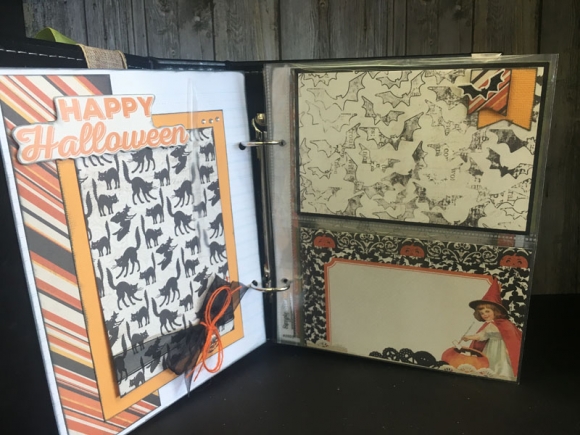
This book came together so easy using the journaling cards and snap sheet protectors. 

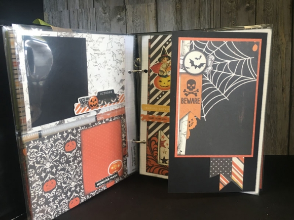
I can’t wait to put all my Halloween pictures through out the years in this album. By adding fold out pages to the book it adds dimension and places for more pictures. 

I love these new sticker banner elements they are so easy and so fun!!!! We will be making this adorable album at our Retreat this month!!!! The products used to create this album are the Simple Vintage Halloween Collection kit and black snap album.

Supplies

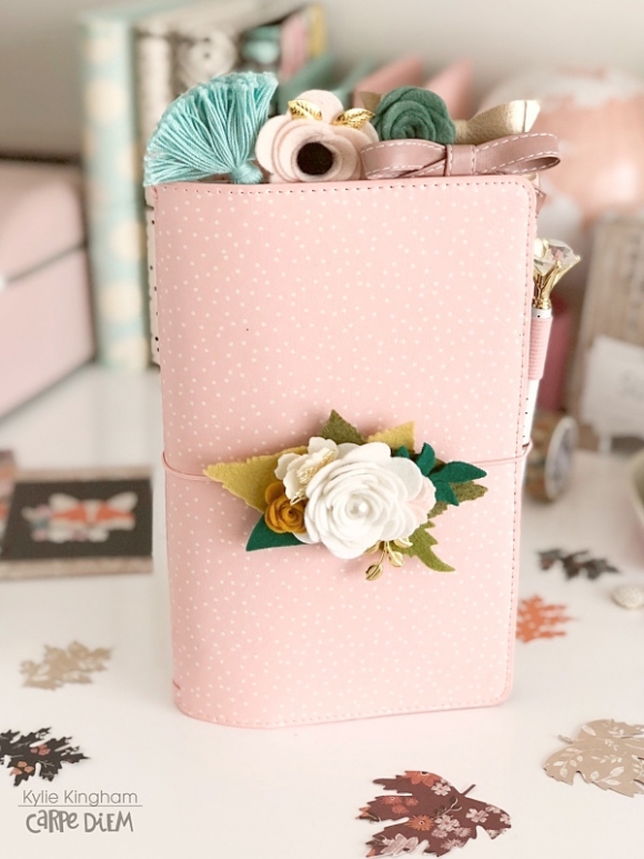
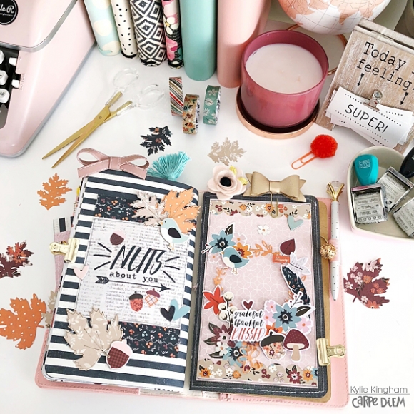
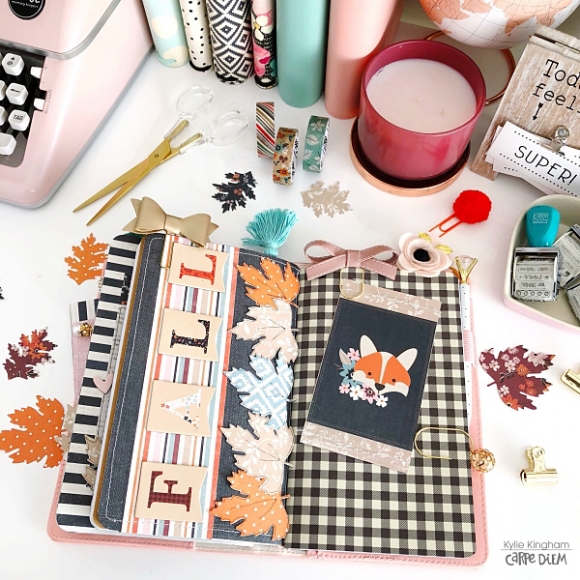
Hello friends it’s Kylie back with you today sharing some September planning inspiration. I moved right into my beautiful Blush Speckle, Travelers Notebook this month. I have to say, I love all the Travelers Notebooks but this one is a stand out favourite because….well ….hello Pink!

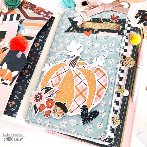
I decided to decorate the month with the ‘Forever Fall’ collection by Simple Stories. The paper prints are so adorable with lots of flowers, pumpkins and Fox’s included with the ‘Bits and Pieces’ too!

As always I have filled my pockets with some of my favourite pieces.I know this doesn’t have any practical purpose but it sure does make my planner look extra pretty! I also added a card made from the 3 x 4 element sheet.

In setting up my Traveller’s Notebook, I created some covers that will slide in over my inserts with the elastic. I used a great mix of papers and embellishments as well as a few cut files I had on hand.

I loved this Pumpkin cut file I found via the Silhouette store.I was able to back it with alternate paper for a colourful effect.It was adhered to my cover with foam tape so it gave a multi-dimensional appearance. All of the corners of my covers have been rounded to match with my inserts as well.

You can’t celebrate all things Fall without a wreath right? Here I have added my own paper wreath with lots of leaves and blooms. Again, I have chosen selected pieces to adhere with foam tape so they sit up from the page.

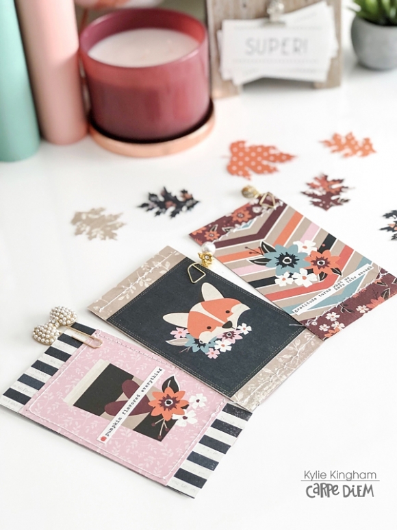
I cut apart the heart 4 x 4 square from the element sheet of paper to add to the back of this cover.It has a denim look background which I love with these colours. How cute is that Foxy??

The Fall banner chipboard stickers were added to my next cover. I also had a fun Leaf die in my stash which I used to cut out leaves to add.They were each outlined and given some veins with a very fine black tip pen, helping them to stand out and look authentic.

The monthly Travelers Notebook inserts are some of my favourite. I love being able to see my whole month at a quick glance and being able to jot things down with an overview. I used the mini flag date stickers and some of the 4 x 6 stickers. For the fun lettering I added, I worked with some Alpha dies from my stash cutting them from the themed papers.I also used some of the washi tape as well for a border. I love how my pages look before the pen!

Here’s a little look at some cute themed cards I made for the month. I have added these to my front pockets and throughout my planner as page markers. They were created by cutting apart the 3 x 4 elements paper and backing them with a co-ordinating paper.I have left a border of the paper showing both top and bottom.They look super cute added into my planner with pretty paperclips.

I can’t wait to dive into my planner and fill up those pages for September.Hope you have enjoyed seeing my planner set up today! Until next time,

Supplies

Hello everyone!!  Jackie G here on the blog today!!

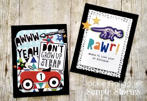
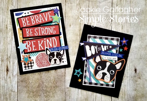
I don’t know about you, but I am always in need of some boy cards.  Not sure why, but they are always the hardest to create.  I absolutely LOVE the newest boy collection Lil’ Dude!!  This collection works for all ages and I love that!! 

All four of these cards were created with just scraps I had left over from the mini album I created a couple months ago.  The this first set of cards I wanted to show something more elaborate and something simple.  The card on the left I used a couple different pattern papers, bits and pieces and stickers!!  I used LOTS of dimension for this card!!  For something much simpler I only popped up the dinosaur and stars. 

The next set of cards I focused on the cute little pug dog.  One card is geared more towards a “little one” and other for an older child.  I made sure to put stars on all 4 cards so they would all flow together and work as a set!!

Thanks for stopping by!!!

Supplies

Hey planner friends! It’s Rachel again and I am feeling all the “Back to School” vibes in my Cream Dot Traveler’s Notebook. Even though I am not a student or teacher anymore, I was still really excited to use the School Rocks! Collection in my Traveler’s Notebook for September. I love this collection’s retro school feel and think the colors will be a great transition into fall. The printables for this month pair perfectly with this collection and I will be sharing how I used both in my setup for this month.

As always, let’s start with those scrumptious pockets! I used several of the elements cards and the combo stickers to give these pocket an A+ upgrade. I giggle a little when I see the trimmed down ruler from the Ready-Set-Learn paper and the You Rule! Sticker - I think it is pretty “punny”!

I decided to keep my insert covers pretty simple for this setup - just a few pieces of paper from the collection kit, an element card and a few embellishments. I love the kraft insert covers peaking through! I did go ahead and add some decoration to the back of the inserts, which I don’t often do. I like how it turned out! Isn’t that composition notebook sheet adorable? It is from the printable set from this month!

Speaking of printables, let’s talk about those next! To make page markers for three of my inserts, I used the printable notebook sheets and adhered the printable die cuts to the top. I laminated the page markers to make them sturdy and a little more functional. Now, they act a a great dashboard for sticky notes or a place to write a to-do lists (with a dry erase marker). I love seeing them peak out of the top of my travelers notebook when it is closed!

I also used the calendar printable (already dated!) and adhered it inside my monthly insert. I decorated the monthly spread with stickers from the Combo Sticker Sheet and paper scraps from the decorated notebook covers. A little hack: you know the cover sheet that you get when you buy a collection kit? Don’t be afraid to use that, too! I trimmed a strip off the top of the cover sheet and used it to decorate the beginning and end of my monthly spread.

I had so much fun putting together my monthly dashboard. I decided to focus on my goals for the month and used the combo stickers to highlight them. The notes page is reserved for “bright ideas” or big moments that I will fill in at the end of the month.

Here is next week ready to go using the new weekly inserts! To decorate, I used the Combo stickers, paper strips, and some fussy cut items from the I Love School Paper. This collection doesn’t come with washi, but that didn’t stop me from making washi paper strips instead!

As you may have seen from my last post, I love stamping, so I decided to pull coordinating stamp inks from my stash and some of the new stamps to complete my weekly spread.

I am really loving the box stamps from the Make a List Stamps to highlight important events. For my “Remember” section, I used icons from the Get it Done Stamps as my bullet points instead of my normal checklist. I keep telling myself that if my checklist is cute, maybe I will get all these things done!

For an extra “punch” of color, I love to use punched papers and adding them as decoration to my pages. For this page, I used a small hexagon punch to make a little hexagon cluster to highlight the weekend.

I like keeping the rest of the collection pieces with me, so I made a pocket folder with one of the papers and adhered a 4x4 element card and a trimmed down 4x6 Element cards to the inside of the paper. This folder lives in the center of the my weekly notebook for easy access when I am ready to decorate!

I hope you enjoyed this walk through of my September setup in my travelers notebook using the School Rocks! Collection. As you can see, this collection is not just for students and teachers. There is so much universal cuteness in this collection, that it is perfect for setting up and decorating all planner pages!
Supplies

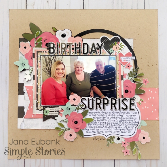
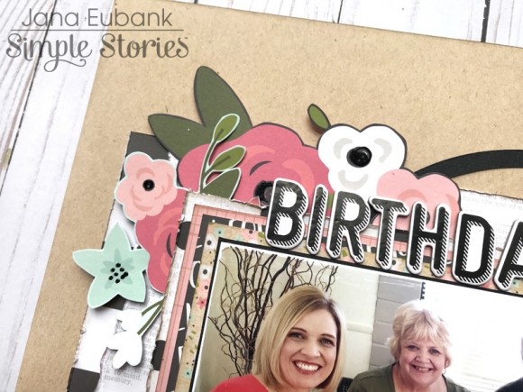
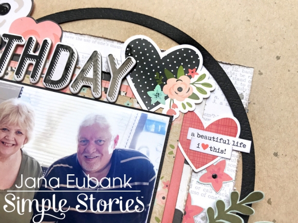
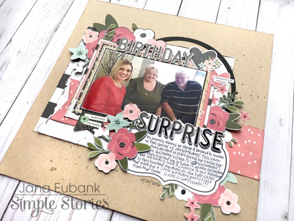
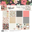
Hello! It's Jana Eubank. I'm back with another scrapbook page. This time I have a girly, birthday layout featuring the Bloom collection!
If you're having a hard time deciding which patterned paper to cut into first, why not cut a piece from ALL of them and layer them together for a fun, textural photo mat? That's what I did on today's page. Take a closer look below!

After matting my photo, I further framed it by capping it along the top and bottom with my title. I split the phrase, placing one word on top of the picture and the other on the bottom. I then added a black cardstock circle to the right corner along with heart die cuts from the Bits & Pieces pack to frame it even further.

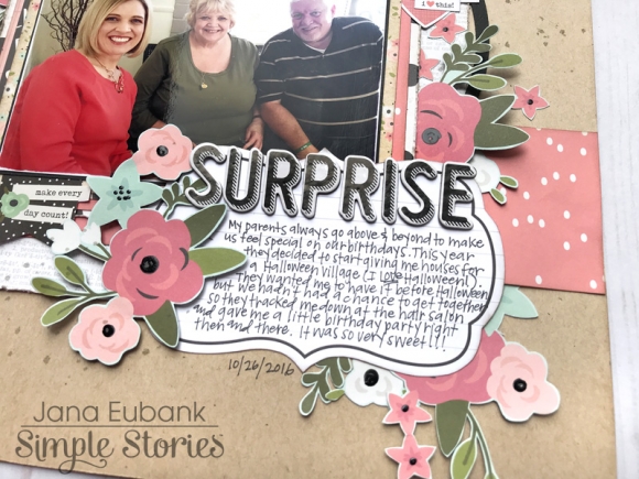
At the bottom of the page, I used the fancy journaling block cut from the 4x6 Elements Paper. Next, I fussy-cut lots and lots of flowers from the Today's the Day paper and the Inspired paper to tuck behind each element of the design. This married everything together and added a fresh, floral feel!

The result is a sweet birthday page perfect for any girl in your life ... maybe even a birthday page about yourself!

Thanks for coming by!

Supplies

 
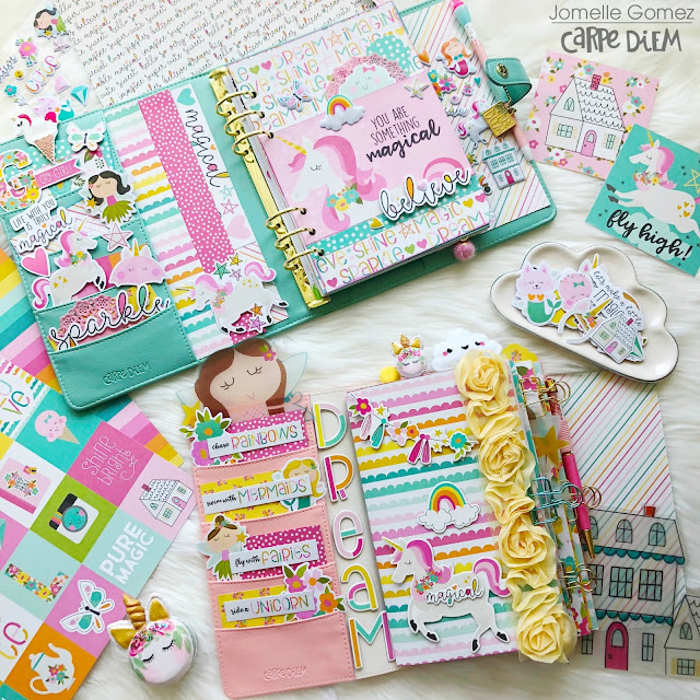
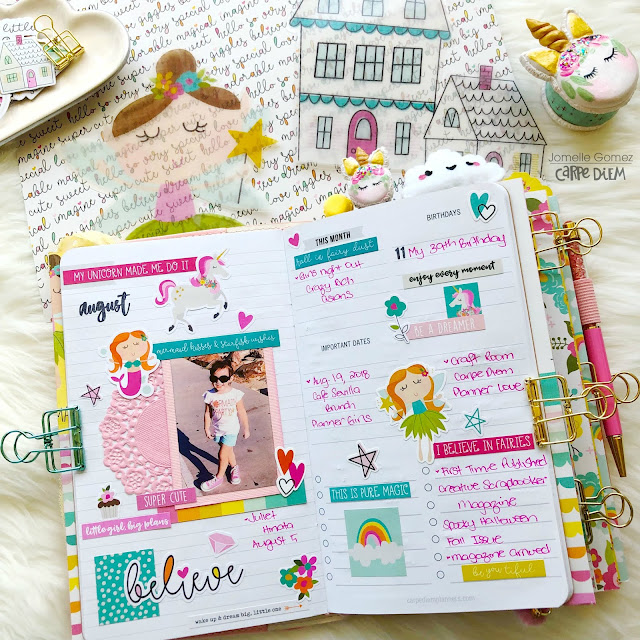
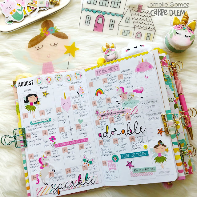
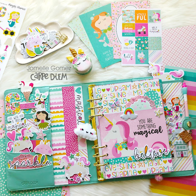
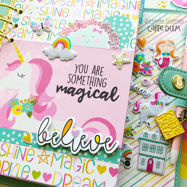
Rainbows, Mermaids, Fairies and Unicorns Oh My! So many magical things you can create with this collection that I decided to set up my A5 Robin's Egg planner and my Blush Speckle TN.
 
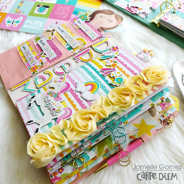
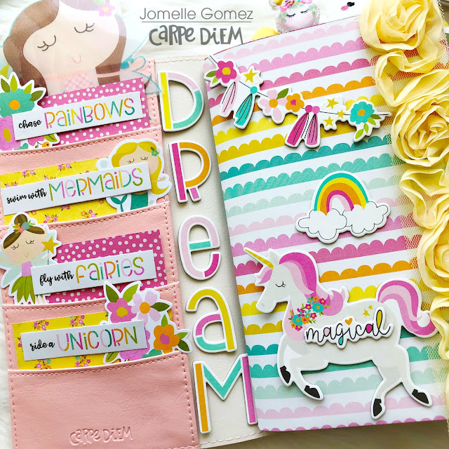
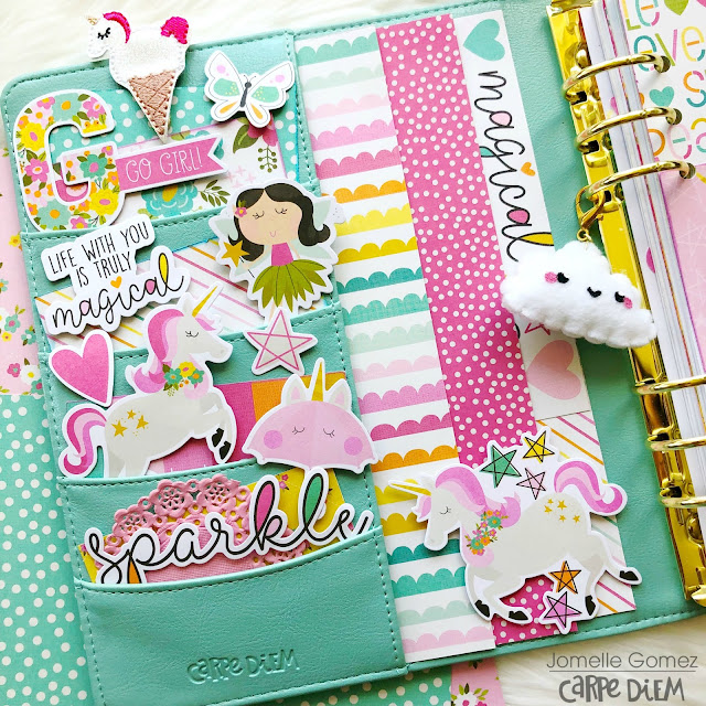
I wanted my set up to highlight the color yellow so I added the flower ribbon on the side of my TN. I used bits & pieces to decorate my pockets. I placed the "Dream" chipboard sticker vertically using washi tape therefore I can easily remove the letters.
 I always love the side view of my TN. It shows the different layers and how chunky it is.
 I printed a large size fairy (as you can see on the top left) on vellum and laminated it. It will be used as my page marker in my TN. 
I have a really old printer and I noticed that the colors are brighter when I print the images on vellums compare to regular paper.
  I decorated the page before the Month and used it as memory keeping. I added my daughter's picture where she was wearing a "Mermaid Party" T-Shirt and her pink Converse shoes when we went to the Aquarium of the Pacific. What's can be more perfect than that?
 Monthly Layout for August. I used the 4x6 stickers to create my layout.
 Let's take a closer look at my A5 Planner Set Up. I created this adorable dashboard and stuffed my planner pockets with all kinds of magical elements.
Now this is what we planner girls call "Pocket Love"
 Believe that you are something magical.
Thanks for stopping by and I hope you have a magical day. For more inspirations check out my Instagram xoxo_jomelle

Supplies

Pages