April 2019 Blog Posts

Hello Friends! 

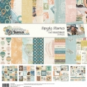
It's Kristine here today and I'm excited to share this perfect summer collection called "Sunshine & Blue Skies". It is full of cute embellishments such as flip flops, surf boards, palm trees and more! Planning on a vacation in the Caribbean or Hawaii anytime soon? This collection would be fabulous for your TN's, Planners and Scrapbook Pages too!

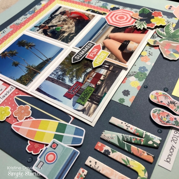
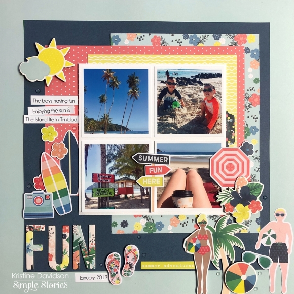
I created a layout today using 4 photos from my niece's adventure in Trinidad. Imagine having the luxury of moving to an island for 3 years with your family ... this is exactly what she's doing! I am so thankful that she gives me permission to use her pics since I haven't seen the sunshine since last ... October maybe! Yes the East Coast is really grey right now.

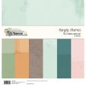
First I used the Sunshine & Blue Skies Simple Basics Kit. This kit has (6) 12x12 Cardstock pages. It is perfect for using as background papers or card bases and a lot more. I used 2 sheets to create the background on the layout.

I used a few 6x8 sheets to use for layering and added 4 small 2x2.5 inch pictures on a piece of white cardstock. I added dimensional adhesive on the back of the photos to give them a bit of a level on my page.

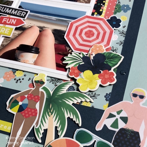
I added chipboard pieces as well as diecuts on dimensional adhesive surrounding the photos. Adding several layers using flowers, cameras, surfboard and even little people diecuts!

These little people come in all shapes and sizes and can be added to any layout to add a little extra FUN to your page. They are so cute!  I hope you enjoyed my layout today and let's see what you create with this beautiful summer collection! Come join us on Instagram @SimpleStories_ and @KristineDavidson

Hello sweet friends! It’s Henny, and it's my very first time here as a Carpe Diem Designer Team member posting and sharing my project with you all today. I have been eyeing this gorgeous "Spring Farmhouse" collection from Simple Stories since it's release day. And I was super excited when I finally got to receive it and play with it.

This collection is so.much.pretty even more in person, as well as the matching planner and traveler's notebook.  I am using the matching "Hello Floral" TN and created a fresh new set up as you can see. Quite in love with the way it turned out.

For the pockets, nothing much going on just simply loaded up with some diecuts, floral shaped page flag notes from my stash and couple of paper bow clips that come from this collection. I also punched the paper with a butterfly punch and created another paperclip. Then I slipped a couple of stickers sheets from this collection into the slip pocket.  

I love creating dashboards and dividers for my planners and TNs. And I also love to embellish them with embellishments such as gems, chipboard stickers, layers of diecuts, etc. This time I did not create a dashboard nor divider, instead I created covers for each of my insert notebooks for this TN. As you can see for the first notebook, I used this fun green checked patterned paper, decorated with a paper doily and one of the beautiful quote cards from the 12x12 cardstock element papers from the collection. I Then layered with a few floral die cuts on the bottom left corner and top right corner, and added a few adhesive pearls just for some sweetness :). Really simple but lovely to look at.

Of course when you're setting up your planner/TN, you can't forget about the washi, can you? :) I used my washi sampler metal die cut and die cut my left over paper, sent it through a laminator and then wrapped up all of the different styles of washi tape onto it. There we have some sampler washi on a card. So adorable!

May is just around the corner, so I managed to decorate my monthly spread with some stickers and have written down some important dates.

Thanks for stopping by and checking out my post. I hope you'll like it and will come back again to check out my next post!

Supplies

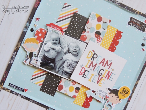
Hello everyone! It's Courtney here today and I am sharing my very first blog post as a Simple Stories design team member. I feel like I need to be pinched! I was all too excited to get started, so let me tell you about what I created.The Simple Stories Say Cheese lines are always a favorite of mine and the newest collection Say Cheese 4 didn't disappoint. I love the colors that are included with this line and love to incorporate them into my everyday scrapping.

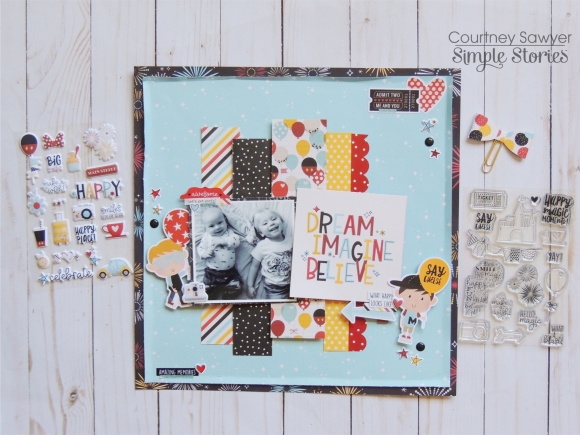
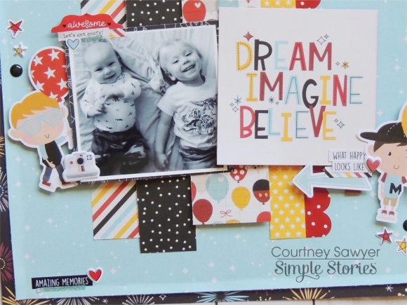
This layout is of my two youngest (I have 5 adorable kiddos), and I titled it with a card from the 4x4 element sheet that says Dream Imagine and Believe. I thought that title was fitting for my littles. My main background sheet is Make a Wish and I trimmed it to 11x11 and then matted it with the fireworks paper called Fun This Way. I really wanted to showcase a ton of the patterned papers so I cut 1-2 inch strips of paper from the 6x8 pad. I popped two of the strips up on two different thickness of foam. I added some of the adorable red scallop border sticker that is included in the 12x12 Cardstock Combo sticker sheet.

I went with three main clusters and then I added a little word phrase at the bottom. This was a happy accident I had started to doodle on my edge and didn't really care for it. So I covered it up with the phrase sticker and heart sticker. They both came from the 12x12 cardstock sticker sheet as well.

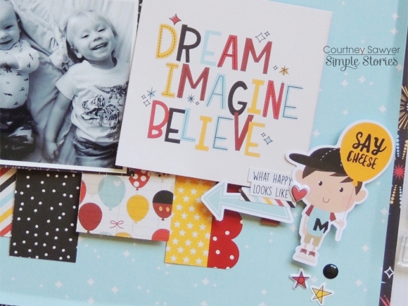
Here are two close-ups of my main clusters. For each of these, I used the cute little boys from the Happy Kids Bits and Pieces ephemera. I picked two that weren't overly themed. I also added a few stars from the 4x6 sticker sheet and the puffy sticker sheet. The black enamel dots came from Say Cheese 2. Now from the 12x12 sticker sheet, I used the What Happy looks like and the awesome tab that I added to my picture.

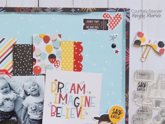
To finish off my layout I added the perfect tag that says Admit two! Me and you along with a heart and more puffy stars. Thank you for taking the time to read about how I created this l layout!

Hello friends! It’s Mik here from Papermiks on the blog today! It’s my first blog post and I’m so happy! First of all, I'd like to say that I'm glad to be part of this team, sharing all my creations and also learning with you. This is a dream come true!! So, let's live it together?

I love to travel and making setups in my TN is a passion of mine. I have to confess, I could do this for all my life and I’d be very happy! 

It’s vacation time for me and thinking about it I’ve chosen the Simple Vintage Traveler collection to setup my Aztec Black & White TN. For every TN, I make one or two accordion folders. In them I can store my cards, stickers and all the papers and tickets that we get during the trip, with those same items I’ll decorate my mini-album.

Besides the accordion folder I like to take two notebooks with me. One for weekly planning and one for lists & notes. This makes it so much easier to have everything handy so when I need any information about our trip its all together.

And what can I say about the ephemera? I love them and also love filling my pockets with them. I put as many die cuts as I can in the planner pockets. This way, when I’m decorating, I can mix ephemeras, stickers and papers on the same page. 

The Simple Vintage Traveler Collection is surely the best collection to use for my trip. What do you think?

Supplies

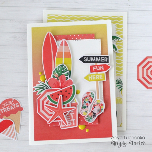
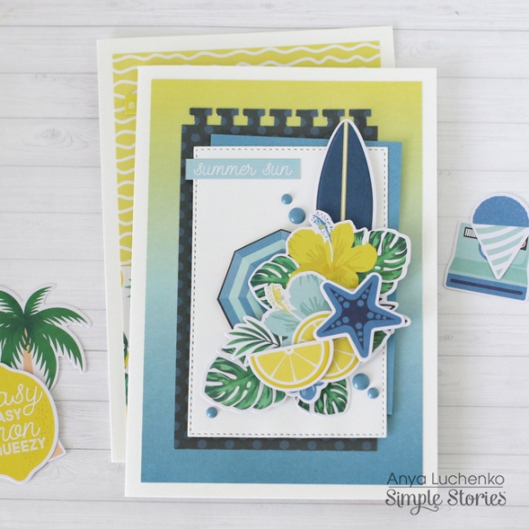
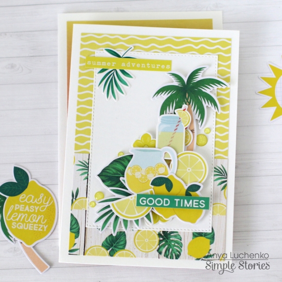
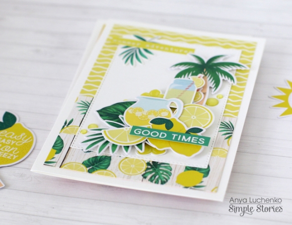
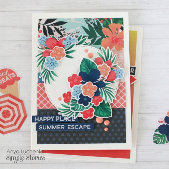
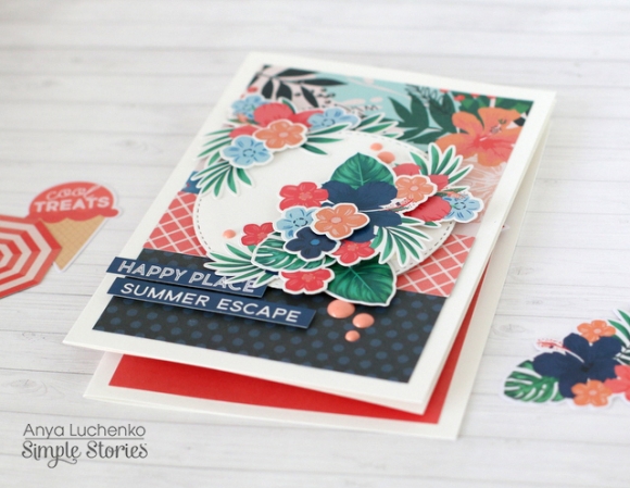
Hello everyone! Anya here today and I would like to share a set of cards I created using the beautiful summer collection called “Sunshine and Blue Skies”. I absolutely adore the color scheme in this line! Makes me want to pack and go on a mini vacation somewhere.

I love making cards in sets of three or four. It also seems like a great time saver, especially if you try to keep a somewhat similar design on all of them. To create these cards I started with a white card base that measures 4.25x6.25.

Next, I covered the front panel of each card with a 4x6 piece of patterned paper or a combination of two pieces of paper, and added a piece of white cardstock on top, which gave me a perfect spot for decorations.

Finally, I created clusters of embellishments using some ephemera, chipboard pieces, stickers, fussy cut elements and enamel dots. Most of these pieces were added with foam adhesive for dimension.

Supplies

Hi Everyone!  Laura Daniels here, a new member of the Carpe Diem Design Team!  So excited be here and to sit and chat with you for a bit.   So …Grab your favorite cup of coffee and let’s talk planners, girlfriend!

Creative Planning on Instagram

Creative Planning You Tube Channel
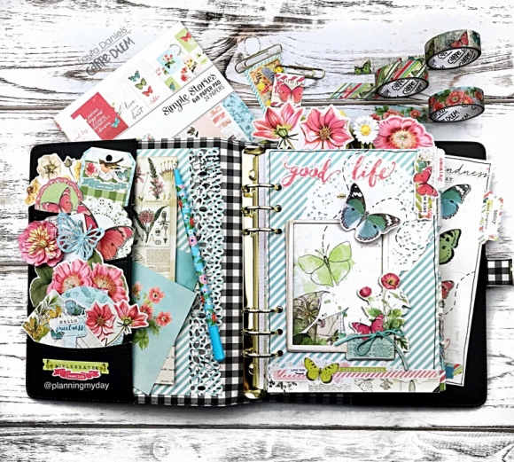
Today I wanted to share my FIVE steps in setting up any 3 ring planner.

1. Front Pockets

2. Dash board

3. 1-2-3 Goal page

4. Calendar month view with tip-ins

5. Currently page
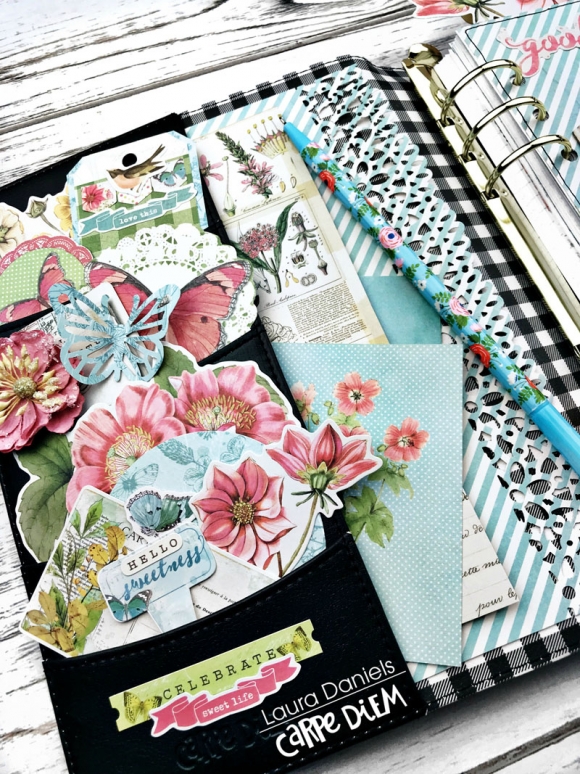
I love front pockets, don’t you?!   It’s like walking in the front door of a friend’s house, but …  before you sit down to enjoy a cup of tea, you find yourself looking around to take it all in!  Some new Décor? A new picture on the wall? Anew flower arrangement on the table….?

My front pockets welcome me into my planner, and it’s a good feeling!

Tip number 1:  Choose 3 colors to work with, choosing different shapes and sizes to fill your pockets up, following a triangle or a zig zag pattern. You can see here, my primary colors are Pink, Blue and Green.
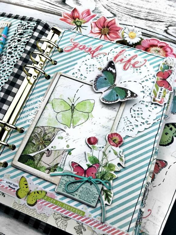
I like to add dimension/ 3-d Elements along with movement to my dash board.  See the butterfly lifted with a dimensional? See them flying across the page?  Your mind sees where they’re headed! See the dimensional frame, it makes you want to see what’s inside?  It all creates a dimensional journey that’s fun!

Tip number 2: Look through your kit to see what really makes your heart smile and then use your creativity to make it pop on your dashboard!  For me I loved the frames in chipboard and the butterflies!!
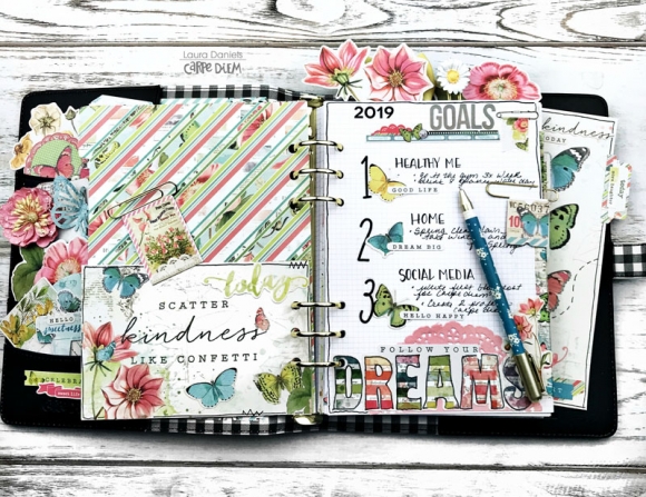
Goals! They inspire me! They bring direction and movement to my month!  I try to focus in three primary areas each new month. Healthy Me,  Home and Social Media!

I’ve found at 57 years old I need to pay more attention to bringing healthier habits to my life style.  Especially with a first grandchild on the way… I want to be around a looooooong time!!

I try to de-clutter one area of the house every month.  Oh ….and I love home improvement projects, don’t you?!  Here you can see I focused on Spring Cleaning!

I’m trying to really establish myself on Social Media, so there’s a lot to learn, and plenty of goals to set!

Tip Number 3:  Choose three areas you want to focus on each month!   Then write 1-2 things in each category.  Be as specific as possible!  Let’s see how we both do by the end of the month, shall we?!
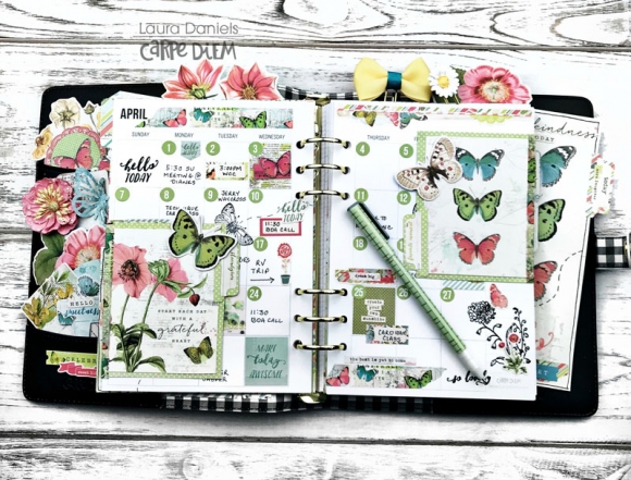
Setting up my month view!  Here’s the order I put it together in.

 I first number the dates of the month with a color that matches the over-all color scheme.  Then I choose 2 cards for Tip Ins, and attach with Washi tape! I Choose a Stamp set to create movement across the page, adding quotes.  Then I log meetings, travel, birthdays and holidays! I fill in any blank dates with stickers and color!

Tip Number 4:  Choose the 4-6 things you want to make sure you record each month in your monthly view.  Ideas:  Birthdays, Events, Appointments, Travel, Step counts, Gym time, girlfriend coffee’s …..

Suggestion: On the back of the Tip-ins you could write your two top favorite memories of the month!
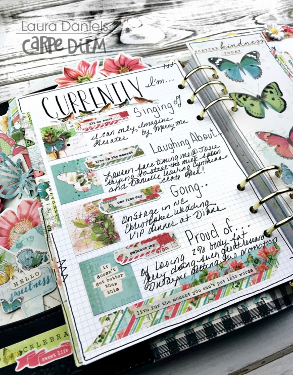
Memories!  They take us back to moments in time, don’t they!  One of the reasons I love writing in my Currently page each month!

Tip Number 5: Think back on the month …..what are the 4-5 events or moments that speak the most to your heart?  Use those are your currently tags for the month!  Did a song keep replaying in your head? Did you have a wonderful visit from friend?  Was there a phone call that made you belly laugh?  Did you enjoy a great movie? Did you go on a fabulous  adventure somewhere?
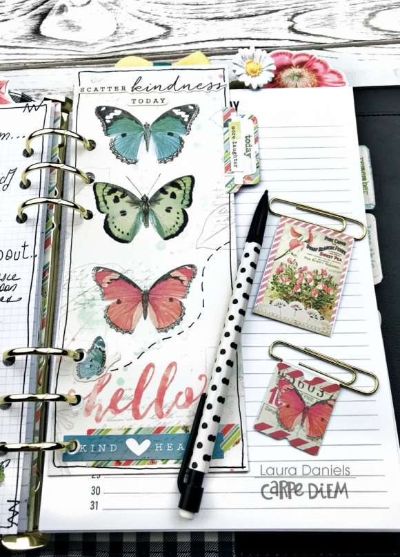
And finally, how can any planner set up be complete without some crafty book marks and paper clips? Lol!

Tip Number 6: Look through your ephemera and Stickers…what can you fold over a paper clip? What can you use to make a 3-D paper clip?  What Cards can you use as a book mark and then ad dimension to it?

Thanks for sharing some of your time with me today!  I’d love to hear back from you and what you thought of this blog post.  Any question about what I’ve created?  .. or how its inspired you! Any ideas for a future blog post?... or for a You tube video you’d like to see?  Let me know in the comments below!

Oh before you head off to finish your crazy day…. be sure to Come say hello on Instagram

Creative Planning On Instagram

And Subscribe to my Creative Planning You Tube Channel! 

Creative Planning You Tube Channel

Hugs and Creative Blessings to you my friend,

Warmly

Laura Daniels
Supplies

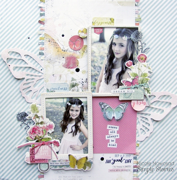
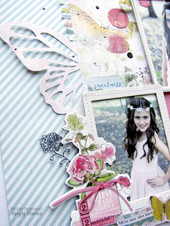
Spring is popping up all around us! The Simple Vintage Botanicals collection is perfect to capture some of those moments of spring. Nicole here today to share a project that I made using this pretty collection.
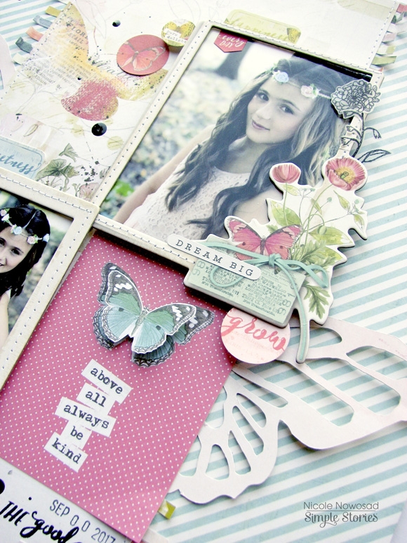
First, I pulled out some of the chipboard frames from the collection and secured my photos behind both. I added some detail by running the chipboard frames through my sewing machine. I added some dimensional foam adhesive to the back of each photo to ensure they popped off the page.

Next, I diecut some larger butterflies from some patterned paper and adhered each beside both photos, adding in a journaling card to fill in the open area.

I trimmed out small pieces of the watercolour palette paper and adhered each piece along the edge of the main patterned paper in the center of the page, adding some machine stitching to hold it all in place. I truly enjoyed creating this layout and working with this new Botanicals collection and hope you love it!

Supplies

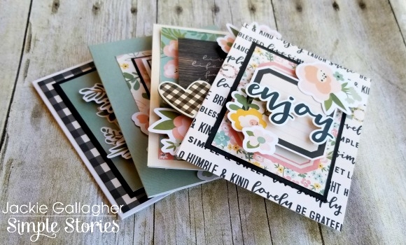
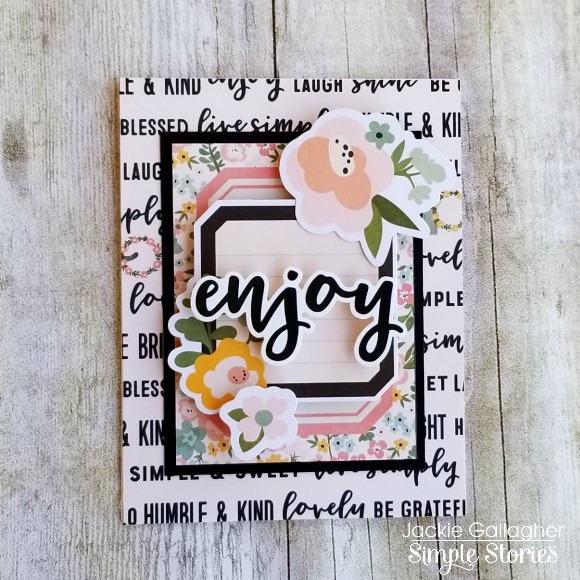
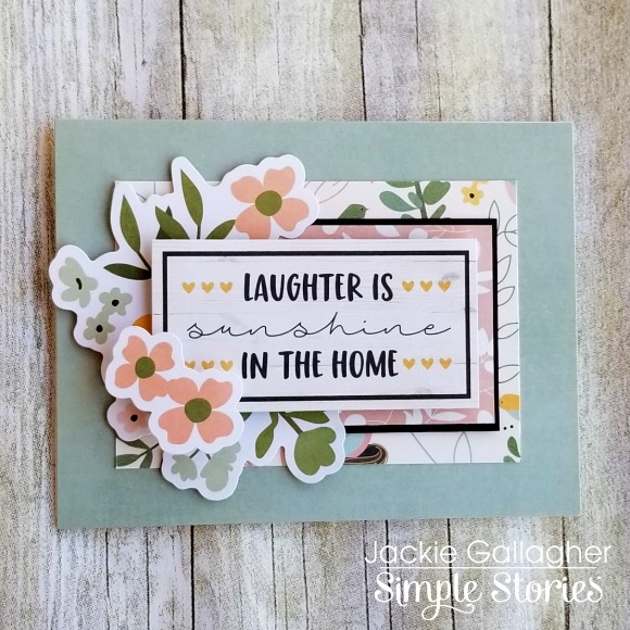
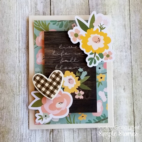
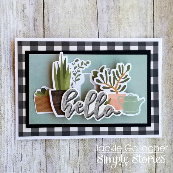
Hello everyone!!  Jackie G here on the blog today to share a couple cards with you using the beautiful Spring Farmhouse collection!!  This is one of my favorite collections!!  I know I say that a lot, but this collection is beyond amazing!!  My all-time favorite thing to craft with are flowers, and this collection does not disappoint!! 

I didn’t use many papers to create these cards, but instead allowed the 3x4 Elements, Floral Bits & Pieces, and the Spring Farmhouse Bits & Pieces do all the work for me!!  Especially those flower pieces!!  Don’t get me wrong, I absolutely love making very intricate cards, but sometimes all you need are just a couple elements to really make a card pop!!

Speaking about popping, I made sure you use LOTS of dimensionals on each of these cards to really draw some interest.  Some elements I even doubled the height of the dimensionals so it looked very realistic.  You can see this example on my “hello” card.

I hope you love this collection as much as I do!! Enjoy!!

Supplies

Pages