A Very BOOtiful Planner Setup!

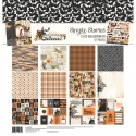
Hey Planner Friends! It’s Rachel again, and I’m here to share my Persimmon A5 Planner setup for the month of October using the Simple Vintage Halloween Collection. This collection has me feeling nostalgic with its vintage, storybook feel. I love all the illustrations, especially the cheeky pumpkin characters and mischievous little cats! The cats peaking out of pumpkins remind me of our own little rascal cat!

As always, let’s start with the pockets! I have a mix of the chipboard pieces and the bits and pieces from the collection tucked into my pockets. Those pieces on the outside of the pockets are adhered on with some removable roller adhesive. Because of the materials of the planners, I never have to worry about ruining them - sticky adhesive rubs right off (when you want it to!). I backed the large vertical pocket with some patterned paper from the collection and use this pocket to store the 4x6 collection stickers for easy access. How cute it the dressed-up girl peaking out of the pocket!

With such a cute washi set for this collection, I wanted to try and make a washi dashboard. I love how it turned out and it was super easy to make! I laid the washi down on a piece of white card stock, trimmed it out, and adhered the back of the card stock to a paper from the collection. This is a great project to get some extra mileage with your washi, and be able to display it in an eye catching way! I did add a few other washi’s from other collections, but you could easily make this dashboard with just the three in this collections.

Next up was the divider for October. I am a big fan of this plaid paper, and couldn’t wait to make a divider out of it. To measure out my divider, I traced around the A5 Divider template. I used a paper trimmer, but you could also use the template like the photo crops and cut right around the template! Once I had the divider trimmed, I used the planner punch to make the punch the holes.

I then pulled some stickers from the combo stickers sheet. This collection has stickers that come already layered into adorable clusters! If you are like me and are somewhat new to planner decorating, these clustered stickers and images are a life saver! See that sticker at the top? Yep, it came like that! All I had to do was peel it off the sheet and place in on the page! Same with the October tab! This is is great for people who love the look of layers, but maybe don’t have the time or experience to expertly craft an embellishment cluster.

I decided to put a little decoration on the page that appears before the monthly layout. I plan to document some great past costumes that my husband from years past. Spoiler alert - he is much more creative than I am when it comes to costumes!

Here is a look at the monthly spread. I started by dating the pages using the It’s a date stamp set. After the pages were dated, I filled in the major events using some icons from the Get It Done Stamp set and stickers from the 4x6 set.

I added a strip of washi to the top of the page and layered some more stickers on top. The little word strips are always so clever!

I love the monthly layout because I can plan around with the decoration, while still leaving room for the important details of the month.

It wouldn’t be a project from me with out a little planner hack! For the weekly pages, I wanted to create a little bookmark with pieces from the collection. I decided to trim down a 2x2 insta pocket page to add chip board stickers, paper from the collection using the 2x2 photo crop, and the bits and pieces. To the top, I added a monthly tab from the Tabs sticker tablet and a washi paper clip banner.

On to the weekly layout! Because Carpe Diem Inserts are undated, you can play around with all the different layouts! This month, I wanted to use the fitness layout. To make it work for me, I simply covered the far left column where each of the boxes are labeled and placed stickers along the bottom where the hydration tracker was. I dated the pages using the numbers A5 Sticker Tablet, a must for undated planner inserts! I even made a ho-hum task list playful by adding bats as bullet points!

Here is a look at the pocket page place marker in action. This is a great way to liven up a planner page, especially if you don’t have time to decorate the planner page itself.

For the second half of the week, I tried to keep some white space for those events and to do’s that come up as the week progresses.

I hope you enjoyed a look inside my October planner setup! Even if I don’t dress up for Halloween this year, at least my planner looks the part! Until next time, I hope you have a BOOtiful October and a Happy Halloween!


