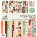
Crafty Girls Create
Morning! Have you ever been to a crop with a bunch of your crafty friends? Well, last year was my first. I meet up with some fellow scrapbookers on Cape Cod. One of them even traveled from The Netherlands!! It was so much fun and inspiring being with other crafty folks.
Today, I used The Reset Girl collection for my layout. I pondered over what to do with those classy girl dies cuts. Finally, I decided to add them on this project. I layered them like they were just a group of girls, hanging around gossiping! I think they worked perfect for this, helping to add a little class to our silliness.
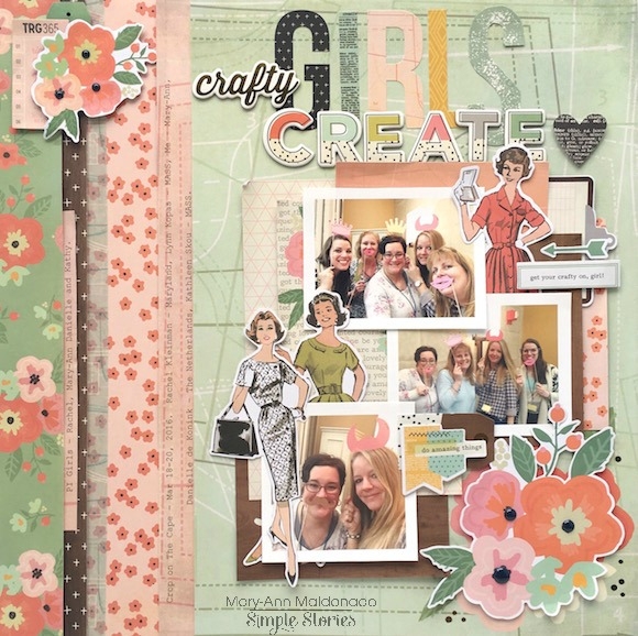
For the base paper, I used the 'You Got This' paper. I cut off the polka dot side, flipped it over and used the pink side. I attached this all to a scrap piece of white cardstock. I then began layering my papers to the left and added my journaling along with a strip of washi.
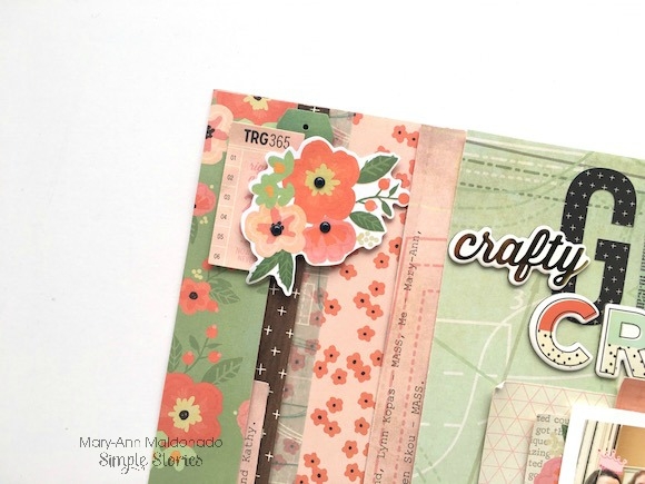
I felt as though this corner of the paper layering needed a touch of decor. This brought in a little floral clump to match the bottom right, helping your eye travel around the busy page.
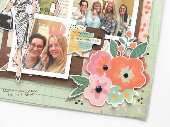
Here I used foam to layer the floral clump directly on top of the existing flowers that were printed on the paper.
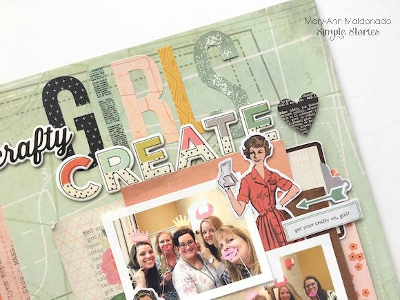
The sticker sheet and the chipboards already provided most of my title. All I needed was an 'S'. I found one that was similar in size in the SN@P! Pack and fussy cut it to complete my title! It is a little larger but it works!
_____________________________
I may be a little embarrassed by this layout! 1 - Because of the silly photos and 2 - because I had never used Snapchat before and needed to be schooled by a 12 year old! Ignore the photos and lets take a look at my page!
I used The Reset Girl collection in a completely different way than my first layout. The collection tends to lead you towards scrapping about paper projects or planning, but can be used in so many other was as well, if you pick out the perfect items.


I used a cut file to create my title with a delicate green paper from the 'Simple Basic Kit' peeking from behind.

I decided to use a Library Pocket for this layout. I wanted some of my journaling to be hidden, so tucking the pocket behind the layered papers helped do that. (I may need to retype that journaling with a crisp new ribbon!)

Because the photos are silly, the clump of glasses towards the bottom of the page help emphasis the changes on our crazy faces.

Empty corners just beg for a little embellishment. I used a few word strips from the 'Word Label Stickers' to convey some of the feeling I had towards the photos.


