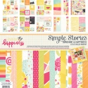
Creating Layouts with Sunshine & Happiness
Hello Friends, It’s Kristine Davidson with you today. I will share 2 of my latest layouts with you today and my love of Sunshine & Happiness! This collection is one of my favourites and I have almost exhausted every. single. piece. of paper in this kit. This collection is full of bright sunny papers, pinks, orange, yellow and the bits and pieces make creating so much fun.
The first layout is called " Hello Sunshine "
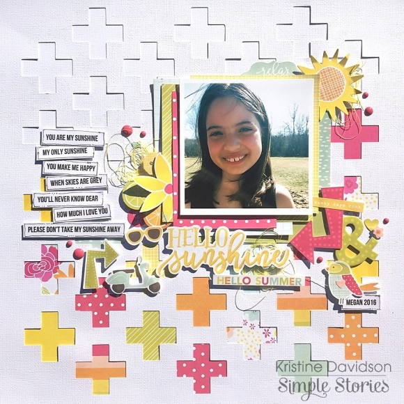
This picture was taken of my niece in the month of May as she was playing outside and enjoying the sunshine. I wanted to add some fun embellishments to this page and included flowers, fruit, sunshine, and my favourite journal strips.
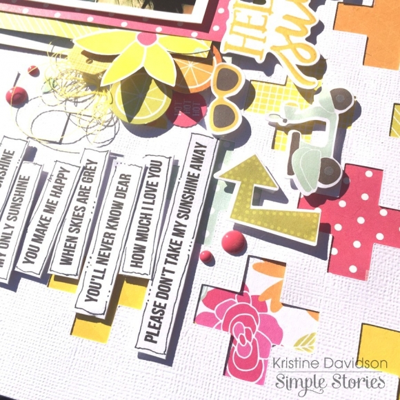
To start my page I created a cut file with my Silhouette Cameo. I love pages that allow me to use a cut file because I find I can add more colors and use up some smaller pieces of papers too. I left the top part white and just concentrated on the bottom for an assortment of colors. I added layers of chipboard, bits and pieces and even a bit of thread to add more texture.
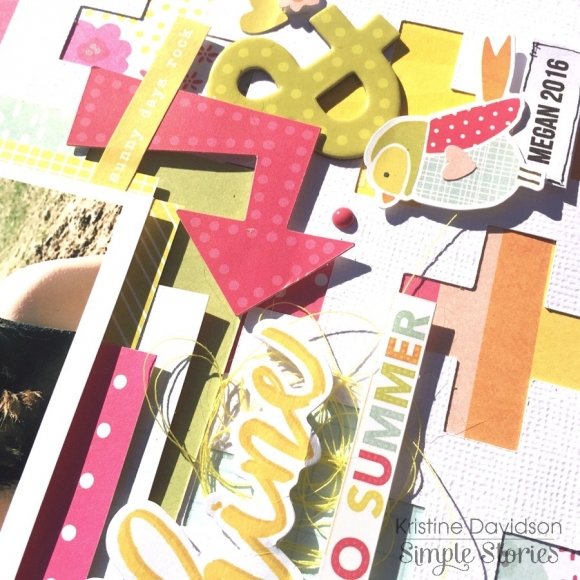
In this picture you can so many elements but for some reason with layers and overlapping it doesn't feel like too much. It creates a beautiful cluster. You can also see I used a few 3x4 cards behind my photo to add more layers and added dimensional adhesive to create elevation.
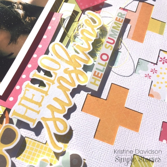
I didn't fuss over a title for this layout. I simply used a piece from the Bits & Pieces package and selected Hello Sunshine for my title. Nice and Easy!
_______________________________________________________________
My Second layout for you today is called "Happy Day"
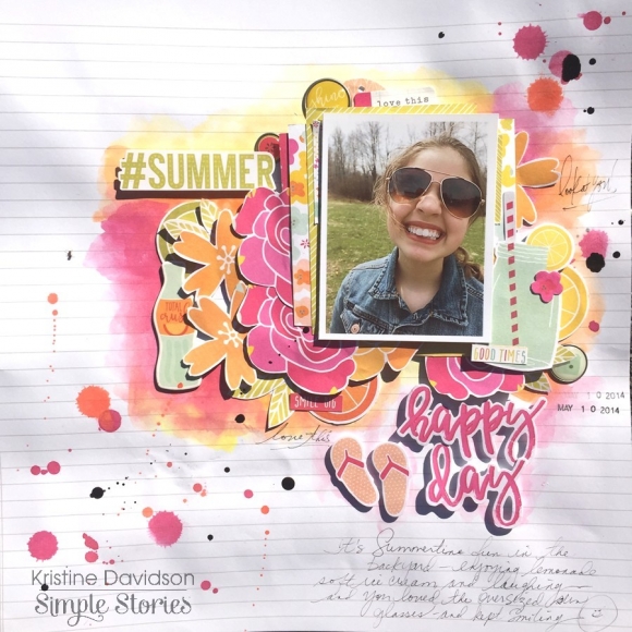
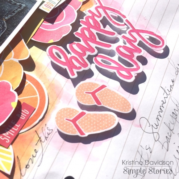
Ok. So I will admit this was a test. I often create layouts and try to remain " clean " but this layout took a life of it's own. I have been drooling over Missy Whidden's work and wanted to try something different. I grabbed some watercolour paints and went to town ;)
Sometimes we have to step out of our element and try something new and this was one of those times. Yes my background paper is warped, yes I have some paint splatters that aren't perfect but that's okay. This collection allowed me to create something different. It gave me tons of color to work with, some great summer die cuts and really made this layout come together.
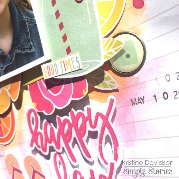
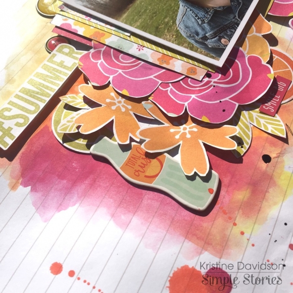
For my title, I created with the same technique - selecting a few Bits & Pieces, adding dimensional adhesive and making it my focal point for my page title.
This is such as great way to use supplies and match it with your layout.
I hope you enjoyed my layouts today and enjoy making your own with this fabulous Sunshine & Happiness collection!
If you are interested in seeing more of my work you can find me on instagram with user name @KristineDavidson.
Thank you so much for reading and being a fan of Simple Stories!


