Not-So-Winter Wonderland Layouts
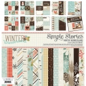
Hey friends! Missy back today to share two layouts using the Winter Wonderland collection. Have you ever had a collection really challenge you? Well, considering this line is all about Winter, snow, skiing and sledding, I was definitely challenged. I live in sunny Florida, and we are all about the sunshine, beaches and pools. So I had to get creative with my projects! This taught me to really study the collection and pull from it what works for me. I looked at the florals as more of a Fall piece and tried to play on the more neutral patterned papers. I scrapped two outdoor photos and used the pieces that helped me showcase them. Here is what I came up with.
My first layout is about going on a hike up a mountain in a state park in Georgia. My friend and I found this really cool structure that looked like an old stone fireplace that must’ve been from a house many years ago. I decided to recreate it using a fun cut file from Just Nick. I cut it on kraft cardstock and then backed it with the beautiful blue woodgrain Warm Winter Wishes paper. I love how it looks! I fussy cut some hearts and flower clusters to layer around my photo. I also smudged some white gesso on the background and used some coordinating Shimmerz Paints colors to add some watercolor effects. I think all these neutral colors really convey nature and the outdoors really well.
I love these little hearts and flower clusters. I layered a few of them around my photo and added some tangled thread under them. I went small with my title and used the small dark brown alpha stickers from the 4x6 Sticker sheet. I really love that gorgeous blue color popping in from the background.
I added another fussy cut flower cluster to the left of the photo as well as more thread and a few brown enamel dots. I did add some foam under my photo to raise it up and create some depth. I also did some machine stitching around the photo area with some dark brown thread.
I created another small cluster for the top right of the layout just to add a little bit of interest up in that area. I also added in a label sticker.
Here’s one more look at the background cut file and the layers behind my photo. I used a few papers from the 6x6 Paper Pad behind the photo as well as a few die cuts from the Bits & Pieces pack. When you are struggling for an idea, cut files are a great way to give the papers you have a totally different look.
_____________________________________
For my second page, I continued with an outdoor photo of my husband and daughter riding the Honda. I love all the green in the photo, so the trees in this collection were perfect. I went with a white cardstock background and added a bit of watercolor in blue and a light golden color. I added a scribbly circle die cut I had lying in my stash just to add a little something extra to the background. I layered a die cut tree and a sticker tree behind the photo. For my title, I made it big and bold with an alpha cut file from The Cut Shoppe. I used papers from the 6x6 Paper Pad to cut them and then backed the open spots with vellum. I love large titles, and I love how this one is arranged to frame the photo.
After I glued down the letters, I stitched through them all with brown thread. I added my journaling to the left side of the page to balance it all out. I had a lot of white space left over in that area, so it was the perfect spot for it.
I love that the die cut tree is a different color than the sticker tree. It makes them look more realistic! And I like that they’re different sizes. They were perfect since my photo has lots of trees in it. For an extra pop of that orange red color, I added in some tangled thread and then a small floral sticker right onto the photo.
I thought this little wooden circle was so cute, and I layered some foam under it to raise it up. I added a fussy cut flower and leaf cluster under it along with some thread. And I found another tree that was smaller, so it was perfect for this spot.
Here you can see a lot of the paint splatters I added in a matching blue color. I also fussy cut those cute clouds from 6x6 papers and stitched them down with blue thread. I really love the pop of blue they give, and I also ruffled the tops of them to give them a little bit of dimension.
I had so much fun putting these pages together! I hope you’ve gained some inspiration on how you can use themed collections in a completely different way! Thanks for stopping by!


