08.28.15
Pin It and Create It
Pinterest is such a great tool for us, as crafters. I love to check through my feed and look for inspiring images...and they are not always necessarily craft related, but can trigger an inspiring idea that can be translated to paper crafting. I decided to browse through Pinterest for some design ideas for the two layouts I'm sharing today, using the new We Are Family collection and Pumpkin Spice collection. And here's what I came up with!
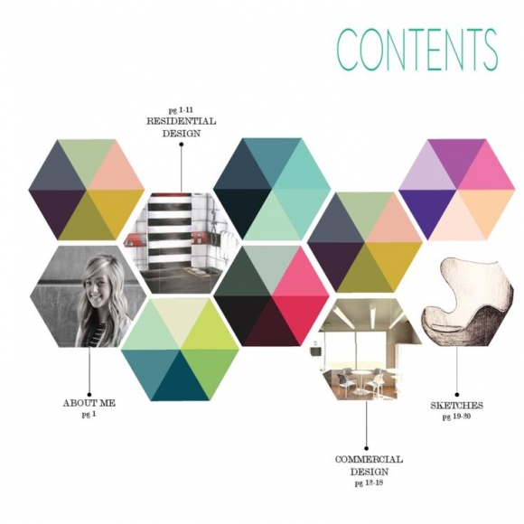
I started my first layout based on a fun hexagon graphic. I loved the multi-colored look of the hexagons and the way they were arranged. I cut 7 hexagon shapes on my Silhouette Cameo, from Cardstock and then cut the same sized hexagon from patterned papers included in the We Are Family collection.

After the patterned paper hexagon shapes were cut, I hand cut each shape into six pieces. Then I mixed the patterned papers and layered each piece back over the Cardstock hexagon shape, to create a patchwork look. I added texture around each of the hexagons, with machine stitching.

I wanted to continue the hexagon theme with my photos, so I cut both of those into the shape, too! Then I arranged all of the hexagons into the same pattern, shown on the graphic. I love that the hexagons created perfect embellishment spots on the layout, and I used a mix of Bradz, Chipboard, wood veneers, stickers and enamel dots from the We Are Family collection.

I finished the layout with my title, and used a mix of letter stickers and die cut letters. I wanted the title to stand out, so I placed it below the hexagon design.
For the second layout, using the Pumpkin Spice collection, I found a gorgeous quilt image and knew it would be perfect with my photo and the theme of my layout. The geometric design was really eye-catching and it gave me the opportunity to incorporate a lot of the patterned papers in the Pumpkin Spice collection.
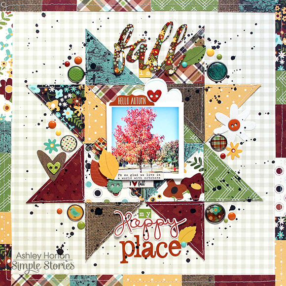
This technique may look difficult, but it's really easy. I started out cutting the patterned papers into 2.5x2.5 inch squares. Once I had the squares cut, I hand cut on a diagonal across each of the squares to create triangle shapes. After all of the triangles were cut, I machine stitched around the outside edge of each one. Then I began piecing the triangles back together on my background paper.
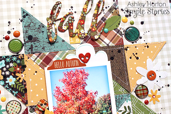
I wanted my photo to be the focus of the layout, so I cut around the edges leaving a White photo mat, to help it stand out from the colorful background and placed it in the center of the design. I clustered a few Chipboard pieces and stickers around the photo to help draw your eye to the center of the page.
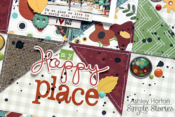
Once my photo was in place, I had to decide where to add the title and some other embellishments. I didn't want to cover a lot of the geometric design, so I decided to add my title and embellishments in the empty spaces of the outside triangle shapes. And to bring in some more patterned paper (because you can never have enough patterned paper on your layout!) I created a border around the edge of the layout, and then machine stitched with White thread.
It's really fun to think outside the box, when you're looking for a design for your layout! Inspiration is all around, and can come from a color scheme, advertisement, quote, art piece...the possibilities are endless! This could also be a great way to get out of a creative rut, if you're feeling stuck. So challenge yourself to look for inspiration in unexpected places. Write your ideas down, sketch them out or snap a quick photo on your phone to reference later, when you are creating!


