




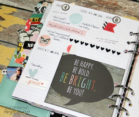


Hello! This is Amber, founder and creative director of Simple Stories, jumping in for day 5 of our Winter Release to introduce some very special new products that I can't wait to share with you. I'm thrilled to introduce 3 brand new Simple Sets - the smaller version of our regular collections. They may be small in size but have BIG meaning! We love providing products to help document and capture your life. But sometimes our life involves more than "Best Day Evers" and "Life is Beautiful" moments...sometimes life isn't quite so perfect. We have hardships and heartbreak... love and loss...real life trials and triumphs. And because life involves the ups AND downs, it's important that we document both the good times as well as the difficult times as well.

The Heart Simple Set was designed with my whole heart and is designed for those that have loved and lost. This past summer we had a heartbreak hit close to our home when our daughter's close friends and family were involved in a tragic boating accident. It was devastating for our friends, family and community. In an effort to help heal and share our love for the families involved we put together albums full of photos and handwritten thoughts from friends, family and the community. As I was putting together this album I had a difficult time finding things to include that that helped share the memory for our loved ones in a more sentimental way. That's where the idea for this special collection came from - wanting to provide our customers with a beautiful and meaningful way to remember their loved ones lost. This collection does it beautifully with a tender, soothing color palette and touching titles and quotes about always remembering those who are always in our heart.


The next Simple Set is Hope -

This collection is dedicated to one of my dearest friends of 30 years, Heidi, and to everyone who has been affected by cancer. Last year Heidi was diagnosed with stage 3 breast cancer. Of course this news was devastating to her, her family, and everyone that knows her. She's the toughest, most dedicated person I know and immediatley set out to kick cancer's butt! After a year of surgeries and treatments Heidi is standing strong - she even dyed her hair pink to show her victory over cancer. Heidi's kick butt attitude is the inspiration for the new HOPE collection - all about fighting the fight and having hope for a better tomorrow. Heidi, you're my hero in so many ways!


The final new Simple Set is Hero -

And speaking of heros, our new HERO collection is dedicated to the many men and women who are serving our home and country, who selflessly put their lives on hold and make countless personal sacrifices to help ensure our freedom.


These 3 new Simple Sets are very near and dear to my heart. I sincerely hope you find as much comfort in working with them as I've had designing them.
In addition to the Simple Sets, I'm very excited to share the newest addition to our SN@P Binder family - Designer Binders. These new 6x8 binders are laminated with metal corners and a decorative metal bookplate. In addition to being great for smaller scrapbooks, they do double duty as storage binders for your Carpe Diem planner inserts as well!


+


Wrapping up today's new products are the new SN@P! Basics - a beautiful blend of our most popular woodgrain papers along with white and cream office patterns -


The new Simple Sets, Designer Binders & SN@P! Basics begin shipping to retailers the end of this February.
Now for some fun! How about a chance to win a prize pack from these fun new products? You have 3 chances to win -
First, simply enter via the Rafflecopter widget below -
Second - PIN TO WIN! Just pin your favorite(s) of the images in this post, tag your pin with #simplestories, then leave us a comment on this blog post telling us that we've been pinned and include your Pinterest user name.
Third - follow us on Instagram at simplestories_ and watch for these posts for a 3rd chance to win!
I'll announce all of the winners throughout the week in one giant celebratory post here on Friday the 15th, so make sure to check back then to see if you're one of the lucky winners!
Good luck - we can't wait to hear what you think about these new products!
Thank you SO MUCH for joining us for our Winter Reveal Week! It's been so great hearing from everyone and seeing the excitement surrounding our new collections!
Hello Friends!
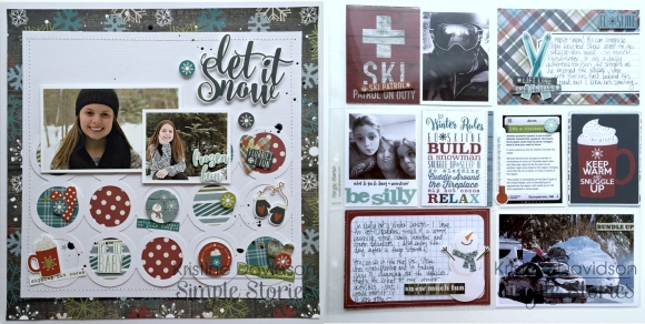
It's Kristine with you today and I am here to share a traditional 12x12/pocket page spread featuring the Snow Patrol Simple Set.
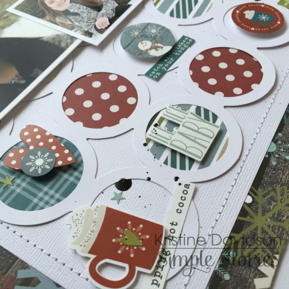
Here are a few details of my left page - I created a layout on one side, and the other side is filled with journaling, filler cards, and photos.
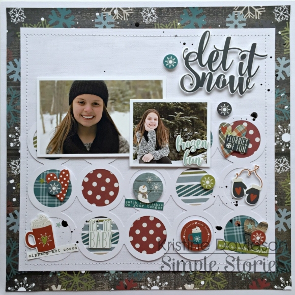
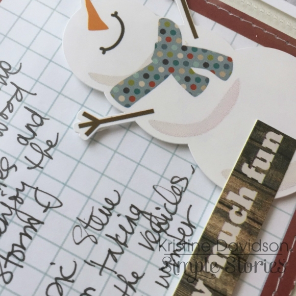
I created this layout with lots of stickers and layers. I love my pop dots and I find creating with them so easy to add dimension to my elements and also create a great visual effect.
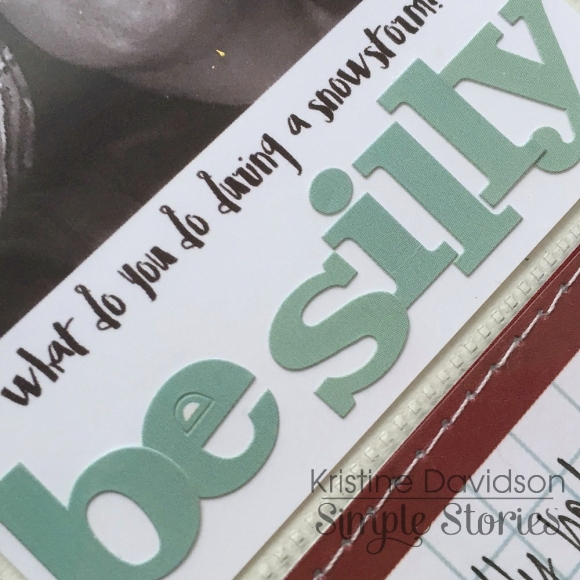
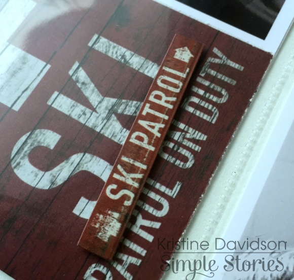
Here are a few close up pictures and you'll be able to see what i did to create dimension with the sticker sheet that comes with the collection. I didn't use any extra diecuts or embellishments other than what was in the kit!
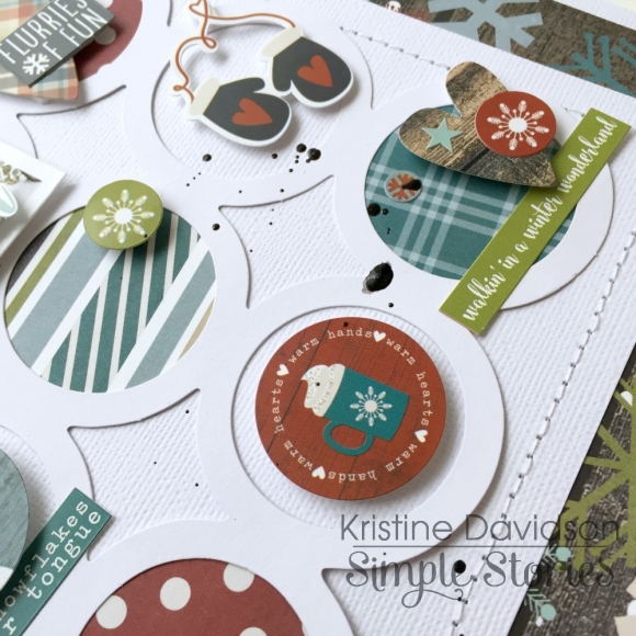
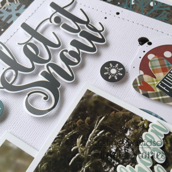
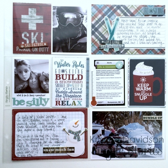
This next set of photos is the right side of my spread that features all the other Life Documented extras. I embellished my cards again with the sticker sheets from the kit and a few 3x4 and 4x6 cards cut up from one of the element papers.
So easy!
Here are a few more photos of the inserts;
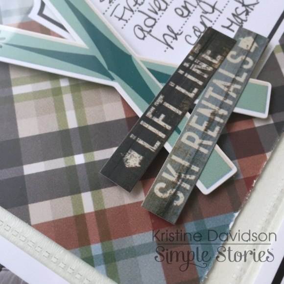
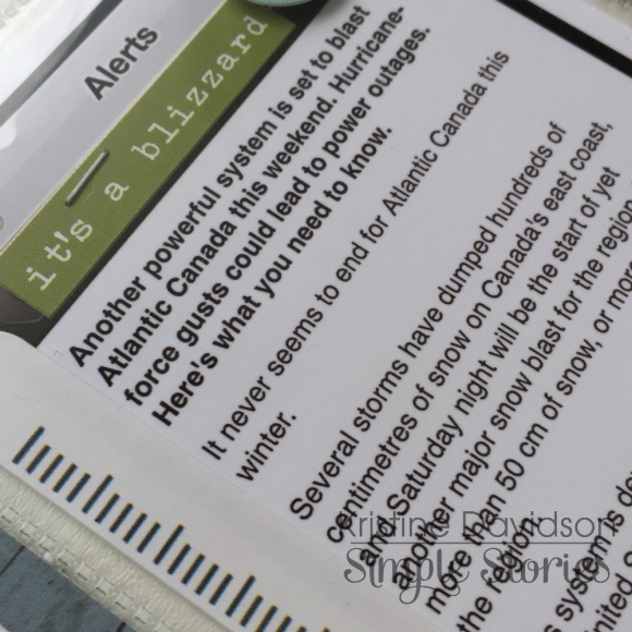
Creating a pokcet page spread doesn't have to be complicated and you can really do what you like. If you want to do a full spread you can or add a layout and a half of a pocket page. This can also work to your advantage for a multi photo layouts as well!
I hope you enjoyed my post today and I hope you enjoy creating with your favorite Simple Stories Products!

Hi everyone! Allison here with a layout using the We Are…Family collection. I also have another sketch to share that mixes up the traditional scrapbooking style with the SN@P! Pocket Pages.

You can download the full sketch with measurements and placements here.
The left side of the sketch is designed in a traditional scrapbooking style while the right side uses photos and cards together with the SN@P! Pocket Page, Design 4.
Here is my layout based on the sketch:

For the first few years of our youngest son’s life, he was a hard core “daddy’s boy.” Mike couldn’t take two steps without Jackson being right by his side. We were talking the other day about how we wished we could calculate how many miles Mike has walked carrying Jackson. It’s got to be a lot!

On of my favorite things about the We Are…Family collection is the mix of the dark brown with brighter colors. The photos I wanted to use were kind of drab in the terms of color so I loved how this collection gave me the opportunity to brighten up my layout with some fun colors while still including some browns to tie it to the pictures.

I accented with vertical strips on the sketch with vertical rows of hearts with a stitched line down the middle.

I repeated the vertical rows of hearts in several areas of the left page and accented them with some teeny tiny hearts too.

I also added some embellishments and word stickers to the larger hearts in two of the rows.

For the title I used the large ampersand and added the “me” and “my dad” to it and then added some more of the teeny tiny hearts around it.

On the right page I used photos, a 3 x 4” card, four 2 x 2” elements, and a 2 x 12” element with the SN@P! Pocket Page, Design 4. I love the design of this Pocket Page because of the 2 x 12” pocket. There are so many fun ways to use that one!

I used a 2 x 12” element strip covered in a long row of hearts in the 2 x 12” pocket. I also added a stitched line over the top of the hearts.

In the top 6 x 4” pocket I cut a 6 x 4” piece of cardstock and adhered four 2 x 2” squares and two 2 x 2” photos to it. This was an easy way to include an extra picture and have some fun with more elements on the page!

I love the photo overlays in each collection. It’s such an easy way to add some interesting elements to a photo.

On the “good stuff” card I added a little bit of hand stitching around the heart. I love adding details to the cards with hand stitching!

I also added a little bit of stitching around the heart on the bottom of a photo and then accented it all with more hearts and an arrow sticker.
I hope you all enjoy using the new sketch!
