January 2016 Blog Posts

Wendy here today to share some inspiration from the brand new Life in Color collection.  I used this collection to capture some everyday moments in our life; there were so many pieces and colors that worked for any topic from a fun moment with my husband to some selfies on Dumbo!
 
 
I just couldn't resist grabbing the fun Here and Now paper with all the Polaroids to begin creating with.  This paper was perfect for all the many selfies I have taken with my boys while we ride Dumbo over and over again!  I began my page with some small wallet size photos placed throughout the page and then I began to decorate and bring the page to life.
 
 
I loved using the bold Life chipboard piece and I paired this boldness with a 2x2 Sn@p! card with the month of the pics.  One of the photo stickers allowed me to add in a thought without detracting from my grouping.
 
 
My next piece was the Hello Bit & Piece that added a pop with the black and it added to my title to make it more comprehensive and led your eyes through the entire layout.  I also took some Bits & Pieces and layered them to decorate the other Polaroid adding some interest and color.
 
 
My final touch were some of the chipboard binder clips that I "attached" my photos with giving each photo some pizazz with the shiny clips and forming a visual triangle of sparkle.
 
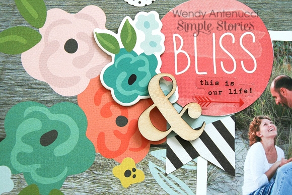
My next layout, Bliss Today, began with this picture I had just taken at our photo shoot and the 4x4 Sn@p! card that expressed love in the bold black.  
 
 
I nestled my "photo block" on the lovely woodgrain paper to match the sand color.  I loved the triangle pieces which I used to bring in some color that matched the grass and pulled your eyes from top to bottom.  By adding the darker colors I was able to get away with the pink (which I thought was lovely), but which my husband might have fussed about.
 
 
I dressed up the black Sn@p! card with some Bits & Pieces and added to my title.  I loved the sentiment on the 4x6 card which I cut out and used to bring your eyes down the paper.  A few scattered circular pieces carried throughout the layout also helped carry your eyes through the page and make everything cohesive.
 
 
A grouping at the bottom of the page incorporating the triangles, flowers, black, and circular elements continued the trend of bringing your eyes through the page.
 
 
And one last look at what gave my page its title and started the circular downward descent to tie the page together and create a lovely layout.
 
Thank you for joining me today, I hope you are as excited about the Life in Color collection as I am! 
Life is colorful indeed! And there is truly no better way to showcase that than with Life in Color, one of Simple Stories' newest collections. I have both a boy and girl and have used this collection for both of those children. I have used it in pocket pages, single pages, with lots of pictures and with only one picture. This is going to be one of those timeless classics that you can use throughout the years and still love, I'm sure of it!
 
 
Snapshots of a Happy Life. This is one happy child! She is often smiling, laughing, joking. This layout shares that laughter in her eyes. The 12x4 elements and 12x2 elements don't just have to be for pocket pages. Many of us on the design team have used them on our layouts. Here is another example. I trimmed this one down a tad and used it as a banner header for the page.
 
I created a photo collage in Photoshop with the three main pictures and left white blank spaces that I then filled in with all kinds of embellishments that come with the kit; frames, stickers, chipboard, washi. Fun, happy embellishments that reflect the fun, happy kid in the pictures.
 
 
You truly get your money's with and a huge selection of option with Simple Stories' products. Don't like chipboard, try the die cuts. Love washi, got that! There is a plethora of goodies to choose from and it all works so well on just about any paper crafting project you can dream up!
 
 
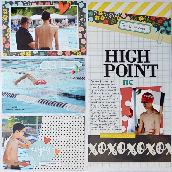
Here again is another use of yet another 12 inch Element, this time the 12x6 piece which I used in a pocket page. These larger pieces are great for journaling and smaller pictures as I have done here.
 
 
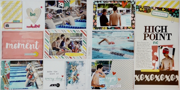
The right hand page of this spread is mostly pictures. I wouldn't think of using this collection with swimming normally but the colors in the collection compliment the colors in my pictures so well. And with the general life embellishments, it was so easy to support the topic.
 
 
This left hand side of the pocket spread includes two more interactive elements; confetti pocket and sequins. I could have included more pictures or more of the fantastic 4x3 cards but I like the white space that the see through elements create in a busy spread like this.
 
 
He's not the only swimmer, my daughter swims too and this is a page about her first 100 yard fly. She was 7 years old and just flew through the water. Butterfly is a tough stroke to pull together and she did a remarkable job of it. I have had these pictures printed for a long time (it was almost 2 years ago) and just couldn't find the right papers to scrapbook this momentous occasion. Until I saw Life in Color!
 
 
With the pictures and "main" part of the layout up above, I needed to create some balance below. A frame from the patterned paper and a 4x3 journal card from the SN@P! Pack were the perfect balance and provided a great place for my journaling.
 
 
There you have it my friends! Life in Color three ways! With so many more ways to come! I have already created an additional 4 layouts with this collection, all of which I'm pleased as pie with!  Look at all those exclamation marks, there really is so much to love about Life in Color. Here's hoping you love this collection as much as I do!
 

Supplies

We're thrilled to introduce you to the 2016 Creative Team!  Look forward to seeing work from these talented ladies beginning in February!

Hello! Chantalle (www.copasetique.blogspot.com.au) with you today and I’m so excited to be sharing a layout using the new Carpe Diem scrapbook collection!  Live Colorfully, Erin was inspired by the beautiful blooms in this collection. I’m so glad this line has expanded from planners into a scrapbooking collection!

Using a 12x12 sheet of ‘Don’t Mind Me’ as a base, I looked through all the papers and elements in this collection and pulled out everything that had the flower print. I wanted to carry on the floral theme to both frame and emphasise the photo of my Daughter riding the carousel.
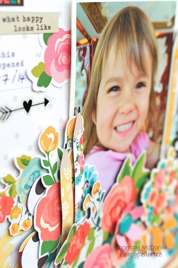
By using both chipboard and paper elements, I was able to build up some nice layers and height contrast. So that the print didn’t blend in to itself too much, I also added a few plain floral elements which I cut using some metal dies I have in my stash.

Building layers can really use up lots of foam tape! I like to add height (especially with larger elements) by using some cardboard instead. It is easily found around the home. Thinner card can also be excellent to provide support for hand-cut items, like these pencils. They looked a little out of shape with foam tape, so I backed them with card first and then added foam tape to the card instead.

They now stand nice and straight on my page.

I hope you enjoy creating with Carpe Diem as much as I have!

Hey everyone, Amy here to share a layout I created using the new You Are Here line.  It is such a fun line, perfect for all your travel pictures.  I wasted no time in using it to highlight a family photo we took on our trip to Punta Cana.


I added a row of my favorite chipboard frames under the photo for my journaling, title and to highlight some of the cute bits and pieces from the line.


Make sure to check out all the new lines Simple Stories has created, they are all amazing!  
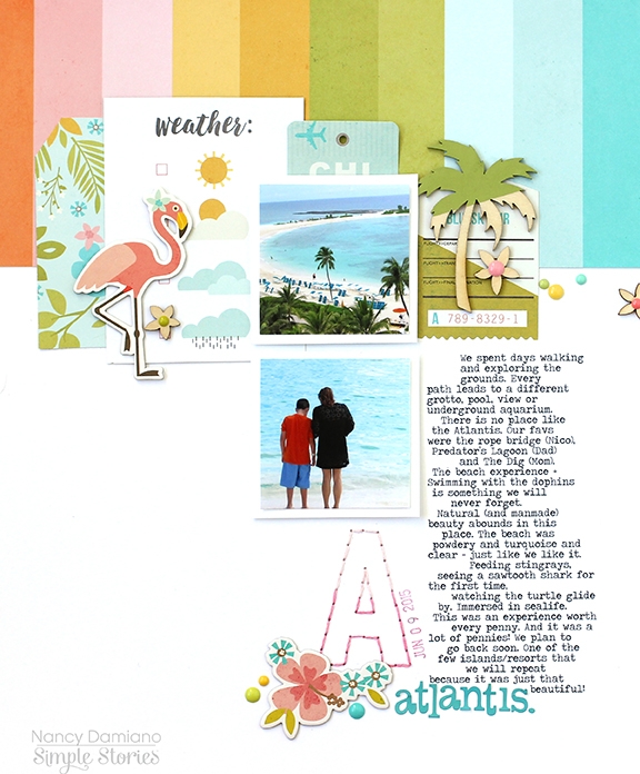
Hey there Simple fans, Nancy up today with a layout using the brand new You Are Here! collection and some planner pages using the new Life in Color Planner Set.
 
Let's start up with the beautiful, tropical line that is You Are Here!. I love all things colorful, tropical themed and flamingo. This line delivers on all!
 
 
This design started with the rainbow strip paper. It's my favorite in the collection and anchors the layout. Layers of die cuts and pattern paper create a place for the two photos highlighted. I then added the fun stuff - chipboard, wood flowers, enamel dots and stickers. 
 
 
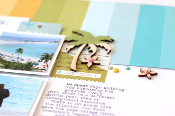
I decided to add a little punch of color with acrylic paint to the palm tree. It really makes that shape pop. I used some washi tape to block out the portion I wanted to keep raw wood. It gave me a nice clean paint line and a nice color blocking effect.
 
 
To balance out the top heavy design and big block of journaling. I hand stitched a large initial "A" (for Atlantis) at the bottom. I used two shades of pink to give the letter an ombre effect. Some chipboard flowers, enamel dots and alpha stickers from the Let's Go sticker sheet finish off the design. 
 
 
Next, we have another bold palette of new planner supplies. The Life in Color Planner Set is beautiful and functional. This beautiful pattern is included in the Planner Set and starts in January.
 
 
Here's a peek at how I started my month. With a punch of color and a sentiment that I love (the cute dog doesn't hurt).
 
 
I filled the month of January with stickers from the Life in Color pack. I love that includes a variety of titles, circles and flags.
 
 
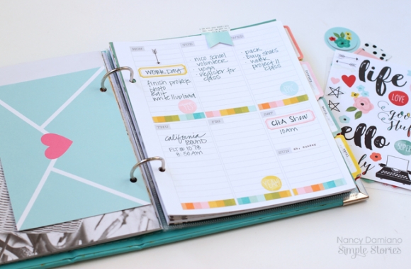
Next up is the start of the weekly view included in the Planner Pack. I added the envelope from the Carpe Diem SN@P! Journal Pages. I like how it coordinates with Life in Color.
 
 
To add a little punch of color, I used the rainbow washi tape from the Let's Go! collection at the end of each weekday. Circle, label and arrow stickers from the Life in Color pack complete the week!
 
 
Watch for the full You Are Here! and Life in Color Planner Set soon - shipping to retailers end of January!

Supplies

Let's be honest. Every papercrafter needs a good birthday collection in their stash, right? Well, look no further. Simple Stories' Let's Party collection is fun, happy, bright, versatile enough for boys and girls and is perfect for cards, layouts and more!  I cut this fun little party heart card with my Cameo.


The chipboard and die cuts in this collection are AMAZING. Check out those cute little balloons! You can use the chipboard strings that come in the set or attach twine like I did. Either way it is pretty easy to pull together a birthday card that will make someone smile. :)


I also decided to take a walk down memory lane and scrapbook some of my kids' younger birthdays. The Chipboard frames are perfect for adding a bunch of photos including those detail shots like ones of the cake and presents. I had so much fun filling one frame with a mix of Bradz, Enamel Dots, Photo Stickers and Chipboard Stickers! And how about that big 1? I may need several more packs of those Pocket Pieces die cut numbers that look like birthday candles, I just love them so!


For this layout I created a large cake for the background and stitched around each layer. The stickers, die cuts and embellishments all work so well together in this collection!


Playing with these old photos and this cute new collection has me inspired to do a mini album of each kids' birthdays. Let's Party has so many fun stickers, embellishments and patterned papers for all types of birthday projects!

Supplies

Hello everyone ! It's Mindi here with you today sharing some pocket pages using the new Life In Color collection. 

A new year is just beginning. With it comes setting goals, taking the time to finish up projects, getting your planner ready or playing catch up. I decided to bundle up our families memories from this past November into a few pocket pages. You have to remember that there are no rules when it comes to memory keeping. 
 

One of the things that I love from this collection are these month cards. It was the perfect title card since these photos are all from November. You can easily add the week number/date, or even event name to make a fast title card. 
 

Here's a look at the left side. 
 
I am in love with these clear photo stickers ! Seriously, obsessed. As you can see I added it to the empty space in my photo to add an easy embellished look. 
 
 
One of the things I have recently liked to do in my pocket page spreads is to add in a 4x6 filler card or journaling card. It seems to break up the photos a bit and add in some color. I added the arrow die cut piece onto the coral filler card and I love the pop of color. 
 
 
This journaling card came about by first cutting up one of the 4x4 cards into a triangle. I folded the top corner over and added an enamel dot. I love how the cards are two sided so that the other pattern shows when I folded it over. I added a strip of washi tape on the bottom and some phrase stickers and the star wood veneer for a fun embellishment cluster. The journaling on this card talks about me setting up a mini selfie photo shoot. I am always trying to find ways to get myself on the other side of the camera. 
 
 
Here is the right side. 
 
 
Using white space for journaling or embellishments on a photo is one of my favorite things. I combined some journaling with a sticker on the bottom of the photo for a great result. One Saturday I added a family bike ride to the to do list. We managed to get one in at the end of the day. It was perfect. We watched the sunset while enjoying some family time. I propped up the phone and set it on the ground and used my phones timer to get the shot. 
 
 
Here is a look at some of the journaling cards and photos. 


Most of the photos and stories from the right side are from Thanksgiving. I made a pecan pumpkin pie, and I added a photo sticker to the photo. We had family staying with us and the trees are always at their colorful best this time in the year. 
 
 
Thanks for visiting the blog today. I hope you found some inspiration and enjoyed checking out how I used the new Life In Color collection. I loved working with this new set and I look forward to using it again soon.

Pages