List Obsessed
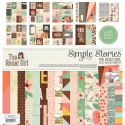
Hello friends! Laura here with you and I am super excited to share today's projects with you! I am playing with a new Simple Stories collection called The Reset Girl, and boy am I smitten!
I am not a planner girl, technically, but I am a long time list maker and pretty office supply lover! So I thought it would be super fun to document my love of lists with this collection! But first I decided to doll up my mini binder that I use to keep track of my design team and scrappy lists with some of the goodies from this collection! I mean how could I resist, really!
My little binder has a clear pocket to insert a cover page into and I used the Aztec/Typeset patterned paper to create one.
I used a few die cuts to decorate the front of my book.
As well as some alpha stickers to add my initials.
And then I added an extra strip of paper to the spine.
Once I was finished decorating my binder, I stacked up all of my list books and snapped a few pictures.
I even added some of the Washi tape from The Reset Girl collection to the spines of a few of my more basic list books.
I love how pretty they look now!
But I am seriously digressing, so back to my layout shares today...
I began with a die cut heart and stitched it to my patterned paper background using three colours of floss pulled from the colours in the patterned paper.
And then I set to work creating two focal areas, one for my photo and the second for my title. I fussy cut flowers from the "Like a Boss" patterned paper to tuck in behind both focal areas. To the right of my photo I also added in some die cuts and stickers, plus a few enamel dots (from the Life in Color collection). How adorable is that little pink coffee mug with gold foil spots! We all know the best lists are created over a good coffee!
The left side of my photo received a similar but more minimal treatment.
The top of my photo also got a special treatment of Sticky Notes, Epoxy Metal Clips, Chipboard Stickers and clear stickers. Because I used two focal areas on my layout I wanted to be sure to create a visual triangle around my photo. And let's face it, it meant I could play with more goodies! ha!
My second focal area, my title, was layered above and below this sweet library pocket - boy am I in love with these! I die cut the word "list" and misted it with gold Heidi Swapp color shine to mimic the gold foil in this collection. I used chipboard, cardstock and clear stickers as well as die cuts to adorn this section of my layout.
After creating this page and decorating my list book, I am seriously thinking I need to become a planner girl; Simple Stories has THE best goodies for planners!
My youngest son is heading back to school in a few days, so that inspired me to create a layout using the photos that I took this time last year.
Library pockets and graph paper, oh my! Did I mention that I also have a thing for school supplies. I may hoard them, for no apparent reason! So as you can imagine, this collection spoke to me for so many reasons!
I had fun, decorating another library pocket on this page, with a slightly more masculine look.
To create my title, I modified an "L" sticker from the word "GIRL" to be a 7, and then fussy cut a "GR" from the 24/Seven patterned paper.
I used Washi tape, clear stickers, die cuts and enamel dots (from the Sunshine & Happiness collection) to adorn the bottom of my page.
I also added a couple of stickers to the upper right side of my layout and then added a few splotches of Mr. Huey's mist. I hope you are as inspired by this amazing collection as I am!
Thanks so much for visiting today! xo


