Simple & Sweet!
Hello Friends! it's Kristine Davidson here today and I'm so happy to be a designer for another year. It's a pleasure designing for Simple Stories and I'm glad I can share these beautiful products with you!

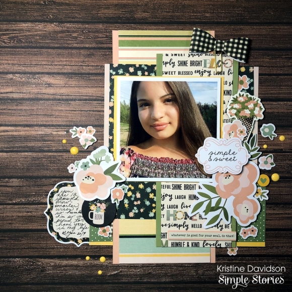
This layout is called Simple & Sweet using the Spring Farmhouse collection. As you know I don't fuss about my titles that much and this layout is no exception. I used a diecut from the Bits & Pieces and found one that would be perfect for my niece's attitude and simple pleasures. If you ever feel stuck with a title perhaps look thru those diecuts and pick one that you can relate with. You can always emphasize a title by adding dimensional adhesive or surrounding it with flowers or other embellishments.
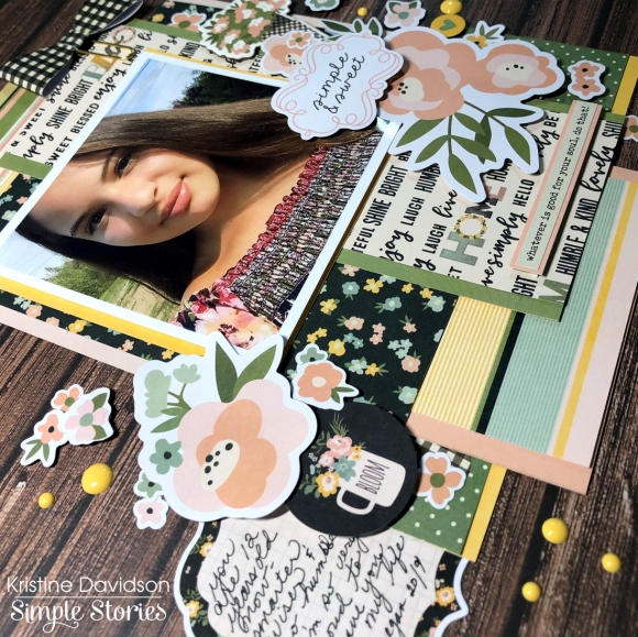
I started my base with an Elmwood background from the SN@P! Basics Paper Pack. If you don't have this collection in your stash -- go buy one! It is a must have. I wanted this layout to have layers and have of those gorgeous 6x8 papers. I love the smaller paper patterns because they allow me to use small photos and they don't overcrowd my page or photos. Does that make sense? I also wanted to mat some of those papers and I used the Simple Basics Kit that match the Simple Farmhouse collection beautifully.

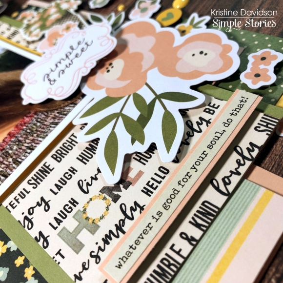
The Simple Basics Kit includes solid colored cardstock papers that can be used for cards, base colors on a layout and so much more. I used these papers to mat my patterned papers. You can see on this picture that I have them matted in assorted colors. I love that little extra pop of color. Cute right?

Adding those solid colors behind my patterns added some extra color on my page and made them visually pleasing. Try something new today! Maybe you have left over cardstock or solid colored papers that you can use on your next layout. Give it a try! Visit Us on Instagram @SimpleStories_ and @KristineDavidson for more projects using Simple Stories.
Chow for Now!

