You Are here
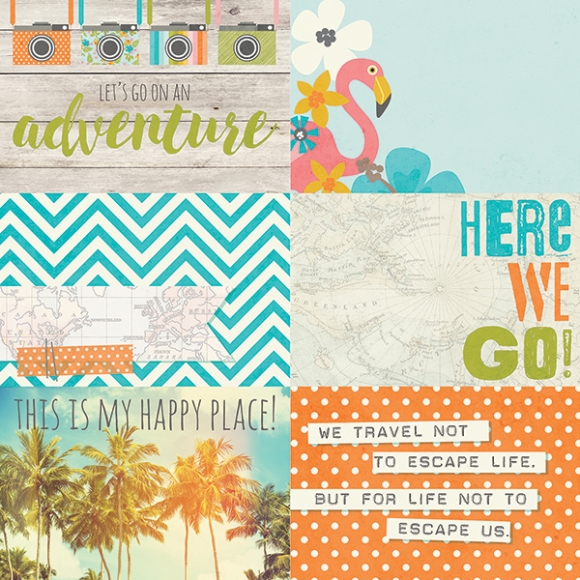
Hello Friends, It's Kristine here today! I will be sharing with you 2 layouts that I created using the gorgeous travel collection called ' You Are Here ' . I have so many great travel pics but sometimes I find it hard to scrapbook them. Having this great collection seems to make it easier for me .. perhaps it's the pink flamingos? the palm trees? or maybe the cute cameras? Whatever it is I really enjoyed creating these 2 pages for you.
My First Layout is called " Explore, Dream, Discover " I got the title from one of the stickers from the Expressions sticker sheet. Genius right?! ;-)
I wanted to add more than one picture so i started digging thru my pictures and found a set from a Las Vegas trip my sister and I took in July 2014. It was so hot and dry, My goodness we did so much walking and had a great time. I had one photo that was the weather forecast that i screen captured with my iphone. I thought this would be pretty neat to have on a page. I have added them to mini albums and life documented pages, but never on a layout. Cool!

This was perfect to add the simple touch of journaling that I wanted. I added a date and of course the weather forecast tells the story that we were in Las Vegas. Adding some pop dots underneath these journal strips also gave them more dimension and definition.
You can see in this next photo that I layered and layered so many Bits & Pieces. I really love the look of layers and this just brought more details that I enjoy in a page.
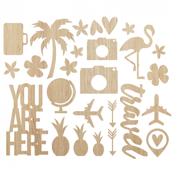
Have you used the cute Simple Stories Wood Veneers yet? Did you know you can altered these quite easily with paint, ink, nail polish?!

************************
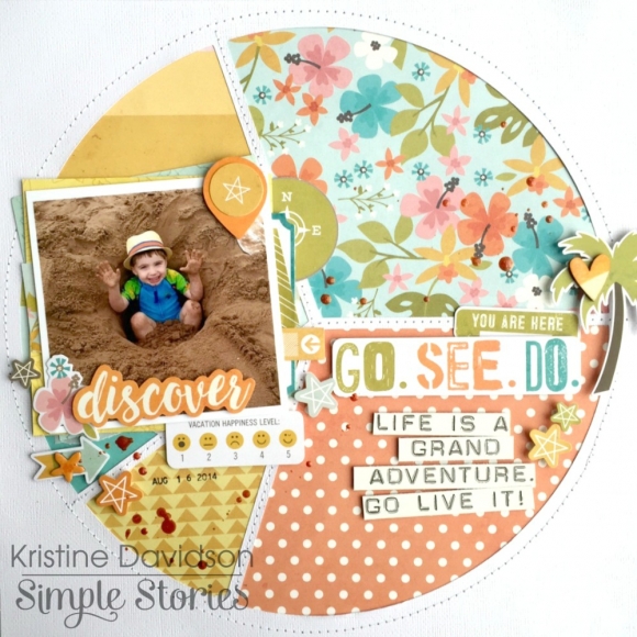
My second layout for you today is a pie chart page! I used my Silhouette Cameo to cut out a pie chart and then simply cut out some pattern papers to fill in the empty spots and created an easy peasy page!

I did the same " trick " as I did in the previous layout. I used some journal strips already done for me and added some pop dots for dimension.
I also added some Glaze to the background of this page and used the same color to paint that cute little wood veneer heart on the palm tree. It's really so easy to alter those pieces - you should try!
I hope you enjoyed my layouts today and enjoy creating your own pages with Simple Stories products ! Interested in seeing more of my work? please come visit me on Instagram @KristineDavidson.
Thank you so much for reading and being a fan of Simple Stories!

