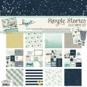
Hello again Simple Stories fans! Chantalle with you today to share some pages I have created using the beautiful Heart and Sunshine & Happiness collections. Both use a similar design, playing on a centred focal point, either vertically or horizontally.
Hello Love
Heart has so many beautiful and truly touching sentiments to remember those we have loved and lost. But it also has some hoard-worthy patterns, like the dotty and starry ‘Love You’ and this dreamy watercolour which is the b-side of Forever in my Heart.

If you love clustering elements this is a great design to try, as you can pack a punch with lots of bits and pieces. Having them all in a similar place along with a simple colour palette adds uniformity to this page as well.
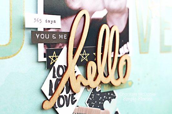
The diamond shapes have been cut out from a sheet of Heart Elements #2. I really wanted to bring in some of the deeper shades in the collection as they complimented the photo of my hubby and I on our 11 year anniversary last year. I liked the diamond shapes as they could easily be applied down the length of the page as well as cut in half and spaced out a bit if I needed to fill a bit of extra white space.
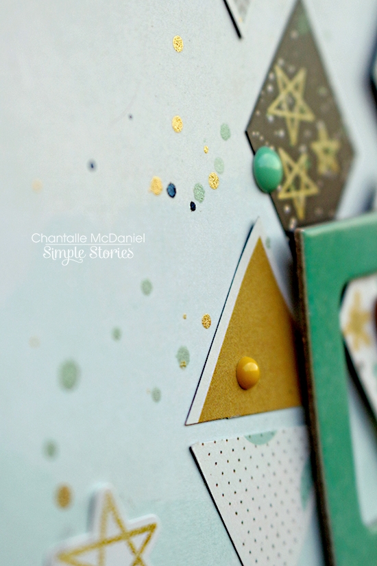
The wood veneer part of the title has been given a twinkle of Wink of Stella. This photo does it absolutely no justice I’m afraid. If you own one of these awesome little brush pens then you know how much they rock! If you don’t have one, it’s definitely worth investing in one. They add some a gorgeous sparkle and if you buy a clear shade you can pop it over the top of just about anything for a little extra sparkle.

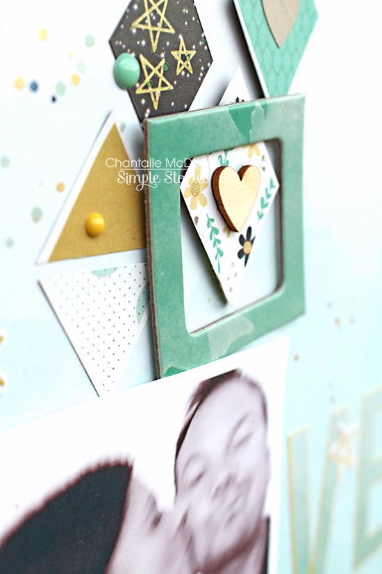
The little frames I added on almost at the end. I wanted to add a bit more dimension and I think they worked with the harder lines of the square photo and the diamond shapes. A couple of mist drops and my fave enamel dots finish the page off.
#5032 Life in Color Stickers
#5041 Life in Color Wood Veneer
#5038 Life in Color Chipboard Frames
#7231 Sunshine & Happiness Enamel Dots
_______________
#HAPPY
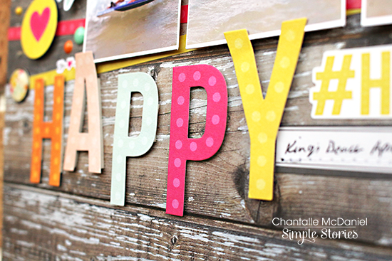
The title of this page just says it all - HAPPY! My kiddos are absolutely beaming as they fly though the surf on their bodyboards. Continuing with a central theme, I have printed the photo out splitting it across three seperate boxes. I think it gives the photo a great sense of movement and is especially suited to the image where they start to split up as they reach the end of their ride. Sunshine & Happiness is perfect, set on some totally awesome Sn@p Basics ‘Cedar’. If you are a woodgrain fan like me, you NEED to grab yourself a pack of these basics today!
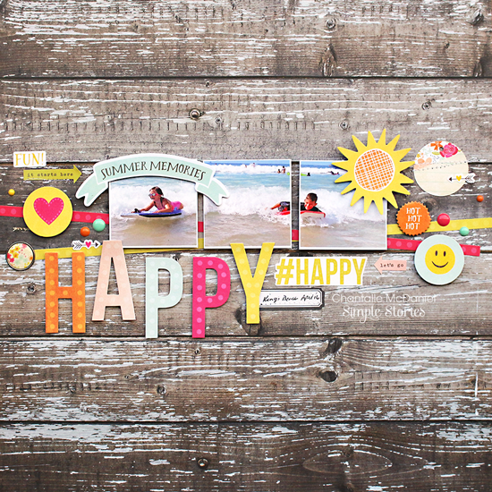
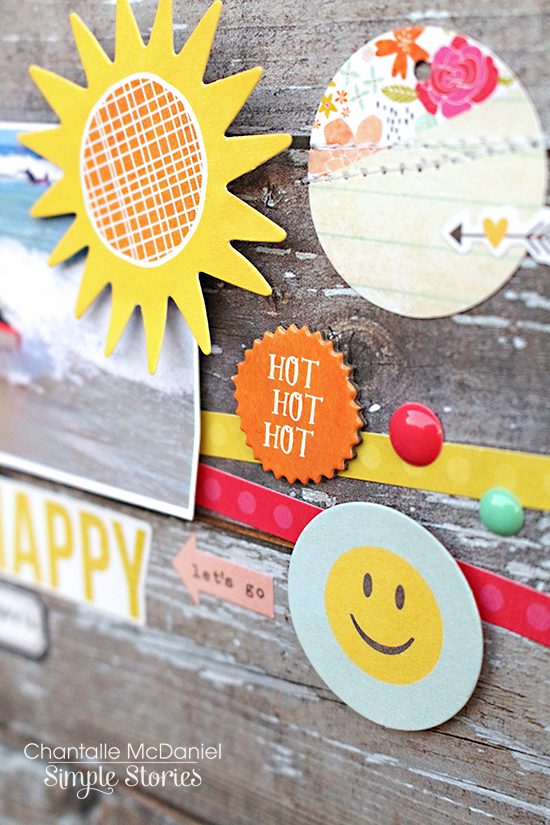
Summer memories are made of this! There are so many things to love about Sn@p! Packs…. one of them is that you get a couple of extra little die cuts, like this banner shape. So cute and just the right size for any project!
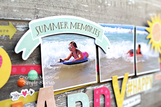
This layout uses mostly a combination of die cuts and stickers. I’ve used the 12 inch stickers that can be found on most Fundamental sticker sheets. Running two strips at slightly different angles across the width of my page, they’re a springboard for the rest of the layout.
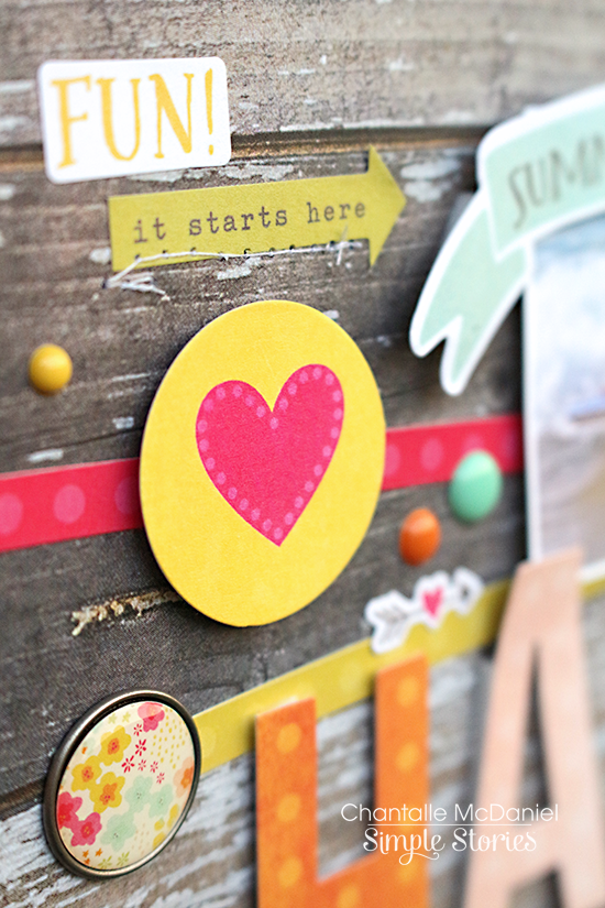
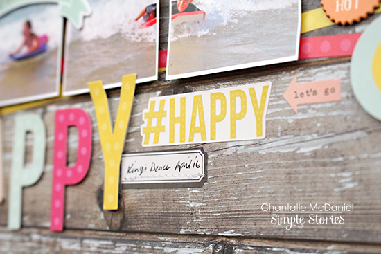
The word ‘happy’ was spelled out using die cut letters from the Sunshine & Happiness Sn@p! pack. I’ve raised them with some foam tape and set them as slightly different heights to add interest to my title.
A bit of machine stitching gives it a playful feel and adds a bit of texture.
Thank you so much for stopping by the blog today.
Happy Crafting


