Chantalle McDaniel's Blog Posts

Hello Simple Stories fans and welcome to the blog today! One of the best things about SS collections for me, is that you get a brilliant selection of elements that all go together effortlessly. I love having some washi, that matching brad or enamel dot in just the right shade!  Sometimes though, it’s awesome to have a few bits and bobs that co-ordinate perfectly plus you know you will make use of every bit, for occasions like Halloween etc… Enter Simple Sets. I love them! I’ve created two pages to share with you today using ‘Old School’ and ‘Hello Lovely’ Simple Sets.
 
Hello Lovely
 
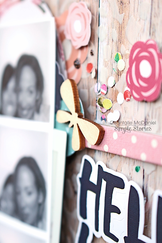
The combination of pink & navy was too pretty to resist for these fun snaps taken in a photo booth recently. 
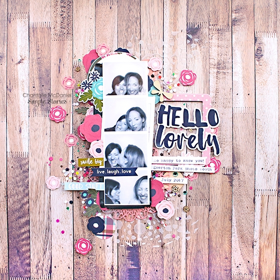
 
 
The woodgrain print was a perfect base on to which to start my layering. This one is the Hickory/Cream Grid. The great news is that you can grab a selection of these useful papers in a Sn@p! Basics Pack which has 8 double sided sheets and is also available in a handy 6x6 size! Perfect for a variety of projects.
 
 
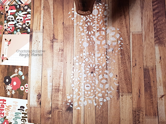
I started with a bit of texture paste through a stencil to echo the floral patterns in the Hello Lovely set. I purposefully didn’t add it in a uniform pattern. I just wanted it to show here and there.
Once the texture paste was dry, I began adding my elements. There is lots to choose from to hand snip if you enjoy fussy cutting!
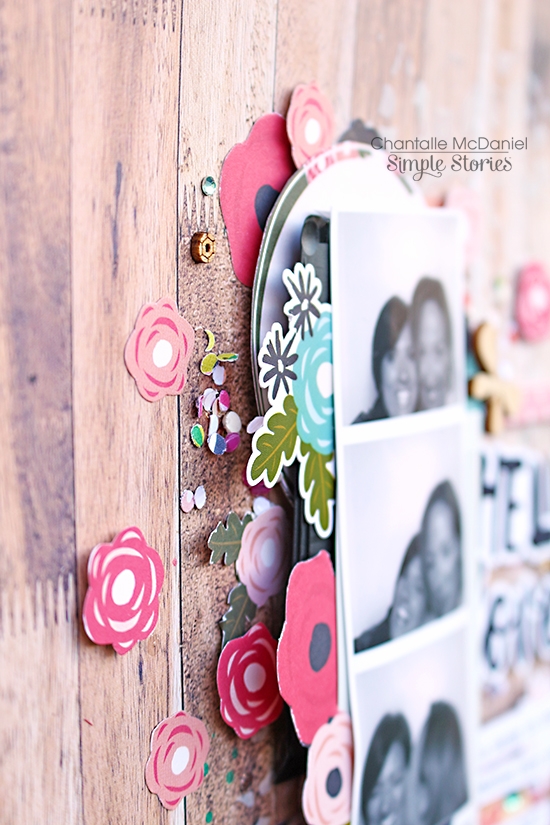
 
 
Below my photo strip are some black plastic bits as well as an overexposed pic I probably won’t use. The black bits are the pieces that are left over from a pack of Instax film. I used a stapler to quickly bind them together and pop them behind the images I was scrapping. I really like the bit of interest they provide!
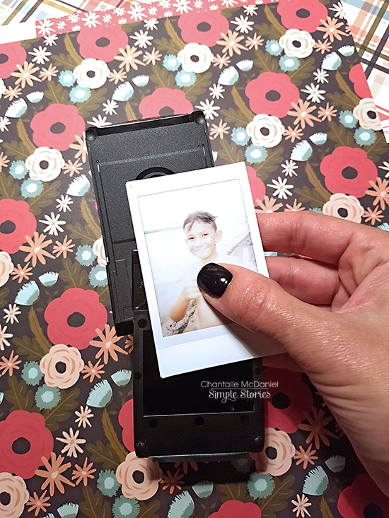
 
 
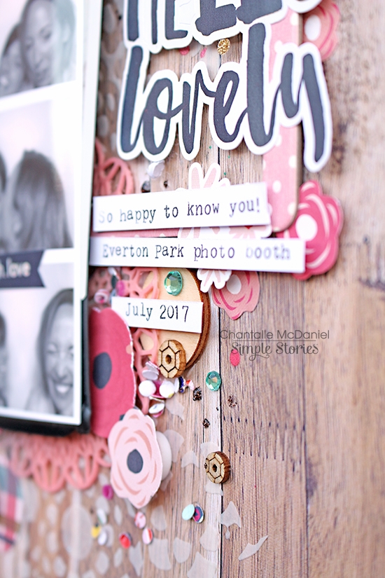
Stickers can be used like a die cut if you pop some talcum powder on the back of them. I’ve mounted this one on to some pop dots and used a chipboard frame from the Enchanted collection to highlight the title.
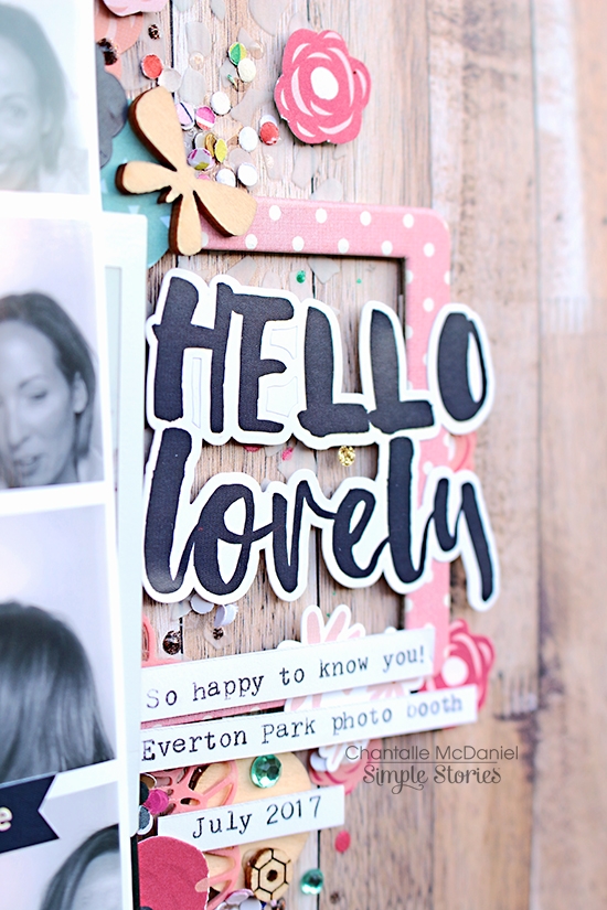
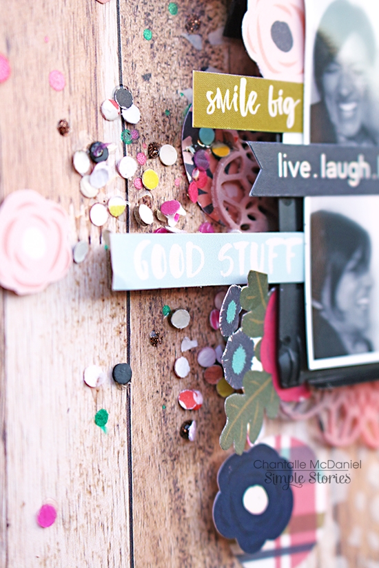
There are lots of little details on this page, like the confetti which I used to show happiness bursting off the paper. It was a bit of a labour of love adding adhesive and subsequently the teensy bits of paper, but it adds that extra element of fun to the page.
________________________________________

This page also uses an element from a Simple Set to create the page title. This phrase is so apt right now, so I cut a section from a 3x4 journalling card from the Old School Journalling Card Elements. My son will be completing his primary school journey at the end of this year and we are so excited and nervous for him as he starts a new chapter in his schooling career.

The background is a combination of Old School ‘Hall Pass’ and the 3x4 Journalling Card Elements B side. The chalkboard print is super cute! I also echoed the paperclip theme of Hall Pass by using some coloured paperclips as embellishments. You’ll notice my materials list is pretty minor for this page, but by using a mixture of elements, it can still pack a visual punch!
 
 
I pretty much used up the whole sheet of 6x12 Cardstock Stickers on this page. I ran them along the edge where the two papers meet, tucking some in and raising some up on foam dots. I’ve added some typed journalling above and below the title to draw the eye along the same line, so it doesn’t look like too sharp an angle jutting out on it’s own.
 
 
Thanks so much for joining me today.
 
Happy creating!


Supplies

Hello everyone. Chantalle here, and I would love to share some recent projects with you, capturing some sweet outdoor moments. I have used new releases Cabin Fever and Summer Days which are both perfect for your summer adventures!
 
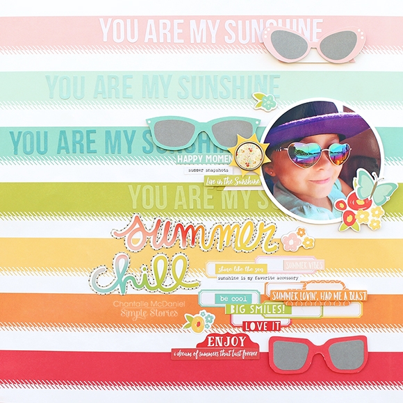
You Are My Sunshine
 
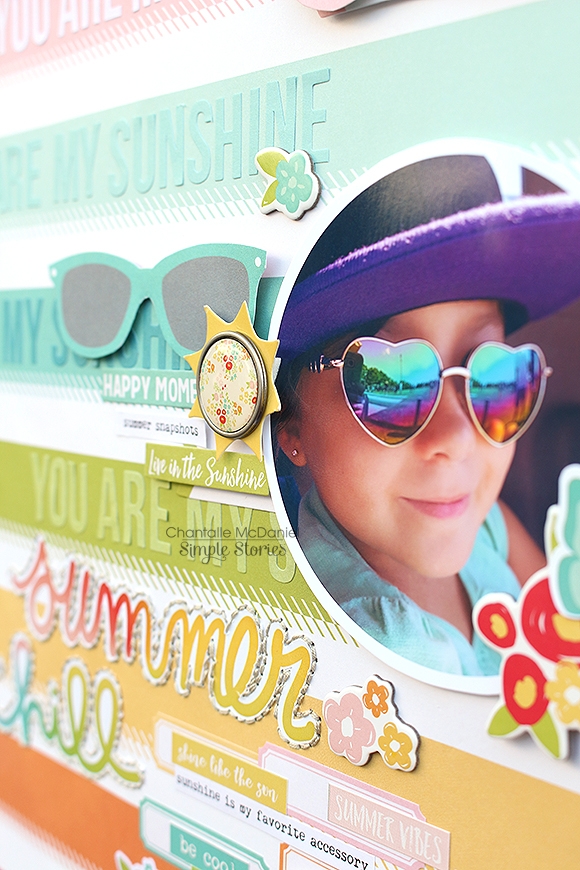
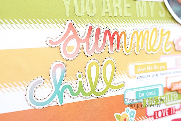
This page uses the bright and breezy Summer Days. I love this new collection with its infectious brights and fun elements. The watermelon is a fave for sure!
 
 
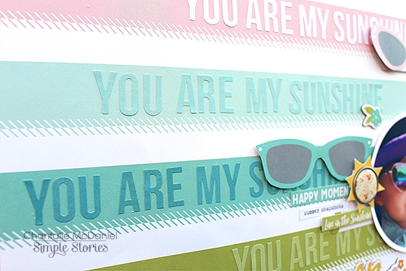
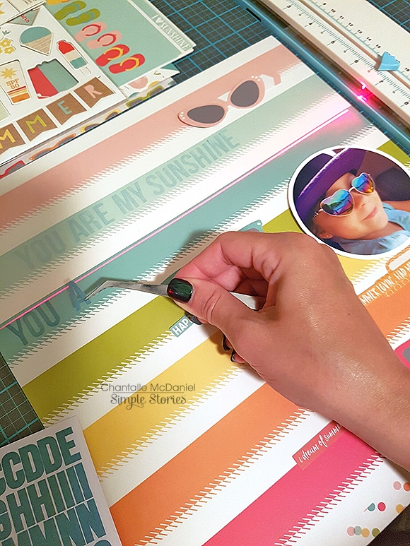
For a bit of fun, I have created some subtitles on the ‘So much Fun’ background paper using some co-ordinating alpha stickers from a pack of Sn@p Color Vibe Lights. 
 
 
I love the way these stickers add a bit more detail to the page without being too distracting. I lined them up with the help of a light ruler but you could also line them up on the very edge of a plastic ruler and then place the ruler down carefully in your desired area, to transfer them.
 
 
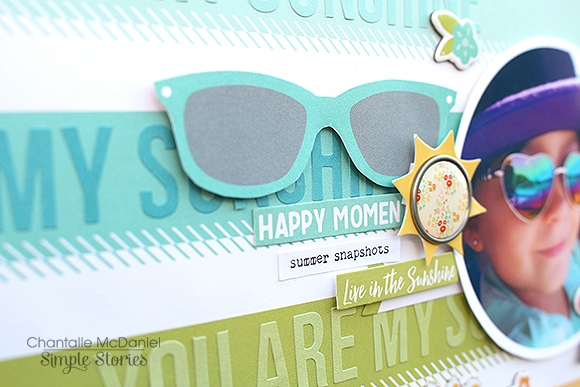
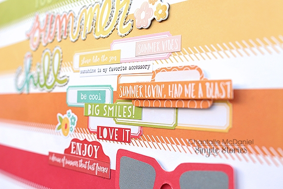
The striped pattern also helped make lining things up a breeze. In between the colour bars, I have added some more details in the form of ephemera and phrase stickers. The super cute sunglasses shapes matched my photo perfectly, so I cut some larger sized ones from a sheet of the 4x4 Elements in three different styles and colours.
 
 
I quite like to group matching colours on my projects. Creating with Simple Stories is such a joy as everything co-ordinates so perfectly!
 
 
I’ve cropped my photo in a circular shape for something different. Using Circle Photo Crops makes cutting your photos to size a cinch!


For a final flourish, I have added some embroidery style stitching around my title stickers. I think it helped it stand out a bit more against the colourful elements.
 
 
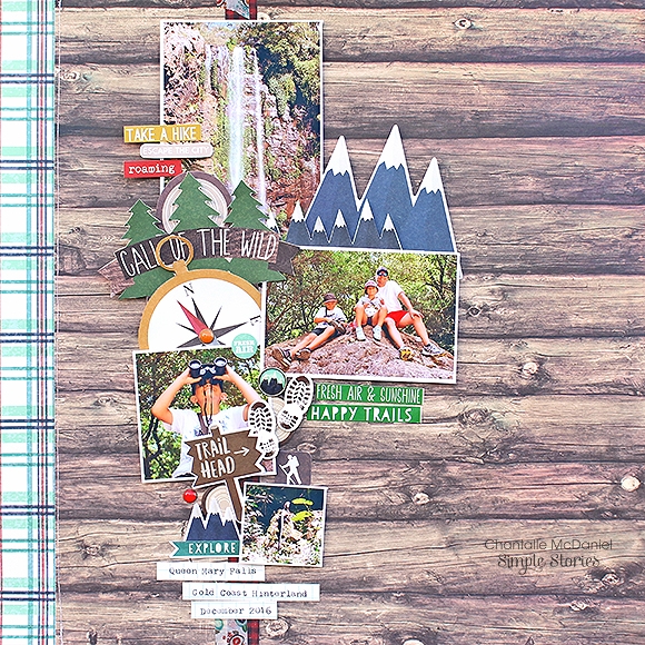
This next page, 'Call of the Wild’ also celebrates fun moments outside.
 
 
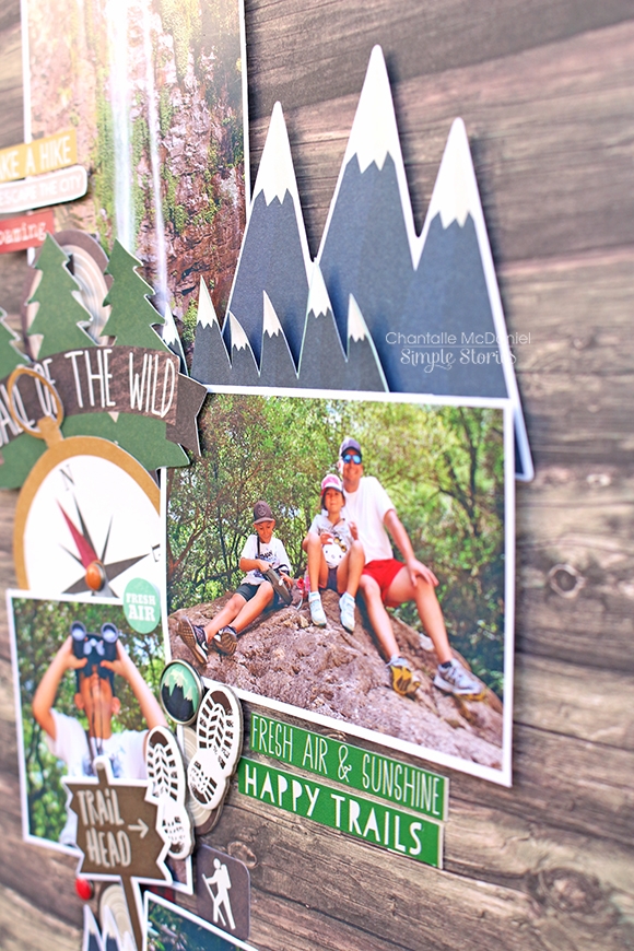
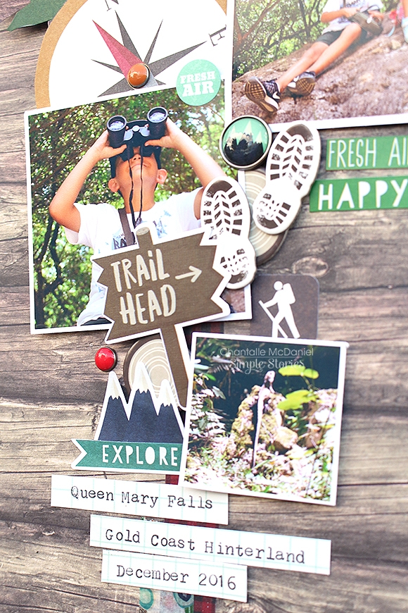
Cabin Fever is amazing for those camping times, getting out and about times or just nature times! Living in Queensland where we have pretty much gorgeous weather for most of the year, I can see myself using every last bit of this collection!  I’ve used a vertical design and grouped lots of fun elements together to show off the photos of a wonderful day we spent enjoying the Gold Coast Hinterland this Summer.
 
 
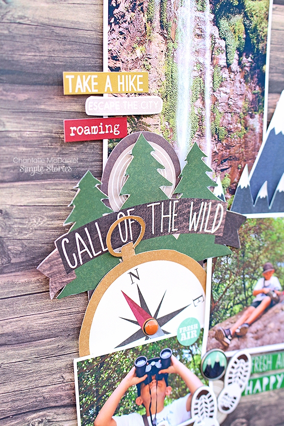
The tree and mountain elements called out to me for this project so I nabbed a few larger size ones from the Cabin Fever 4x4, 3x4 and 4x6 Elements pages. I always look forward to seeing these papers in Simple Stories collections as they are full of extra bits and pieces to cut out if you need some more of a certain shape or for a journalling spot etc. Value and versatility in one! The compass was also cut from the 4x6 Elements page. I added a little brad in the centre for a bit of extra detail.
 
 
I also loved the muddy boot track and tree stump chipboard stickers!
 
 
Thanks for joining me today!


SaveSave

Supplies

Do you ever just find yourself looking at a page or project you have created and wonder ‘Where did that come from?!’   More often than not, something totally awesome will come of something that’s driving you nuts! I had ideas about how the two pages I am going to share with you today were going to turn out, and let me tell you, they were nothing like this! Not that I’m complaining, lol. I love them both now, but they didn’t start out that way ;)
 
 
Nope #whatever! is a fun page about my sometimes crazy kids, who are getting to an age where they just won’t ‘smile nicely’ for the camera anymore! I pleaded with them to stand at the edge of beautiful Lake Somerset, but they just mucked around. The photos that came of it were so funny though and the #Whatever simple set was the perfect match for them.
 
 
Now this next part might sound a bit nuts, but ever since I first saw the front ‘info’ page of the Reset Girl Simple Basics Kit, I just wanted to use it on a project. I LOVE how all the papers displayed next to each other… it’s such an awesome mix of prints and colours! I trimmed the individual prints down in to strips and attached them to my Instax photos - a perfect fit!
 
 
I put the photos aside and started combining papers and embellishments to create my page. I put everything together and…. hated the outcome. #ohdear! So I pulled it apart, keeping the major elements to re-use and chose a new sheet of paper - yummy Mint Hashgrid by the Reset Girl. I added elements on top and still thought it was all a bit too busy, so I decided to give it all a good wash with some white acrylic paint. Instantly, it looked way better! I continued to place the rest of the elements on the page and I was so happy with the outcome.
 
 
For my title, I have combined a hand-cut word ’NOPE' from the 4x6 #Whatever elements and some stickers from the Cardstock sticker sheet.
 
 
Those little snippets of paper from the info page peek out on either side of my central band. As you can see in the image above, I cut them in half (or thereabouts) so they would ‘stretch’ further. This is a great technique if you want to make stickers go further too
 
 
It was all quite spontaneous once I got fully going, so I wasn’t too fussed if things weren’t perfect. There are no rules in this glorious creative pastime of ours, so go with what makes your heart happy!
 
 
A bit of journalling and (all-time faves) enamel dots, finish off the page.
 
 
Don’t be afraid to make a change if something isn’t working for you or if you just feel like having a go. It can be so rewarding!
 
________________________________
 
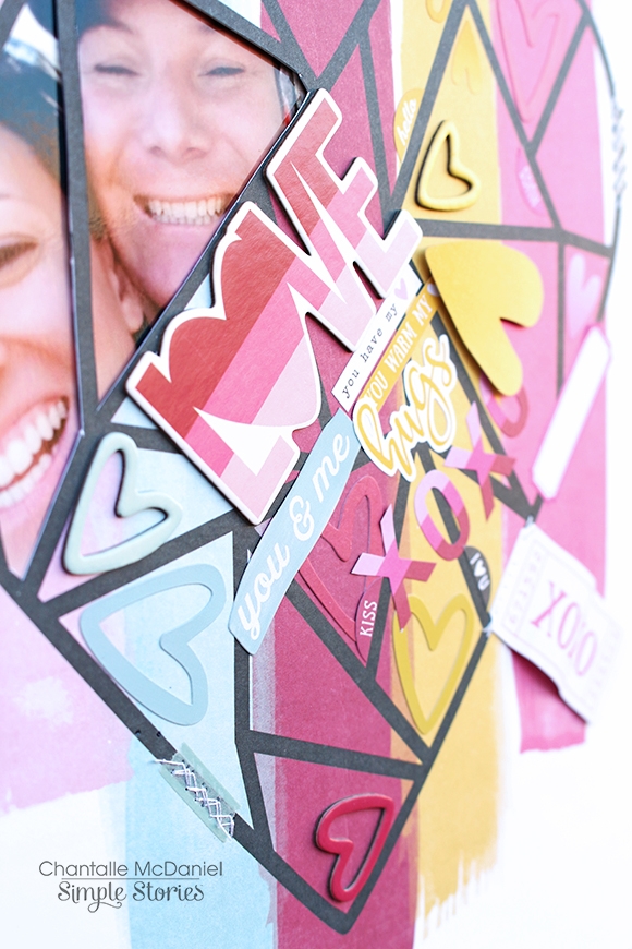
L❤︎VE
 
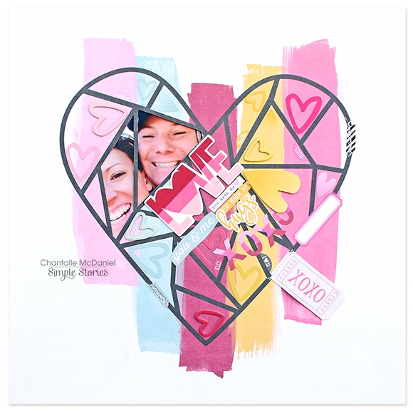
In stark contrast, this next page is super ‘clean’. I do feel myself wondering on a small level if it maybe needs a few more ‘things’, but you know what? It’s OK if it’s not the ‘normal’!
 
 
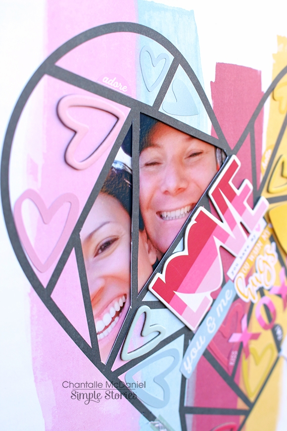
I had plans for a big photo and it just didn’t do it for me, so I went about trimming my photo down and cutting out some areas of a sheet of Love & Adore ‘With all my Heart’. I removed a teensy bit extra from the grid, so our faces could show through a bit better. It’s one of only a handful of really lovely photos of my DH and I, and I like the way it sits up in that left hand corner, sending the flow of the page down diagonally.
 
 
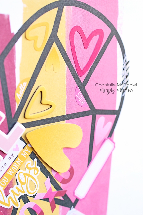
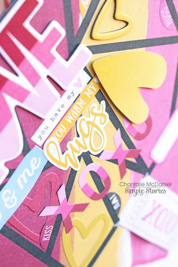
What followed was a hearty explosion! I’ve grabbed all the hearts I could find, in the stickers and ephemera in this collection and placed them in the matching area on the paper. I use this technique often and have kept the same colours together because I think this is a great way to add interest while keeping it less ‘busy’.
 
 
Here you can see how the heart cardstock stickers look different to the more matte finish of the heart stickers from the 4x6 Sticker Sheets and how both of those look different again to the heart chipboard and die cut shapes.
 
 
Another little detail on this page is the semi-circular shapes I have added at various intervals along the black grid line. I simply snipped the coloured part off from the little circle stickers in the 4x6 Sticker Sheets and used them in the co-ordinating coloured areas.
 
 
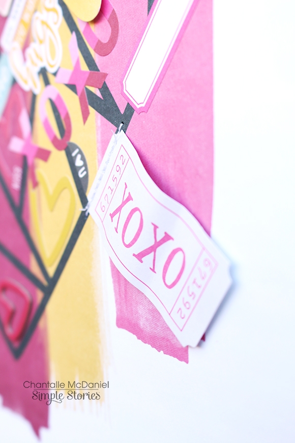
The last little touch was this ‘xoxo’ ticket shape from the Bits & Pieces pack. I’ve adhered it to the page with a wave-like shape, so it looks like a little fabric tag. I think it adds a bit of a 'stitched' feel to it. As if it could be something you would pick up at a market or something. Am I sounding crazy? Lol, maybe.
 
 
The point to both of these pages is just go where the moment is taking you. Have fun, enjoy the process and get those fingers busy!
 
Til next time!


Supplies

Pages