July 2016 Blog Posts

Hey there!  Missy here today, and I have two layouts to share with you.  I can’t get enough of the new Sunshine & Happiness collection!  I love scrapping with bright summer colors, and this collection is right up my alley.  I chose a sweet photo of my daughter for this page, and her pink shirt coordinated very nicely with everything.  I used a lot of yellow, orange and pink from the collection, so I used some aqua and turquoise acrylic paint and ink spray to create a big color swatch on my background.  I love how the other colors contrast against it.  I found a fun loopy cut file from the Silhouette Store and cut several of them out on my Cameo to use as a background design.  I wanted this layout to feel fun and festive, and I think it definitely turned out that way.

I knew I wanted to use the “Sunshine” sticker as part of my title.  I created the rest of the title in my Silhouette software using the Luna font and then cut the letters with different patterned papers.  I arranged the letters and then used a metallic gold pen to trace around parts of them.  I also used a pencil to make them stand out a little more.  I created a fun little cluster over on the right using some of the Bits & Pieces and some stickers. 

Here is a close-up of the loopy cut files.  I love how they turned out!  I used some shiny gold thread to machine stitch through them for some extra interest, texture and shine.  I added some white tissue paper behind my photo for an extra layer and raised it up with pop dots.  I added a few more die cuts & stickers as well as some tangled thread.

I fussy cut this cute sun & cloud from one of the patterned papers and used it as a background element.  One of my daughter’s nicknames is “Sunshine” so I can’t resist all these adorable sunshines in this collection!  It’s so fitting.

These balloons were the perfect embellishment for this area by the photo, plus the colors were spot on.  I also used a bit of blue spray ink and my small paint brush to give the edge of the cloud a light blue tint to make it stand out a bit more.  I finished it all off by tucking in more tangled thread for extra pops of color.

______________________________

For my second layout, I challenged myself to combine two collections to create a unique look.  I used pieces from Heart and Carpe Diem.  I was surprised at how pretty the two looked mixed together.  I highly recommend pulling two collections out and try to mix and match.  I love how this turned out.  My background paper is from Heart, and it is so pretty!  The ombre look was perfect for a background.  I chose a fun cut file from The Cut Shoppe and used papers from both collections to cut lots of those fun shapes.  I scattered and layered them on the background and then stitched them down with some shiny gold thread.  I did add a bit of gesso and blue and aqua spray inks and some gold paint to the background to give a little watercolor effect.  I wanted the mixed media to peek through all the cut file designs.

I knew right away that I wanted to fussy cut the “heart” from one of the Heart patterned papers and use it as my title.  I love how it looks raised up.  I also fussy cut that gold heart from paper.  I pulled a few alpha stickers from the Light Snap Stickers to finish the title and used gold thread to stitch through it.  I love the pops of black in these papers, and the Carpe Diem Clear Stickers made the perfect little additions for that.

I added a few of the stickers from Carpe Diem, and I also used more balloons my page.  Balloons are a happy embellishment, and I think they can work on so many pages!  Since my mom, my sister and I were about to go out together in this photo, it seemed like the balloons symbolize a celebration.  And that’s what it was!

Here’s one more look.  I used a few stickers from both collections here and added some black and gold paint splatters.  All those fun die cuts in the background made this layout come together fairly quickly.  Once your background is filled up, all you have left to do is embellish.

Good morning all. Brenda Smith here with you today to share a few pages in the my new Marigold Carpe Diem I'm using as a memory planner. 

First, I've packed my pockets full of the pocket cards from the Dashboards and Pocket Cards pack. I stored some of my most often used sticker sets in the larger pocket. I used the Carpe Diem pouch to add a bit of whimsy and sparkle to my planner and filled it with some gold sequins that I recently rescued from my boss's trash can. Who could throw away something that pretty?!

I used the backside of a dashboard insert to add some gold foil stickers from the Designer Stickers pack. The sequins won't be a forever fixture in that pouch but they're a fun addition for now! 

 
This memory planner spread covering the last week in June spilling into July was inspired by the fun angles in the Posh collection. Since I do not yet have the Posh scrapbook papers in my possession, I turned to past Simple Stories collections for my paper choices. The aqua and white is from Sunshine & Happiness and the navy and white polka dot is from Bloom & Grow. 
 
 
I decided to use some of my gold sequins from the pouch in the front to decorate these spreads. I find they add the perfect amount of detail with little effort. 
 
 
Sometimes I opt to share a cute story about my kids or sometimes I just talk about the everyday minutiae that makes our life what it is right now. I feel both types of memories are valuable and will mix and match on each spread without worrying about congruency. 
 
 
When working in my memory planner, I always do my month-at-a-glance at the end of the month. That way I can fill in the little squares with pictures from the corresponding days. I resized my photos in Photoshop but the same can be done in Word by simply dragging and dropping photos onto your document and resizing. 
 
 
I chose not to put any text on this month at a glance because I thought the pictures mostly spoke for themselves and I thoroughly documented our adventures this month through my weekly spreads (not to mention my pocket pages in my 12x12 album). The Instaquote Stickers are a quick and easy way to add pattern, color, and interest to your monthly page. 
 
The planners & accessories will be in stores before you know it, I can't wait for you guys to see how many improvements have been made to these planners!

Supplies

Hi there! It’s Shei on the blog today. I’m so happy to be back sharing two layouts.  Let’s get started!

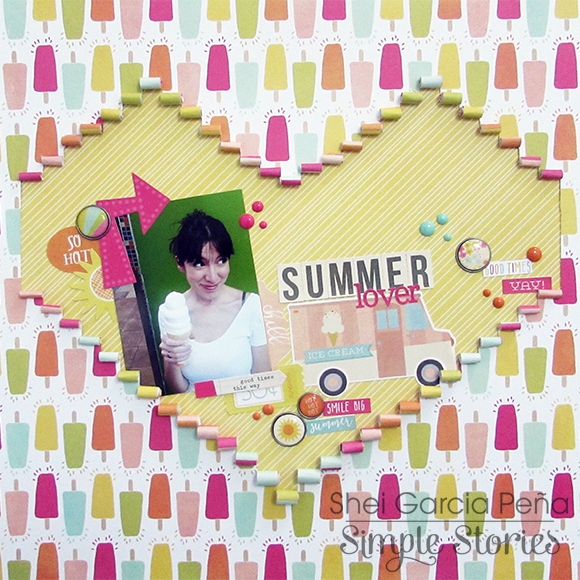
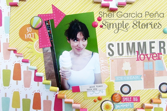
I used the Sunshine & Hapiness collection for my first layout. I chose a recent photo of me eating an XXL ice cream. I just love ice cream and for me summer begins when I eat my first ice cream. So this line is perfect to document this moment, ‘cause it's a very happy and colorful collection, perfect for summer pictures. 

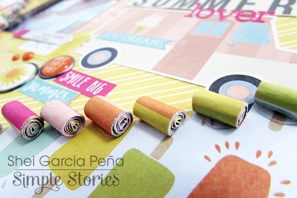
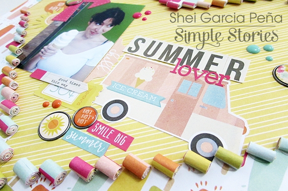
I used “Oh Yeah!” b-side paper as my background. I really like all these popsicles! I cut some stripes and I rolled them creating a heart and showing the “Lime Stripe” paper that I pasted on the back of the “Oh Yeah!” paper.

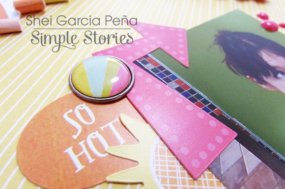
Then I glued my picture and I began with the embellishing. I used some stickers from Fundamentals Cardstock Stickers like the pink arrow, the sun or this super cute ice cream truck and some phrases from Expressions Cardstock Stickers. 

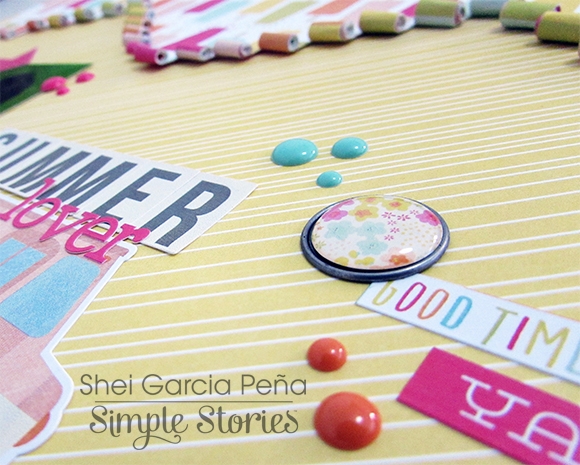
I combine letters from Fundamentals Cardstock Stickers and from Expressions Cardstock Stickers to make my title “Summer lover”.

I also added some of the self-adhesive brads (one of my favorite Simple Stories’ embellishment) and some colorful enamel dots.

________________________________

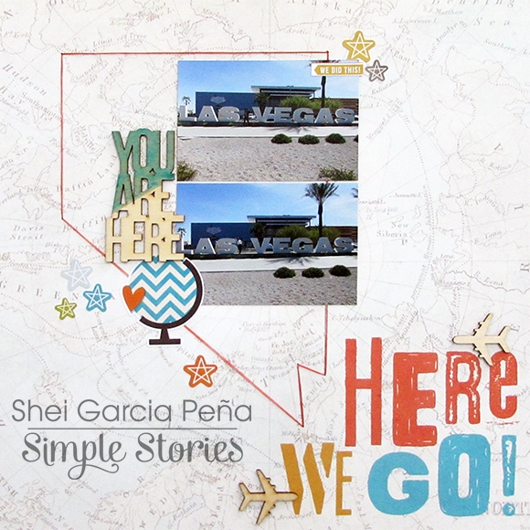
The next layout I’m sharing with you today was created with the “You are Here” collection, perfect for our summer travel projects. 

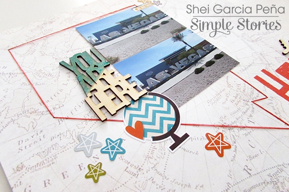
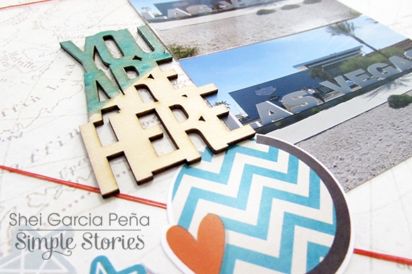
I started this page with the “Here We Go!” paper as my background. The pictures in this layout were two photos of our trip to Las Vegas (the funniest travel we’ve ever done!). So I decided to added a hand-stiched simple contour map from Nevada with orange thread to combine it with the colors of the paper.

Then, I used some elements from Fundamentals Cardstock Stickers for the embellishments like the stars and this lovely desktop globe. Also, I added some Wood Veneer to complete my layout. 

Thank you so much for taking the time to read my post! I hope you enjoyed my layouts! See you next month!

Never stop smiling! Kisses!!

Hi Everyone! This is Jennie and this week I was inspired by the red and blue colors and the outdoorsy fun photos to use the Bloom & Grow Collection.  

This week I had a lot of photos which for some people mean less embellishing but I can’t help myself and I went sticker crazy. I specially love the 4x6 Stickers and the phrases stickers! I just need to a little something extra to my photos.

The 4x6 Stickers also include labels which are perfect for stamping my weekly card. For the title and other details I used theExpressions Cardstock Stickers. The Expressions Cardstock Stickers come with 4 types of alphas and a bunch of phrase stickers.

The Photo Flips are becoming a staple on my pages. I just love the possibility of having a little extra room for photos or journaling.

This side was super fun! For the first time I used the Design 8 Pocket Pages. I used to be a traditional scrapbooker, but with pocket pages I get to document so much that I abandoned 12x12s. Once in a while it’s fun to do a mini layout like the one I made in the 6x8 pocket. In that 6x8 pocket you could also do a photo collage.

Embellishments clusters make me super happy. In this layout I used a lot of stickers, die cuts and enamel dots.

If you want to see how I put this page together check out the process video - https://www.youtube.com/watch?v=wXFIxQ97yqs

Thanks for checking out the post!

Supplies

Hello! This is Alexandra and today I'd like to share the pocket pages I made about our week in France. There were so many pictures I wanted to include I had to use several pocket pages and I used Simple Stories' Bloom & Grow collection.


★★★


First, let's take a look at the pages as they appear in the album...


★★★


and now, the pages one by one...


A page dedicated to our visit of Monet's house and garden in Giverny. I added a Photo Flip...


The second page is about the Louis Vuitton Foundation and was trimmed down.


The other side is about meeting my friend Sylvie in front of the Rodin Museum in Paris.


We visited a fabulous exhibit about the Impressionists in Normandy. I bought this postcard and added a few important points on the back of it.


The last page is mostly about our last three days in Paris and meeting up with my BFF Virginie and her family.


Thank You! 

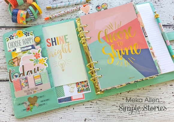
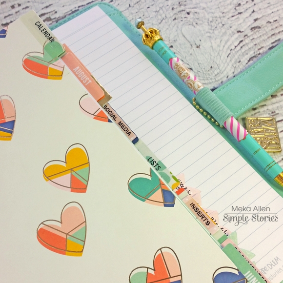
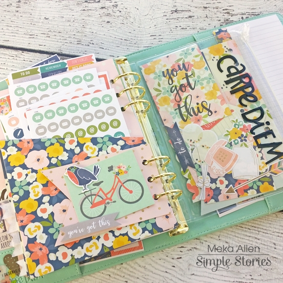
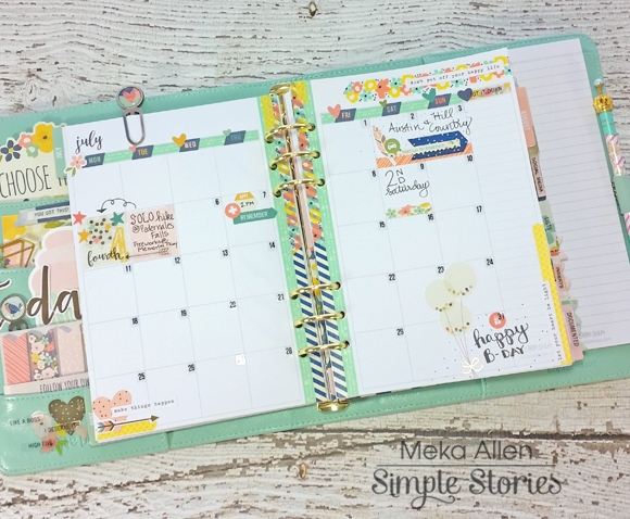
Hey, planner friends! Meka with you today to share my July Carpe Diem planner setup. I’m using the lovely revamped Robin’s Egg planner with matching insides and gold hardware, decorated with accessories from the absolutely beautiful new Posh Carpe Diem planner collection.  Posh has lots of totally new products, like fun Pocket Cards - they make decorating the front pockets super simple!

I’ve removed most of the months included in the Posh boxed set to make room for the coordinating A5 dividers. The Clear Stickers fit just right, and I added a few of my own (created with a label maker) to suit my needs.

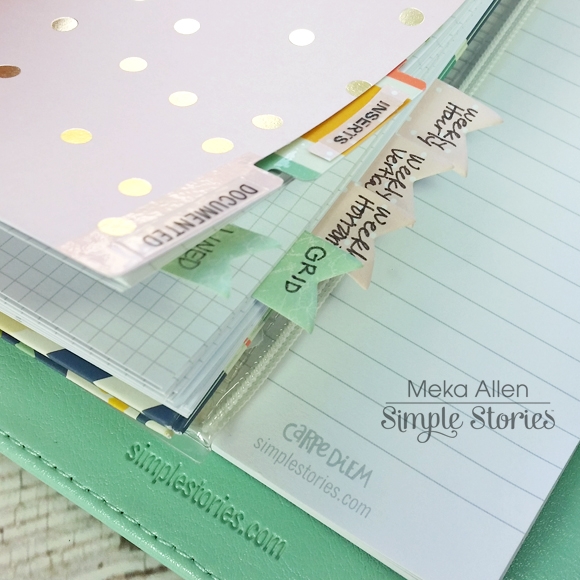
Behind the “Inserts” divider, I’ve added a few sheets of each of the different Planner Essentials Basic Inserts available - grid and lined paper - as well as several different planning layout options.  The new Page Flags are just right as temporary tabs for the various inserts.

Pocket Inserts and the Pouch are great places to house stickers, Bits & Pieces, and mini dashboards.

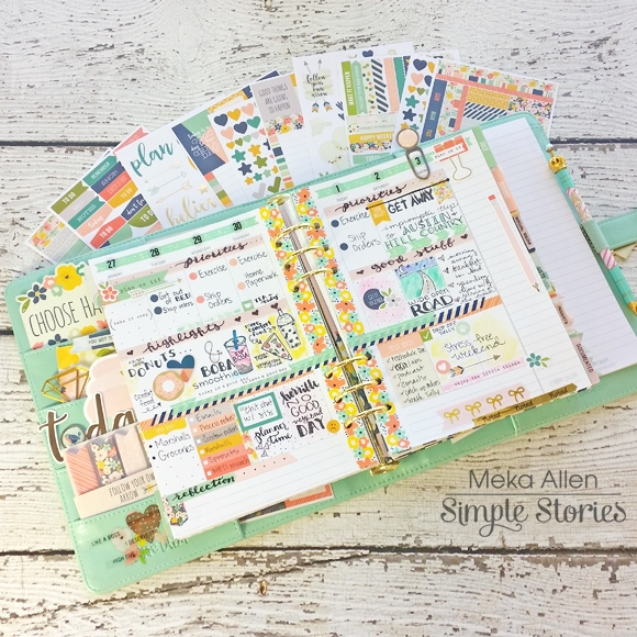
The Sunday-start July monthly layout has been transformed to Monday-start by first covering the horizontal weekday bar with thin washi from the Totally Chic Posh washi set. Then I cut apart a days of the week sticker from the Weekly Stickers pack, and adhered the individual days on top. Stickers from the Planner Essentials Clear Numbers pack worked great for the dates.

For last week’s layout, I couldn’t wait to play with the new Vertical Weekly Inserts. I dove deep into Posh embellishments -- Bits & Pieces, stickers, and washi galore! Doodles and hand-lettering, gave the layout a personal touch. The new 140gsm weight of these inserts hold up well to marker and watercolor accents, with no bleeding through to the back. 

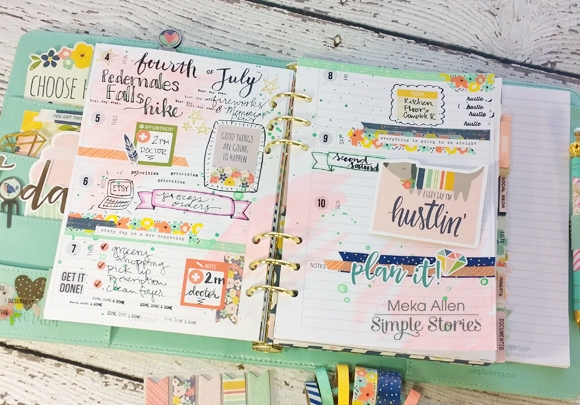
For this week’s layout, I chose the Weekly Horizontal Inserts (with the same 140gsm weight). After applying watercolor as a base layer, I added the details of my week with more Posh embellishments. Did you notice the redesigned horizontal format? These are undated like all Carpe Diem inserts, but the new circle space for the date matches up perfectly with the Clear Number Stickers.

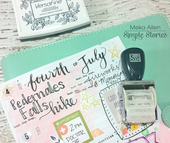
My favorite part of this week was getting to use the new Planner Essentials roller stamp. July 4th was a fabulous day, so I went to town stamping “best. day. ever.” all over it!

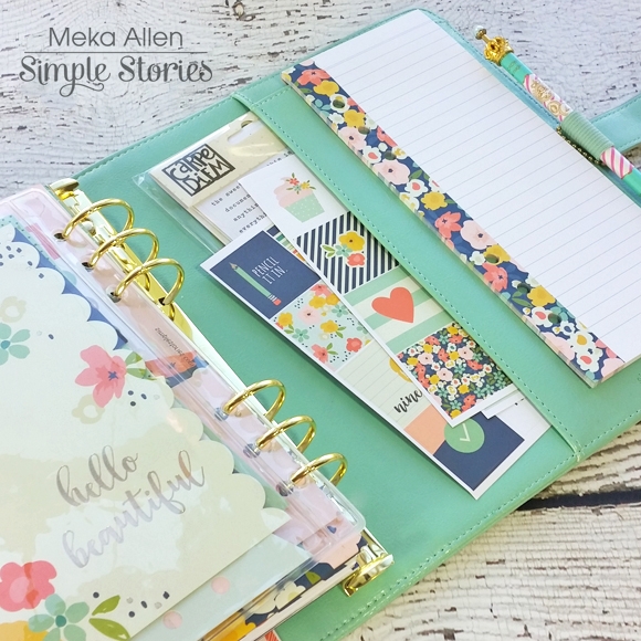
The last little nugget of goodness is the new set up for the back of the planner. There’s now a large pocket that’s great for housing extra sticker sheets, the new Carpe Diem Doc-It journal (not pictured), or loose papers. The smaller pocket accommodates the Posh bookmark tablet for quick notes and lists.

You gotta agree with me that Simple Stories knocked it out of the park with their latest launch! So many beautiful accessories, décor, planner upgrades and the drop-dead gorgeous Posh planner collection—what’s not to love? Be sure to visit me on Instagram (Instagram.com/yespleaseplanning) to share more Carpe Diem planner love!

Hello scrappy friends!  Laura here with you today sharing two new layouts using two fabulous collections!
 

I Heart You

I used the Heart collection for my first layout.  I just love the colours and sweet theme of this collection and couldn't resist pairing it with a photo of our puppy.
 

I started my page by die cutting hearts from a variety of patterns and adhered them to my background, to mix things up a bit I used one of the hearts as a stitching template and added in some hand-stitched hearts. I really love the water-colour look of this patterned paper and so I liked being able to leave more of it visible through the open hearts.

From there I layered my photo onto a couple of layers of patterned paper, and some die cut circles.
 

I focused on a title next, which is something that I often "wing" as I finish my page, but this time I really wanted to used the "heart" sticker, I love that it looks glittery.  I flanked it with another sticker that I cut up to finish off my title.
 

I kept my embellishing to a minimum (well for me anyway, lol) adding a small cluster to the top left of the photo.
 

I also added in these great wood veneer hearts, from the "Life in Color" collection to each of my stitched hearts, and then topped them off with a navy enamel dot from the "Bloom and Grow" collection.
 

I also added a small cluster to the lower right side of my layout, I really love the way the colour of the wood veneer meshes with the gold-yellow colour of the Heart collection.


Take me to the BEACH
 

This layout is a little "more", more pasterns and embellishments and much more vibrant and was so super fun to create! I started by cutting a few circles from this fun orange polka dot paper and stitching them to my background.  Then I layered up my photo with a few of the cut apart cards and some foam dots.
 

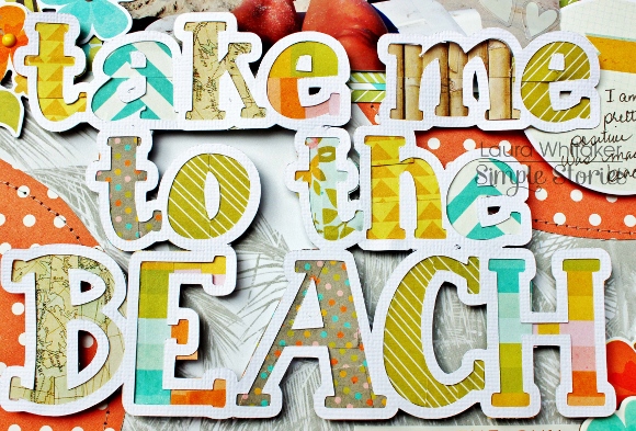
I just loved the Washi tape from this collection and wanted to find a way to use it all! Ha!  I created this cut file to use as a large focal point on my page.  I covered the insides of each letter (the part that you might discard) with a variety of Washi tape patterns.  I so love how it looks!
 

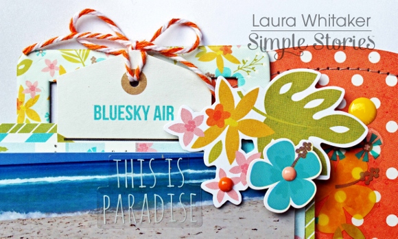
And then I added in my embellishments.  This time going bold with these fabulous summery colours! I adorned the left side of my photo  with a large cluster.
 

A more modest cluster sits atop my photo.
 

And a smaller cluster adorns the bottom of my title.
 

Wanting to add a bit of journalling necessitated another small cluster. Simple Stories always has fabulous stickers and "bit and pieces" for their collection that are so perfect layered together, and make this fan of clusters so happy!

Supplies

Good morning friends! If you haven't yet seen the planner collaboration happening between The Reset Girl and Simple Stories, you're going to want to check this out.  Go ahead. I'll wait. Now, isn't all that stuff GORGEOUS and so different from everything you're seeing on the market today? But you might be saying, "I'm not a planner. I don't need that stuff." Not so fast! You might change your tune when you see how versatile these supplies really are! 

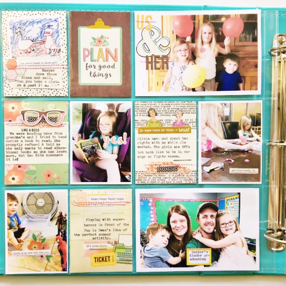
I created a pocket page using only The Reset Girl supplies that will be shipping with the planner release at the end of July, early August. The base of my page is made using a set of 12 pocket cards  intended for the 3x4 window pockets of the TRG Carpe Diem planners. 

Combined with the 6x6 Sn@p Basics Pad, I transformed the cards to fit my needs. I trimmed down some graph paper to 2"x3" from the pad to serve as journaling spots on patterned cards. I used some die cuts from the Bits and Pieces pack to cover up some parts that were too planner-specific for my everyday pocket page. 

The card with the ladies on it actually says "Planner Girl" but I covered it up with the graph paper and word art. The pennant and "happy happy happy" card are covering up another planner-specific phrase. 

I knew I wanted to keep this pages simple and fairly straight-forward since I didn't have many dimensional embellishments to work with so I added visual interest and texture with some machine stitching in pink thread. I find that I can take a "meh" page and transform it into something I really like just by adding stitching. 

The Planner Basics StickersIcon Stickers, and Word Label Stickers are the perfect embellishments for photos and cards. I found that there were plenty of phrases and icons applicable to everyday life, including the "finding my happy" sticker on the 4x6 photo. 

The rolls of washi tape that coordinate with this line are perhaps one of my favorite things from this release. You can never have too much washi tape! I just tear off small pieces and use as part of my layering embellishments. I commandeered some tags from the Bits and Pieces pack to use under my photos for journaling. When I ran out of those, I cut more small bits from the 6x6 Basics pad. The Clear Stickers make great faux stamps for your photos (the "SMILE" camera sticker seen here). 

 
Don't be afraid to think outside of the box with your supplies and repurpose them to make them work for you!

Pages