Leah O’Neil's Blog Posts

Hello again crafty  friends! Leah here to show you how I am using one of my Doc-It journals as a gratitude journal. Did you know that gratitude boosts levels of dopamine and serotonin in your brain? Just the act of thinking about what you appreciate can trigger these “happy” chemicals in your brain, making you feel happier.  November is the month of the Thanksgiving (in the USA) and often inspires many of us to spend more time reflecting on what we are thankful for. This month seemed like the perfect time to start a daily gratitude journal.

In the past, I have tried to incorporate documenting gratitude into my daily routine, but I have failed time and time again with establishing it as a habitual practice. I am just recently realizing why that keeps happening. I don't know if any of you feel this way, but when I think about what I am grateful for, my brain immediately goes to BIG, general ideas, such as family or my health, or the roof over my head. While I truly am SO grateful for all of those more obvious things, thinking on such a large scale really limits my list. When you are trying to establish a daily gratitude practice, you start running out of ideas pretty quickly if you are too generalized. My dear friend Tiffany spoke to me a little about how she has been documenting her gratitude and I have found her method to be quite helpful for me.  At the end of the day, she reflects back on that day and asks herself, “what is the best thing that happened today?”  Then she writes it down. This practice has really helped me get more specific with what I am feeling grateful for, which makes the process a little more exciting because I now have more variety in my answers. This method has also become a wonderful way to document memories! You will notice how my daily pages so far have a scrapbooking vibe, which is making this project feel even more special, by including mementos and photos with each gratitude message.

For this journal, I started with the Posh Doc-it journal and covered it with one of my favorite 12x12 papers from the Hello Fall collection. I added watercolor to the background and then layered some gold glitter washi tape, tissue paper, a small square SN@P! piece, and a couple of those beautiful leaf die cuts from the Hello Fall collection. I used foam adhesive under the square to make it pop off the background.

The bottom is just torn pieces of patterned paper that I layered and inked to add a little dimension. In the corner, I inked a doily and added some Hello Fall stickers and twine.

The inside cover and first page of the journal act as a cover page. On the left side is an element from a page in the Hello Fall 6x6 paper pad. I felt it was appropriate because I am grateful for all of the things listed (which is why I love autumn so much)! I used some leftover paper scraps to layer behind the words. I inked the edges of the yellow paper to give it a burned look and added some string from my stash that reminded me of sweater material, which I thought gave the layers a “cozy” feel. Last but not least, I punched a tag out of some orange patterned paper and added twine and a clear sticker from the Posh collection.

On the first page of the journal, I used more of that paper I covered the front of the journal with, but I painted the leaves with different colors of watercolor paint. I also painted some of them with a gold shimmery paint. I drew a border around the paper with a fine point sharpie. On top is a Hello Fall SN@P! card and the letter and number stickers are from the Posh collection. 

 I then added a cluster of embellishments: a gold doily, enamel dots, a tab, word strip stickers and washi tape. 

The bottom part of the page has a picture of my entire family and the gather together words are fussy cut from a 12x12 paper in the Gather Together collection kit.

I am only documenting a couple of days from the end of October because my husband and I celebrated our first wedding anniversary over Halloween weekend. I wanted a chance to scrap those memories and express my gratitude on those special days.

The first layout in my gratitude journal is highlighting the date night that kicked off our wedding anniversary weekend! I documented the memories from that night with some photos, movie tickets and journaling. On this day, I was thankful for date nights! All the décor used in this layout is from the Happy Haunting Collection kit, except the washi tapes. I LOVE adding watercolor to my layouts because it adds so much vibrancy and interest! The paper in the Doc-it journals is very thick; it takes the watercolor so well and doesn’t bleed at all!

The next layout is from a trip to a Halloween event that my husband and I took with my youngest sister. Even though the event itself was not all that we expected, the spooky atmosphere and the company made this night a blast. On this day, I documented the experience and expressed gratitude for my sister’s wild, super goofy and amazing personality. She is one of the funniest people I know and we took so many crazy photos that night- this is only some of them!

All of the décor is again from the Happy Haunting kit. I fussy cut the date and the crossword pieces from the 12x12 elements pages to create die cuts. I added lots of watercolor to the background to allow the die cuts to pop off the page.

I really love how the crossword looks with the watercolor peeking through!

Instead of gluing the card at the top of the layout down, I stapled it onto the page so that I could add journaling underneath.

The next layout is really special. This one went a little against the grain in that I didn’t journal about anything from that specific day. We had to work on our actual anniversary, which is why we spent the weekend celebrating. So for this day, I printed out some of our wedding photos and journaled about how thankful I am that my husband challenges me and truly makes me a better person.

This layout understandably has a more romantic feel than the last few pages. I used the beautiful Posh collection for this one. I mostly used SN@P! pieces and die cuts from the collection and used several of my paper punches to punch different shapes out of the 6x6 paper pad to layer behind the photos. I used my scalloped edge punch a lot in this layout, which was inspired by the white doily that spans both pages underneath all of the photos. It is a large square doily from my stash with a scalloped edge. 

I really like adding ink to the edges of most of the layers because it adds dimension by creating some separation between the layers. In this case, it makes them stand out against the white background as well. I also frequently add faux stitching to my layouts, like I did to the vellum circle, because I love how it looks and am often too lazy to do the real thing.

How lovely are the clear stickers over the photos?! 

I really hope I am able to continue diligently with this gratitude journal! Many of my upcoming layouts are only going to be one-page, the two-page layouts will be reserved for special occasions. I hope you will follow along with me on this journey and try creating your own gratitude journal, or just use a notebook or your planner to write down something you are grateful for every day. Remember to stimulate those happy brain chemicals! Follow me over on Instagram to see my upcoming journal layouts!

With love and gratitude.

Supplies

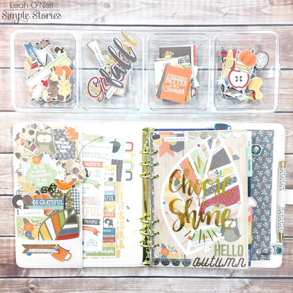
Hello friends and hello fall! Leah here to show you how I’ve added touches of my favorite season to my planner using the Hello Fall collection. I cannot say enough just how much I love my Ivory Carpe Diem planner! I know darker colors tend to be more popular for fall and winter, but the warm neutral tone of the Ivory really compliments and emphasizes the beautiful colors in all of the Simple Stories Fall and Winter collections. Doesn’t the Hello Fall collection look so warm and cozy against the Ivory?!

The Hello Fall collection is full of adorable seasonal designs and sweet little woodland creatures!  My favorite design is the leaf with all the colors of the collection in it. You will notice the leaf design reappears several times throughout this post!

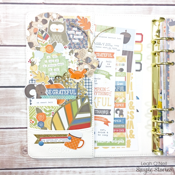
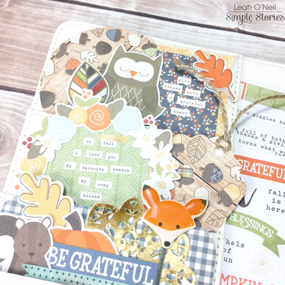
In my front pockets, I used several pieces from the SN@P! Pack: a couple of the 2x2 cards with fun fall sentiments on them, a couple of the 3x4 cards to provide patterned backgrounds, and several of the ephemera pieces from the pack. The larger leaf in the bottom pocket was cut out from a card in the pack as well. If I wanted to, I could decorate my entire planner with one SN@P! Pack because there is so much product in each one!

I also punched a tag and 3-inch circle from papers in the 6x6 paper pad for layering, and added some of the darling die cuts from the Hello Fall Bits and Pieces pack. How cute is that fox clip?! The decorative clips are one of my favorite products in all of the new Simple Stories collections!

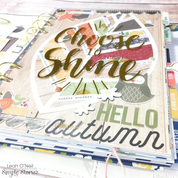
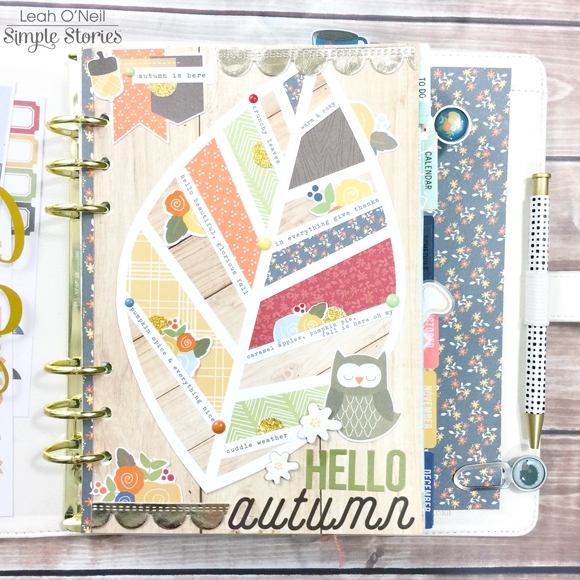
Under the clear “Choose to Shine” dashboard that came with my planner, I made a fall-themed dashboard to peek through. When I saw the “Celebrate Fall” 12x12 paper with that gorgeous leaf design on it, I KNEW I wanted to do something special with it! However, the leaf was too big to fit in my A5 planner. So I found the same page in the 6x6 paper pad and cut out the leaf so I could turn it to fit on the page. I cut down the “Falling for You” 12x12 paper to use as a background to adhere the leaf to. I added very little extra décor because I didn’t want to take away from the beautiful design, but I love how the little details turned out!

I arranged some of the word strip stickers from the Hello Fall sticker pack into the white vein areas of the leaf. All the sayings are fall-inspired! I also added some enamel dots and cut a few floral stickers in half and tucked them around the word strips for a little more interest. Up at the top of the page, I added the die cut flags from the Bits and Pieces pack and an acorn sticker. The gold scalloped ribbon is from my craft stash.

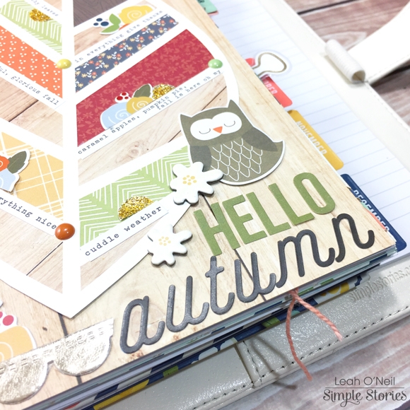
At the bottom of the dashboard, the owl is from the Bits and Pieces pack and the little white flowers are from the chipboard sticker sheet. The letters that spell out “autumn” are from the Hello Fall 12x12 cardstock sticker sheet, and the green letters that spell out “Hello” are letter stickers from the SN@P! Color Vibe collection. Whenever I stack letters like this for a title on a page, I like to combine different fonts because I think the contrast creates a bolder statement that attracts the eye.

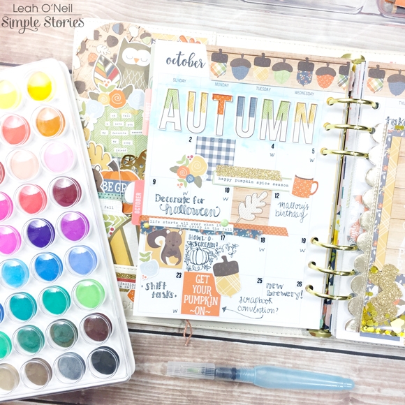
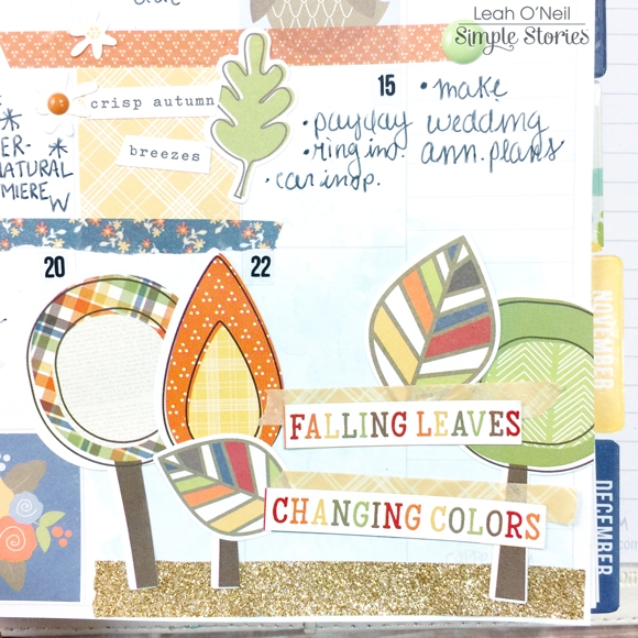
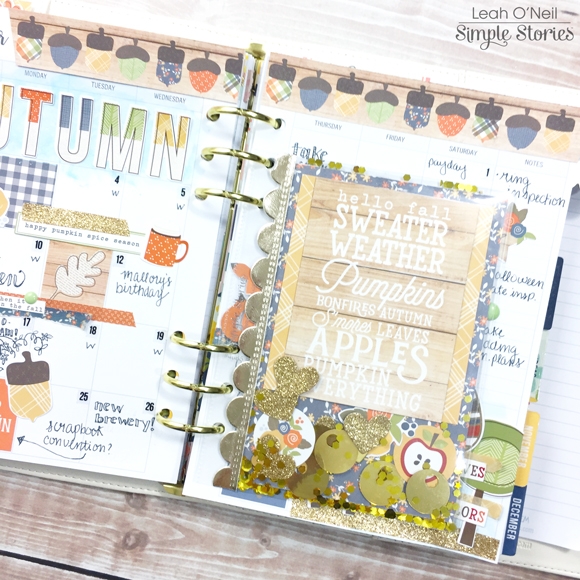
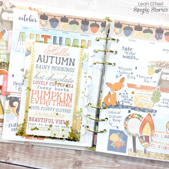
My October monthly pages were a blast to create! I love adding a little mixed media into my planner here and there. I mixed a few watercolor shades to create the light blue shade that you see under the big alphas that spell out “Autumn.” These alphas are from the 12x12 Cardstock Sticker sheet.

I decorated the rest of the layout with stickers from the Hello Fall sticker pack, the Hello Fall washi tapes, and die cuts from the Bits and Pieces pack. I brought more of the blue watercolor into the bottom right corner of the layout to create some balance. The acorns across the top of the pages are cut from one of the elements sheets in the 6x6 paper pad.

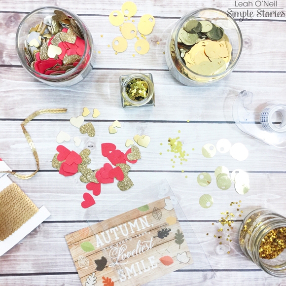
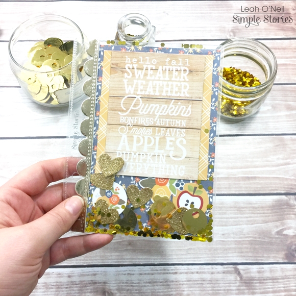
The next decorative fall element I made for my planner is a shaker pocket! It was SO easy to make! I started with a clear 4x6 pocket page, chose a few of my favorite SN@P! cards, and gathered a few sparkly things from my stash.

For the front side, I layered a few cards from the SN@P! Pack and just started putting various gold sequins and glittery hearts into the pocket, as well as couple of small die cuts. To seal the top, I used plain old, clear Scotch tape. I added a little more of that gold scalloped ribbon along the side as a finishing touch.

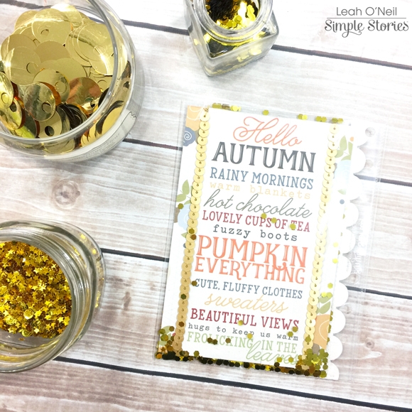
For the back of the pocket, I chose another one of my favorite 4x6 SN@P! cards and added some gold sequined string. I didn’t add any other bling into this side of the pocket, but some of the glitter came through from the other side and I love it!

Here’s what the shaker pocket looks like in my planner! How sweet, right?! 

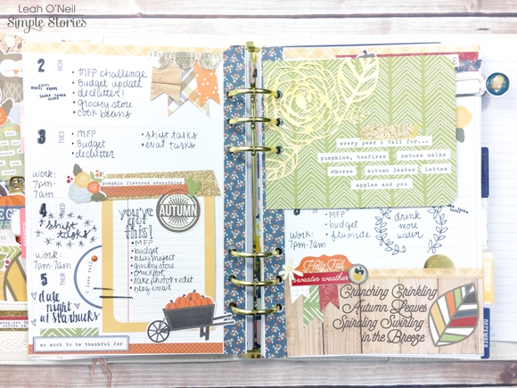
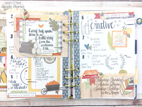
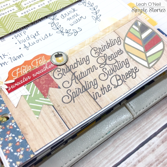
I am really feeling inspired to use the Hello Fall collection throughout the season on all my weekly layouts! For the first week of October, I used lots of Bits and Pieces die cuts and the Hello Fall washi tapes. I cut all the flags from different patterned papers in the 6x6 paper pad. The notecard on the left is from the SN@P! Pack, as is the green card on the right with the flower. The flower itself is from Heidi Swapp and sprayed with her gold Color Shine spray. I cut about half an inch off the length of the card and rounded the corners so the card became part of the layout, rather than covering half the page.

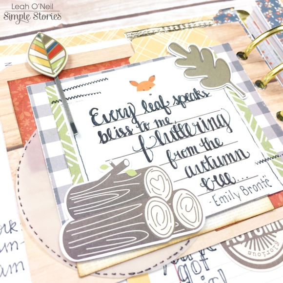
On the other side of the green card, I had a lot of fun with lots of layering! I started with a 3x4 SN@P! notecard and cut it to be slightly shorter to fit the space better. I then used several scraps from 6x6 papers I had cut earlier to start layering behind the notecard. To add some dimension, I inked the edges of the orange paper scraps. I also used a 3-inch paper punch to punch out a vellum circle to tuck into the layers, and added some faux stitching around the edge with a black sharpie pen. I added a couple of die cuts and a decorative paperclip, and stamped the stitched pattern from The Reset Girl roller stamp. I then chose a fun Fall quote I found online and lettered it onto the card.

The right side of my weekly layout has more Hello Fall stickers, die cuts and washi tape.

The bottom of the page is a strip cut from a paper in the 6x6 paper pad. I used some washi along the top, added a die cut tab, a decorative brad, a couple of cardstock stickers and more of the paper flags I made with paper scraps.

I really cannot get enough of this collection! I will be happily using it all season! The designs are so beautiful, and all the quotes perfectly capture the magic of autumn. If you haven’t “FALL-en in love” with this collection yet, go check out the Carpe Diem Planners Instagram for some more deliciously fall-themed planner décor! You can also check out my Instagram to see more of my Hello Fall projects coming up!

SaveSave

Supplies

Hello everyone! Leah here with you today to show you how I’m using my planner to organize my finances. I know what you’re thinking…what a boring topic, right? Finances can be very overwhelming to talk about. There are tons of useful tools available to manage your finances electronically, but for those of you like me, who also like working on paper, I want to show you how I have set up my Financial Planner.

At the beginning of the year when I was writing out my goals for 2016, two of the biggest ones were relating to money, mainly paying down as much debt as possible and saving up a down payment for our first home. I always had the intention of setting up a separate planner specifically for managing my budget and debt repayment. I have spent several months deliberating how I would organize this planner and what components were necessary to help me accomplish my goals.

I would like to be very candid with you all. When I got married, my husband and I both brought significant debt to the table. Between school loans and credit card debt accrued during trying times when we were less financially stable, I had to accept that the financial goals I had for our future were going to take time and unwavering diligence to achieve. The last several months, we have made several cut backs so that we could aggressively pay down our debt. However, it did not take long for me to realize how much little purchases can add up. We were living so frugally, or so I thought, but our debt did not seem to be decreasing. I decided it was time to finally sit down and set up a tangible resource that would allow me to organize a budget, closely monitor spending, and create visual incentives to keep me encouraged and on track. As I started setting up this planner and tracking our spending and debt repayment, I realized a few things: 1) We had actually made quite a lot of progress in the last few months, but 2) our total debt was much larger than I originally thought, and 3) we were still wasting quite a bit of money on frivolous spending. At this point, I was feeling very overwhelmed. However, I was looking forward to getting everything down on paper.

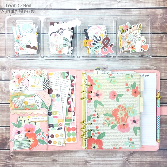
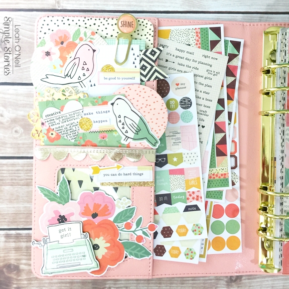
To make this planner feel a little less daunting, I started by creating some decoration. The pockets of my Ballerina Pink Carpe Diem planner were clearly WAITING to be decorated. How could I deny them? The Reset Girl collection has SO much ephemera (my favorite thing)! I used pieces from the Bits and Pieces pack, the Big Bits and Pieces pack, the SN@P! pack, and patterned paper shapes punched from the 6x6 paper pad.  I loaded up the larger secretarial pocket with sticker sheets from the collection that I thought would be most useful in this planner, mainly the more functional stickers. Fortunately, Simple Stories makes super cute functional stickers so no need to sacrifice prettiness for function!

The 12x12 patterned papers available in The Reset Girl collection have such beautiful florals and patterns! I used some of my favorites to create a few dividers.

I ordered the clear laminating stickers for my file tabs online and am still waiting for them to come in, so I cannot label my tabs quite yet. If you’d like to see how I make my dividers, including how I create my tabs and label them, you can check out this older blog post for details.

Even though my tabs aren’t labeled yet, I will walk you through my setup. I put my favorite divider up front and center. The first section will be titled “Inbox.”

This section has a folder that will hold receipts and important papers/notes that need to be filed away later.

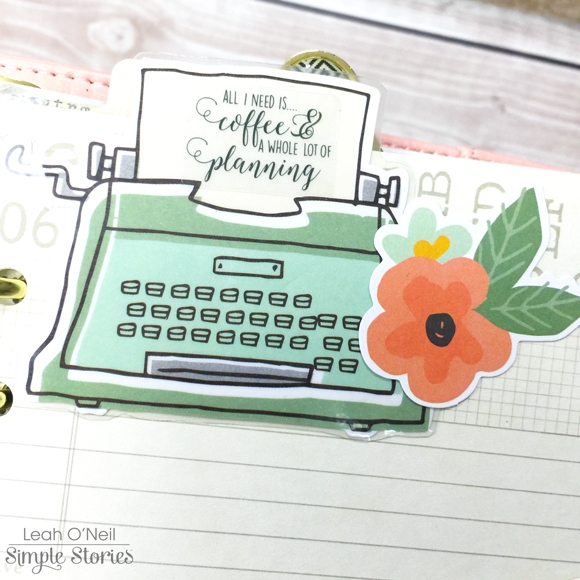
I love this big typewriter from the Big Bits & Pieces so much that I laminated it for protection so it can peek out at the top of my planner. The clear sticker quote fits perfectly on the typewriter page. How pretty is that font?! I also added a little floral die cut.

On the bottom of the folder, I layered some washi tape under a pencil die cut and word strip sticker, and embellished with a chipboard flower. I also punched a banner out of a patterned paper from the 6x6 paper pad.

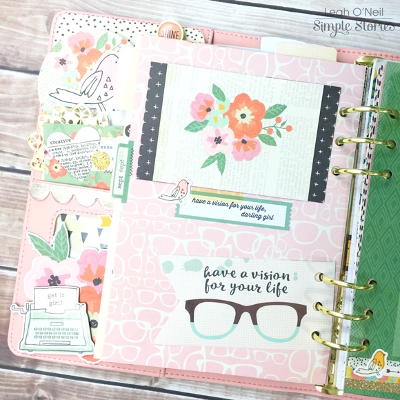
Below is an insert that came in the planner and it has a vision board design on the other side. I actually flipped this page upside down so that the spotted pattern was on the front and the vision board was on the back. I laminated this page so it can act as a dashboard. I can change out the card on the front easily or add sticky notes if I want.
The page below originally had text on it (it was upside down since I flipped it over), so I covered up the words with the pink planner die cut. I decided to turn this page into a vision board for my financial goals. Because the page is laminated, I can change out my goals if they change. Most of them are long term for now, but I might change them to be shorter term goals at some point. I added all the décor after I laminated the page, so most of it is removable if I want to change it up later as well. I love having so much flexibility!  All the décor I used is either The Reset Girl washi tape or ephemera from the Bits and Pieces packs.

The next section in my planner will be titled “Spending.” This section has the monthly calendar and vertical weekly inserts included in the Ballerina planner. At the front of each month, there is a habit tracker that I am using as a “no spend” chart for September. I get a gold circle on the days where I spend less than $20 on “extra expenses” I do not need (not including re-occurring payments like subscriptions and membership fees).

I added minimal decoration on this page and the page next to it. I used a card from the SN@P! pack, a couple stickers and some washi. The flag with the glasses came in the Reset Girl Dashboards set.

As we get further into this section, you will see less and less decoration. The calendar inserts are where I start getting into the nitty gritty of my budget and spending. Crunching numbers and maintaining discipline in tracking this area of my life is difficult enough without adding pressure to decorate. Plus, I want to keep these pages neat and tidy.

On the monthly inserts, I used a ruler to draw a diagonal line through each day. The number highlighted in mint is the total amount of money I had to spend on rent, bills, groceries and other necessary expenses. The number highlighted in pink is total money spent on things I do not need for the day. At the end of the month, I will add up the amount spent on “needs” versus “wants,” and my goal is to show a decrease in money spent on “wants” each month. In the notes column, I have a list of upcoming expenses I am expecting this month. I also have an area where I will record the total amount paid towards credit cards and the total remaining balance left on all credit cards. At the bottom of the column, I have drawn a jar where I plan to record how much I am saving throughout the month – the goal being to save $50 a week.

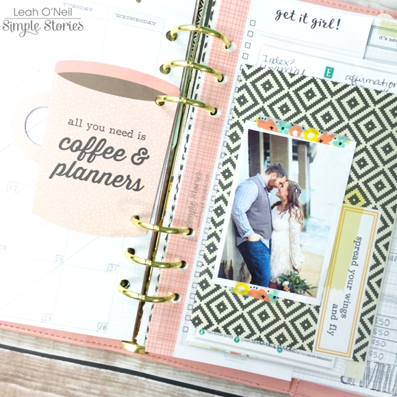
I am pretty excited about this next idea I’m going to show you. I am using a 4x6 clear pocket insert to hold receipts accumulated throughout the month. I will be using the receipts as well as online banking to track my spending in detail on the weekly inserts, so I needed somewhere to store these receipts. I used a couple of 4x6 cards from the SN@P! pack to make the receipts less of an eye sore. The coolest part about using a clear pocket here is that the slick surface allows me to stick things to it easily. On one side, I used some washi tape to hold a picture in place, which I can change out anytime. I stuck a few sticky notes onto the other side.

The cute pink coffee mug is from the Reset Girl Dashboards set. I also added a page from the bookmark tablet for notes/lists.

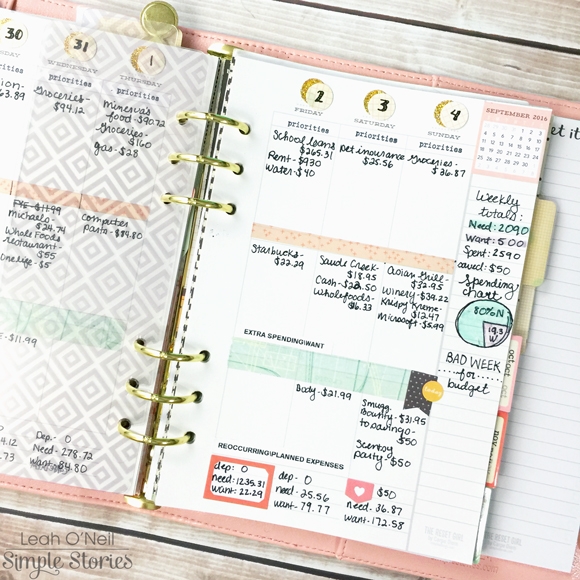
Moving onto the vertical weekly inserts, this is where I am tracking itemized spending in detail. The vertical inserts are perfect for this because I have divided my spending into 3 categories. The top box is for priorities, things I HAVE to pay. I labeled this box using the roller stamp from the Planner Essentials collection.

The middle section is for “extra spending/wants,” things I do NOT need. Sadly, I am off to a bad start for this month due to a weekend spent with friends and family and eating out. The bottom section is for re-occurring payments like subscriptions and membership fees. This is also where I will list planned extra expenses, like birthdays or other situations that might call for extra spending. This section will also be classified as “wants.” I love the few lines at the bottom of each day because it gives me a place to calculate totals. The first line is where I note total deposits to checking/savings accounts. The second line is the total spent on “needs,” the sum of expenses in the Priorities box. The bottom line is the sum of the expenses in the middle and last box for each day, the “wants.” These daily totals are the numbers I carry over to the monthly calendar each day.

In the notes column on the right, I have totaled up the numbers for the whole week. I created a visual demonstration using a pie chart to illustrate percent of spending on needs versus wants for the whole week. Ideally, the percent spent on “wants” would be much less. This planner is still a work in progress. 

For now, I am just tracking spending for September. At the end of the month, I am going to use those numbers to generate a monthly budget and savings plan. Once I have a budget set, I will report whether I stayed in budget or went over budget in the bottom of the notes column each week. The last section in my planner is dedicated to Debt Repayment tracking. I did not take pictures of that because it has too much personal account information.

Below is a peek at my essentials for daily financial planning: a good cup of coffee, a bag of erasable pens and highlighters, a couple washi tapes, my planner, and my phone. I use my phone for a calculator and to view my online banking.

When I started this process, I felt so overwhelmed. Now that I have this planner set up, I feel like I have a plan of action and am actively working towards reaching my financial goals. The most important thing to remember in achieving any difficult goal is that it’s a journey that takes time and commitment. My mantra right now is “One day at a time.” I can do this! What is your biggest goal for 2016? Have you considered setting up a planner specifically for helping you accomplish that goal? I love being able to take out this planner and dedicate intentional time working towards specific goals. If you have any questions about my financial planner setup, please ask here in the comments or hop over to my Instagram. I will be happy to give more details!

SaveSave

Supplies

Pages