Hi everyone, Odessa here with a cute mini album I’ve been working on. I love to take photographs and have a bunch that I just love from our summer camping adventures so far this year so I decided to print some of my favourites and put them together in a 4x6 SN@P! album with the Simple Stories Happy Trails collection. We’re all about camping in my family so when I saw Happy Trails I knew it would be perfect for documenting so many of our summer adventures!

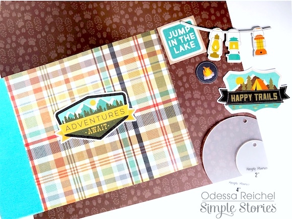
I started out by embellishing the cover of my album. I love how the chipboard covers of the 4x6 SN@P! albums can look good plain or are super easy to embellish. I picked the fun plaid print from Happy Trails and used one of the Bits & Pieces to make a simple yet perfect cover for family adventures.

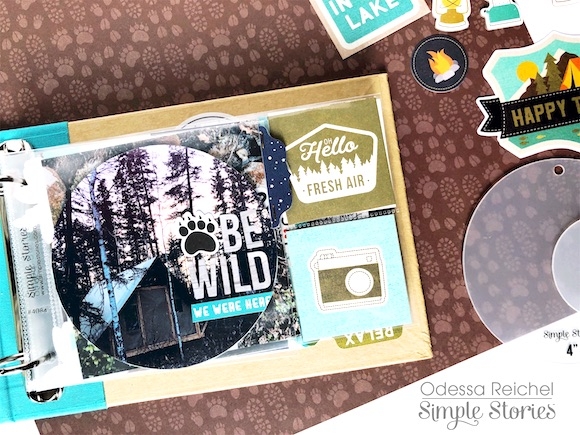
I love circle photos! I used one of the Circle Photo Crops to cut a 4x4 photo into a 4x4 circle and stuck it in a 4x4 square protector to create a page with a bit of depth from the empty space around the photo. Layers are so much fun in a mini album and that empty space is a great way to add some in. I added some alpha stickers and a word sticker along with a little tab on the edge from the Combo Sticker sheet.

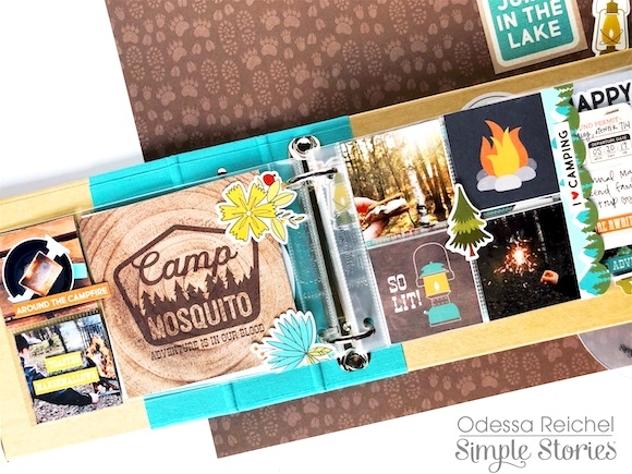
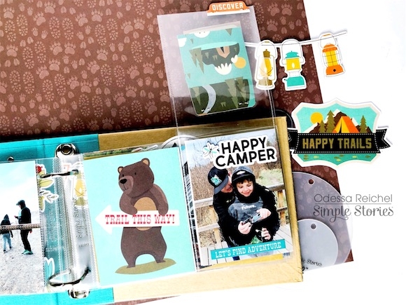
I like to mix in lots of different photo, page protector and journal card sizes in a mini album as well and this page has a bunch! There are some mini 2x2 photos along with a 4x4 journal card on the left. I used some of the stickers from the Happy Trails Combo Sticker sheet on the outside of the protector so they went over the edges of the pocket for a bit of fun.

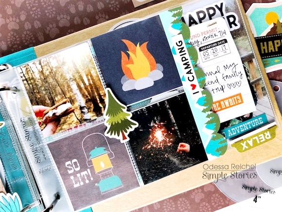
On the right side I cut down 2 of the 2x2 pockets on the page protector so it was square and filled it with some fun 2x2 campfire photos and journal cards. I stuck a chipboard sticker right in the middle of the pocket and then used the scalloped border from the Combo Sticker sheet on the edge for some more layers! I like to add things to the edge of smaller protectors to make them a bit more obvious.

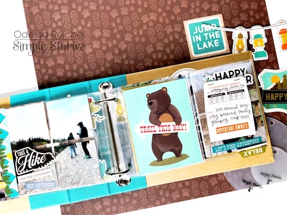
On the other side of the smaller protector I cut a 4x4 photo into smaller squares and put them in the protectors for a tiled look with some phrase stickers and a chipboard sticker. I also used a Photo Flip on this page. I really wanted to include the campground permit from the Bits & Pieces so I placed it floating in a 3x4 Photo Flip with a little Happy Trails tab sticker on the bottom to make it more interactive.

On the other side of the floating embellishment I cut down a piece of Happy Trails cardstock to the same shape. When it’s flipped up it reveals a cute photo of my boys.

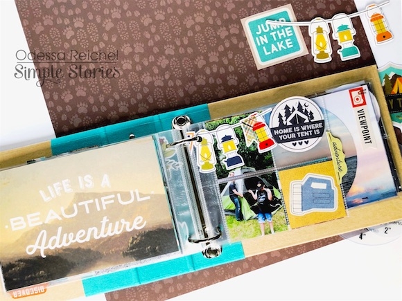
Here’s another spread with a cut down protector to get 4- 2x2 squares. I used one of the beautiful 4x6 Happy Trails cards on the page because it was just so perfect and then filled my squares with photos and 2x2 cards. The lantern banner is put on top of the protector so it extends over the top and even over the hole of the page protector.

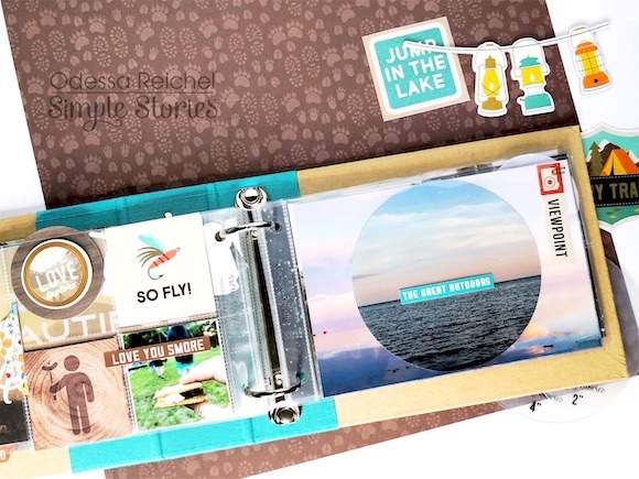
On the other side is an obligatory smore camping photo with some fun puns next to a full 4x6 photo. I had a ton of beautiful sunset photos from a perfect camping spot right next to a huge lake. I used two in this pocket by using a Circle Photo Crop to cut another 4x4 circle and then laid it over a regular 4x6 photo. I used some simple phrase stickers and Bits & Pieces to add some words to the page.

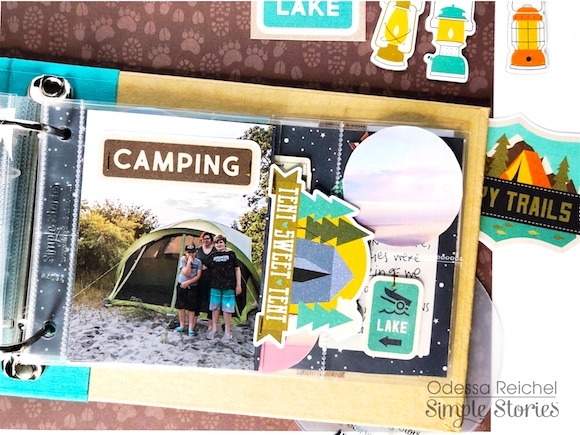
I really like the single 3x4 photo pockets for the 4x6 albums. I put a nice photo of my boys and I in front of our trusty tent. I really wanted to use the Tent Sweet Tent embellishment from the Bits & Pieces but it was a little large for the photo. I decided to use it as a tab and cut down some Happy Trails cardstock to the same side and attached them like I would tabs. I really like how that turned out! There are so many layers peeking out here, I just love it!

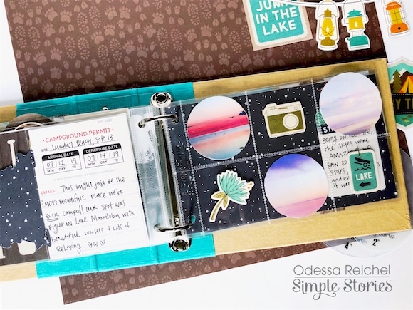
On the other side I used the Campground Permit journal card cut from the Happy Trails cardstock next to a ton of cute sunset photos! Like I said, I had a bunch, so I took some of my favourites and used the Circle Photo Crops to make a bunch of 2x2 circles to put in the pockets. I added in some various Happy Trails embellishments in the empty pockets with nothing around them to get a fair bit of the next page peeking through. I used the reverse side of the Happy Trails 3x4 Elements Cardstock for some night sky vibes as a good background for my photos.
I hope you enjoyed this peek in my mini album and that I’ve inspired you to have some fun with different photo sizes, shapes and layers!
