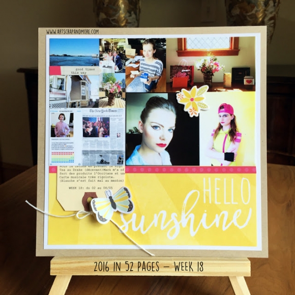
Hello there! Allie here today sharing two layouts using the fun, NEW Sunshine & Happiness collection! I love all the bright cheerful colors that have me in the mood for summer!
For the first layout, was instantly inspired by the High Five patterned paper. I cut it up and repieced it back together to create a dimensional background! I added sewing around the triangles to really make them pop. Once I had my photo down, I used the Bits & Pieces included in the SN@P! pack to create my title. I added pop dots to the bottom of "HAPPY" for extra dimension!
I added a few more embellishments to complete the layout--the Bradz are my favorite!
For my next layout, I used the
Happy Day paper and some watercolors to create a fun effect.
I loved the flowers in the corner of the
Total Crush paper, so I cut the corner from the page and used it as a base to my layout. I layered with fussy cut flowers from the Happy Day paper, and added Bradz and enamel dots on the centers.
I also used
chipboard and some of the Bits & Pieces for variety. Once I had everything down, I used watercolors and a waterbrush around the edges of my layers. I alternated between pink, orange, and yellow watercolors.
Using a waterbrush allowed me to have more control over the look. I cut out the quote from the
4"x6" Horizontal Elements paper, then placed it beneath my title. I completed the page by using the watercolors to add splatters!
Thanks for joining me today, I hope you feel inspired to use the new Sunshine & Happiness collection! I had a lot of fun creating these layouts and it's made me extra excited for Summer!


