August 2017 Blog Posts

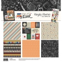
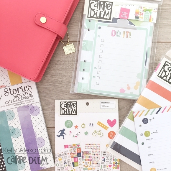
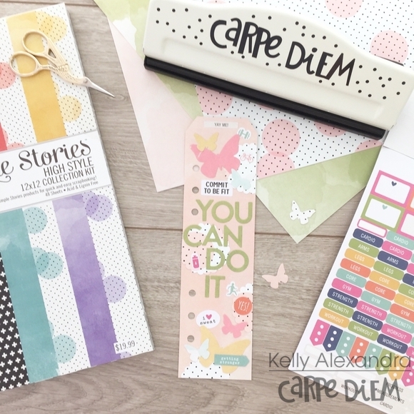
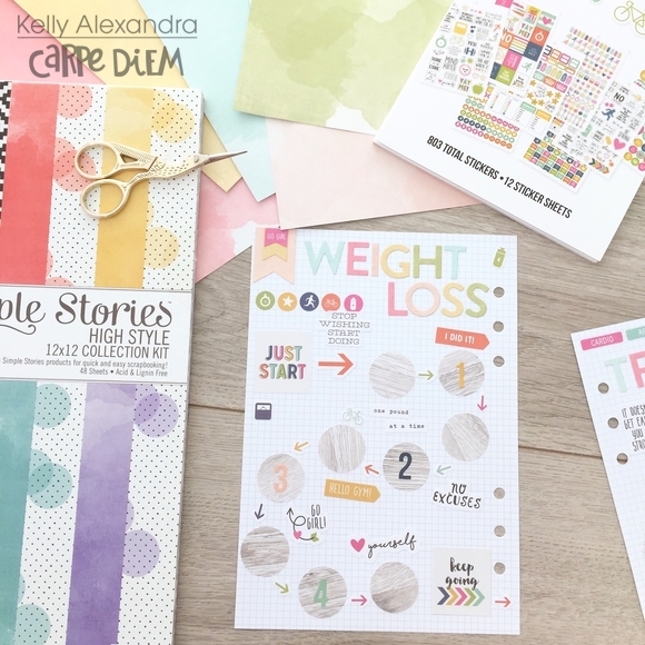
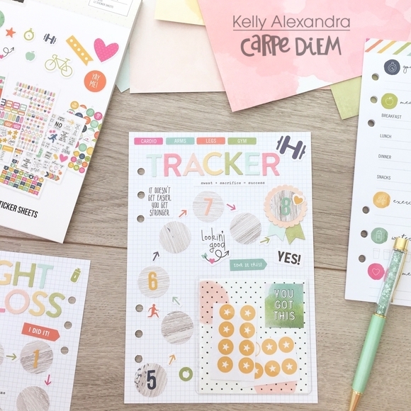
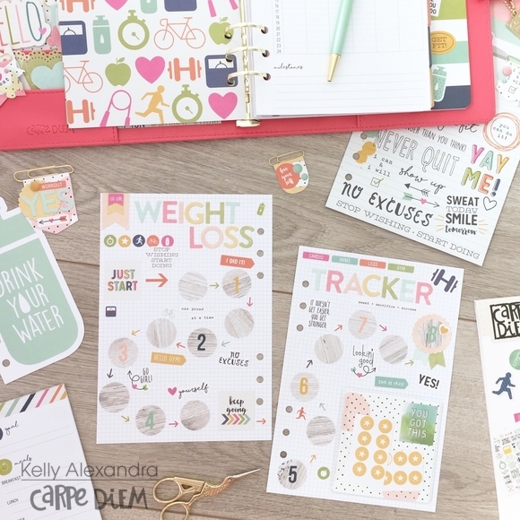
It is back to school week at our house and it is extra special this year as my daughter, Mila, started Kindergarten.  It feels a bit strange to start school when I am still dreaming of summer, but no better way to get into the spirit than with the Simple Stories “Old School” Simple Set.  You may already know that I love using the Simple Sets in my planner.  You get a few sheets of gorgeous paper that can be used to make dashboards, dividers, or can be cut up to be used as washi.  There are also journaling elements paper which have beautiful journaling cards to put in pockets or decorate a page. 

The collection goes perfect with my Black Speckle Carpe Diem Planner, and no planner girl can do without the Carpe Diem A5 punch!

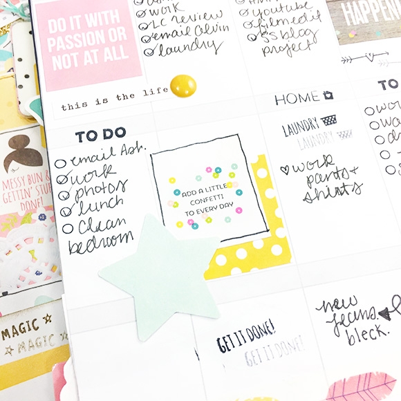
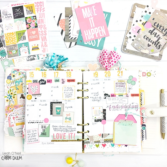
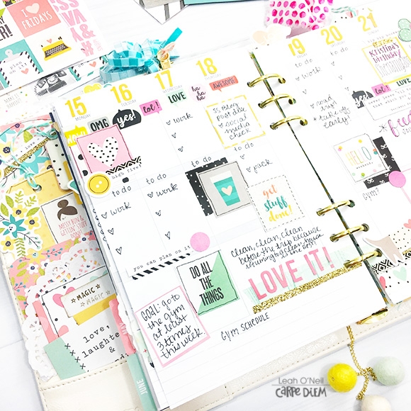
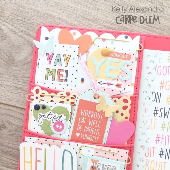
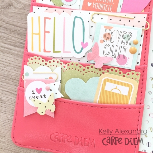
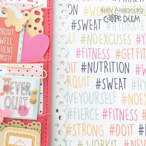
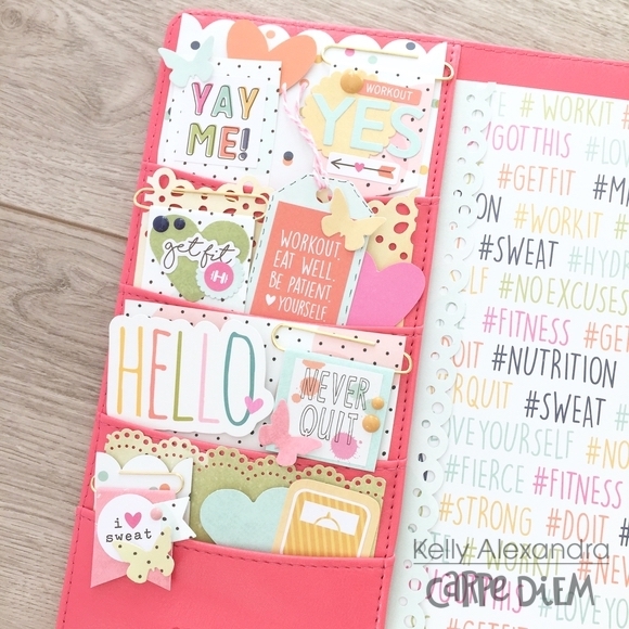
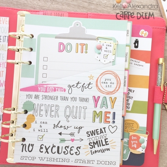
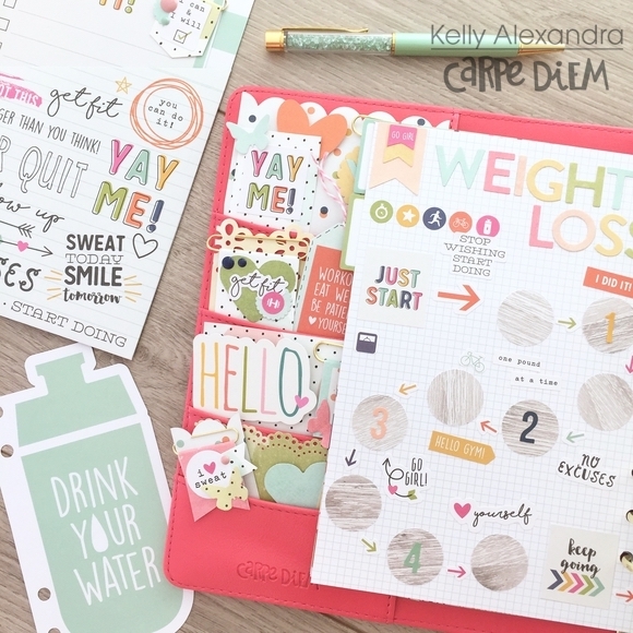
Look how fun my planner looks all set up with using the Old School products.

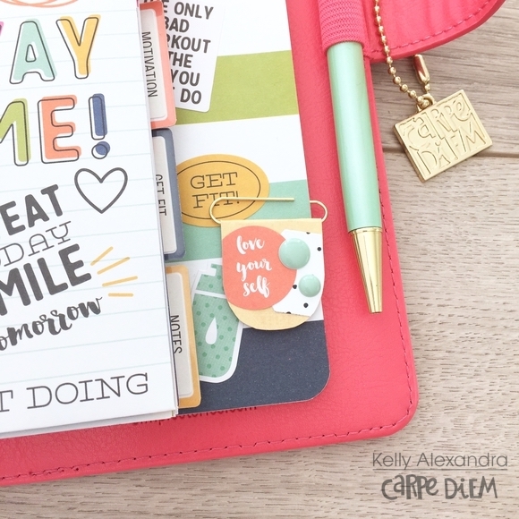
Dashboards are so easy to make!  They are my go-to planner item when I want to be a bit crafty, but don’t have a lot of time.  I used the back side of the 3x4 and 4x6 Elements Paper for the dashboard, (don’t worry there are two of each sheet in the set!) layered on two 3x4 journaling cards, punched it and in to my planner it went.

Now, it is time to fill the front pockets.  I used most of the 3x4 and 4x6 Elements Paper to decorate the pockets.  I also added in some sticky notes from the Simple Stories Say Cheese line.

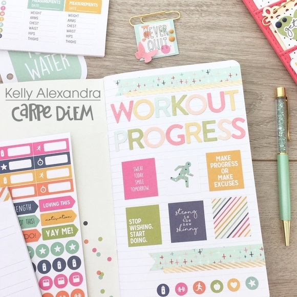
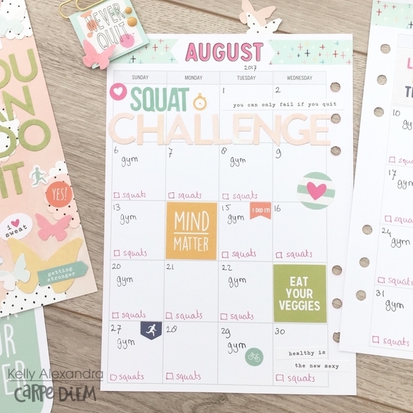
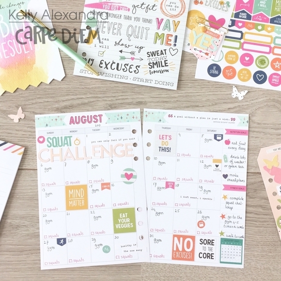
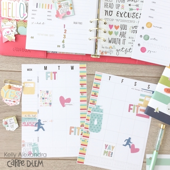
Here is my weekly spread I made with the collection.  The marker and alphabet “washi” are strips cut from the ABC 123 paper.  The rest are mostly stickers from the 6 x 12 cardstock sticker sheet and the Simple Stories Alpha Stickers.

The red Alpha stickers were actually white, but I colored them with a marker (while still on the sheet) and they worked perfectly.

What a colorful collection, all the colors and elements used together easily make a fun layout!

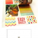
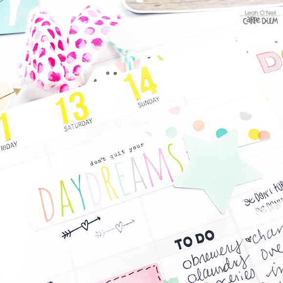
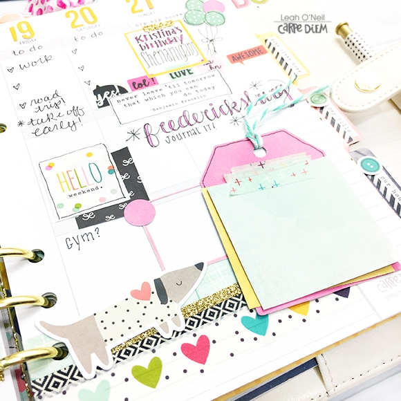
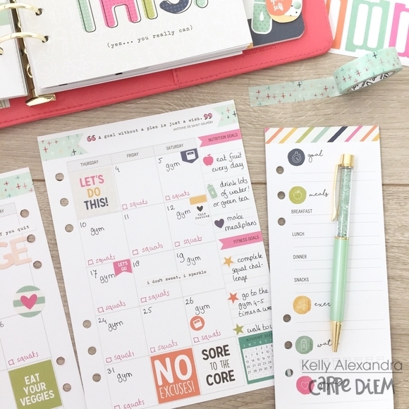
I also love daily planning.  When I don’t have a huge list of To Dos but have a day worth remembering, I make a daily page and fill up the lined portion of the insert with a photo or a fun memory.  I use the timeline on the right to practice my hand lettering.  For this layout, I mixed in some elements from Summer Days to play up the yellow, orange and blue elements in the Old School Collection.

Print out a picture and add some stickers iand you have quickly made a memory page.

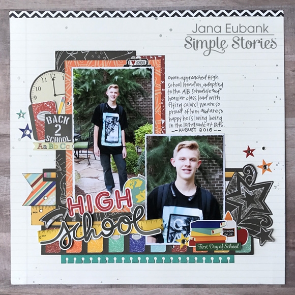
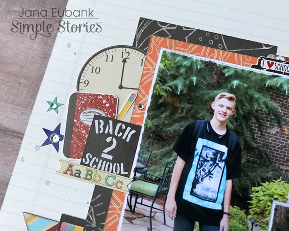
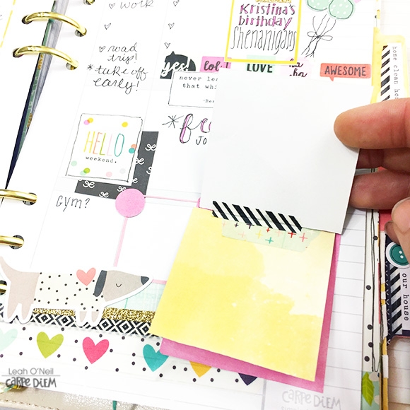
Adding a journaling card to the page fills a bit of space so you won’t feel overwhelmed trying to decorate the whole page.  I filled the rest of the page with the remaining stickers and pieces from the decorative papers and now I will always remember my little girl dashing off to Kindergarten!

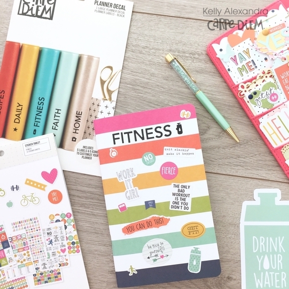
Keep your eye out for the Simple Sets, planner girls.  They can give your planner a lift and have plenty of fun things to inspire you to get crafty.

Until next time!

SaveSave

Supplies

Hello everyone ! It's Mindi here with you today. I am so happy to be sharing some pocket pages using the new collection called Beautiful. And Beautiful it is, the colors are so very soft and pretty. I decided to use this collection for some everyday sorts of stories and photos. This first one is all about a wonderful weekend we had with family. Here is a look at the first spread. 
 
 
During this particular weekend we took a drive down to the local park. We actually had water flowing in the river and we wanted to show it off to our guests. To start out this spread I had this big photo of the flowers and the water I wanted to use. I also had several more photos that I wanted to incorporate into this spread without adding extra inserts or pages. That is where the Photo Flips can come in handy. I placed a photo flip on top of my page protector so that you can flip the pocket and still see the photo inside of the bigger pocket page. 
 
 
On the back side of the flip pocket I added a chipboard piece, some journaling and a photo of us at the park. These photo flips are a great way to add in extra photos and stories to your layouts. I love them. 
 
 
One the opposite side of the big photo I have a 4x6 photo and a journaling card beneath it. This photo is of our Sunday dinner. I added some journaling onto my photo and a few stickers to add a little bit of gold. I really liked adding in little bits of gold here and there to my pages. It was the perfect touch to these pretty colors. 
 
 
This next set of pages are all about friends and making cookies. My daughter had a friend over for the afternoon and most of the evening. The first thing that they wanted to do was to make cookies together. For the most part I let them do their thing and snapped a few photos along the way.  Here is a look at what the whole spread plus an insert looks like layered together. 
 
 
This collection is really universal as far as what you can use it for. I really loved all the wonderful quotes that were included. This "So Thankful" sticker was perfect for the story of the friendship that these two girls share. I added the number 4 and the letter U to spell out So Thankful 4U. Underneath it I journaled about how thankful I was that my daughter has such a great friend. 
 
 
I decided to use an insert in between my two pages. I used a pocket page that has 4 3x4 pockets and I cut that in half leaving 2 3x4 pockets on each side. I was able to get in 2 extra photos that I wanted to include with this particular story. The top photo is of the unbaked cookies and the bottom is a filler card. This filler card was one of my favorites and I knew that I had to use it. I added a few simple embellishments to the card and called it done. 


The other side of the insert has another photo and a journaling card.


Here is a look at what the last page looks like. I used the pocket page that has the 4x4 pockets and it is always fun to mix it up a little bit. In the top pocket I used a journaling card. Included in the collection there are even 4x4 papers and it makes it so easy to get your memories scrapped fast and beautifully. The bottom pocket is where I have another photo. When I am creating my pocket pages I like to alternate photos and card as much as I can. It makes for an easy flow and a clean look. In the small 2x8 pocket I chose some green patterened paper to make sure my colors were equally spread out. The green paper also went great with the green cookies in my photos. 
 
 
Thanks for coming out to check out the blog today. 

SaveSave

Supplies

 
Hello! Jana Eubank here. My favorite season is right around the corner and I just couldn't wait to get cozy in my scrapbook room and do a little fall scrapping with the Old School and Spellbound collections
 
HIGH SCHOOL
 
The Old School collection was absolutely PERFECT for these photos of my son on his first day of high school last year. 
 
 
I adore the variety of school supplies included on the Old School 6x12 Sticker sheet. I layered a composition notebook and pencil below a clock I cut out from the 3x4 & 4x6 Journaling Card Elements paper.
 
 
I used the "school" script word as part of my title adding it on top of the ruler sticker from the 6x12 Sticker sheet. The title and photos are anchored to the page with several strips of the ABC 123 Paper.
 
 
I also created a cluster of school supplies at the bottom of the page and accented them by cutting out the chalkboard doodled stars from the patterned side of the 3x4 & 4x6 Journaling Card Elements paper
 
 
Finally, I sprinkled a bit of mist around the page along with the star stickers accented with clear gems.
 
 
______________________________________
 
GHOULS NIGHT OUT
 
Halloween happens to be my favorite holiday and the one where I take the most pictures, so of course I couldn't wait to pull out a few snapshots from last year and play with the Spellbound collection!
 
 
I love the ornate frame stickers in this collection. I chose to fill the openings with the damask pattern of the 3x4 & 4x6 Journaling Card Elements paper and add additional stickers around them to create two clusters on my page. The first cluster is at the top left of my page ...
 
 
... and the second is to the right of the photos. Both clusters include a frame, pumpkin, purple roses, word stickers, and a sprinkling of bats and purple gems to tie them in with one another. 


The other black and white elements in each cluster also tie them together, but add variety to each cluster at the same time.


I added in a title created from purple cardstock and my electronic die cutting machine. I layered this on top of the photos and decorative elements in order to connect the grouping together.
 
 
More purple gems are sprinkled around the black and white stickers below my journaling. It almost feels like the bubbles of a witch's brew around the page! Spooky!
 
Have you started to think about what you want to be for Halloween this year?
 

Supplies

Hello again creative souls! Leah here with you on the blog today. It’s been quite a while since I’ve shown you some weekly planner layouts! That’s what I have for you today, two vertical planner layouts with accompanying process videos. Yes, TWO plan-with-me videos! I am still using up lots of tidbits from the new Carpe Diem collection and have a few cool ideas to share with you all for your planner spreads.

In this first planner spread, I had a lot of fun layering the Carpe Diem stickers!

I like layering the patterned stickers that have no words, behind stickers that have quotes on them. It draws focus to the quote and adds a pop of color. I added a couple of these die cut stars to my layout that I made using a paper punch during my last planner setup video (you can watch that here).

I’m using the space at the bottom of the page to do a little mood tracking. The hearts are from the Domestic Bliss roller stamp. I rate my mood at the end of the day on a scale of 1-5, color in the corresponding amount of hearts, and make a little comment about why.

As I am writing this post, the second half of the week has not happened yet. Though I already have my week planned, I will continue add in the mood info at the bottom at the end of each day.

Also during my planner setup video last month, I fussy cut these clouds out of a pocket card to make die cuts. With the star die cuts on this layout, I really feel like the clouds add the sweetest whimsical touch.

Here is the process video of this week’s layout coming together.

For my second weekly layout, I went a little bolder with the colors, but using the same collection. You can see how just changing out the washi tape I used, allowed me to bring out those bolder colors from the new Carpe Diem line that I didn’t use as much in the last layout.

You might notice this week looks incomplete but that’s because I sometimes like to “pre-plan” and decorate a few weeks ahead and then fill in the plans as they come. In addition to decorating, I will also go ahead and write in plans I know are happening ahead of time. For example, I know I am going on a weekend trip during this week. So I dedicated a space to documenting that.

I even made this cute little interactive booklet with a few paper scraps, so have a place to add some photos and journaling after my trip. When you don’t have enough real estate to write a lot on a planner spread, adding a “flippable” element can give you more space for memory-keeping.

While we are talking about fun planner tips, get two stickers out of one by cutting out the border from around those box stickers you’ve been using, to get a little frame sticker that you can write in. You’ll be able to see how I do this in the video below!

Check out the process video for this second weekly spread!

To me, this is the most fun detail of the entire layout – and this is why you should always come check out the blog post in addition to the process video, because there’s always more content here! You may have noticed in the video, that I used a small ½ inch circle punch to cut out a few circles from one little square sticker. I did that so I could turn them into mini balloons. Aren’t they adorable? What a fun way to mark a birthday in your planner! Also, here is another example of how I’m using the border of a used sticker as a box to write in.

So I am curious friends, do you like to decorate ahead a few weeks? Or do you plan and decorate as you go? Sometimes when I get in the creative zone, I just don’t want to stop after one layout is complete, so I keep going. Let me know your style in the comments below! Be sure to check out the Carpe Diem Planners Instagram and Facebook for lots more planner inspiration, and come say hello over on my Instagram @sunny.leah. I hope you will tag me if you try any of the tips/techniques from this post. I LOVE seeing you all get creative with your Simple Stories products!

SaveSave

SaveSave

Autumn is my favorite season!  I love the crisp air and the show of color everywhere!  If you love Autumn too you’re going to fall for the new Simple Stories Vintage Blessings Collection

Fall is a time for families to gather for Thanksgiving and for us to count our blessings.   Who wouldn’t love a hand made card with a personal note expressing how much they’re loved and thought about? 

The papers in the collection are the fall colors you’d expect like green, yellow, and red with a surprise pop of aqua blue and pink.  The colors work beautifully together and have a homespun folk feel.  I cut a hilly landscape to create the scene on this card mixing gingham, floral and calico.

Sentiment stickers are from the Combo Sticker in the 12 x 12” Collection Pack that’s also sold separately.  The house and banner are from the 6x12” Chipboard Sticker Sheet.   The tree, leaves and sun are from the Bits and Pieces die cut pack.
 

____________________________________

I’m smitten with the birds in the collection!  They’re a patchwork of the different patterns in the set that looks amazing!  You’ll find them printed on the paper, die cut in the Bits and Pieces pack, and on the Chipboard Sticker sheet. 

I perched the bird on a branch from the Bits and Pieces.   My tip for breaking up patterns is to add some solid color.   As an example, to help define the circle of yellow gingham paper I cut for a sun, I added a slightly larger circle of solid yellow card stock backing. 

I created the background in lighter colors to help the branch and die cut leaves stand out and create more contrast.

There’s even sticker packs available in this collection to add smaller images and sentiments to your projects like the bitty “fall fun” I added on the border.

The Combo Sticker sheet has so many great embellishments including a row of tabs like the “blessed” on my card.  The script font is beautiful and the soft blue matches the papers perfectly!  

The Bits and Pieces die cut pack includes 58 die cut pieces ready to work with so creating scenes and embellishing your projects is a treat.  The colors match the card stock perfectly so everything looks great together! 


I just know you’re going to love this collection!  Thanks for stopping by and have a blessed day!


Supplies

Hello everyone! It's Jennifer and I'm on the blog today to share pages I created with the new Beautiful collection!  Can I first just talk about how amazingly gorgeous this line is?  I feel like it has a different feel with the muted pastel colors mixed in with gold foil!  The black and grays are wonderful for contrast, as well!  Beautiful is definitely a feminine collection but could be used for wedding or vintage themes too!
 
For my first layout, Amazing, I used one of the awesome Simple Stories Silhouette cut files for my background!  I used the Sectioned Heart Cut file first with my white cardstock background.  I love the many patterns in the Live Beautifully paper so I chose that to be my "insert pieces" for my cut file. I again cut the Sectioned Heart file with Live Beautifully so I could adhere each piece into the negative spaces. It is helpful to first adhere the white cardstock onto a second sheet of cardstock, as well. 
 
 
Once my insert pieces were in place, I used my sewing machine to add a couple lines of stitching around my heart!
 
 
After adhering my photo, I added in die cuts from the Bits and Pieces pack including this gold foil script "Amazing" that I used for my title. I used a bit of foam tape to "pop" it up to add some dimension.  
 
 
​I love that the embellishments include many little accent pieces including stickers and die cut pieces! I kept with the heart them and added few to the top of my photo! You can also spy a tab sticker from the Combo Sticker sheet (which measures 12x12!).  
 
 
Showing additional pieces from the Bits and Pieces pack!  I love the sentiment cards with their empowering statements!  I thought this was perfect for a page for my teen daughter!  
 
 
_______________________________
 
For my second layout, Look For the Beautiful in Every Day, I was inspired by the circles in Simply Wonderful as well as the circle embellishments on the 6x12 Chipboard Sheet. I wanted to incorporated them all together without being too busy.  I again used my Silhouette and cut circle frames with Shine Bright which includes gold foil dots! The frames range from 2 1/2 to 4 inches in diameter; I also placed different patterns in the center of each frame.  
 
 
Again, my daughter is the subject of my page! I hope that when she looks at her scrapbooks, she will see herself through my eyes! This is another reason why I love this collection so much! All of the little sentiments are perfect and what I think every parent wants to tell their child.  I used one of the sentiments stickers as my title; I love the deco shape and used pop dots to add dimension. 
 
 
I also incorporated my different circle hand punches to layer more circles and add in those circle embellishments I first mentioned!  I also had some grey, gold, and white enamel dots in my stash that I added.  


I'm a big fan of roller stamps and love using my Carpe Diem stamps to add little sentiments under my date!  You can also spy one of the many sentiment stickers found on the Combo Sticker sheet!  There are FIVE rows of different sayings all in the gorgeous colors of the collection!  
 
 
Thank you so much for stopping by! I hope you will check out this collection in its entirety!   And be sure to see the NEW and awesome lines Simple Stories has in store for this year! 
Have a wonderful day!  

SaveSave

Supplies

Hi everyone, I had a very nice summer holiday and enjoyed nice weather and lots of delicious food. Now it is time to loose those extra holiday pounds I gained and to set up my fitness planner to help me achieve that! I am using the A5 Fitness Planner Inserts and the Coral A5 Carpe Diem planner.

To decorate the planner and inserts I will mainly use the Fitness sticker tablet and the ‘High style’ 12x12 paperpad. This paperpad has beautiful watercolor papers that match the fitness inserts perfectly.

Before I set up the planner I decided to create some flag paperclips. I took some small and bigger gold paperclips, cut some different shaped banners from the ‘High Style’ paperpad papers and decorated the banners with diecut shapes, stickers and enamel dots.

In total I created six flag paperclips, three small ones and three bigger ones. These are perfect to decorate the planner pockets and extra pages in my planner.

The fitness insert set includes six colorful dividers and different tab stickers to choose from. I selected the following six sections in my planner: Goals, Tracking, Calendar, Motivation, Get Fit and Notes. The ‘Calendar’ section will hold my monthly and weekly fitness inserts and the ‘Get fit’ section some menu planning inserts.

For this setup I also created a fun motivational bookmark. I selected the light pink watercolor paper from the ‘High style’ paperpad, cut it down to size and punched holes using the Carpe Diem punch. I decorated the bookmark with some diecut shapes, words and stickers from the tablet.

Now it is time for one of my favourite parts of setting up a new planner: decorating the planner pockets!

I selected a few papers from the ‘High Style’ paperpad as a base and used different border punches to create beautiful borders at the top of the papers. I decorated the pockets with my diy flag paperclips and some stickers from the sticker tablet.

The back of the dashboard that came with the Fitness insert set had awesome fitness hashtags so I slided it in the large side pocket and added a little piece of light blue watercolor paper with a cute border. I am very happy with how these pockets turned out!

With this fitness planner setup I included the ‘Bold stripe’ doc-it journal and decorated the front with some motivational stickers and the fitness decal. The decals are designed to put on the outside of your planner but it works fine on paper or these doc-it journals.

In the doc-it journal I am going to track all my gym workouts such as cardio and weights. Ofcourse the journal needs a fun intro page so I used the ‘High Style’ papers to diecut the letters ‘Workout progress’. I finished the page with strips of washitape and stickers from the tablet. The doc-it journal slides perfectly in the back pocket of my planner.

For this planner I decided not to create a new front dashboard but use the planner pocket that came in the fitness insert set. I am planning on putting my gymclass schedule in here and other notes I need to save.

I thought it would be a nice extra project to create a fun spread to track the weightloss journey for my few extra holiday pounds. I used plain graph paper and papers from the ‘High style’ pad to diecut the letters. With a circle punch I punched circles from light wood paper from the ‘Wood and gingham’ paperpad.

To decorate the pages I used arrow and quote stickers from the tablet. On the right side of the page I glued a clear pocket, which holds some star icon stickers. For each half pound I will manage to loose, I will put a star sticker on the circle as a reward. The end result is a fun two-paged spread on which I can track my progress.

For the monthly spread of August I thought it was smart to plan all my gym sessions and to do a fun monthly challenge. This month I am going to do a daily squat challenge so I diecut the letters and wrote down a daily checkbox to check off whether I did my squats.

All the monthly pages from the fitness inserts have awesome fitness quotes. For August it was: ‘How bad do you want it?’ I added the ‘very bad’ and two little butterflies to decorate it a bit.

The setup for my planner is mostly done, now it is time to use it!  Simple Stories has some free fitness printables that you can download here - I printed them in different sizes to decorate my first weekly spread to track my food and exercise.

I hope this blog inspired you in creating and decorating your own fitness planner! On my instagram page createplannernl I will show some more spreads and extra pages in my fitness planner. Have a nice day!

Supplies

Hi Simple Stories fans and welcome back to the blog today!  Chantalle with you, and I’d love to share some layouts, which both make use of some machine stitching to secure embellishments, as well as add a decorative touch.
 
JUST ADD H2O
 
This page, capturing my kiddos in the pool at one of our fave holiday destinations, was created using the Summer Days collection. The bright colours, fun prints and mini swimming costume shapes were perfect for bringing this memory to life on paper!
 
 
The inspiration for the title of this page came in the form of a phrase from a sheet of Summer Days ‘4x4 Elements’.
 
 
I set up the text in Silhouette Studio and then went about using my Silhouette Machine to cut the lettering out of a 12x12 sheet of Summer Days ‘Lazy Days’.
 
 
Initially I thought I would leave the top section as is, or just cut it neatly into a strip about 4x12 inches across. Thinking of all the splashing that was going on in that pool at the time (not to mention two cheeky little monkeys!) I thought it would look better if I tore the paper, to give it more of a sense of movement.
 
 
Another fun touch is this scalloped stitching! The sewing machine I used is new to the market and allows the user to sew with thicker mediums like Baker’s Twine! I’ve done the scalloped stitching across the teal cardstock and photos, to echo a wave pattern.
 
 
For an extra bit of fun, I've added some water and splash marks to the page. Glossy accents made for some awesome water droplets and Versamark can be used to create a stained effect.


______________________________________
 
WE’RE NOT LOST, WE’RE JUST EXPLORING
 
Getting out and about to explore the beautiful area in which we live is a firm favourite in our family. We are so lucky to live in a beautiful part of the world, with opportunities for adventure right on our doorstep. Cabin Fever is perfect for capturing those big and not-so-big trips out!
 
 
I’ve turned things on the diagonal with this page, choosing to pick up some of the thicker lines and bring them out by machine stitching with embroidery floss from edge to edge. Inside these lines, I have added my text and photos at an angle to mix things up.
 
 
The heading was hand cut from a sheet of 4x6 Horizontal Elements. I snipped it in to pieces so I could run them within the stitched lines. Below these strips, I began with some border stickers from the sheet of Cabin Fever Combo Cardstock Stickers. I’ve also popped some strips of Summertime Sweetness Washi Tape as well as some pattern stickers from the 4x6 Sticker Sheet pack.
 
 
Another little touch I added was a mini circular garland which I created by punching some 1 inch circles from a leftover piece of ‘Off the Grid’. I then sewed these together using a straight stitch.
 
 
I’ve popped a few up on foam tape to add a touch of height.
 
 
For the rest of my embellishments, I’ve used some Cabin Fever Bits & Pieces, Chipboard Stickers as well as stickers. Finished off with a bit of journalling which I have also divided in to strips to match the diagonal theme.
 
 
Thanks so much for joining me today.
 
Happy crafting!


Supplies

Pages