March 2018 Blog Posts

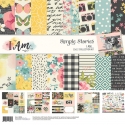
Hello Friends! It’s Kristine Davidson here today and I’m sharing 2 layouts I created using the NEW and SUPER Fabulous I AM Collection. This collection is beautiful … soft, colorful, floral and perfect! I created 2 layouts using pictures of my nieces from a few years ago. They are growing up and being teenagers and It’s hard to get nice photos of them so I have to go back a few years and find some that not the Snapchat faces I often get via text!
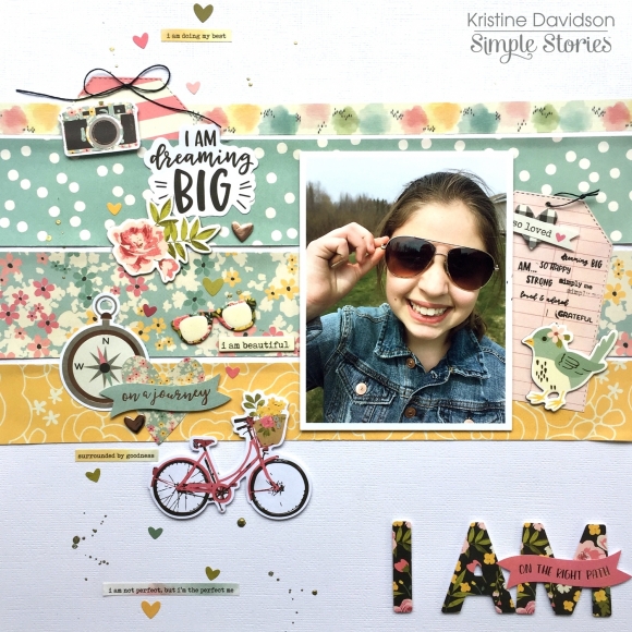
The first layout is called I AM. It’s a straight forward title and I used some bits and pieces, the roller stamp, some chipboard pieces and added a few descriptions that go well with the I AM Title.
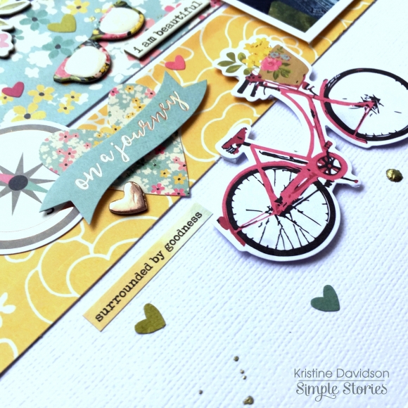
 

I used a strip of the washi tape for my first stripe at the top – it’s colorful and fits perfectly. I then cut up a few other pieces all different width but same length to go across my page. The size of the photo is 4” by 5” . I added so many great embellishments on this page to create a focus on the left side of the photo. A few heart stickers and some chipboard really did the trick for this page.
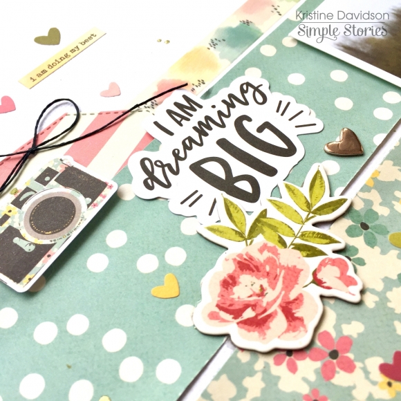
 

The diecuts are amazing in this collection and I’m not just saying that. They really are! You might want 2 packages of those Bits & Pieces!

The Second Layout is called I AM FABULOUS.
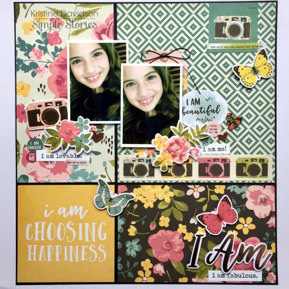
My niece just turned 11 and I told her she needed to STOP growing up! I created this layout using a piece of white cardstock but then adding some black cardstock behind my papers. I created one of my favorite go to formats – a GRID layout.
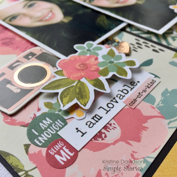
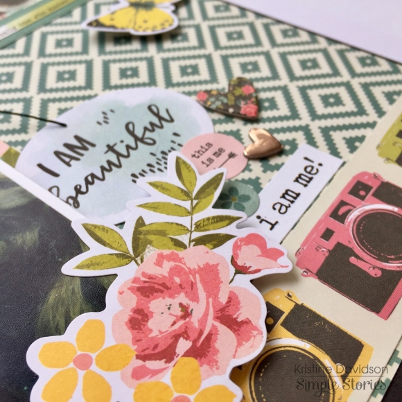
I was able to add so many colors and again tons of those Bits and Pieces to this page. Adding some pop dots under the butterflies made them dimensional and really pop off the page. I hope you enjoyed my layouts today I will definitely be using more of this beautiful collection. Come follow us on Instagram! @SimpleStories_ and myself @KristineDavidson.

Supplies

Hi there! I am so thrilled to be back on the Carpe Diem creative team for 2018, and what better way to start than with the beautiful ‘I Am’ collection!

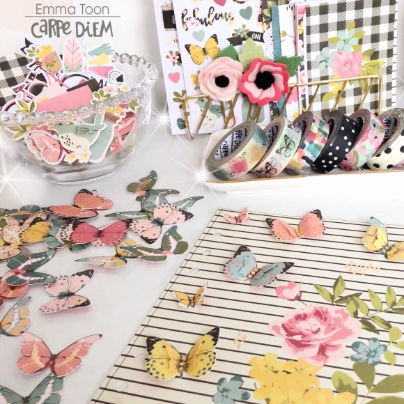
This collection brought to you by Simple Stories is full to bursting with positivity!...oh and lots of butterflies, as you’ll see in my photos! Talking of which there’s a whole 12x12 scrapbooking paper with foiled butterflies, I choose to fussy cut them all out to use for decoration.

I used several of the butterflies on a dashboard I made, layering them up and adding little gems to complement the rose gold foiling.

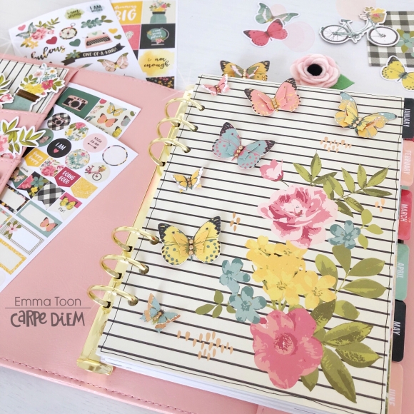
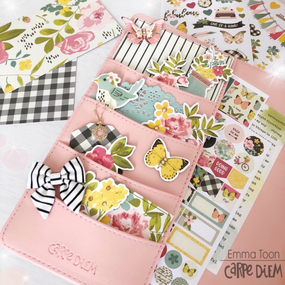
I think you know by now how I like to make the pockets of my planners leaning more towards decorative than functional. I’ve used the A5 Carpediem Blush planner this month and I think it works so well with the I Am collections colours.

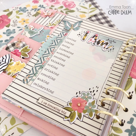
In this collection there is the Sn@p cards which I love to use for journaling, filling pockets and decorating my dividers. Here you can see how I’ve used one ready to fill in with lots of different details, I am loving, liking, doing etc, isn’t this a great way to be able to document how you were feeling on that particular month!

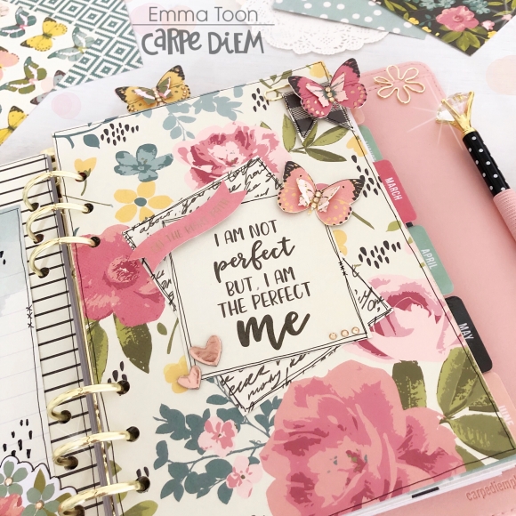
I’ve used another one of the Sn@p cards here on this divider and layered it up with some rose gold chipboard hearts and you can also see a couple of different ways I’ve used the butterflies on paperclips.

I hope you’ve enjoyed a little peak inside my planner if you would like to see more ways I’ve used the I Am collection please pop over to my Instagram account https://www.instagram.com/heartsbyemma

Supplies

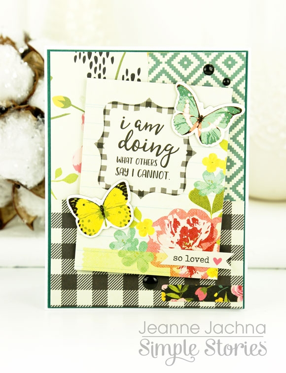
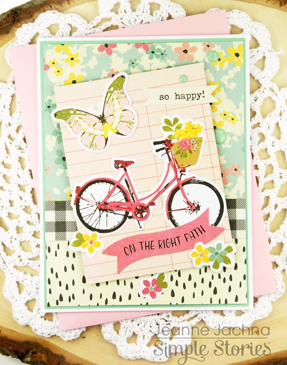
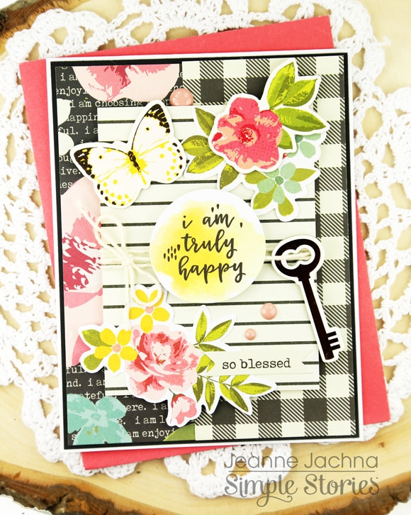
Hi!  Jeanne here today and I’m excited to share some projects made with the Simple Stories I AM COLLECTION.  This heartening collection is filled with positive messages sure to lift your spirits and inspire.

The images are feminine and romantic – think  hand painted florals and  butterflies! 

The collection includes die cuts (Bits & Pieces), chipboard, stickers and even washi to make each project a coordinated work of art.

This is a GORGEOUS collection of pink, teal, yellow and some midnight black thrown in for drama – the contrast between patterns is simply stunning!

You’ll love mixing and matching the patterns that are designed to coordinate perfectly with all the other elements in the collection.

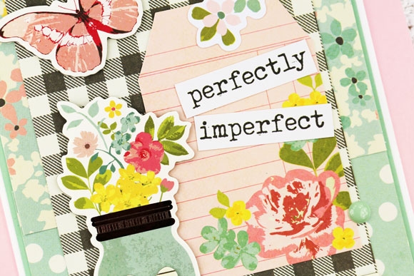
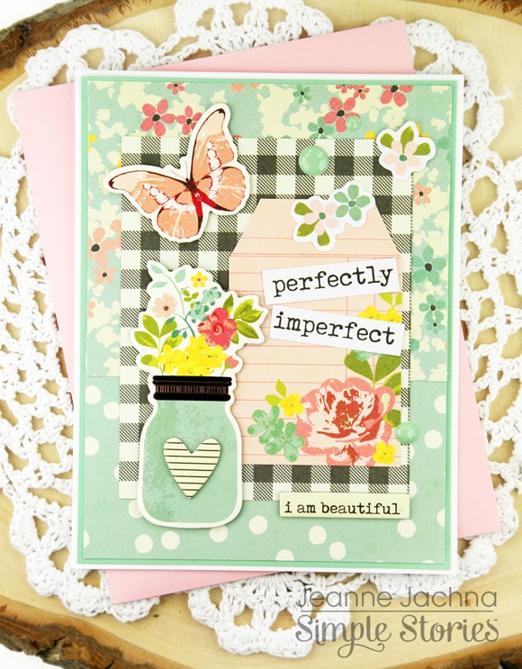
We all need a little pick me up every once in a while – what a beauful way to encourage and to let someone know they’re on your mind, and that you believe in them!

Supplies

Hello Simple Stories friends and fans!

Nathalie with you today.  I am so excited to be returning for a new term as a member of the Creative Team.  I love Simple Stories and the people behind it all.  Thank you Simple Stories for inviting me back!!!

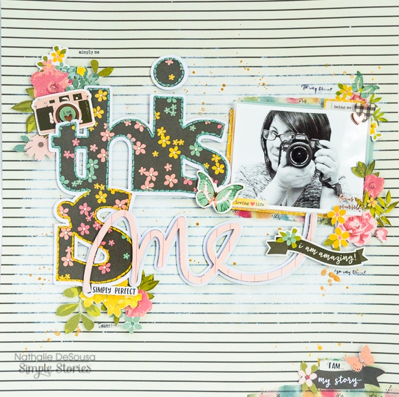
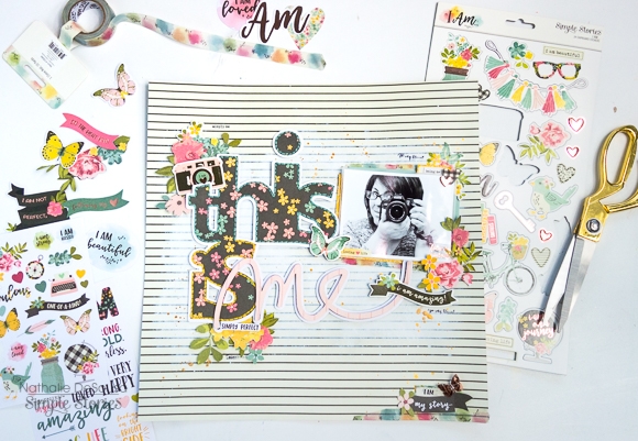
Every time, I think i have finally picked my favorite Simple Stories collection; they top it with another more beautiful collection.  This is the case of  the new I AM collection.  When it arrived at my doorstep, I fell in love with all the papers and embellishments, and quickly pull a picture that mostly represent me to create a layout with it!   

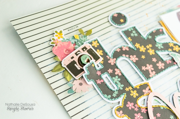
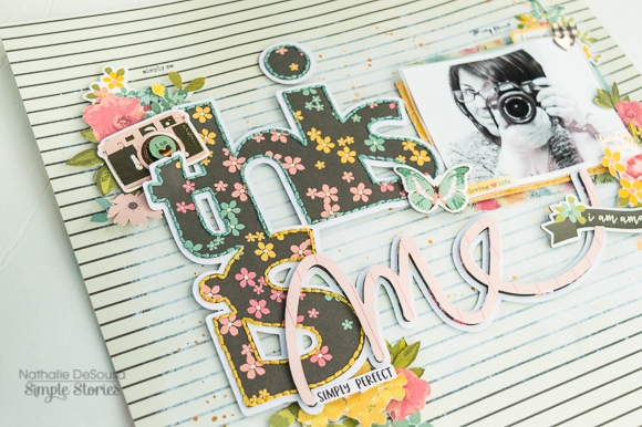
We always document all those special moments in our lives, but some times forget to tell our story.  So what better way to keep a memory of you than to create a self affirmation page.   For this, I pulled a cut file from the Silhouette store, and cut the title for this page from the B side of the 3x4 journaling cards.   A bit of coordinating hand stitching just adds texture, and brings all the colors of the flowers forward.

A bit of white acrylic paint on the B side of the Bold and Beautiful paper make sure all the details in the title pop.   To emphasize the "ME" in the title, the word was cut form another paper from the collection and attach with foam adhesive to the title.

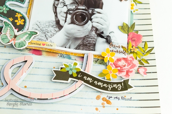
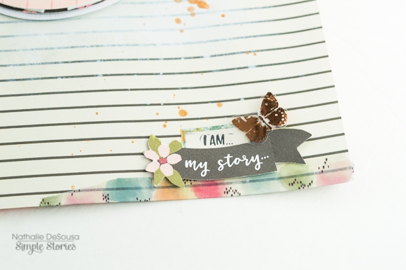
The icons and stickers from the collection are perfect to create clusters and embellish the page. The florals of this collection are so beautiful you will want to get a few of the sheets to fussy cut them, and add them to your projects.  But let's not  forget the beautiful roller stamp; the sentiments are just perfect to create a self-empowering page;  a must have!!!

You will fall in love with all the patterns and colors from the Simple Stories  I AM collection, and  it will help you to document your own story.

XO

Supplies

Hello!!  It's Lisa and a cute sloth here today. I have the cutest photo to scrapbook. The colours just went so well with the 'Romance' collection, so I decided it was the perfect time to document our Sloth encounter from last year.
 

I love this photo so much and wanted all the focus to be right there in the centre on that adorable sloth. So I created various different frames to do this.

I started off by adding a thick white border to my photo before printing. This really helps the photo stand out from the page. Otherwise the colours would just blend in to the back ground.
 
Then I cut one the the 4X6 elements out, cutting it in to a rectangle to border the photo. I made sure there was a good space to add my title 'Kisses' here which came from the coordinating 12x12 sticker sheet.
 
I then took my circle cutter and a couple of pieces of patterned paper and cut out 3 large circles to go around my photo. I love how this creates such a pretty frame and then by adding some of the 'Bits and Pieces', more stickers from the 12x12 sheet, a couple of pieces of the Chipboard Stickers and some stickers from the 6x4 pack. It just works so well.
I wouldn't usually use black on my pages, except when journaling, but I have to say, I love this contrast. It just works and compliments the page and really helps the title stand out too.
 
 
I'm so happy with my cute page. I think this collection was the perfect choice. Thank you for joining me today. If you would like to watch me create this layout, please see my video here.  I had so much fun!!
    

Supplies

Pages