Kristine Davidson's Blog Posts

Hello Friends! 

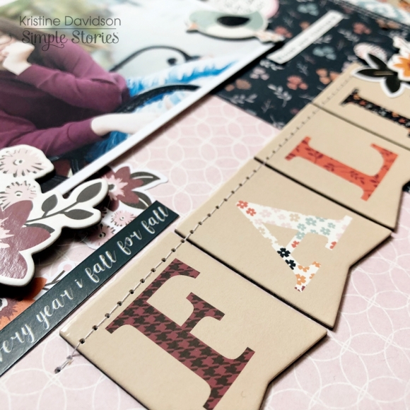
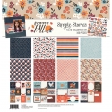
It's Kristine here today. I am sharing a layout using the gorgeous fall collection called Forever Fall.   I wanted to showcase the papers from this kit and of course the assortment of colors.  The photo is of my niece and a back to school picture. It was perfect for this collection of pinks, blues, and of course the burgundy flowers.

I used a patterned paper for my background instead of a piece of white cardstock. Creating a few layers using strips is a great way to add details and the ability to use more than one piece of paper.  
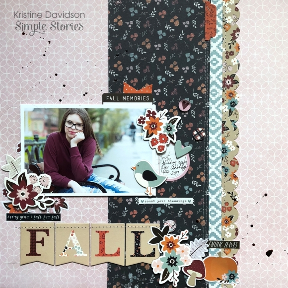
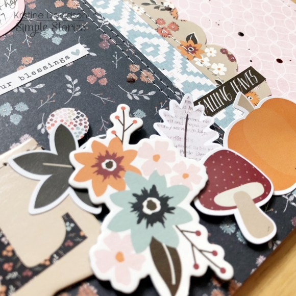
I did some sewing on the FALL chipboard banner. This helps them stay in place but also adds some texture to the page. The scalloped strip is from the sticker sheet. 
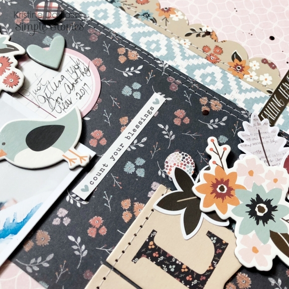
Adding some extra touches to the Fall banner are stickers and also chipboard pieces surrounding the picture.  I placed dimensional adhesive on the photo and some of the embellishments.
This layout is super simple and can easily be duplicated. Once you get your Forever Fall collection try a scraplift of this layout. If you do please share it with me @KristineDavidson.  If you have a few minutes please visit @Simplestories_ on Instagram for behind the scenes, design team projects and so much more!

Enjoy those fall days!

Supplies

Hello Friends!

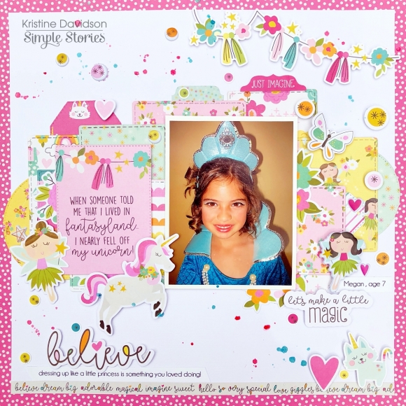
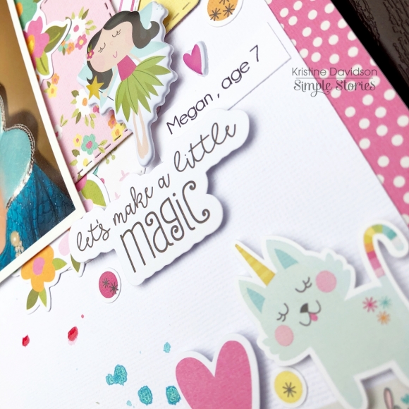
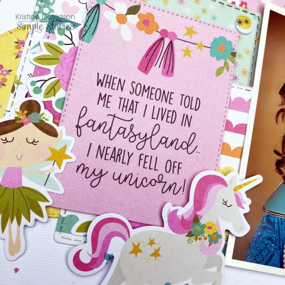
It's Kristine with you today. I am ready to show you the cutest page using the Dream Big collection.

Don't be intimidated by bright colors or designs. You can often create a page using many pieces of pattern papers. Layers are simple to do and make it easy to use so many pieces and not all of them have to be the same size.

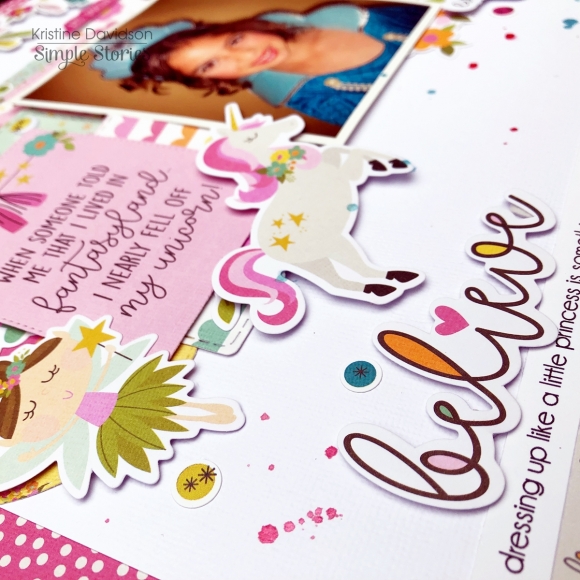
Here I cut up a few pieces of papers and stacked them over each other. This gives me the opportunity to add many pieces and creates a uniform background.

I used so many fun bits & Pieces, NEW Puffy Stickers and colors on this layout. I've had this picture for many years but never had the right collection. Dream Big is perfect for those fun dress up photos.


Hope you have yourself a MAGICAL day!

Supplies

Hello Friends!

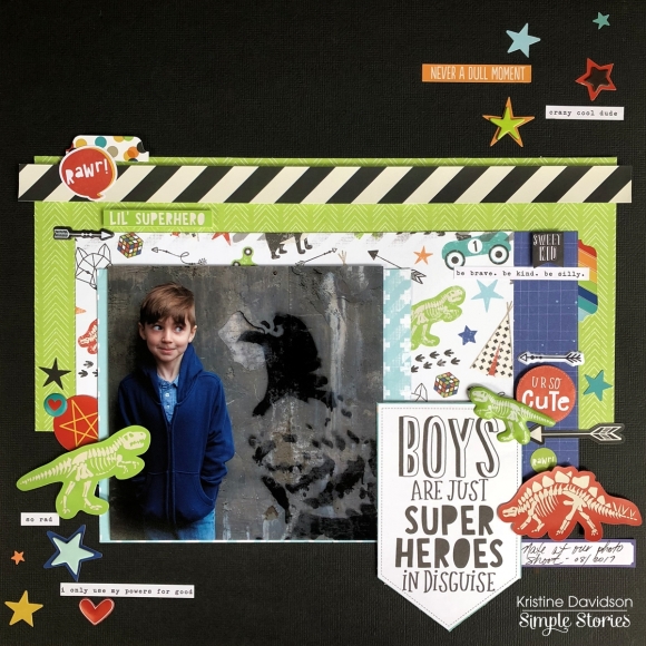
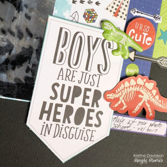
It's Kristine here today to share a layout with you! I used this super cute Lil' Dude Collection. It just screams fun and adventure for those little boy pages. I love the colors and the die cuts that include robots, cards, and dinosaurs are perfect!

This is a layout I created with a picture of my nephew. It was a photo shoot last year and this crow is painted on a large cement wall in the city. This photo was perfect for this collection.

Something I want to share with you on this layout is my title. I like simple titles and don't over think it. To create my title I used a 4x6 card from the Lil' Dude 4x6 Elements sheet. I cut it to fit my page as a banner. I thought it was perfect and so easy to do. Perhaps on your next layout you could try and use a journal card or element card to create your title!

Thanks for visiting today and please visit us on Social Media for more Simple Stories projects.

Kristine

Supplies

Pages