Lisa Dickinson's Blog Posts

Hello! It's Lisa Dickinson here today sharing a layout on the last day of 2017! I absolutely love mixing papers from different lines to create a unique look for my page, and Simple Stories makes that so easy. The colors and patterns in each collection are made for mixing and coordinate seamlessly, making it a cinch to pull patterns from any line and get a cohesive look!

FirstChristmas_W


This holiday page uses products from the Very Merry and Sub Zero collections - don't they look great with each other? I added some of the non-traditional holiday patterns and colors from the Sub Zero line with the classic red & green papers in Very Merry for this unique look.


FirstChristmas2_W

This cute chipboard snowman gets dressed up with a few enamel dots added as buttons.


FirstChristmas3_W

And this moose die-cut gets a Christmas flourish with the addition of a small red button!


FirstChristmas4_W

The script title is one of the Simple Stories electronic cut files available in the Silhouette store - I simply cut only the "Christmas" portion of the "Merry Christmas" file.

Wishing you all a Happy New Year's Eve and wonderful 2018!

Supplies

Hello! It's Lisa Dickinson here today, hoping everyone had a joyous holiday (and that you took lots of fun photos that are now waiting to be scrapped!) Today I'm sharing a simple page technique that's perfect for almost any festive event - a wreath of stars!


Merry&Bright1_W

I simply sketched a circle centered on the cardstock and then machine stitched several times around the circle (it doesn't need to be perfect!).


Merry&Bright2_W

Then I added die-cut stars from several of the Sub Zero and Oh What Fun! papers, which I scored from point to valley and gently folded to make them three-dimensional.


Merry&Bright3_W

Large glue dots (the 3D kind) are great for securing the stars to the page and also help keep the centers from getting smashed!


Merry&Bright4_W

A simple sticker (adhered with foam adhesive) serves as a title atop a block of typed journaling.


Merry&Bright5_W

Tuck in a few die-cut snowflakes and add a sprinkle of sequins for a wonderfully whimsical wreath!

SaveSave

Supplies

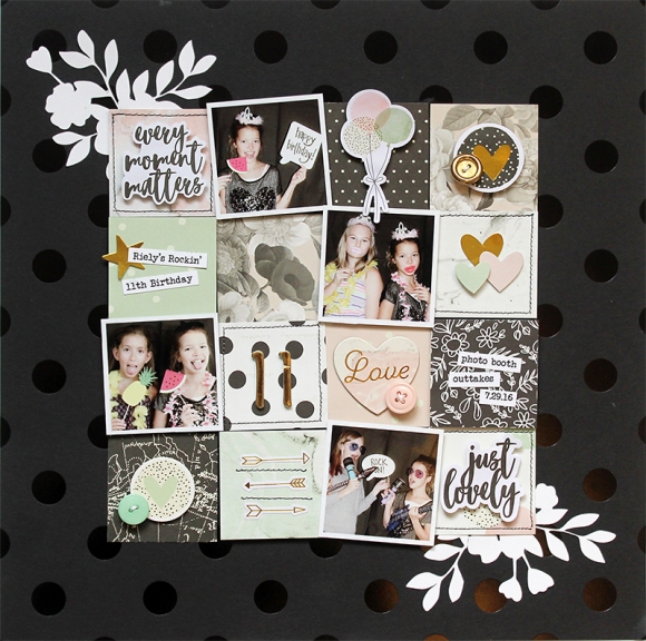
I love creating a grid design to showcase lots of little elements on a page. On this layout, it was a great way to incorporate many of the pretty patterns from the Beautiful collection.

11-2_W

I added some cut floral shapes to the corners of my grid to soften all the straight lines in the design.

11-3_W

Each piece of the grid is a miniature canvas that I decorated with an assortment of chipboard, journal strips, stickers, die cuts and buttons. 

11-4_W

I also added machine stitching to a few of the grid blocks - it adds a bit of texture and a handmade touch!

Supplies

Pages