October 2018 Blog Posts

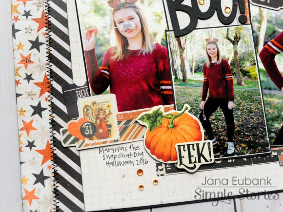
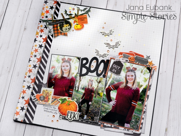
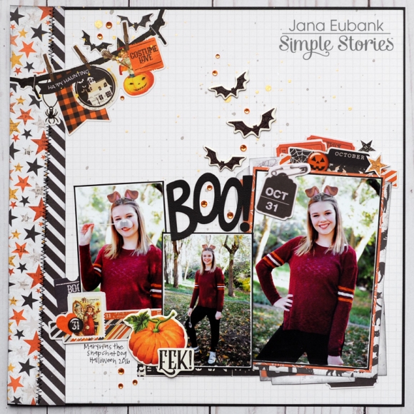
Halloween holds so many wonderful memories for me. It's a holiday that I am sentimental about, so it probably doesn't come as a surprise that it is one of my favorites to scrapbook! Hi, Everyone! It's Jana Eubank. I'm here to share a new Halloween page with you using the Simple Vintage Halloween collection.

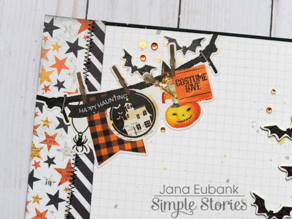
I love the layered look of the stickers and other elements in this collection. It was an easy choice to add this banner sticker to the top of my layout.

One of the 4x6 Vertical Elements cards had a layered look to it. I cut around it and added it behind my main photo, with a few more stickers and Bits & Pieces. I LOVE the die cut of the safety pin holding the back tag. It looks so cute overlapping the top left corner.

I used another sticker with a layered look at the bottom of my photos. I tucked a black die cut ticket behind it and then added a couple of chipboard elements on the right, overlapping the adjoining photo.

I wanted the layered pieces to be the star of this page and opted to build my design on a simple Hickory/Cream Grid Snap Basics paper background. Along the left side of the page, I added a splash of color with two strips of patterned paper, sliced at an angle and zig-zag stitched for interest.

Supplies

Hello again creatives! Leah here on the blog today with lots of fun ideas, tips and tricks to show you in my traveler's notebook this month. I've got a lot to share so let's jump right in! I am still using and loving the layout of the Carpe Diem Daily TN inserts. I love all the space I get from having two pages for each day.
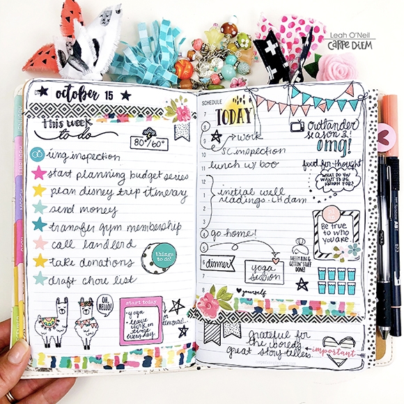
I have finally gotten a chance to open and play with some more of the Carpe Diem stamp sets. It's amazing how much versatility you can get out of a few stamps and stickers! My favorite set is definitely the No Prob-Llama stamp set. I used it quite a bit on this first daily spread. How flippin' adorable are these llamas?! I also really love the banner stamp in this set. I like to kick my stamping up a notch (and disguise some of my stamping mistakes...) by coloring in the stamped images with my TomBow markers. I use a waterproof stamping ink so that the ink doesn't smudge while I'm coloring.
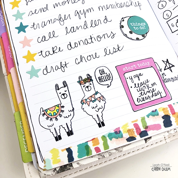
I have been getting a lot of use out of this hydration tracker stamp from the Work It stamp set on my daily planner pages. I get so much satisfaction from being able to color in the glasses of water. Yes, I am an adult motivating myself to make better adult choices with the reward of coloring. Whatever works, right?
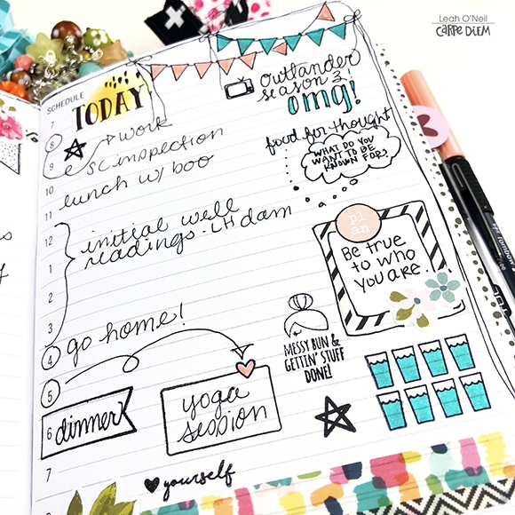
For this next daily planner spread, I put the A5 Hello Sticker Tablet to work! All of the Carpe Diem sticker tablets have such a large amount and variety of stickers in them that you can really make them go a long way. I love finding new and creative ways to use the different stickers. For example, adding a few along the top of a page to create a banner adds a touch of décor without taking up a lot of space. Layering stickers of different shapes and sizes provides an illusion of texture to the page without adding too much actual dimension off the page.
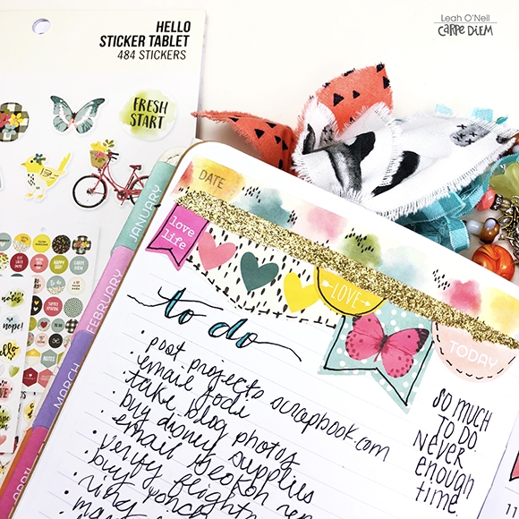
I used some of the square stickers from the tablet to decorate and fill in a few areas of white space on the spread. I also mixed in a few functional stickers from the A5 Planner Basics Sticker Tablet – that tablet is a must-have no matter what you're planning style is.
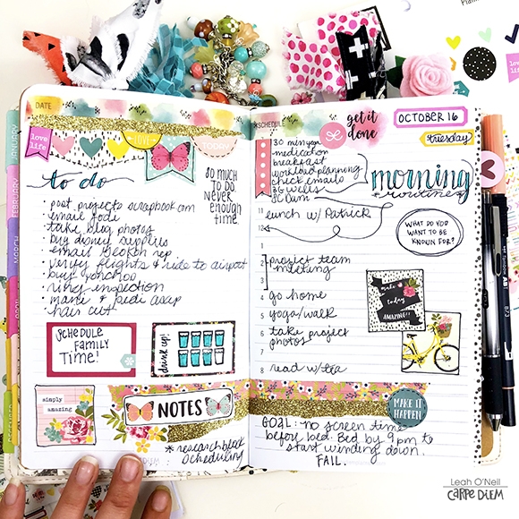
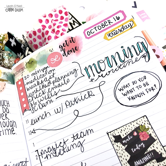
I get questions every once in a while about how I adapt my planner spreads if there is a change in plans, or if there isn't room to write something new in where I may have added a sticker already. The truth is, I barely even think about it and just draw an arrow pointing to where ever I want to fit or move something. Sometimes I'll add little swirls to the arrows to make them less boring.
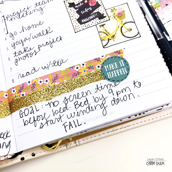
I've been using the bottom of the right page on my daily spreads to write in goals and affirmations. I always start the day with good intentions, but sometimes things just don't work out as planned, what can I say? This goal had a short life, but tomorrow is a new day!
If you go back and look at both of the spreads above, you'll see where I wrote in a question on both days: “what do you want to be known for? I've been re-writing and repeating this question a lot lately. It really resonated with me when I heard it and it surprised me how challenging it has been for me to answer. You really have to dig pretty deeply, and sometimes under a lot of layers to answer this question honestly and meaningfully. I am going to keep writing the question on my daily spreads and reflecting on it until I feel I can truly answer. I decided to do a little journaling on this topic in another one of my TN inserts this week. This is just another great example of how all-inclusive and versatile traveler's notebooks can be. I can add a notebook any time to serve any purpose I want.
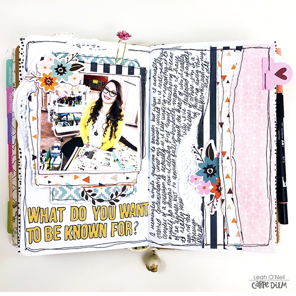
This creative journaling spread was so incredibly simple to throw together. I used 4 sheets of patterned paper and a few die cuts from the Forever Fall collection. It can be so easy to fall into the trap of thinking you need a bunch of fancy supplies to create something beautiful, but that's really not true.
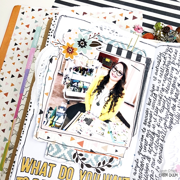
You don't even need scissors for this! The only other supplies I used were a stapler, glue stick, pen, and a couple of doilies from a pack I bought at the Dollar Tree. I simply tore off pieces of each patterned paper in different sizes to layer behind my photo and along the edge of the right page. I cut a doily in half, tucked one part behind the layers under my photo and the other under one of the layers on the right page. It turns out I actually cut two doilies because I didn't realize they were stuck together, but hey, it just gave the layout some additional texture.
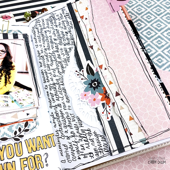
Sometimes on a journaling spread such as this, it just feels right to keep it simple. I had plenty of space to journal and was able to emphasize my photo simply by giving it some dimension with the layering. I added strips of the same patterned paper to the right page to balance out the full two-page layout.

Thanks for sticking with me if you've made it this far in this lengthy blog post. I hope I've been able to give you some new ideas and tips to help make the most of your supplies. As I said before, you really don't need a lot of fancy supplies to create something you love. Until next time friends, happy creating!
I realize everyone is thinking about fall, and pumpkins, and Halloween these days ... and I'm not usually one of those people that starts planning for Christmas far in advance.  But when I received the Merry & Bright collection I fell in love with the colors and was eager to start a new project!

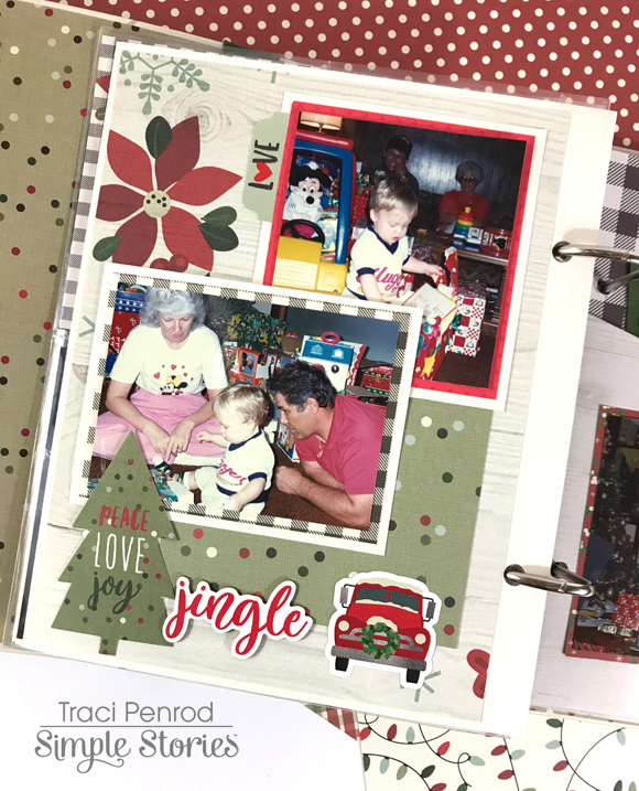
I've been wanting a Christmas album, with just a few photos from each year, to set out for the holidays. Since I have older photos, the creams in this collection really worked well.  This is my son, 27 years ago!  

I used papers from the 6x8 paper pad for this album.  I love the interest and fun that pages like this Santa add to the album. 

I also used a combination of divided photo sleeves and full 6x8 pages.  The full page design allows me to play with lots of fun papers and embellishments.  

On the page above I used stickers, bits & pieces die cuts, and chipboard.

The binder album that is part of the Merry & Bright collection is great too!  It comes with add in pages that include the pocket above.  I decided to use the pocket to store a few Christmas cards, but extra photos, holiday recipes, letters to Santa, and gift lists would all be perfect in this pocket!
The outside of the album is really pretty by itself, but I added a green ribbon, a few chipboard pieces, and some gems to give it a little shine.  
 
I have a long way to go to get my album ready for the holidays but this collection is so much fun to play with I'm looking forward to documenting all of the other years!   Thanks for stopping by!
 

Supplies

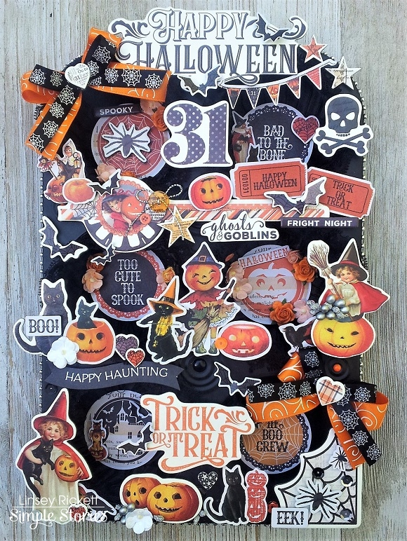
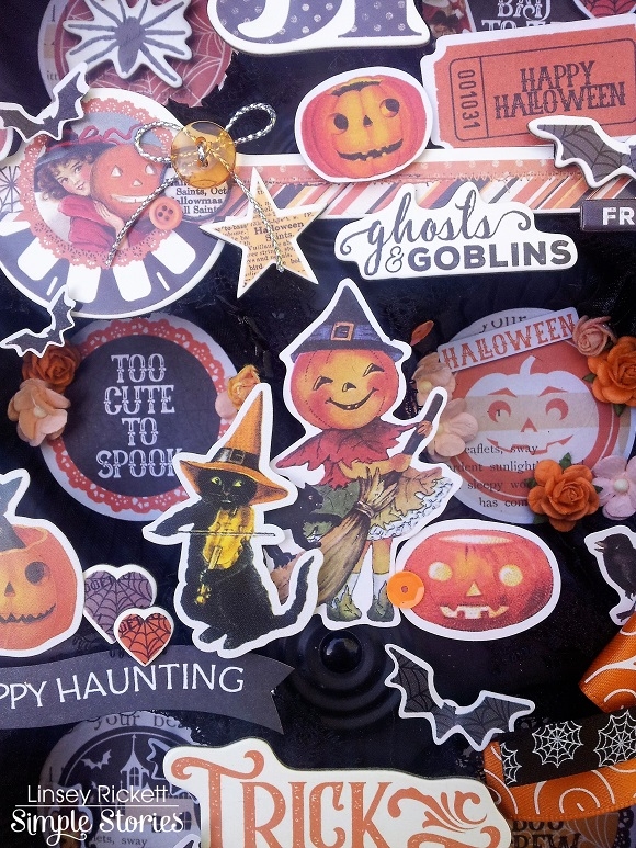
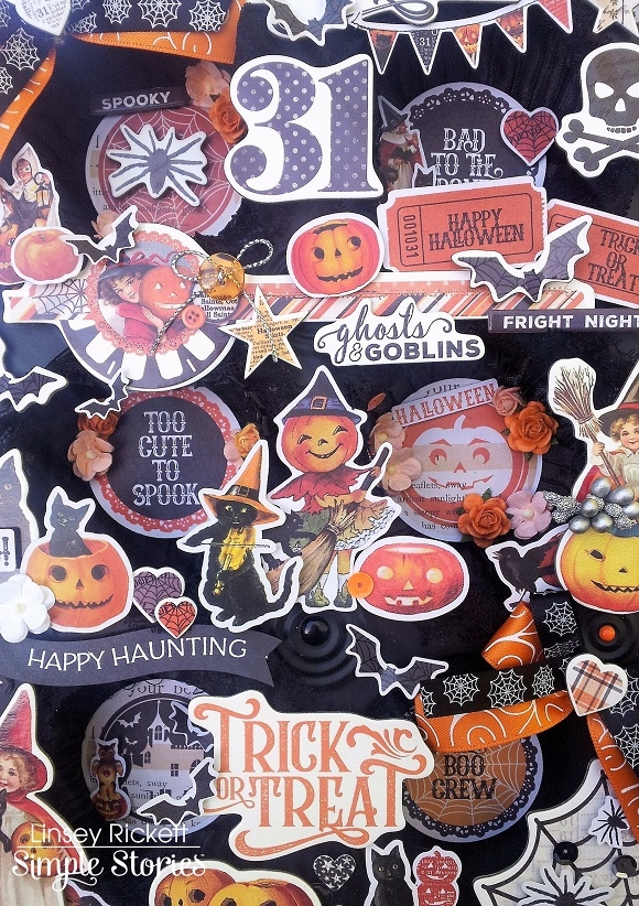
Hi friends and happy Friday! Linsey here sharing my latest altered Simple Stories project with you! Have you ever altered a cupcake tin? I've been wanting to for quite sometime now and I finally did it! I love how this cute little piece turned out and it's just in time for Halloween too! If you haven't gotten your crafty hands on the darling new Simple Vintage Halloween Collection yet, I sure hope you'll want to after seeing this spooktacular showcase!

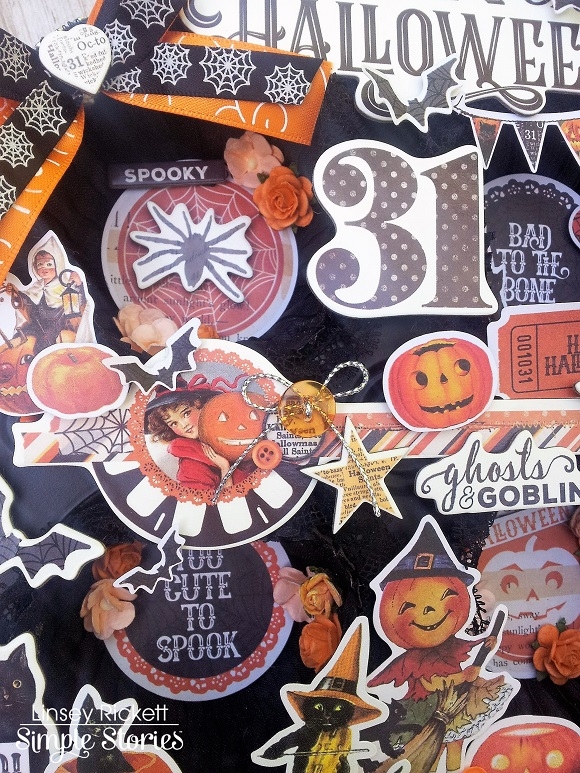
There's a few different choices when it comes to cupcake tins. Depending on what your project is, you can get a 6, 12 or even a 24 slot tin. The more slots, the smaller they are. For this project, I chose to alter a 6 slot tin. First, spray paint cupcake tin in black inside and out. Let dry, spray paint 2nd layer and let dry again. Next, line inside of each slot with black lace trim. Now our tin is ready to begin decorating! The circle die cuts in the Bits & Pieces are a perfect fit to adhere to the wall of each slot.

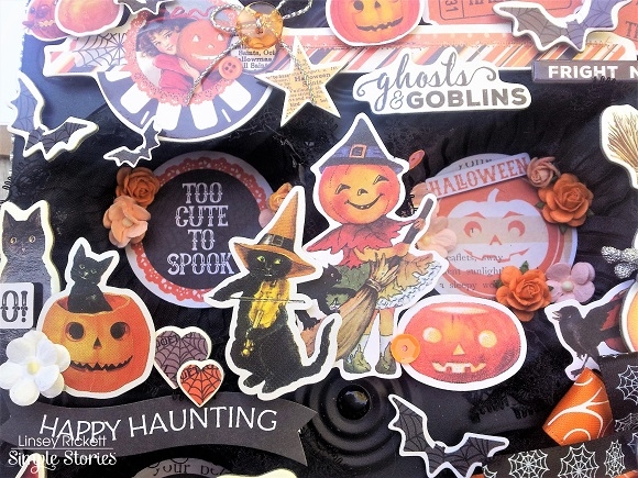
Create a main title and build the scene adorable images from the 6x12 Chipboard and Combo Stickers. The smaller images from 4x6 Stickers are just right for the insides of the cupcake slots. Add dimension to some pieces with 3D Foam Squares.

Embellish with extra accents like ribbon, sequins, bling trim, enamel dots, etc. The imagination is the limit! I couldn't help but fill in just about every nook and cranny of my cupcake tin! So. Much. Fun.

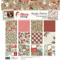
Don't forget that there's much more to this darling and festive collection! The 12x12 Collection Kit and 3 Pack Washi Tape is a must-have for any Halloween-loving crafter or planner! For me, another perk to this collection is that it's not too scary or creepy. It's much more on the cute and sweet side, which I love. It's a great collection for the young and the young at heart! I think this will be a super cute addition to this years Halloween décor!  

And that's all for me! Thank you so much for stopping by and allowing me to share my project with you today! I've enjoyed it so much and I hope you have been inspired to create something fabulous with the Simple Vintage Halloween Collection too! Until next time, happy crafting!

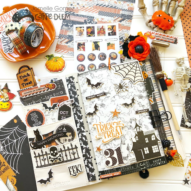
Hello everyone! Jomelle here on the blog today sharing my bewitching Halloween Set Up using the Simple Vintage Halloween. One of the best month of the year is here and I couldn't be more excited. I cannot tell you how much I love Halloween. Oh how I wish I can celebrate Halloween all year long. There's just something about the costumes, candies, spooky decor, witches, ghouls and everything else.
 
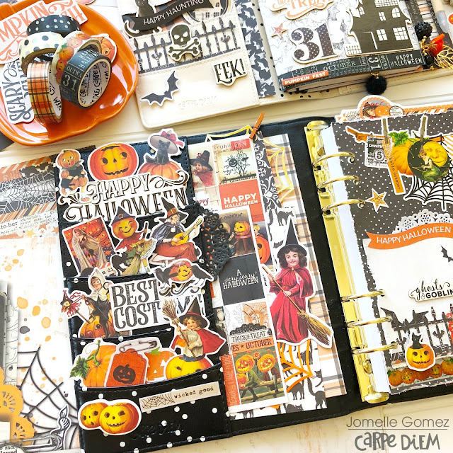
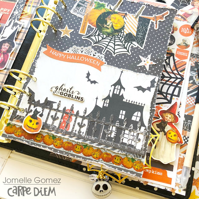
I love Halloween so much that I wanted to set up my TN and my A5 planner. Here I am using the Cream Dot Traveler's Notebook and the Black Speckle A5 Planner.
 
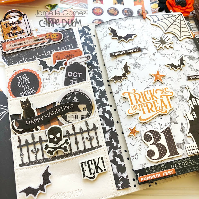
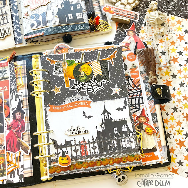
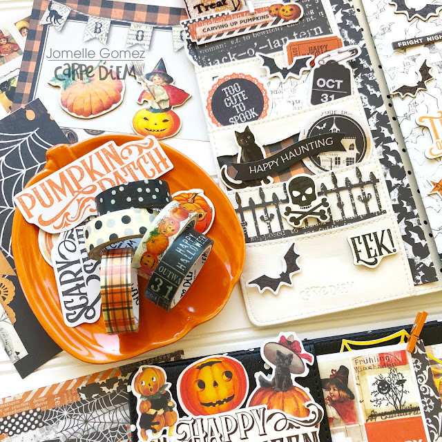
To add that "vintage" look for my dashboard, I decided to distressed all the edges. I used a punch to add the fence.
 To create a be-witching theme, I stuffed my pockets with bits and pieces. I used washi tape to keep the pieces stay in place. I also added the orange and gold spider web from my stash. To be honest, I thought the witch with the red outfit sitting on the broom stick looks cute and creepy at the same time. It kinda freaks me out a little.
 
Here are the wicked washi tapes I used to decorate my Halloween set up.
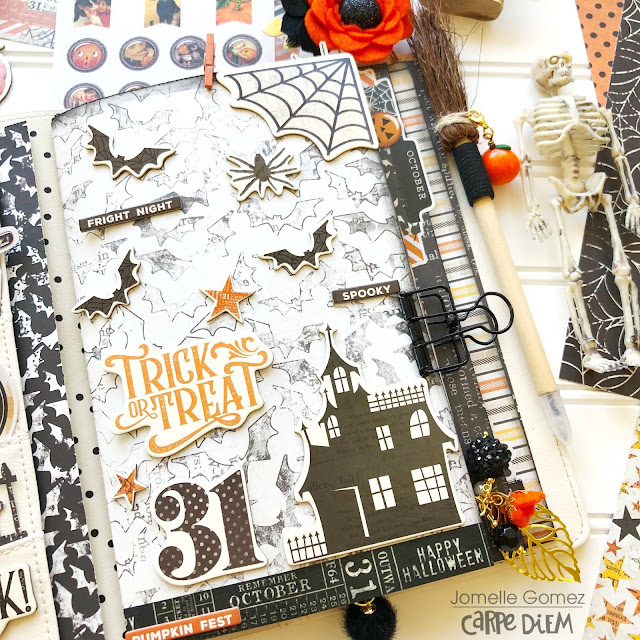
I always want to change things up in my Traveler's Notebook. One of the easy way is by creating a Halloween theme covers for my inserts. I can keep using the same inserts throughout the year. 
For my TN set up, I wanted to only use black, white and orange colors. I picked through my bits & pieces, papers and stickers and chose those colors to decorate my TN.
Creating this insert cover was super easy. All I did was cut the "jeepers creepers" 12x12 paper to the size of my TN. Then I added chipboard stickers to decorate. I also added a washi tape on the bottom of the page. That's it. Super easy huh?
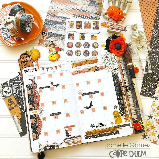
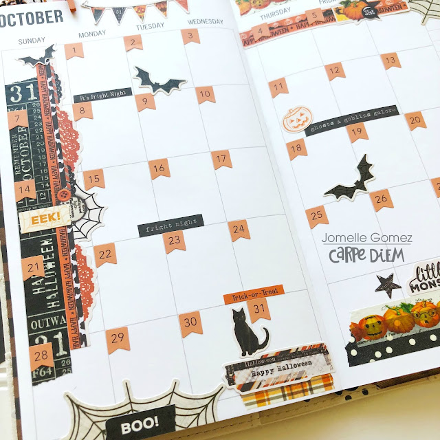
Before the Pen October Monthly Layout. Planner girls love to share this layout before they permanently write down their plans. Sometimes I also use this page as memory keeping in my planner. I love to jot my family's adventures and memories, especially our "food trips"
I used the orange number stickers to add the dates. Then I decorated with washi tapes and stickers.

 
Thank you for stopping by for a spell and I hope you enjoy viewing my bewitching Halloween Planner Set Up. See you next month.

Supplies

Hello! It's October and that means cooler temps and of course, Halloween!  This time of year has been my favorite ever since I  can remember and I just love decorating for the trick-or treaters! I also get excited about Halloween scrapbook paper as well and Simple Vintage Halloween did not disappoint! I  love the traditional black and orange colors mixed in with the cremes and yellows!  Honestly, it was tough to pick which pattern is my favorite; I love them all! 

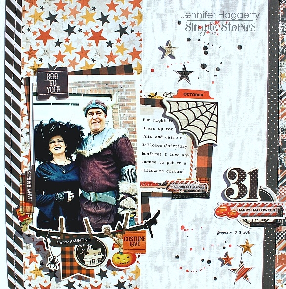
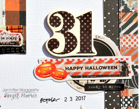
I  began with white cardstock as my background then adhered strips of my top favorites (again tough to narrow it down!) using the star background of "Trick or Treat" as the largest piece. At the right of my page, I  stitched through two patterns and then layered two pieces from the Bits and Pieces pack.  For my title, I  used the "31" from the 6x12 Chipboard Sheet.  

I  know I've written this many times before but I  appreciate a good banner!  And how adorable is this one found on the Combo Sticker Sheet?  I  adhered it at the bottom of my photo using a few pop dots!  

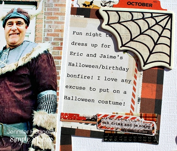
For my journaling, I  utilized one of the 3x4 Elements by turning it upside down and placing the Chipboard Spider Web in the corner, I  also added a few stickers from the Combo Sticker Sheet as well.  Inserting a small sticker or die cut is a nice accent and adds a lot to break up a pattern or white space. 

I layered the plaid of "Jeepers Creepers" under my photo and added one of these cute tags from the Bits and Pieces pack.  I  stapled the tag before adhering just to give it extra security.  

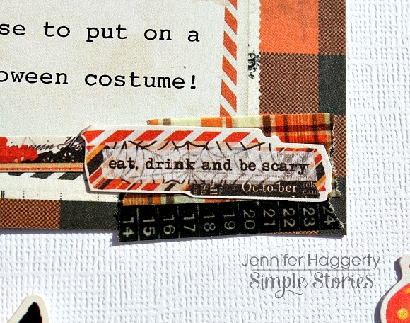
Here, you can spy two of the adorable Washi Tape from the collection I  layered at the corner of my journaling.  I  then affixed one of the cute sentiments from the Combo Sticker Sheet.  

Thank you for stopping by the blog today!  I  hope this inspires you to do some creating of  your own with Simple Vintage Halloween or any of the other awesome Simple Stories collections!  Have a great day!

Hey Crafty Friends!

Florence here back with another blog post. In my entry a couple weeks ago I shared my October Daily Project and said I would show you a couple of my project photos :) I actually ended up creating a challenge with my friend for some guidance requested by a handful of people. I also created loose leaf pages for now because I’m indecisive and originally wanted this to be in a TN, then thought hey this would look great in a planner too. First world problems- having options. 

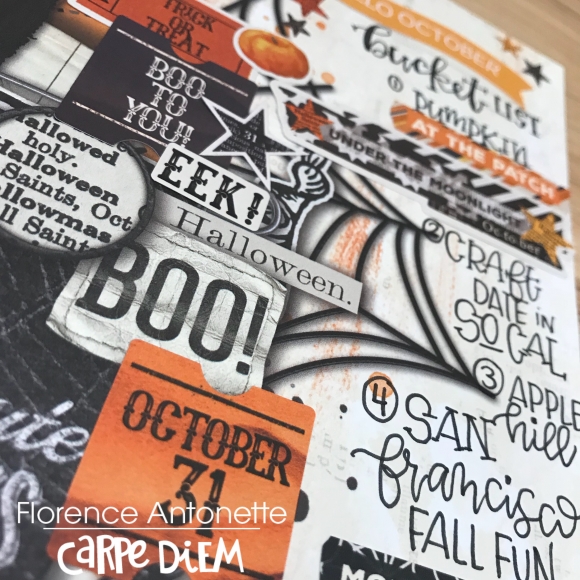
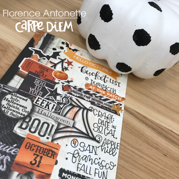
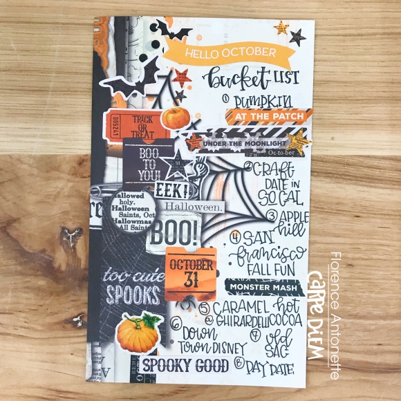
Day One was my October Bucketlist. Normally I have a huge list, but reality sank on things I actually CAN do versus what I want to do. So I kept it simple and picked only 8 things. 

1. Go to the Pumpkin Patch

2. Craft Date in Southern California

3. Apple Hill (my ultimate favorite Fall activity in Northern California)

4. San Francisco Fall Fun

5. Caramel Hot Cocoa at Ghirardelli (San Francisco, CA)

6. Downtown Disneyland

7. Old Sacramento

8. Plan a fun day date

Sometimes simple, less detailed bucket lists are more doable. Sure I could've done a longer list of 31, but what is the likelihood of me actually accomplishing it? 

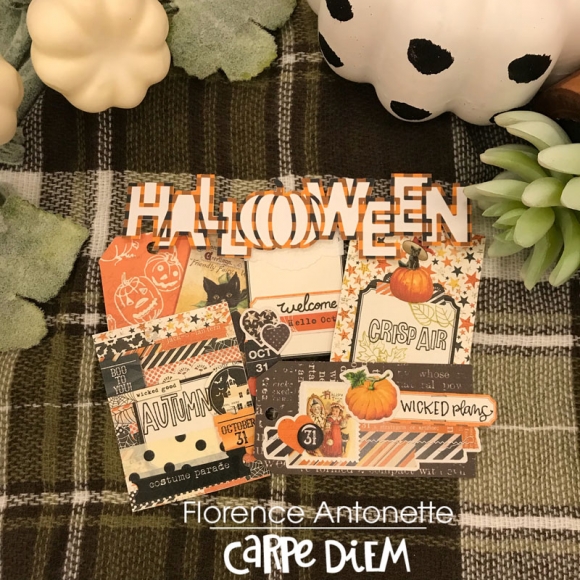
I also created some creative layered tags. These are so simple!! Especially with layering! I think they look good by themselves or added on to a page as well. These tags can have endless possibilities! 
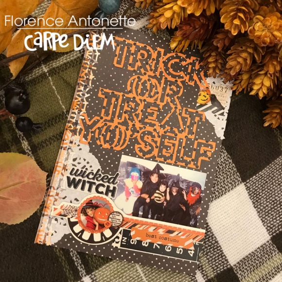
Lastly, I wanted to share with you my Day 9. This was a throw back photo of 26 years ago with some of my cousins, my brother, and I. Isn't it interesting how photos can just bring back a day and memories can surface? That's one of my most favorite things about memory keeping. In the planning world, we call it memory keeping, in the paper crafting world it's called scrapbooking. I choose to scrapbook in TN's and planners and preserve this through memory keeping LOL! See what I did there?

Are you still a traditional scrapbooker? Or are you a planner girl turned memory keeper? I love how this community has evolved into something SO amazing and we can inspire each other through our photos.

Keep an eye out for my next blog post this month where I will teach you how to make simple box stickers with our digitals!! Did you know that we have a digital store? I love it because it's readily available especially to those who aren't without a storefront scrapbook store. Until next time!!

XO,

Florence

Supplies

Hi everyone! Tara here with Secretbees Studio  Halloween is one of my favorite holidays to decorate and craft for. I love the rich color combos, the spookiness and the fact that everyone young and old love this festive day! The treats aren't too bad either!

For this project I wanted to combine my love of treats into a decoration and this hanging banner definitely fits the bill!  The 'Simple Vintage Halloween' paper collection from Simple Stories is full of traditional blacks and oranges in amazing designs and the chipboard, ephemera and stickers are cute, quirky and super fun! 

Using the amazing patterned papers as the base of my banner, I cut three different backgrounds for my banner flags. I then created pockets for each flag from card stock and topped those with more fun patterned paper or a 4x6 journal card. The pockets themselves are large enough to hold a good amount of holiday treats and a small decoration!


A big variety of the Bits & Pieces, chipboard stickers and word stickers were layered over the top of the pockets adding lots of fabulous visual details! To accent each pocket a bit more, I used strips of the matching washi tapes too!

To hang this jolly banner I used a dowel rod that was cut to size and covered in more washi tape with a strip of ribbon adhered to both ends. I then embellished the banner with  lots of paper curls and more stickers for a jolly look! 

Supplies

Pages