Dorymar Perez's Blog Posts

Hi Friends, It’s Dorymar today! This is my first project as a 2020 Creative Team Designer, I’m super excited to be back on the team. This 2020 will be a very creative year! Today I share with you a Gorgeous Snap Album with the New I AM Collection; I love every piece of this collection. Over the years this is one of my favorite Simple Stories collections, what I like most about this collection is that we as scrapers are always behind the camera, looking to document every perfect moment with our loved ones, but this collection allows you create from you and set aside everyone else. LOL!!!
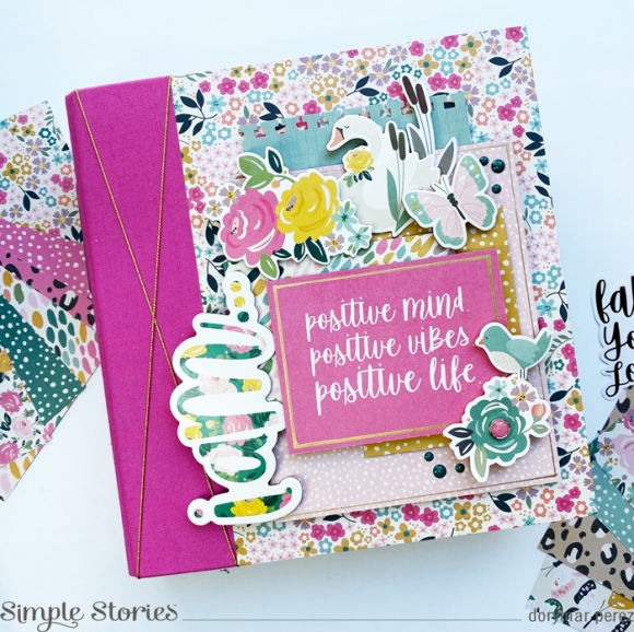
The collection is full of refreshing colors and patterns, but as I love bright colors I wanted to focus on the pink and bluish tones. That's why I decided to select the 6x8 Pink Snap Binder, because it is super bright and will stand out perfectly with the golden details that the collection has.
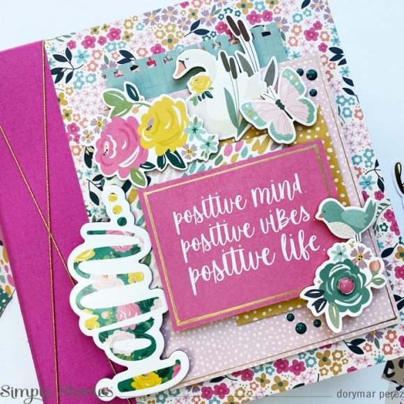
For the cover, I selected various patterned papers and snap cards to create layers.  I selected the 3x4 card as a title of my album, around the card I added a file line with a gold pen and some cutest elements from the chipboard’s sticker.  To add texture, I added one of the new brads and enamel dots. To finish my cover and give a personal touch I added a gold twine on top of the side of the album. I am in love with the result!
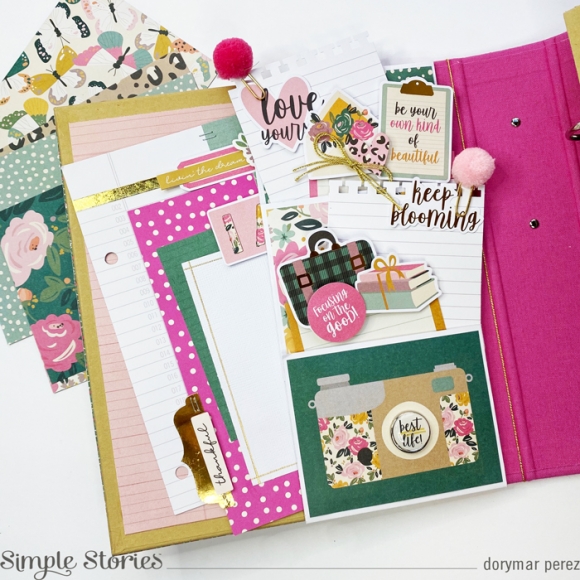
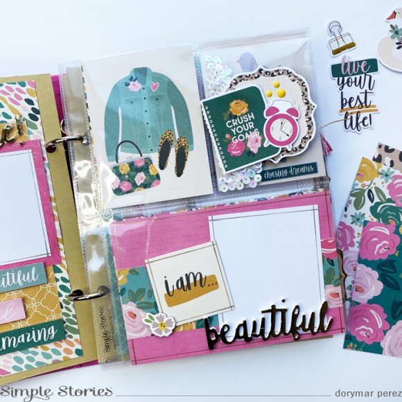
This collection has so many beautiful elements that I wanted to use as many as I could. Inside the cover I created a series of pockets, full of space for journaling and photos, as well as using a lot of goodies from the collection. It’s gorgeous!
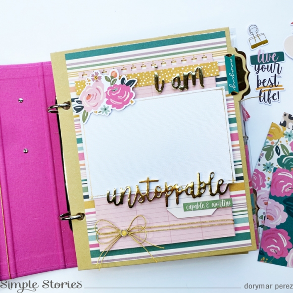
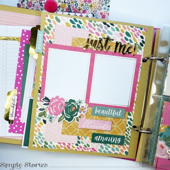
One of the new products that I liked the most, are the gold words, I used them in several parts of the project, above you can see how they stand out in the dividers of the album, in the pocket pages and in the journaling cards.   They look spectacula
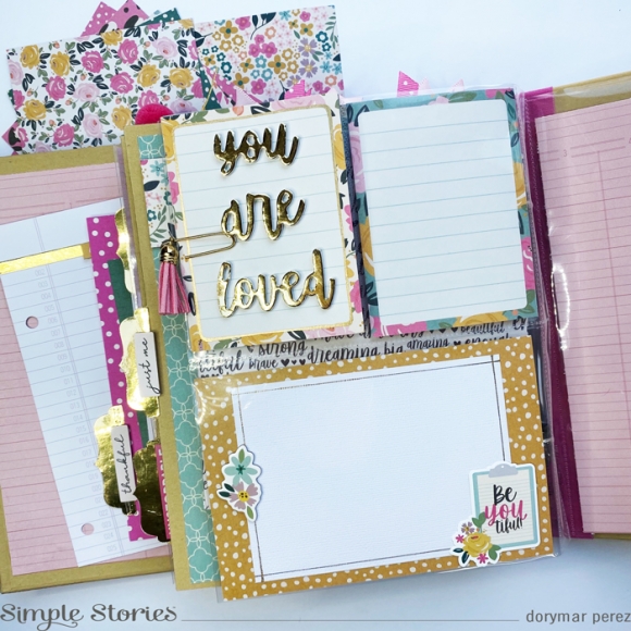
Who doesn't like to create your own embellishments? Here you can see how I used the die cuts and stickers to create a fun piece to the pocket page.
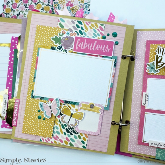
The new decorative brads have a great variety of pieces, among them some ephemera with built-in brads that are beautiful, on the page you can see how I added it between the pieces and it is perfect to add phrases, dates or just some sticker with a message.
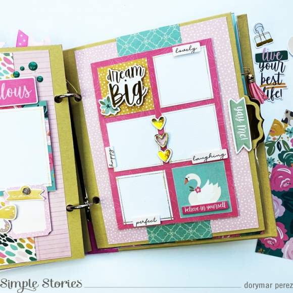
I love to create a layout for my dividers, they give me the opportunity to make different designs to add photos of different sizes. Here, I added space for 2x2 pictures and used the fun 2x2 cards to decorate it.
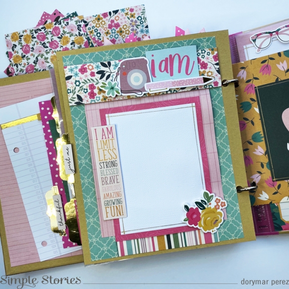
To add more golden elements, I used a golden page from my shelves and used my digital cut machine to cut some tabs from the Simple Stories design in the Silhouette Store. This gave the project a cute touch
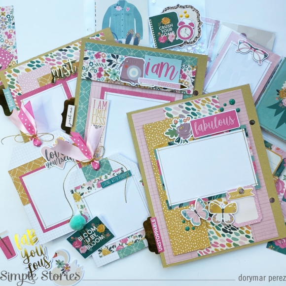
I hope you've enjoyed a peek inside my snap album using the I AM collection and inspired you to create your own one.

Supplies

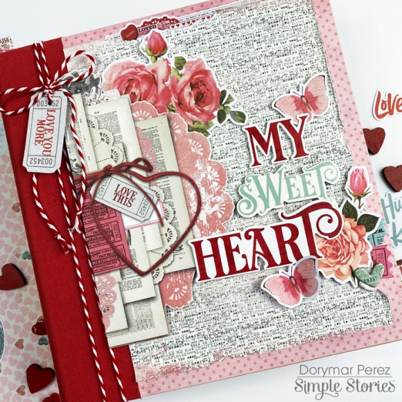
Hello, Simple Stories fans! It's Dorymar here sharing a lovely SN@P! Album created with the My Valentine Collection.  This collection is so gorgeous! It has a wonderful mix of vintage elements and beautiful colors.

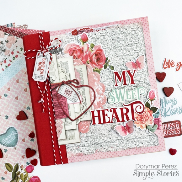
I selected the 6x8 Red Snap Binder for this project because it matches perfectly with the collection and highlights the beautiful colors. For the cover, I used many elements and added layers to make the project more fun!

I used pieces from the Combo Sticker, Die Cuts, Chipboards, Mini Sticker Tablet and paper from the 6x8 paper pad to decorate the cover.   I love how the elements, colors, and designs combine perfectly to make a wonderful project.

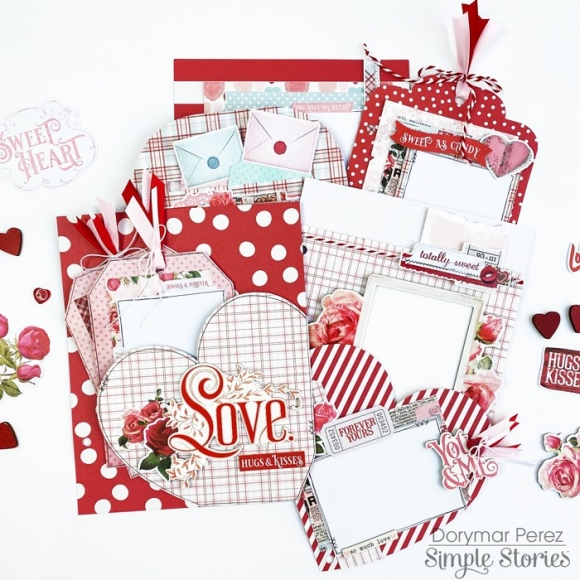
I love creating my own divider pages, in this case, I will share ideas on how you can customize the pages included in the Snap Binder. 

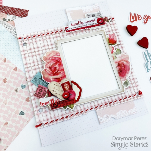
The collection includes beautiful layered frames with various designs that make the task of decorating easier.  I adhered all the die cuts with dimensional tape to create layers and highlight each element. I distressed the edges of the papers to continue giving the vintage touch to the project. Also, I added twine and staples to incorporate texture into the page.

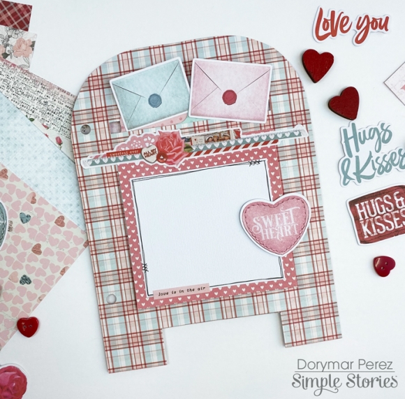
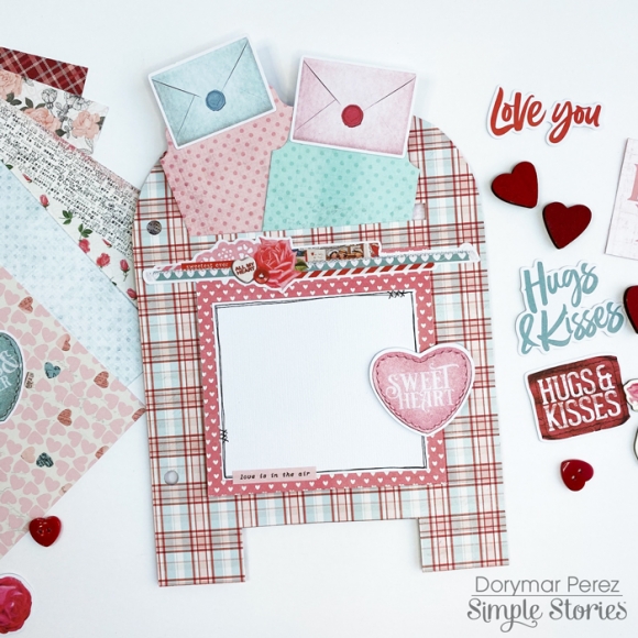
One of the typical things we see in the Valentine's collections are the mailboxes, because it’s one of the seasons that we send cards to our loved ones. I used one of the papers from the paper pad and drew a mailbox to create a beautiful page divider in my album.

This mailbox has a pocket on the top and has two beautiful tags to add photos or journaling.  On the front it has a flap that opens and allows more space for memorabilia. It’s so gorgeous!

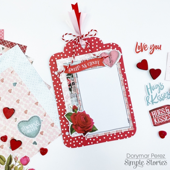
One of the things I love about snap albums is that the page dividers have various patterns and colors and allows me to play with them. In this case I created a giant tag to change the pattern of the album and make it fun.

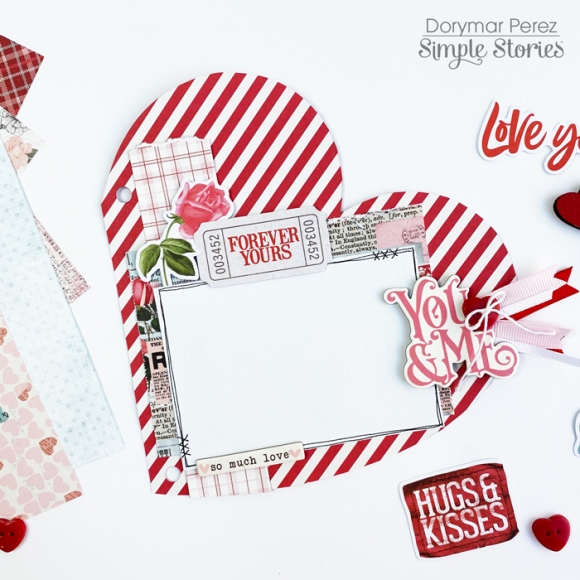
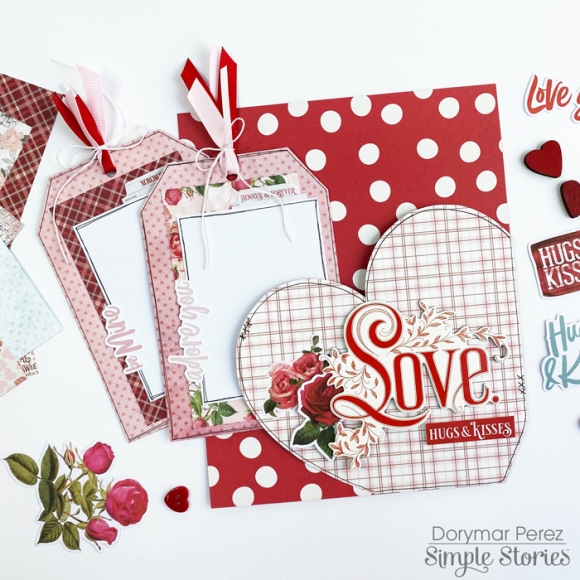
A giant heart couldn’t be missing in this project, I used another page divider and draw a heart to continue incorporating versatility and more space for photos to my project.

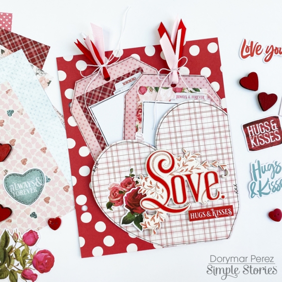
I selected one of the 6x8 papers and cut part of a heart to make a pocket, I decorated the front with the love word on chipboard and closer I adhered stickers flowers.

Inside the heart pocket, I included two tags, which I’ve decorated and created areas which will be perfect to add pictures or journal.

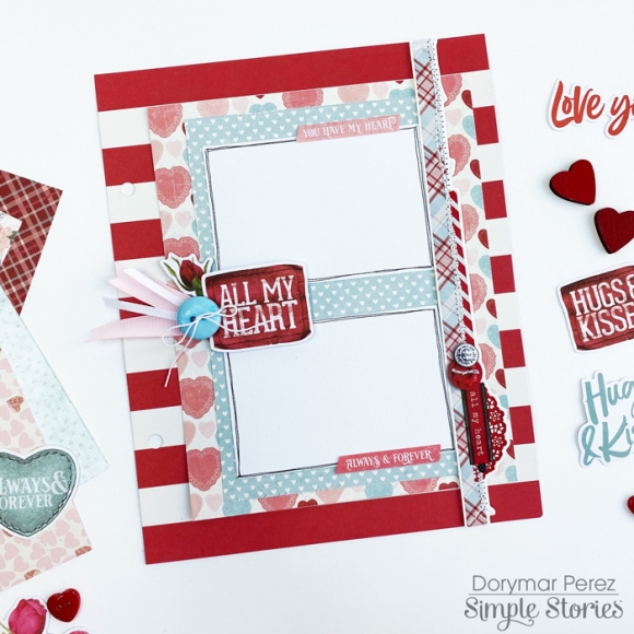
In this page divider, I created a big flap on front with space for a lot of photos, on the side I placed a beautiful border that includes the sticker sheet and on the side where there is space for the photos I incorporated die cuts, tape and a button.

I hope you enjoyed the project and I also hope it inspired you to use this fun collection. Please come join us on Social Media @simplestories_ and myself @dorymar_pl.

Happy scrapping!

Supplies

Hi crafty friends, It’s Dorymar today with a super fun Sn@p Album with the Hey Crafty Girl Collection! This collection is seriously perfect for all crafty girls.  It’s just fantastic! 

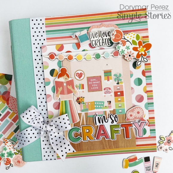
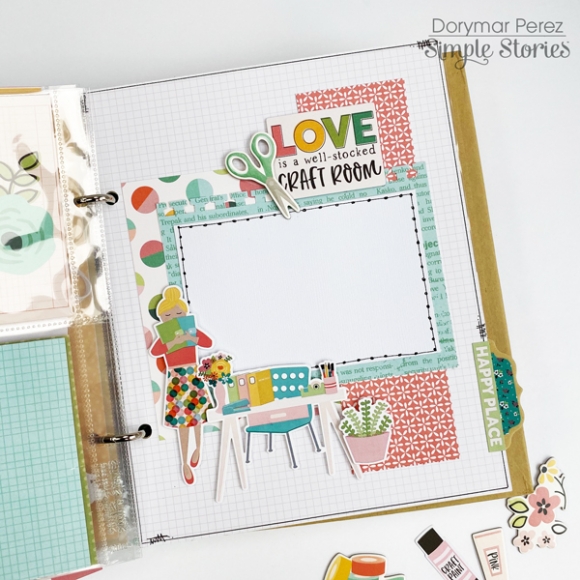
For the cover I want to recreate a craft room, to create it I used one of the 4x6 journaling cards in combination with the gorgeous chipboard stickers. I put all of them in 3d foam dots to create layers and dimension. I love how they look together.

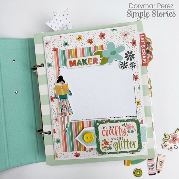
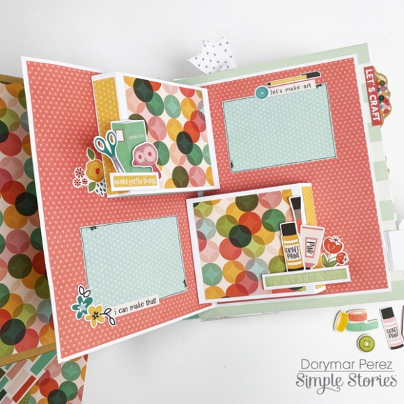
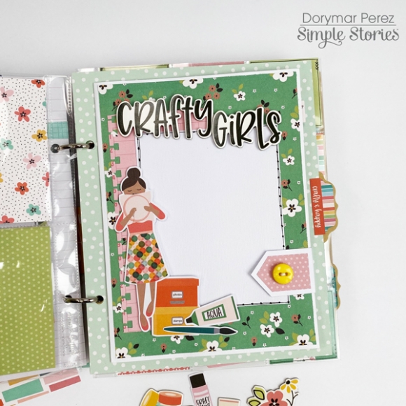
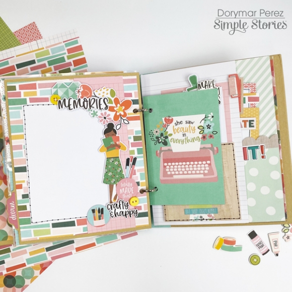
The mini was decorated with all the beautiful patterned papers, ephemera die cuts, chipboard pieces, stickers, buttons, ribbons, etc.  Each divider is different from the others, this makes the album very fun.  In this occasion I decided to do something crafty in honor to the collection and created three-dimensional pages.

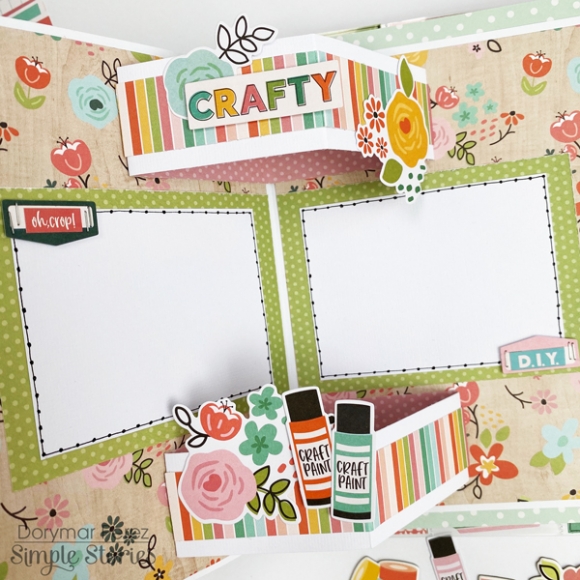
Inside of this spread, you have space for four pictures, two of them are in dimension. Closer to the photo mats I created a fun cluster with the die cuts and embellishments.

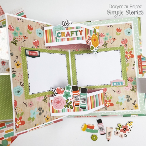
The collection has several crafty girls and I had a lot of fun playing it on different pages. For this spread, in particular, I created an open fold layout and I used the Crafty Girls chipboards as a title, inside of this spread I created a fun dimensional page.

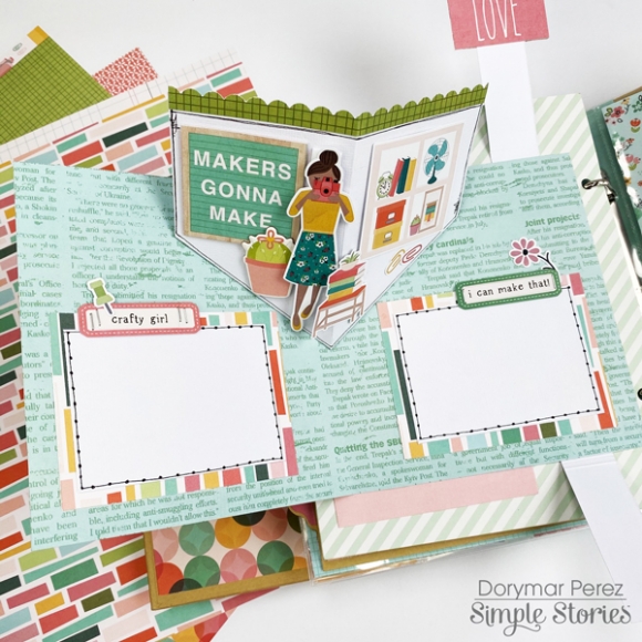
When you open the spread, I’ve got a HUGE 3d pop up!  There is also room for photos or memorabilia to be stored. Closer to the pop up I created little clusters with the die-cut from the ephemera packs. 

Here is a close-up of the spread. The embellishments are so beautiful, I love them all!

This spread is very fun, on the outside I wanted to keep it simple but when you open it is so fun and pretty.

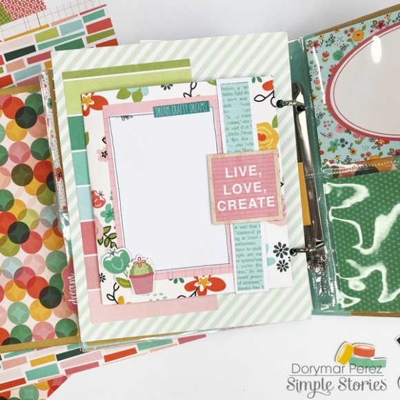
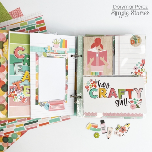
I wanted to showcase the papers in this collection, so I used as much as I could.  When you see each of the pages of this album you fall in love more with the collection. Here I show you some of them.

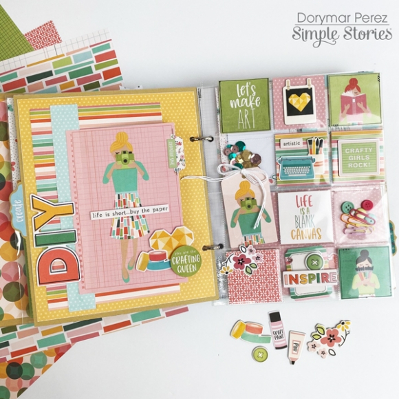
Many pages are pocket pages with inserts.  So again, LOTS of room for photos!!

This album could not stay if the pocket page for 2x2 cards. I love these pocket pages!

I had a lot of fun designing this project and I hope it inspires you to create your own with the stunning Hey Crafty Girl Collection! Thanks for stopping by!

Happy Crafting!

Supplies

Pages