Nathalie DeSousa's Blog Posts

Hello Simple Stories friends!!

Nathalie with you today with  a new project using the beautiful Simple Vintage Great Escape collection.  As soon, as I received this collection, all i could think about was documenting our hikes around the river bank.  We live next to a river, so a large part of our neighbourhood is a part of a provincial park, which means i get to experience nature 5 minutes from home!  So, I pulled a picture of my littles enjoying our hike for this page...
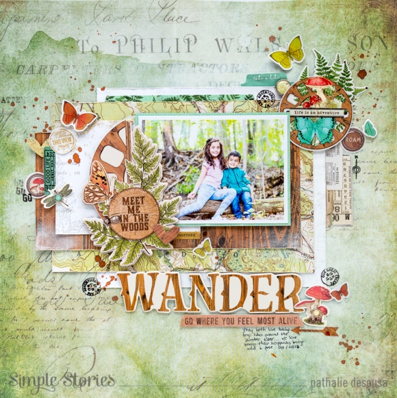
I loved the papers in the collection so much, that i decided to play with them to create the page.   I started by adding a little bit of white acrylic paint to the b-side of Born to Roam paper - that creates the soft white halo around the papers -. 
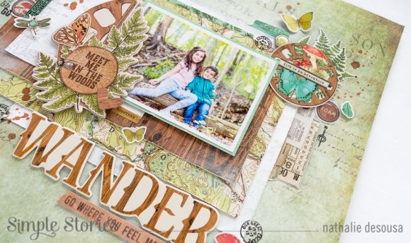
While the paint dried, i started to create the paper layers.  First, i backed the picture with a piece of the Fern/Juniper Basic paper.  I wanted to emphasize the color of the picture, so i decided to use lots of green and wood grain papers.   I cut layers from the Wild and Free, Time  for Adventure, Let's Explore, and Made to Wander  papers; along the way, i distressed the edges of the papers and added a bit of white paint to some of them, s too.
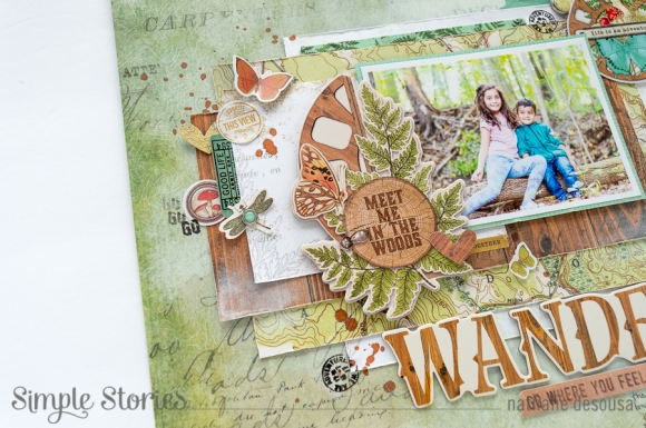
I love the layered Chipboard frames in this collection, and have learned that sometimes, i need to alter elements to make them work for my page.  So, i trimmed the frame part of the chipboard, and used the clustered elements as an embellishment for my picture.  In addition, i added a few more stickers from the collection.
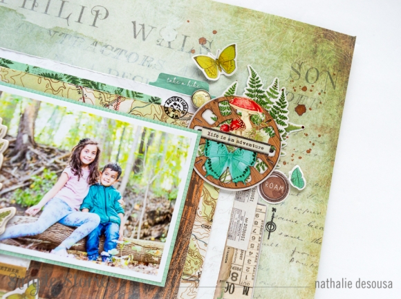
To balance the page, i added a large cluster of embellishments to the top right corner of the picture.  First i added a strip of washi tape in between the bottom two layers -this helps to give the impression of more paper layers-, then used some of the banner stickers to add more layers to the right side, then just added the large sticker at the very corner of the picture.
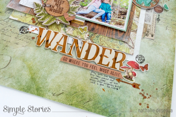
The large chipboard "WANDER" word is the perfect size for a title. So, i combined it with some ephemera and those cute mushroom brads to create my title.  I added small butterflies to create movement through the page starting at the title, and zig zaggiing through the page.  In addition, i added a few stamped images to bring extra sentiment to the page.
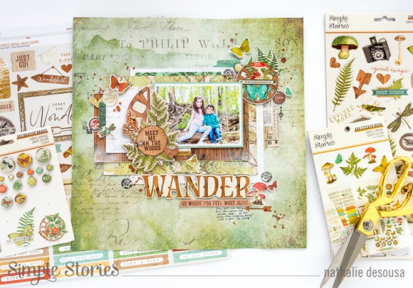
I love how this page came together, i just played with paper and embellishments to bring the rustic look of nature to the page.  I am sure you are going to love the new Simple Vintage Great Escape collection for all your outdoor adventures.  Cannot wait to see what you create with it!!

XO

Supplies

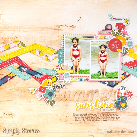
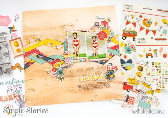
Hello Simple Stories Friends! Nathalie with you today with a new layout that celebrates the splendorous Summer days, and what better way to document those sun-filled memories than with the new SUMMER FARMHOUSE collection from Simple Stories.  

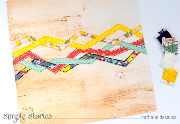
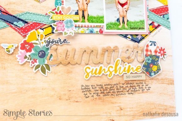
I love the country feel of this collection, so i decided to "modernize" a weaving design for the background of the page.

I cut zig zag strips from a few of the papers in the collection, and literally weave them along the width of the paper.  Once they were in place, i brought back the homemade feel of the collection by hand stitching each strip to the woodgrain paper -Sunnies and Sandals-

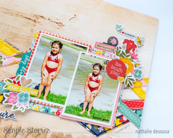
The lovely red color in the palette matched the color of my daughter's bathing suit  -12 yrs ago-, so  i printed a few of the pictures, and layered some papers (3x4 elements and 4x6 elements) behind the images.  Once i set them on the right of the page (along the stitched weaved strips), i embellished the  images with pieces from the ephemera, sticker sheet and tablet. All the florals in this collection are amazing!

I love the tone on tone look of the Summer chipboard piece on the background; so, i mixed it with a die cut piece and a stamped image ( the collection matching stamp is awesome,and so versatile!) to complete the title.  A few more embellishments completed the page.

This layout was truly so much fun to put together using the beautiful  Simple Stories' Summer Farmhouse collection.  I am sure you are going to love all that you can document with it this summer!

XO

Supplies

Hello Simple Stories Friends!

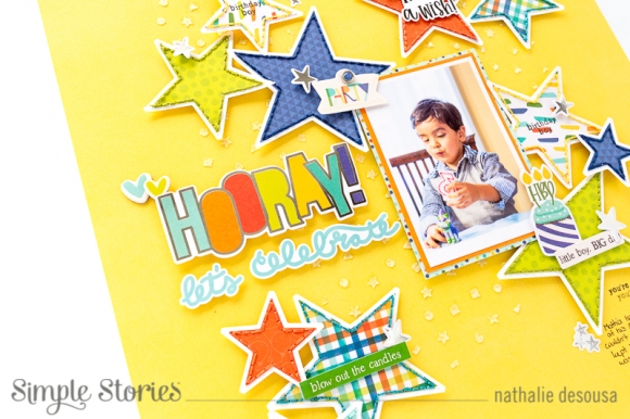
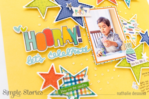
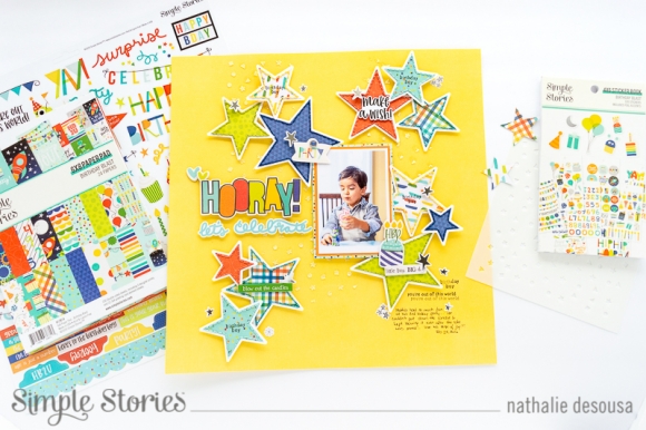
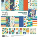
Nathalie with you today to share a colorful and fun page with the new BIRTHDAY BLAST collection.   This new collection is filled with fun designs, colors and sentiments that are perfect to record those special celebrations.   

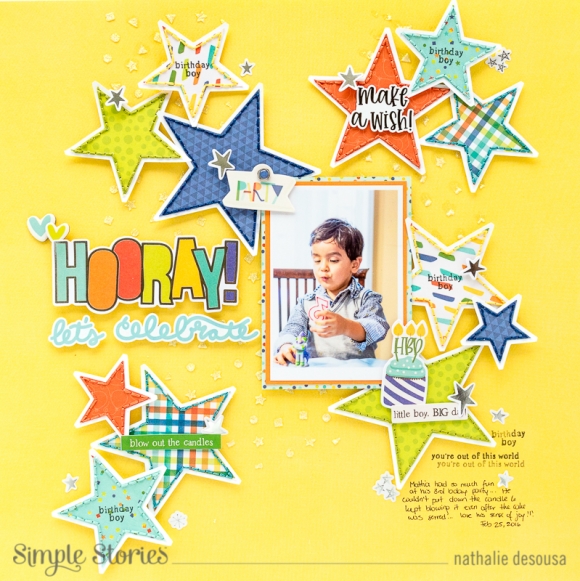
I love the masculine tones in the collection, and all the galactic designs were just ideal to document this picture of my nephew a few years ago ( his party was all about spaceships).    

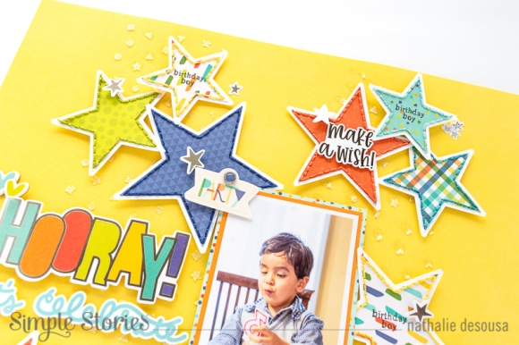
The new Color Vibe collection Basic cardstock are amazing, and provide an amazing background for any layout.  For this page, i used the Buttercup paper from the Sn@P Color Vibe Light pack, and added a bit of sparkle to the background using glitter paste and the 6x6 CONFETTI stencil.   While the glitter dries,  i cut a few stars from the 6x8 paper pad and papers from the collection and hand stitched them to a white cardstock offset of the shape.

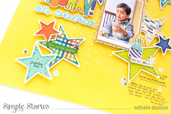
I  used a bit of foam adhesive to attach clusters of the handstitched  stars to the page, making sure that i had a combination of the colors of patterns.   I added a few small embellishments to each of the clusters.

To create the title, i  used a combination of ephemera and stickers from the collection.   Once, i set the title down, then i used a  few papers to back the picture and attach it to the right of the title.

To finish this page, i used the BIRTHDAY BLAST stamps  to add a few sentiments to some of the stars, and to help tell my story.    A few silver stars from the Sticker tablet and ephemera packs complete the page.

I hope this inspires you to mix color and design on your next celebration page.  The new BIRTHDAY BLAST is so perfect to document those happy moments.

XO

Supplies

Pages