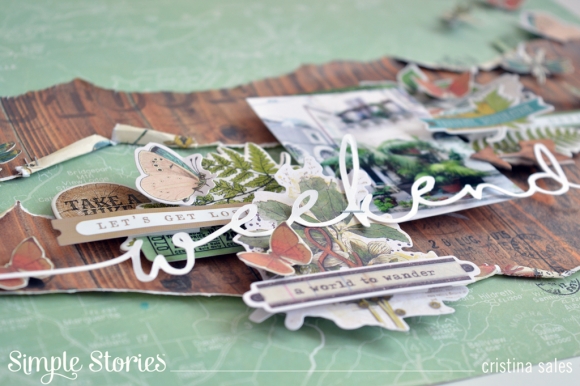
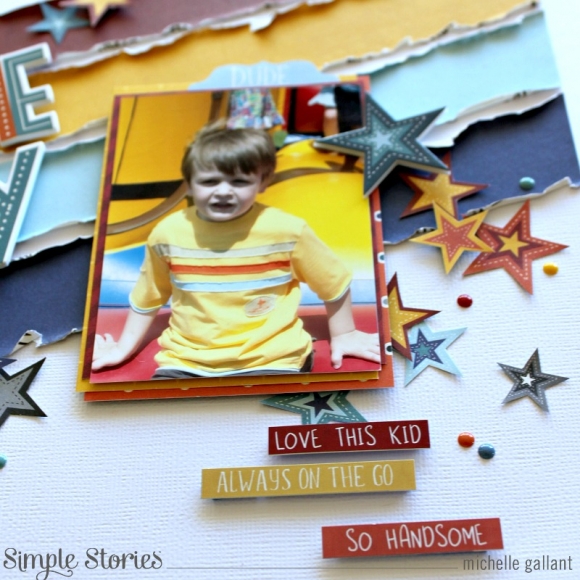
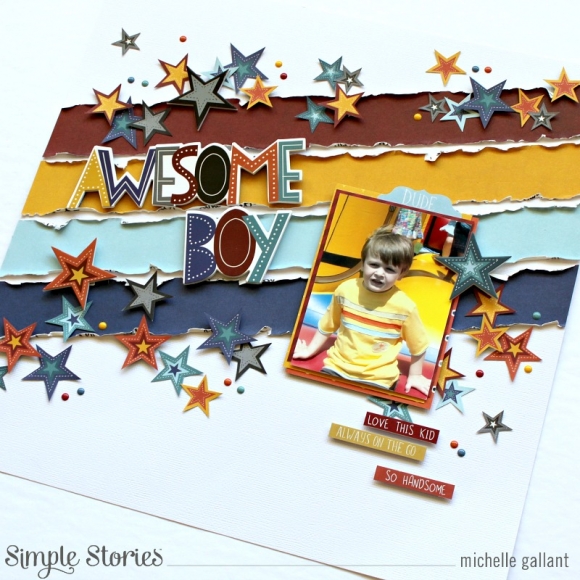
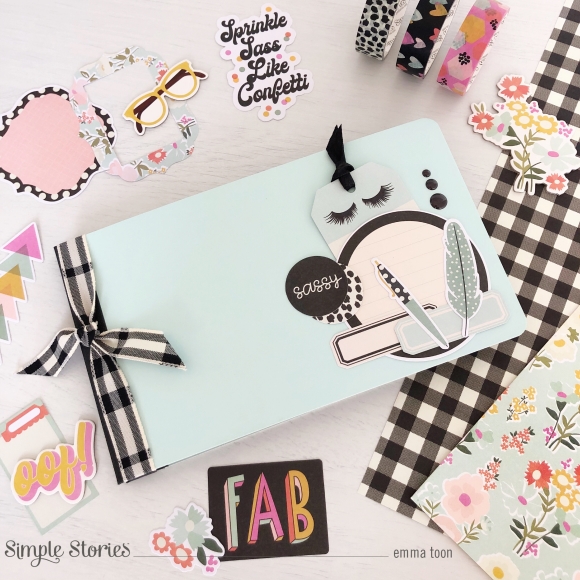
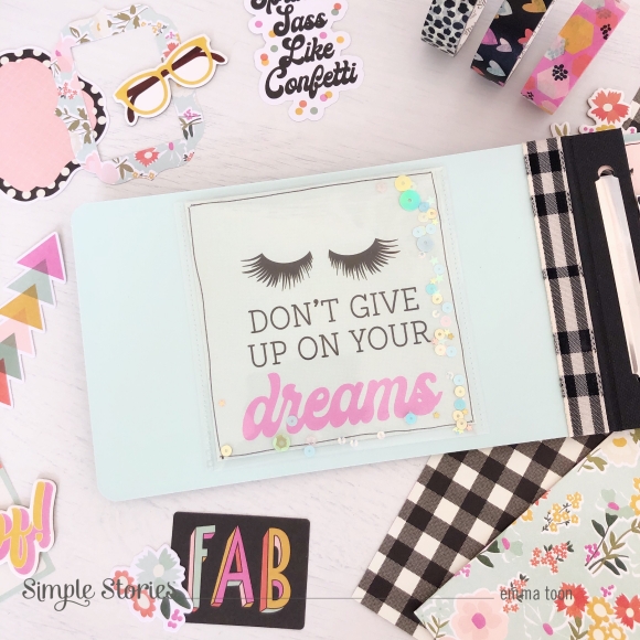
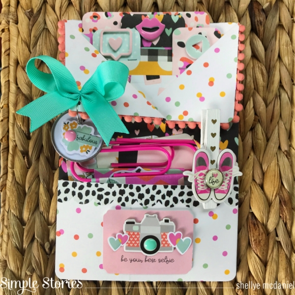
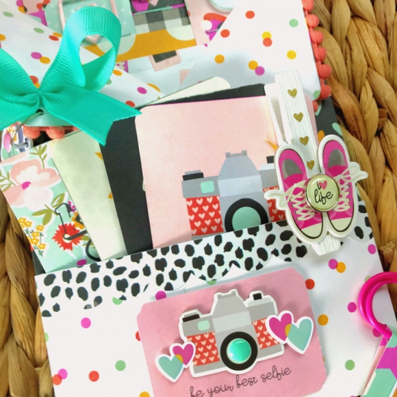
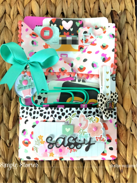
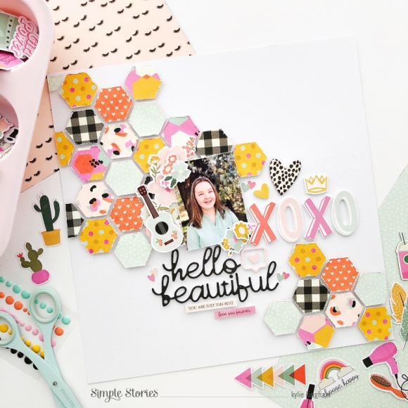
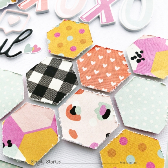
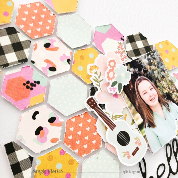
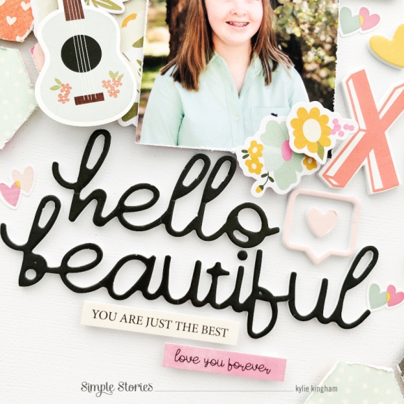
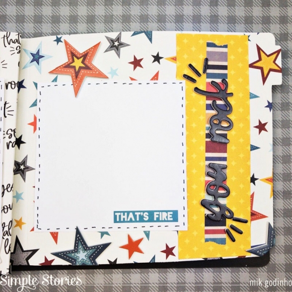
Hi there! Tya up on the blog today sharing my latest batch of handmade cards with you! I got the pleasure of working with the 2020 edition of the “I Am” collection. Each time that Simple Stories has come out with the “I Am” collections- they just get more and more beautiful! I love the colors and icons and the positive messages this collection includes.  It’s perfect for sending some positive vibes to your special someone.

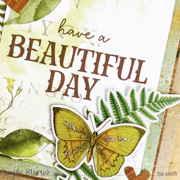
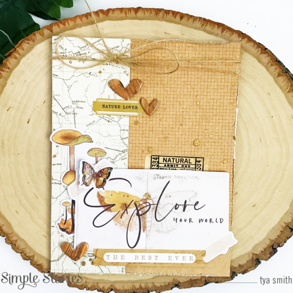
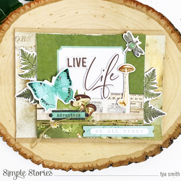
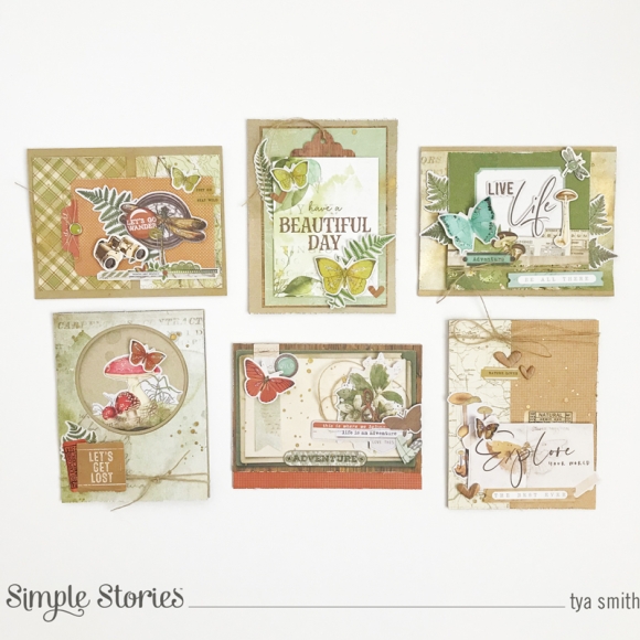
I created 8 cards with this collection and here are each of them close-up. I had so much fun making these and loved the different variety of cards I was able to make.

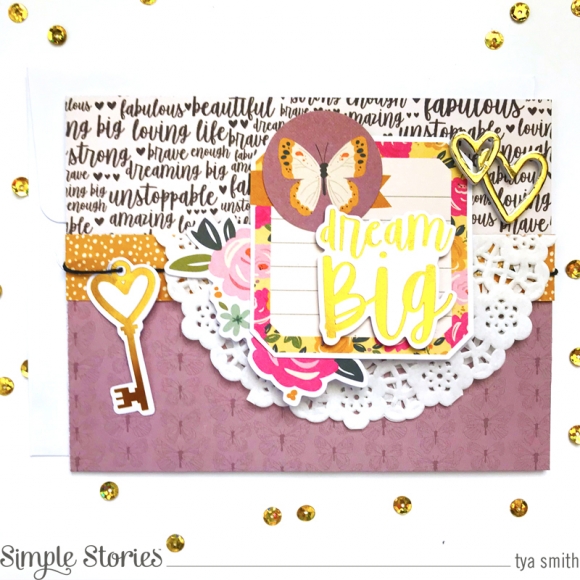
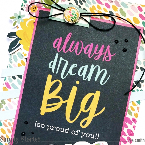
Card 1 was fun to make - I love the addition of the beautiful dusty purple in the collection. I made sure to use it along the bottom of this card. The gold foil that is shown on the “Dream Big” sentiment was a great addition to add some shine to the card.

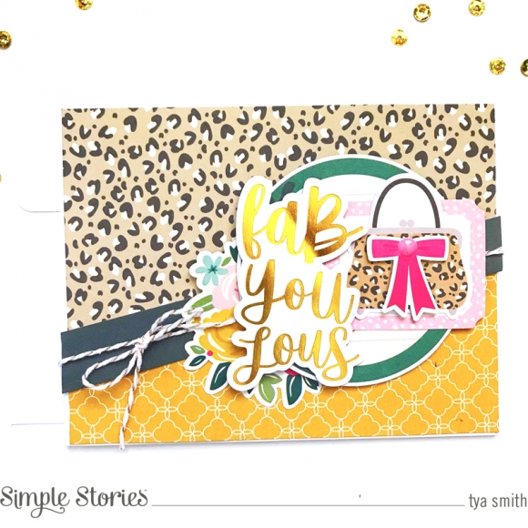
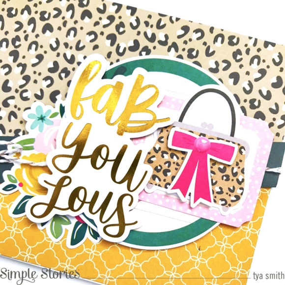
Card 2 has more of that lovely gold foil and some super fun Leopard print paper. I want that Leopard print purse to be real lol! I added a cute floral cluster in next to the sentiment adds some more feminine touches to the card.

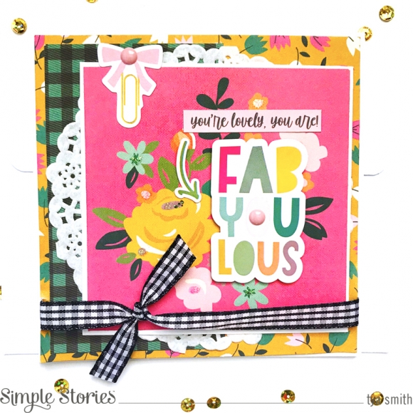
Card 3 is indeed “Fab-You-Lous!” I like using the 4x4 Element cards as bases for my card embellishments. The black and white gingham ribbon brings a fun and funky spin to this card.

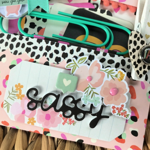
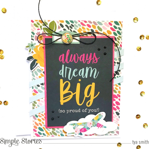
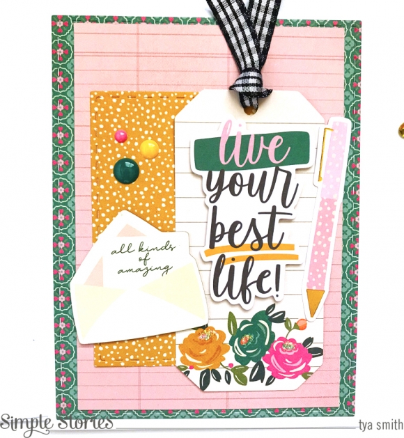
Card 4 is made with one of the 3x4 cards that are in the 6x8 Paper Pad as the sentiment. 3x4 cards are a great and easy way to add a sentiment to your cards without a lot of work. I love that the Decorative Brad is the same print as the background pattern paper. That is a great way to add cohesion to your cards.

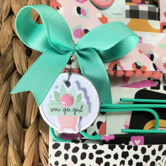
Card 5 is a fun one too. I really liked the darker teal color in the collection. I have used the cute lined paper type label that is from the Journaling Bits and Pieces before on my cards and I like turning it into a tag by punching a hole in the top and lacing some ribbon or twine through the top. I also added some of the Enamel Dots for some shine.

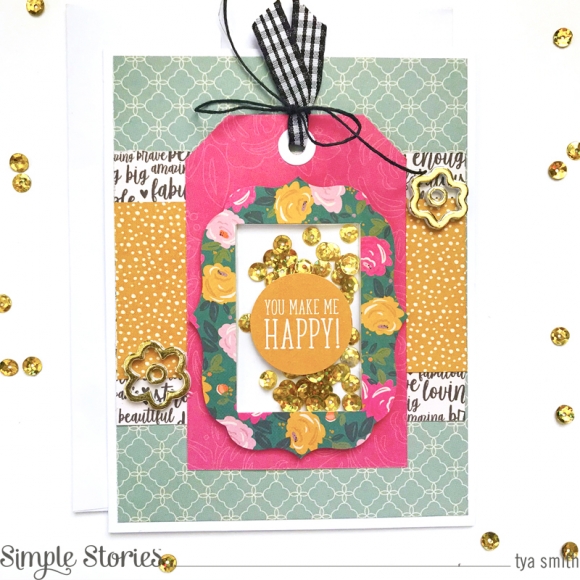
I decided to make Card 6 into a shaker card. The cute window label shape from the Journaling Bits and Pieces makes the perfect cover to make a cute shaker card. I added some gold sequins to the inside and then placed the frame on a hot pink floral paper. Then 2 super cute gold flowers are from the Foam Stickers. They add some fun dimension to the card.

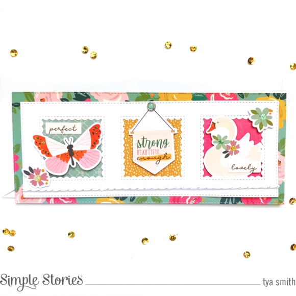
Card 7 is a new type of card style for me – this is called a Slimline card and boy was it fun to work with a different sized card. This card was made with some metal dies to create the cute windows with some of the Bits and Pieces Ephemera sticking out. The swan and butterfly shapes fit great inside the windows.

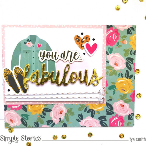
Last card, Card 8 is a great way to end the batch. The cute foam stickers have gold foil on them and add great shine to the cards! The cute denim shirt and Leopard print shoes were stickers and add cute and hip element to the card.

This was one of my favorite collections to work with! I hope you enjoyed the cards and that they inspired you to used the “I Am” collection to make some cards of your own. Anyone would love to receive one of these cards. Thank you so much for stopping by- Happy Crafting friends!

Supplies

Hey friends! It’s Kylie back with you all today with a fun new layout to share. My son recently became a teenager and I was super excited to start creating a page design using the ‘Bro & Co’ collection. There are so many fun elements to this range and the colour palette was perfect!

To begin I trimmed a small strip (4-5mm) off each edge of a piece of the YOU ROCK paper and layered it over a piece of the BRO & CO 4 X 6 ELEMENTS paper. Next, I trimmed a good 10mm or 1 cm off each side of the IT’S ALL GOOD! paper and adhered it centred. I now had a lovely framed effect for my background paper. I really loved the ‘Star’ design of the ‘It’s all good’ paper and this was what inspired me to use a simple star cut file for my background. I backed it in several of the papers for lots of colour before adhering it predominantly over the right side of my page. For a little extra dimension I added some of the star chipboard stickers and die cuts with foam adhesive over the top of the cut file randomly.

I absolutely love working with big titles! The foam stickers were perfect for constructing a title that I felt reflected my photo and page design. These were added over the blank space on the left of my page, next to my backed photo which I had adhered with foam adhesive. By using the foam helps the photo sit up from the page.

My son loves to have some time playing his X-Box so I loved the die cuts that could reflect this by adding them next to my photo.

To finish my page and add a final touch of balance, I added the scalloped border from the sticker sheet across the bottom of my page. Some smaller phrase stickers were also added as a sub-title phrase. They were just perfect:- ‘ Not so little, But still my baby, Love this kid!’

Thanks so much stopping by today! I hope you have enjoyed seeing my latest scrapbooking layout.

Take care,

Kylie.

Supplies

Hello friends! It’s Mik here from Papermiks on the blog sharing my latest flipbook creation. In 2015 I still lived in Bern, the capital city of Switzerland. There are a lot of beautiful sceneries and incredible places for hiking. That Summer we went to Kandersteg, located at the Bernese Alps along the valley of the river Kander, to hike across the Gasterntal Valley.

At the moment I saw the SV Great Escape collection I immediately thought of that panorama and retrieved some photos from our day in Kander and created a flipbook using this a-ma-zing collection.

Before I started decorating my cover, I decided to cut a piece of it. I wanted to make my flipbook more creative and fun, so I cut a 2.5” piece from the front cover and started creating pockets and tags, gradually cascading from the front cover to the back. To give this effect I added 1” to each new page.

I decided to cover the front of my mini album with a piece of “time for adventure” paper and added a card from “3x4 elements”, which I distressed. The items of the simple stories collections are so versatile! Here, I transformed a layered frame into a chipboard, added a small frame and I put a ladybug sticker. I love to add these details in my projects. In addition to the leaf die cuts, I added numbers and letters that you can find it in the Color Viber collection.

At the first page of the album I put a photo without a pocket page. I like the effect of mixing photos inside and outside pocket pages. Adding stickers to photos is something I love too!

Here I added a small pocket and used two brads to close it. At the front I put a 2”x 2” photo that perfectly matched with this page.

I believe that one of the most indispensable items are tags. So here I created a tag in which I put the photo of the cows that came to “visit” us while we lit a small fire. It was a beautiful moment! They had to be part of this album.

One of the most beautiful things of hiking are the landscapes that we find along the way. To embellishment this moment, with the waterfall, I used a layered frame, die cuts, brads and some stickers.

Have you ever tried sewing on acetate? Here, I sewed a die cut on a piece of acetate. At first glance it looks like the die cut is sewn into the photo, although it really isn't. I love these effects we are able to produce with these transparent pages.

When you turn the acetate page, you have this beautiful photo of the Gasterntal mountains in the Bernese Alps. For me, a Brazilian girl, the Swiss landscape is something incredible! I hope you’ve got some inspiration from this idea and enjoyed it! Thanks for stopping by and have a creative day!

Supplies

Hi beautiful Simple Stories friends, Cristina here with you today to show you a new project I made with a brand new collection Simple Vintage Great Escape. This is another vintage style collection I totally fell in love with. Beautiful designs mixed with soft colors and delicate icons that perfectly match with my taste.

I looked through the papers of collection kit many times before I decided which ones to choose because I really loved all of them. Finally I decided to use the one with a map pattern and a really soft green shade and the one with vintage designs and big words that reminds me the shabby style I really love so much.

I decided to use a pic about a journey in Sicily because there I remembered many colors like those inside this collection. That ones I chose were perfect!!!

I really enjoyed playing with these elements, colors and designs. The vintage style is totally different that I usually use but especially this is very soft and versatile so I had so much fun playing with it and making this page.

I chose my decorative elements from all the products available in this collection such as chipboard, ephemera die-cuts and the clear stamp. All the products are really high quality and the clear stamps are made in photopolymer that is the best way to have a very perfect stamp.
So that’s my project and I hope you like it and you can get any kind of inspiration by it. Please don’t forget to leave us a comment below and tell us which is your own idea on how to use this beautiful new collection.

Thank you so much for joining me today! See you next time!

Supplies

Hello friends!  I hope you’re having a great day!  Today I’m happy to share EIGHT cards made with the Simple Stories Kate & Ash Collection!   This collection celebrates the young women in your life and inspires them to be unique and individual.

The papers in this collection are 12” square.  As a card maker I like to start by cutting them into 6” square to make them more manageable.  I can layout all the sheets and easily see all the prints.   The prints are not overly large making these ideal for cards or page layouts.  You can get a good idea of the print size on my A2 cards. I like to arrange the pieces on clear plastic sheets the size of my card base before I commit to adhering them in place.  It’s easy to pick up the entire arrangement and lay it over the pretty papers to help me decide what print will look best.

The paper pack includes printed cut apart journaling cards as well as a full size sticker sheet with borders, tabs, words and lots of great images.  I apply baby powder to the sticker backs so I can move them around on my designs before I adhere them in place.

I love all the extra embellishments Simple Stories adds to their collections like washi, coordinating color enamel dots and decorative brads.  Each of my cards has ALL THREE.  Can you spot them?

The chipboard and bits and pieces die cut pieces in the collection are the frosting on the cake! They’re sugar and spice and everything nice.   I’m having a flash back to my own teen years – playing Blondie on my record player, applying make-up in the mirror, always a camera at hand and hanging with my best bud – my Golden Retriever named Bear.

The papers are fun and trendy with flirty eyelashes, leopard print, speech bubbles and florals.  I love the shades of pink aqua and yellow with a bold pop of black for contrast and a little drama.

As always, all of the elements are perfectly color coordinated.  You can always expect the best from Simple Stories with tons of different embellishments so your projects can be as unique as the people you personalize your creations for.

As your young lady is exploring what makes her beautiful and unique, and her ability to see the world in her own special way, these cards let her know you support and encourage her in all she does!

Supplies

Hey everyone, Michelle here today with a new layout to share using the Bro and Co collection.  I think this may be my favorite release so far this year.  I love a good boy collection and this one doesn't disappoint! 

The stripes on the So Rad paper kinda looked like my son's shirt.  So I cut them out and distressed the edges to mimic his shirt.  I then fussy cut a lot of stars from the It's All Good paper and scattered them across the layout.

I then just added a few stickers and enamel dots to finish.  I really love all the dimension and texture the distressing and stars added.

I can't wait to create with this gorgeous collection again!

Thanks for stopping by!

Supplies

Hiya, Emma here today, I’m wanting to show you what I’ve done with the super fun, Kate & Ash collection! Oh boy! This new Simple Stories Collection is just so cute!! It’s bursting with sassy wording, awesome images and fabulous prints!! You’ll love it!! I decided to use it with the new Robins Egg 4x6 Flipbook. 

To decorate the front cover of the Flipbook, I picked out lots of embellishments in the Robins egg colour and black to make them pop! I’m loving how it looks! I also used some black check ribbon to tie around the cover...and of course, my faves, enamel dots!

On the inside I made a shaker pocket, super easy, choose the image you want, slide inside a Sn@p! flip pocket with some sequins, seal the top and attach with double sided sticky tape. 

It’s really simple to add more pages to the flipbooks, wether it be, more pocket pages or like this one where I’ve decorated a page to add as my front page. 

I like to do a mix of journaling pages and pages to add photos. I use the lined and graph paper from the Sn@p! Basics set for my journaling areas.

I love to use as many layered embellishments for decorating my pocket pages, I often use foam sticky pads under stickers to give more depth. 

Adding brads is also another way to add more detail, you can always add them onto the outside of the pockets too. 

The great thing with the Flipbooks is that you can mix up the different sizes of pocket pages, here I used a page that holds the 3x4 Sn@p! Cards. I’m sure you’ll have great fun using the Kate & Ash collection and enjoy setting up your very own Flipbook too! 

See you next time!

Supplies

Hi everybody! So happy to be here today! I'm Celes from GuiadeManualidades.com and today we are going to create with a wonderful collection: Bro & Co. The lovely teenage boys of the house will have their own mini album to put all favorite photos and memories. This project has a box for the mini album and to keep memories in an easy way for them. Let’s get started!

Mini Album Structure: for making it you have to cut 1 piece of white cardstock paper of 36” w x 9" h. Then you have to score it (wide) in 4 1/2“, 9", 13 1/2“, 18", 22 1/2“, 27", 31 1/2”. Turn your paper and score it in 3”. If you need to cut two pieces of paper to get the 36”, remember to add an extra 1 1/2” so you can glue them together.

Then, you need to cut two pieces of stable cardboard of 4 5/8“ w x 6 1/8“ h. Use one of the papers of the collection kit to cover them and choose a ribbon. Glue a piece of ribbon on each cover.

Box Structure: for making this box you need seven pieces of stable cardboard. Pieces: A- cut two pieces of 5“ w x 6 1/2“ h, B- cut two pieces of 3“ w x 6 1/2“ h, C- cut two pieces of 3“ w x 4 3/4“ h, D- cut one piece of 2“ w x 6 1/2“ h (round two corners if you like). Get a pair of magnets for the box.

You need to choose 4 design papers from the collection kit (3 for the outside of the box and 1 for the interior of the box).
Outside of the box: use the first design paper to cover one piece of A, B and D (left extra paper at the end). Another one to cover one piece of B (remember to add one magnet and left extra paper at one high side) and two of C (left extra paper at both wide sides). And a third one to cover the last piece of A. Let all of them dry off.

Once all pieces have dry off, glue them together to make the box. Use the last design paper to cover all the interior of the box (remember to add the magnet to piece D before cover the interior, so you can close the box in the correct way)

Interior Structure: this mini album has two sides. The first one if full of pockets (8 pages) and, when you their it around, you will 6 pages for photos and embellishments ( you have six pages because you have to glue the interior structure to the covers using this side) As you can see, I used two design papers to decorate each page. You can cut 8 papers of 4 1/4“ w x 3 1/2“ h and 8 papers of 4 1/4“ w x 2 2/8“ h.

For the other side of the album you can cut 6 papers of 4 1/4“ w x 5 5/8“ h. To decorate each page use all you have. Die cuts, stickers, chipboards, enamels dots, washi tapes and much more!

Covers: this project has two covers. One for the box and one for the album.  You can coordinate the design of both of them.

In my case I prepared 3 paper rosettes using the Color Vibe “Bolds” collection kit. I chose 3 papers and cut 2 strips of 1 1/2” w x 12” h of each color and scored them every 1/4”. Then, I used all I had to decorate… die cuts, stickers, chipboards, enamels dots, brads, washi tapes… Love to play with all of them!

As you can see, this mini album has a lot of space for pictures and to keep special memories. And having a box is an extra that teenagers will love.

I hope you like this idea! Have a great week!
 

Supplies

Hello Simple Stories fiends!  

Nathalie with you today to share a new layout that is all about the sass and  color of the new KATE & ASH collection from Simple Stories.  The collection is beautiful and perfect to document so many memories,  but especially those of teenage girls!

There were so many "perfect" embellishments to describe the feelings in the pictures, that i kept the background for this page pretty simple, so all the embellishments will pop.

I cut 1.25" strips of a few of the collection papers (Awkward, Good Vibes, Hey Girl!, Looking Good).  One of the sides of the strip was distress a bit , so that it brings movement to the page.  Once i glued them in place, i stitched a 0.5" strip of the Girl Power paper to the  center of the strips.  I might have added a bit of washi tape as a bottom layer ;).

I backed the pictures with pieces from the 3x4 cut apart paper, and placed them on the layout with a bit of foam adhesive atop the paper strips.  Here is where i began layering and attaching embellishments mostly to the right side of the pictures.

Lately i have been loving brads -once again- so i weave a few of them in between phrase stickers and ephemera pieces; these work so well with all the enamel dots scattered on the page!

Can i take a moment to let you know how awesome the foam stickers are!!!  I used a few of the black fine script ones to create the title.  Then added my lines of journal below the title, and finished it all up by running a bit of more washi tape and a small cluster at the very bottom of the page.

The amazing KATE & ASH Collection is so easy to work with, and perfect to document those lovely girls in our lives.  Be sure to check it out!

XO

Supplies

Hi friends, it is Dorymar today with a beautiful project! If you love nature, camping, hiking, etc., this project is for you!  The New Simple Vintage Great Escape is a gorgeous collection inspired by Nature. I love to go hiking or simply walking in the woods and when I saw the collection, I fell in love with it!  Look at this beautiful project!

For this project I selected the new 6x8 Green Flipbook, the bright green color is the perfect combination for this collection. On the cover I selected the Wild and Free Paper as a background, I cut the paper in half and used one part as a background and the other part to make a beautiful layer.  The big butterfly with the foliage and bingo card is so beautiful and brought a perfect background to my project.

I love to create many layers and dimensions in my projects, on this cover after I covered the cover of my flipbook, I fussy cut the beautiful wood frame from one of the 4x4 elements paper, then  I used the fantastic icons included on the bits and pieces package and for the great finishing touches I added chipboard icons and decorative brads. All are adhered with dimensional tape to create a great look.

Here you can appreciate the beautiful layers and gorgeous designs!

For the first spread of my project, I wanted to create a page with many elements and details to emphasize the theme of the project. Like when you walk through the forest, there are so many colors, dimensions, and details. To achieve this,  I used the beautiful paper "Born to Roam" as a background and on it I added the beautiful banners included in the banners sticker sheet and some beautiful wooden frames included in the combo sticker sheet and accentuated everything by adding butterflies, mushrooms, insects and ferns included in the bits & pieces.

The whole interior of this project makes you transport yourself into nature, this collection is full of wonderful elements that when I started creating with it, I couldn't stop. Each of the spreads and pocket pages are full of pure details and beautiful stuff that makes me jump with excitement. Below you can see each of the pages of this project in detail and you will surely be delighted and ready to look for this FANTASTIC COLLECTION.

One of the icons that I liked the most in this collection are the messages carved in the wooden slices, they are perfect to add as titles or messages within your project.

I adore each of the cards included in the 3x4 element paper, they are full of messages, designs and they are perfect to highlight the project.

The decorative brads of the collection played an important role in this project, they stood out in the clusters I made around my photo mats. They are perfect!   

Aren't these some of the most beautiful designs you have ever seen? I adored and used all the die cuts, decorative brads, and chipboards I could create all these beautiful clusters on my pages.

This is by far one of my favorite projects this year. I hope my project inspired you to create or use the new fantastic Simple Vintage Great Escape Collection.  Thank you so much for stopping by today!

Happy crafting!

Supplies

Hello friends! Anya here today and it's my turn to share a portion of inspiration with you using the Bro & Co paper collection! There are so many different things I like to create and layered tags are one of them for sure!

I like to cut a bunch of tags from different patterned papers in the line using tag dies and then simply play with all the die cut pieces to create a nice balance in color and design. It's fun and relaxing at the same time. Sometimes I feel like making tags is the best way to get into scrapping mood!

Here I made four tags, which now can be used as is, or you can use them on layouts, gift bags, create cards with them or add them to other fun projects. My teenage nephew's birthday is coming up and I am sure these will come to a good use. 

Nothing adds a more perfect finishing touch to masculine project as brads do! Simply adore that shiny dot with a metal rim, which usually becomes the star of any finished project!

Supplies

Do you ever use really big photos on a layout?  As I looked through the Simple vintage Great Escape collection I was inspired to try printing a really big photo to use with it.  I knew the rich colors from my outdoor photograph would really pop amidst the colors in this collection.  Christine joining you today to showcase a big photo on an outdoors themed layout!

As you can already see, the colors in this were a perfect match.  I cut the picture out in a circular shape allowing one part of the circle to be filled with this gorgeous green patterned paper.  That paper was the perfect match for bringing out all the greens in my photograph! The plaid paper plays nicely off all the colors as well.  I didn't want quite so much of a contrast with the white background, so to soften that I used some of the map washi tape.  I tore it in half to give it an even softer look.

I don't often put my title in a different orientation from my photograph - usually for designs sake - the title is horizontal.  But for today's layout, I really liked the way the chipboard word "wander" looked sitting on the border between the picture and patterned paper. The eyes sometimes like something unexpected and you run with it!

The ephemera in this collection is to die for.  I loved the foliage pack especially and as you can see, I used it to create a giant fern cluster on one side of my photo and used it a second time as anchors for my title work.

My final big design choice involved how to add more colorful to this very green layout.  I opted to bring in some of the butterflies from the ephemera packs alongside the brads.  Both of these brought in some additional pops of color and dimension without being too overwhelming.

If you want to check out how this whole layout came together, you can catch all of the details on my <a href="youtube.com/cameyer71">YouTube Channel</a>!

Supplies

Hi! Odessa back with some more SN@P! pages. This time I’m using the fun and a little snarky Bro and Co collection. With two tween boys at home, this was just what I needed for all their non-adventures hiding out with video games and generally being cool guys.

I kept it simple with a SN@P! Binder with a black spine which goes well with the darker tones in the kit. I had some trouble deciding which cardstock to use on the cover because there were a few I really liked, but the bold directional print of So Rad! won out because I knew it would have big impact.

Then I started embellishing the cover of the SN@P! Binder. Instead of a bold title, I decided to go one of my favourite routes, matching the colours of the wide stripes on the cardstock with all kinds of embellishments. Chipboard stickers, Combo stickers, Bits and Pieces and Enamel Dots all from Bro and Co. It was also a fun way to use a few things I liked that didn’t make it into my pockets like the funny yellow shirt.

Bold colour, so much snark and nerdy vibes is my life with 2 boys and Bro and Co really worked well with the photos I was documenting. On this spread I’ve got a fun brother photo next to my older son’s final school assignment, a quarantine time capsule. I used lots of the 3x4 journal cards from the 3x4 Elements Cardstock on this page and So Rad! under the Epic title Bits and Pieces. I also used a handful of the 2x2 Elements with Bro in the centre to make a tiled 3x4 journal card. The Colour Vibe Bolds Alpha Sticker Book was full of just the right coloured alpha stickers to add to my titles and add numbers to the list card.

I love a good embellishment cluster so I used this adorable cold drink Chipboard Sticker with some brads, enamel dots and stars. That checker print is on point!

This layout has some more general life stuff like listing what the boys have been up to along with some photos. I used the fun mixtape from the Bro and Co 4x6 Elements with a phrase from the Foam Stickers over the label which was an easy and impactful way to fill up that 4x6 pocket.

The 3x4 Elements from Bro and Co are just so funny, I liked this one next to a pic of some shopping requests the kids made.

I used the Bro and Co Stamp set here to stamp on a mix tape to make the boys’ current “playlist” along with more of the Colour Vibe Bold Alpha Stickers. I also loved that little bear and stuck him on the cool checkerboard Killin’ It Cardstock with a speech bubble. Adorable and cool! It’s nice to have such a vibrant collection to go with photos of my guys. If you’ve got hours of at-home video games to document I highly recommend Bro and Co!

Supplies

The idea of a pajama party may be the furthest thing from anyone's mind right now, but when the time comes (or make them now for the people in your household) these will surely be a hit!  

I took the idea from "loaded pockets" or "loaded envelopes" that are very popular snail mail or exchange gifts.  The folding of this design will be shown on my YouTube channel; I've explained it below, but it can be confusing if you don't have a visual. 

To start: Cut your favorite "Kate & Ash" patterned paper to 12"X11".  Place the 12" edge onto a score board and score at 3.25" and 8.75".  Turn the paper and score at 8".  Keep in mind that the backside pattern will fold up, so make sure the design isn't upside down!

Working below the 8" score mark: make cuts along the 3.25" and 8.75" marks UP TO the 8" mark; trim away the rectangle flap on both sides.  The flap that remains at the bottom: cut away a small section in the middle, leaving a 1/2" border around the sides and top; this will be the flaps to glue down and make the pocket.  

For the folds: Fold the two side folds in towards the front (the 3.25" and 8.75" sides).  The folds will overlap; glue them in place.   Fold the flaps at the bottom and bring up to adhere to the top.  

Now for the decorating!  After corner-rounding all of the sides, I aded pom trim around the "collar" and then added a bow and embellished metal rimmed tag.

I used another patterned paper and cut to create cards for the top pocket.  I made three in different sizes and then added tabs to the tops.  In the bottom pocket, I cut apart the 3X4 cards and tucked them inside.

Jumbo clips were embellished with a die-cut banner and fun embellishments.  I also topped a clothespin with a couple of chipboard pieces and decorative brad.

The tags in the top would make a great place for pictures.  Set up a little printer station and let everyone print pictures from their phones or computer!  Have each slumber partier write little notes and share inside the pocket :)

Don't forget, I'll have a quick video of how the pocket is constructed on my YouTube Channel!  

Thanks for stopping by!
Shellye

Supplies

Hey everyone! It’s Jen today with a project using the amazing Simple Vintage Great Escape collection. Recently, my son embarked on a camping trip with his girlfriend to nearby Mt. Rainier. Because my love of memory keeping is no secret with our friends and family, they took tons of great photos and shared them with me. What a gift!

I was really drawn to the Wild & Free patterned paper and used it for the background – the illustration of the old book pages is gorgeous. Before adding any embellishments, I used the stamp set to add more fern leaves in brown and a few more birds in gray.

To add more depth, I cut apart another of the same background paper, distressed the edges of what I’d cut, and layered the pieces on top of their identical counterparts along the left edge. Doing this really made the background look as if it’s made of pages from a book.

Next, I moved to the right side of the layout where I added a cardstock banner sticker in the upper corner. I used foam squares to adhere the Great Escape sentiment sticker with a die cut butterfly on top of the banner for more texture.

The title, which is a quote, uses Color Vibe Bold alphas with wording created on my manual typewriter.

In the bottom-right corner, I used die cuts and chipboard to add more color to the project. The embellishments in this collection use such deep, rich hues that are absolutely stunning.

To complete the layout, I added more embellishments around the photo as well as within the layers of “pages” along the border.

I love this photo of my son and can’t wait to use this collection with the remaining photos from his trip.

Thank you so much for stopping by today!

Supplies

Hi there friends! It’s Tya, and it’s my turn up on the blog today to share with you my latest handmade card creations! This time around I got the pleasure of using the gorgeous “Simple Vintage Great Escape” collection. Full of earthy tones, stunning patterns and lovely flora and fauna themed icons – this collection had me wanting to get out into nature!

All of my cards are A2 size (4 ¼ x 5 ½ inches) and were made using kraft cardstock for the card base. I also used some gold paint mist on the background of the cards. It was fun to get a little messy – something I like to do with the more vintage-y themed collections.  I created six cards and I’d love to give you a closer look at all of them! Here we go!

Card 1 starts us off and one of my favorite parts of the Simple Vintage collections is that they have the most beautiful ephemera! A lot of times when I made my cards, I like to start out by making little clusters of ephemera and then decorate further with other embellishments like the Decorative Brads, twine, stickers etc.  This card is a great example of how I do that as you can how I layered several different products to make this card.

Card 2 was a fun one to create! Here I cut out a couple of circles using some metal circle dies and a manual die cutting machine to get circle shaped window in the top portion of my card. I decorate the inside of the card with one of the cute mushroom themed ephemera pieces. On the outside of the card I added more ephemera, stickers, staples and some twine to decorate.

Card 3 shows of more layering of the ephemera in the collection. I had the most fun doing this! And if you’ll notice – each of my cards features a butterfly. I just couldn’t help it! There were so many of these beautiful shapes that I added them to each card. I added some of Stickles on each of their wings also for some shimmer. Lots of texture on these cards! Isn’t that rusty orange color in this collection just stunning? I love how bright and vibrant it made this card.

Card 4 is probably my favorite of the bunch, I don’t know if it’s the butterflies, the wood grain pattern or the dreamy soft blues and greens found in this collection. This one came together quickly and I loved that also!

Card 5 is one that I did and created a sort of monochromatic color scheme with the creams and the browns in the collection. This type of technique is also fun to do. Monochromatic is very pleasing to the eye and I found this card really soothing to look at.

Card 6 is our last one of the bunch. I used one of the 4x4 Elements as the base of my card. It already had some lovely layering going on so I was able to add just a few more of my own to finish off this card. I love that big aqua butterfly and the cute dragonfly brad!  The title was made with one of the ephemera pieces as well. A few big leaf clusters from the Foliage Bits peek out from the two sides of the card.  These pieces were a really fun way to finish off my card.

Here’s a group shot of all the cards that I created:

Well, that’s all I have to share with you today. If you are looking at doing some card making using some of the most beautiful botanical themed products you MUST pick this collection up. It was a joy being able to work with it! Thank you for stopping by today – Happy Crafting friends!

Supplies

Hi there friends. It’s Kylie with you all today sharing a fun new layout I created with the divine ‘Kate and Ash’ collection. This range is oh so cool with lots of fun ‘girly’ elements included. I can see my self scrapbooking lots of fun pages of my daughter with this collection. For my layout today, I went with a white cardstock background for something different, as usually I like to layer lots of various printed papers together to form my background page.

Honestly, when I sat down to create this page, I could not decide on what papers to use as they are all so vibrant and lovely. I decided to create my own patterned background using a simple hexagon punch. Several papers were selected and I punched a whole bunch of the shapes out. Using a distress tool I textured each side of the hexagons and placed them in random assortment over my white background. Once I was happy with the placement of them, I adhered them with some foam tape, so that they sat ‘lifted’ up from the background. This height gives a lovely sense of dimension.

Once in place the hexagons cascaded on a diagonal from the top left to lower right of my page. My photo was printed to a smaller scale and added through the middle of my background.

I must say, I am totally obsessed with the ‘Foam Stickers’! So many fun title options can be created with these and I love the vibrancy it adds to your completed page. It was tough choosing from them as I love them all, but I decided to add ‘Hello Beautiful’ and the ‘XOXO’ stickers as main titles.

To finish my page, I added some of the gorgeous ‘Bits & Pieces’ in and around my photo for balance as well as several decorative stickers from the cardstock and combo sticker sheets.

Thanks so much for stopping by and taking a look at my layout today!

Until next time,

Kylie.

Supplies

Hello friends! It’s Mik here from Papermiks on the blog today! I'm super excited to share this fun flipbook with the fantastic Bro&Co Collection.

At the moment I saw this collection, I knew that my cover would be a cassette tape! I had so many cassettes in my teens and I loved them! To make this mini album I decided to use a black 4x6 flipbook, I thought it would be perfect to be my cassette tape. For the cover I used an Alla K’s cut file “pocket insert - card cassette tape”.

The file is all organized by parts, so I just chose which papers to use, adjusted the size to fit and put my silhouette to work. To make my tape I used 7”3/8 x 3” ¾ from Killin' It! paper, 6” ¼ x 2”  Totally Legit! paper and 6” ¾ x 3” ¼  plus 1”3/8 x 4” ½  from Charcoal paper - color vibe cardstock kit basic.

To make the pages to my album I used the background of the tape cut file. In this way I standardized the pages so I can have all the pages in the same format of cassette tape.

I mixed the paper pages with the pocket pages that come with the flipbook which gives me more space to fill my album with lots of pictures. It’s important to say that all the internal paper pages has 7” 7/8 x 6” 1/8.

As you know I love to use pocket pages and some flap pages. This gives my album an interactive touch and I love it!

Another thing I love to do is create pockets.

Here I added a pocket to place tags in. I had a lot of fun creating this album. The Bro & Co collection is a super fun! I’m sure that will help you to document your boys in a happy and easy way. I hope you’ve got some inspiration from this idea and enjoyed it! Thanks for stopping by and have a creative day!

Supplies

Pages